22 Kitchen Cabinet Color Ideas Trendy Shades
Cabinet color sets the tone for the entire kitchen. It is the largest surface of color in the room, and it influences every other choice, from countertops to hardware to wall paint. Pick the right color and the kitchen feels intentional and welcoming. Pick the wrong one and you will notice it every single day. This guide covers 22 cabinet colors, from soft white and warm beige to navy, forest green, and terracotta, with practical advice on undertones, lighting, and pairings for each.
Every color below comes with guidance on what it pairs with, what lighting it needs, and the mistakes to avoid. You will find safe neutrals that work anywhere, bold colors for confident kitchens, and the current favorites like sage green and greige. The product picks under each idea help you sample and plan. Most kitchens use one main color, but the two-tone idea at the end shows how to combine two successfully.
This article is for homeowners planning a kitchen refresh, from a simple repaint to a full remodel. It is also useful for renters considering peel-and-stick options and for anyone choosing colors for new cabinetry. You do not need design training to use this guide. What you need is patience with sampling, because cabinet color always looks different in your kitchen than on a screen. Start with the colors that speak to you, sample generously, and trust what you see in your own light.
This post contains affiliate links. If you buy through them, I may earn a small commission at no extra cost to you.
1. Soft White Kitchen Cabinets with a Modern Touch
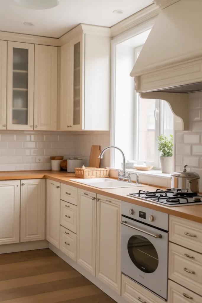
Soft white cabinets are the safest strong choice in kitchen design, and their popularity is no accident. They reflect light, make small kitchens feel larger, and work with every countertop from marble to butcher block. The key word is soft: a warm or slightly creamy white avoids the stark, clinical feeling of pure brilliant white. Modern shaker fronts or flat-panel doors keep the look current and prevent it from feeling dated. White cabinets also give you freedom elsewhere in the kitchen, since any hardware finish and any wall color will work with them. They photograph beautifully, which matters if you ever sell; buyers consistently respond well to bright white kitchens. The color also makes the kitchen feel clean even when it is not spotless, a practical advantage for busy households. If you are choosing one color to live with for fifteen years, soft white is the lowest-risk option with the highest long-term satisfaction.
Pick the right white: Whites vary more than people expect, and the wrong white can ruin an otherwise good kitchen. Hold samples against your countertop and flooring in your own kitchen light before deciding anything. A white with warm undertones suits wood floors and cream tiles, while a cooler white pairs with gray stone and stainless steel. Test at different times of day, because north-facing kitchens make whites look gray and south-facing ones make them look yellow. Paint large sample boards, not tiny chips, and tape them to actual cabinet doors. Live with them for several days, checking in morning, noon, and evening light. Once you pick, buy all the paint from the same batch, since whites shift between batches more than saturated colors. Keep the can label and formula for future touch-ups; you will need them eventually.
Keep them clean: White shows everything, so the finish matters as much as the color. A satin or semi-gloss paint wipes clean much more easily than flat, which absorbs grease and stains. Choose a scrubbable cabinet paint, not wall paint, since kitchen grease needs real cleaning power and wall paint will fail within a year. Wipe the doors near the stove weekly with a damp microfiber cloth and a drop of dish soap; this thirty-second habit prevents the slow buildup that dulls white cabinets. Avoid abrasive pads, which dull the finish over time and create micro-scratches that trap dirt. For stubborn spots, a paste of baking soda and water works gently. With decent paint and basic upkeep, white cabinets look fresh for years instead of months, and touch-ups blend invisibly if you kept the original formula.
- Compare white samples in your kitchen at morning, noon, and night before choosing.
- Use satin or semi-gloss cabinet paint for wipeable, grease-resistant doors.
- Pair soft white cabinets with brushed brass or matte black hardware for a modern feel.
Shop This Look
| Soft White Satin Cabinet Paint | Brushed Brass Cabinet Pulls for Kitchen | Microfiber Cleaning Cloths for Cabinets |
2. Sage Green Kitchen Cabinets for a Calm Look
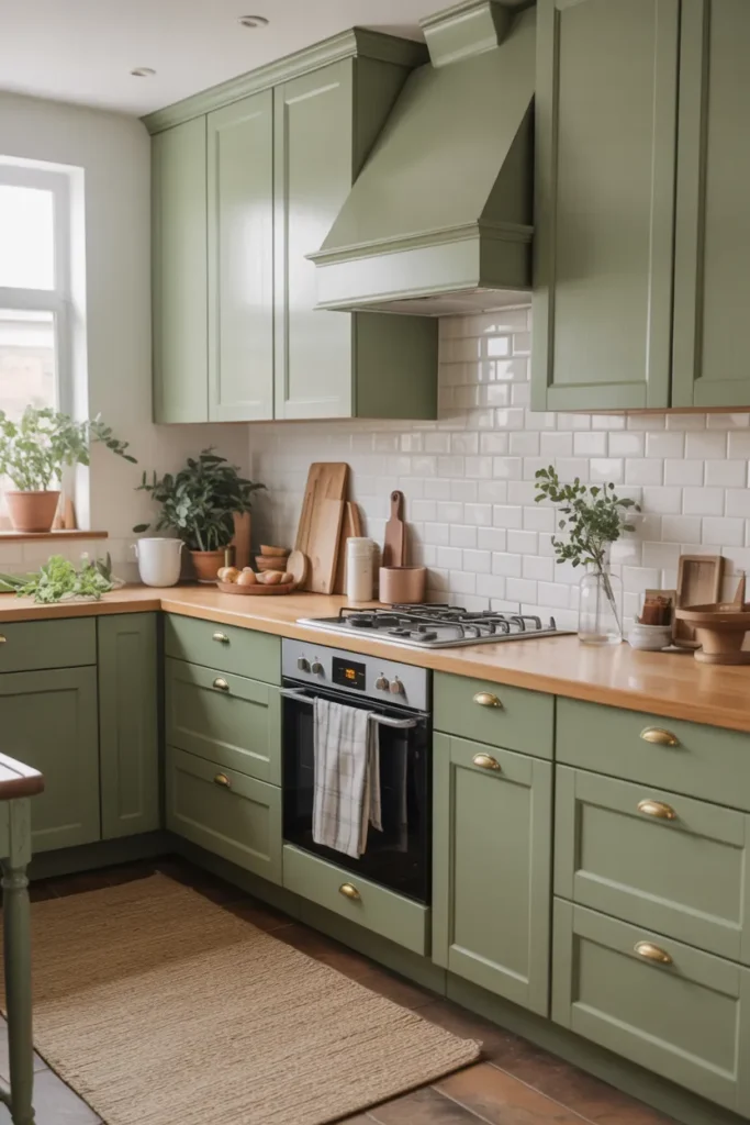
Sage green sits right between gray and green, which is why it works in so many kitchens without feeling like a gamble. It reads as a neutral but has more life than plain gray, bringing a quiet freshness that plain neutrals lack. The color feels calm and natural, like something from a garden, and it pairs beautifully with white countertops and wood accents. Sage suits farmhouse, transitional, and modern kitchens equally well, adapting to each through the details around it. It is trendy right now but classic enough to age gracefully; green kitchens have appeared in design history for centuries. The color also has a psychological calmness that suits the hardest-working room in the house. If you want color without commitment anxiety, sage is the gentlest entry point. It makes a statement so quietly that even color-shy homeowners end up loving it.
Balance the palette: Sage needs light partners to stay fresh and avoid going muddy. White or cream walls, light stone counters, and pale wood floors keep the kitchen bright and let the green breathe. Dark countertops can work too, but they push the room toward moody, so make sure that is the direction you actually want. Brass hardware is the classic pairing with sage, adding warmth that plays beautifully with the green undertones. Brushed nickel works for a cooler, more contemporary feel. Avoid pairing sage with other strong greens, which turns the room muddy and confused; one green, used confidently on the cabinets, is enough. Keep the backsplash simple, handmade-look white tile or pale stone, so the sage remains the star. The overall palette should feel like a garden room: fresh, calm, and natural.
Test the undertone: Sage greens range from gray-dominant to green-dominant, and the undertone changes everything about how the kitchen feels. Gray-leaning sages feel sophisticated and calm, almost like a warm gray with a secret. Green-leaning ones feel fresher and more botanical, bringing the garden indoors. Sample both types on your actual cabinet doors and live with them for a few days before deciding. Check them next to your fixed elements, especially the floor and backsplash, since those cannot change and the undertones must harmonize. Look at the samples in evening light too, because warm bulbs can pull the gray out of sage and leave it looking flat. The right sage should make the whole kitchen feel like it was always meant to be that color, effortless and inevitable.
- Sample both gray-leaning and green-leaning sages before committing.
- Pair sage cabinets with brass hardware and white counters for a classic combination.
- Keep walls light so the sage reads as fresh rather than heavy.
Shop This Look
3. Navy Blue Cabinets for a Bold Statement
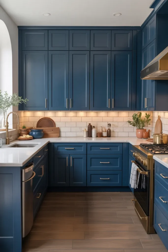
Navy blue cabinets make a kitchen feel confident and tailored, like a well-cut suit. The deep color has the drama of black but with more richness and warmth, avoiding the severity that pure black can bring. Navy works especially well on an island or lower cabinets paired with white uppers, which keeps the room from feeling dark while still delivering the drama. It suits traditional, coastal, and modern kitchens, adapting through hardware and styling. The color photographs beautifully and gives the kitchen a designed, intentional feeling that pale cabinets sometimes lack. Navy has proven staying power; it has been popular for a decade without feeling tired, which suggests it is becoming a classic rather than a trend. For homeowners who want a kitchen with presence, navy delivers more impact per square foot than almost any other color.
Light it well: Dark cabinets absorb light, so your lighting plan matters more here than with pale colors. Under-cabinet lighting is almost essential with navy, because it keeps the counters bright and shows off the backsplash instead of letting it disappear into shadow. Pendant lights over an island add focused task light and look gorgeous against the dark background. Make sure your general room lighting is strong enough that the kitchen does not feel cave-like in the evening; recessed ceiling lights on dimmers give you control. Warm white bulbs, around 3000 Kelvin, keep navy looking rich and deep instead of flat and black. Natural light helps enormously, so keep window treatments minimal. If your kitchen is naturally dark, consider using navy only on the island or lowers, with white uppers to bounce light around.
Choose your pairings: Navy’s best friends are white, brass, and warm wood, and the combination is close to foolproof. White uppers or a white backsplash keep the contrast crisp and the room bright. Brass or gold hardware glows against navy and adds a classic, tailored touch that elevates the whole kitchen. Warm wood floors or open shelves soften the formality and keep the room feeling like a home rather than a showroom. Avoid pairing navy with black countertops unless you want a very moody room; the combination can feel heavy and closed in. A light countertop, marble-look quartz or white granite, is the safer and brighter choice that lets the navy shine. Keep wall colors light and warm to complete the balance.
- Use navy on lowers or the island first if full navy feels like too much.
- Install under-cabinet lighting to keep counters bright against dark doors.
- Pair navy with brass hardware and light countertops for a timeless look.
Shop This Look
4. Warm Beige Cabinets for a Cozy Feel
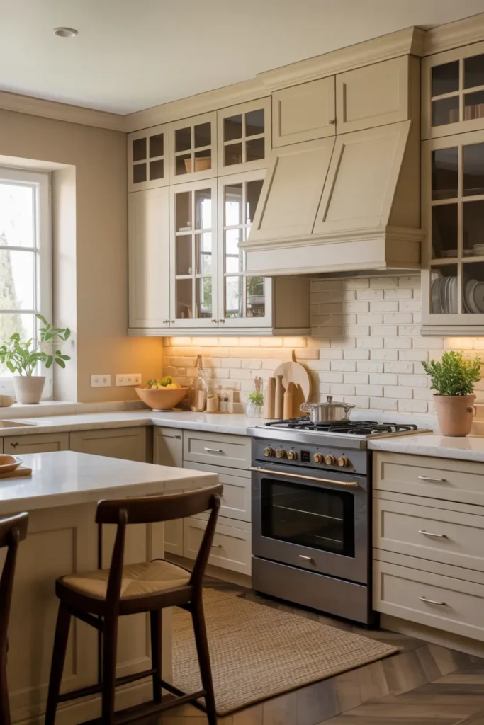
Warm beige cabinets create a kitchen that feels welcoming the moment you walk in, and that immediate comfort is their greatest strength. Beige has moved past its boring reputation; the current warm beiges have depth and subtlety that read as sophisticated, not bland. They work beautifully with wood tones, which makes them natural partners for oak floors and butcher block counters. Beige suits traditional, farmhouse, and transitional kitchens, bringing a relaxed elegance to each. It is also forgiving in daily life, hiding dust and fingerprints better than white or dark colors, which means the kitchen looks cleaner between cleanings. For busy households, that practical advantage matters as much as the aesthetics. Beige is the color of comfort, and a comfortable kitchen gets used and loved more than a precious one.
Add warmth: Beige needs warm companions to reach its full potential and avoid looking flat. Wood open shelves, a butcher block island top, or rattan bar stools all deepen the cozy feeling and add the texture beige needs. Bronze or aged brass hardware adds richness and a handcrafted quality. Keep the lighting warm, around 2700 to 3000 Kelvin, since cool light makes beige look gray and lifeless. A textured backsplash, like handmade-look tile with variation, adds the visual interest that keeps beige from feeling one-dimensional. Layer in soft textiles: a runner rug, linen curtains, or cushions on banquette seating. The goal is a kitchen that feels like a warm hug, layered and inviting, not a beige box that happens to hold appliances.
Mind the undertones: Beige goes wrong when the undertones clash, and this is the single biggest risk with the color. Pink-beige cabinets next to yellow-beige floors create a muddy, uncomfortable feeling that no styling can fix. Sample your beige next to every fixed element in the kitchen and check them together in daylight, not just under store lighting. The safest beiges lean slightly toward greige, with a balance of warm and cool that plays well with others. Avoid beiges with strong pink or yellow casts unless your fixed elements share them. Once the undertone is right, keep the rest of the palette simple and let the warmth carry the room. When beige works, it feels inevitable; when it does not, it feels like a mistake you see every day.
- Sample beige next to your floors and counters to check undertone clashes.
- Pair beige cabinets with wood accents and warm lighting for maximum coziness.
- Choose a satin finish for easy cleaning without a shiny look.
Shop This Look
5. Charcoal Gray Cabinets for Modern Elegance
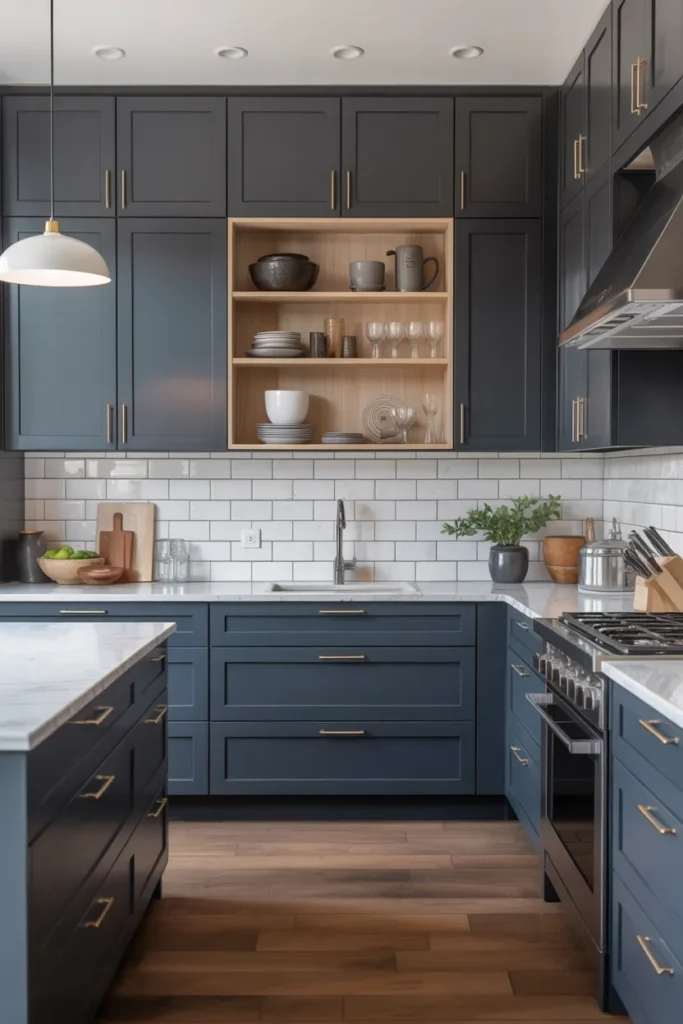
Charcoal gray is the sophisticated middle ground between black and mid-gray, offering drama without severity. It has the depth of dark cabinets with a softness that pure black lacks, making it more livable day to day. Charcoal suits modern and transitional kitchens, and it pairs well with both light and dark countertops, which gives you flexibility. The color hides wear remarkably well, which makes it practical for busy family kitchens where white would show every mark. It reads as elegant rather than trendy, so it ages better than more fashionable dark colors that date quickly. Charcoal is the choice for people who want a dark kitchen but find black too stark and navy too colorful. It is confident without being loud, and that quiet confidence is the essence of elegance.
Keep it elegant: Charcoal’s elegance comes from what surrounds it, so choose the supporting elements carefully. Light countertops, a pale backsplash, and good lighting keep the kitchen feeling refined rather than heavy or closed in. Polished nickel or chrome hardware adds a crisp, tailored note that stands out beautifully against the dark doors. Avoid matte black hardware on charcoal doors, since the tones merge and the detail disappears into the darkness. A white or light gray wall color gives the dark cabinets room to breathe and keeps the room feeling open. Keep the styling minimal and architectural; charcoal already makes a statement, so it does not need help from busy decor. Every added element should earn its place.
Mind the lighting: Dark cabinets need more light than you think, and charcoal is no exception. Plan for layered lighting: bright ceiling lights for cooking tasks, under-cabinet strips for the counters, and pendants for the island. Without enough light, charcoal can make a kitchen feel smaller and gloomier than intended, especially in the evening. Natural light helps enormously, so keep window treatments simple and let daylight in. At night, warm white bulbs keep the gray looking rich and deep rather than flat. Test your lighting before the final paint coat if you can; it is far easier to adjust fixtures than to repaint. Consider white or light uppers with charcoal lowers if your kitchen is small or dark; the combination gives you the drama without sacrificing brightness.
- Use polished nickel or chrome hardware so details stand out against dark doors.
- Plan three layers of light: ceiling, under-cabinet, and pendants.
- Pair charcoal lowers with white uppers to keep the room bright.
Shop This Look
6. Olive Green Cabinets for a Rich Natural Style
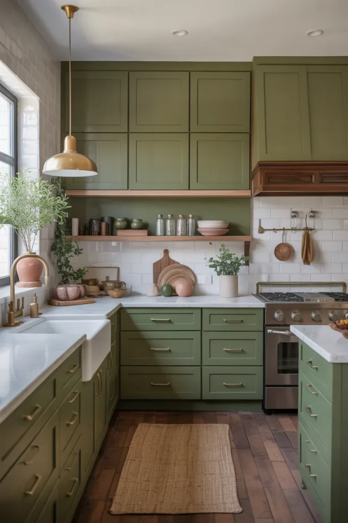
Olive green brings an earthy richness that feels both natural and sophisticated, like the landscape of a Mediterranean hillside. It is deeper and warmer than sage, with yellow undertones that glow in natural light and give the kitchen a sun-warmed feeling. Olive suits kitchens with wood elements, stone counters, and a connection to the outdoors, whether real or aspirational. It works in traditional, Mediterranean, and modern rustic styles, bringing an old-world soul to each. This is a color with real personality, so it rewards confident styling and punishes half measures. Timid olive, used on a single accent cabinet, looks like indecision. Committed olive, covering the kitchen with conviction, looks like one of the most characterful rooms in the house.
Go natural: Olive loves natural materials, and the more you give it, the better it looks. Wood counters, stone backsplashes, and linen curtains all deepen the earthy feeling and build the layered, collected look olive deserves. Leather bar stools or a jute rug continue the theme at floor level. Keep metals warm: brass, bronze, and copper all flatter olive’s golden undertones beautifully. Avoid cool grays and stark whites nearby, which fight the warmth and make the olive look muddy by contrast. The overall effect should feel like a Tuscan farmhouse kitchen updated for today: grounded, warm, full of texture, and deeply inviting. Plants thrive visually against olive; the green-on-green combination is naturally beautiful and costs almost nothing.
Commit fully: Olive is not a color for timid accents; it looks best when it covers all the base cabinets or the full kitchen. Partial olive can look like a mistake or an unfinished idea, while committed olive looks deliberate and confident. If the full commitment scares you, try it on the island first and live with it for a month before deciding. Most people end up loving it enough to go further, because olive grows on you. Balance the richness with light walls and plenty of natural light so the kitchen stays bright. Keep the styling honest and unpretentious: olive does not need luxury details to shine. The result is a kitchen with real character that stands apart from the sea of white and gray, and you will never get tired of it.
- Pair olive cabinets with warm metals like brass and copper.
- Use olive on all lowers or the full kitchen, not as a small accent.
- Keep walls light and let in as much natural light as possible.
Shop This Look
7. Light Gray Cabinets for a Clean Contemporary Look
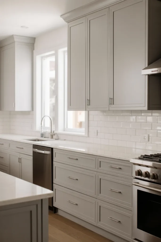
Light gray cabinets are the workhorse of contemporary kitchens, and there is no shame in choosing the reliable option. They are neutral enough to match anything, modern enough to feel current, and light enough to keep small kitchens bright and open. Gray does not show wear as obviously as white, which makes it genuinely practical for real life with kids, pets, and daily cooking. The clean, understated look suits minimalist and transitional styles without demanding attention. It is not the most exciting choice on this list, but it might be the most livable, and livability is what you experience every day. Gray is also the easiest color to coordinate: every countertop, every floor, and every hardware finish works with it. If decision fatigue is real for you, light gray removes a dozen small choices from the process.
Keep it contemporary: Light gray reads as contemporary when the details are right, so keep them clean and simple. Flat-panel or simple shaker doors, minimal hardware, and clean lines keep it modern and prevent it from drifting traditional. Stainless steel appliances blend naturally with gray, creating a cohesive, professional feeling. A white or very light backsplash continues the fresh feeling and keeps the room bright. Avoid ornate hardware or fussy details, which push gray toward traditional and fight its modern character. Keep the walls a soft white or very light gray for a tone-on-tone calm. The beauty of light gray is its quietness, so let the architecture and the light do the talking rather than adding decorative noise.
Watch the undertones: Gray undertones make or break this color, and they are easy to get wrong. Blue-gray feels crisp and modern, perfect for contemporary kitchens. Green-gray feels natural and calm, working well with wood and plants. Violet-gray can look muddy under warm light and is the riskiest choice. Sample your gray next to your countertop and floor, and check it morning and night, because undertones reveal themselves in changing light. The undertone should harmonize with your fixed elements, not fight them; a blue-gray next to warm beige floors creates subtle but constant tension. Once you find the right gray, keep the rest of the palette simple. Gray is a team player, so give it good teammates and it will make the whole kitchen look better.
- Choose blue-gray for crisp modern or green-gray for a softer natural feel.
- Pair light gray cabinets with stainless appliances and simple hardware.
- Keep backsplashes light to maintain the bright, clean feeling.
Shop This Look
8. Cream Cabinets for Warm Elegance
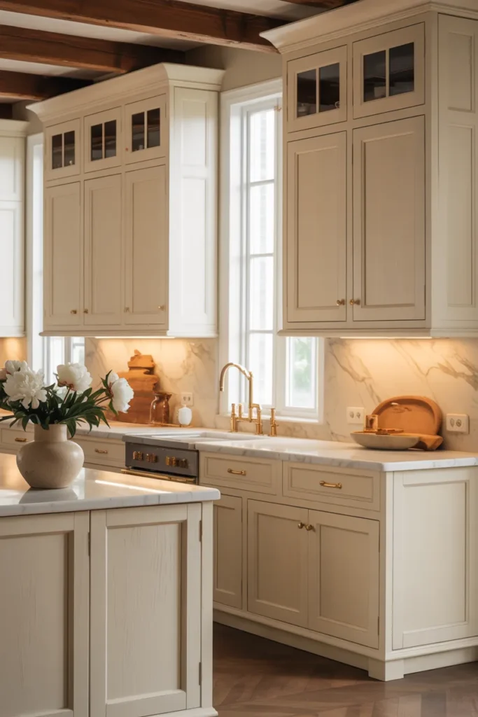
Cream cabinets offer the brightness of white with a warmth that white cannot match, and that warmth changes how the kitchen feels. The soft yellow undertone makes kitchens feel sunny and welcoming, even on gray days when the light is flat. Cream suits traditional, cottage, and French country styles beautifully, bringing a relaxed elegance to each. It pairs naturally with wood tones, which makes it easy to coordinate with existing floors without stress. This is an elegant, timeless choice that feels personal rather than generic, like a kitchen with a history. Cream has been used in kitchens for centuries, which means it will never look dated the way trendy colors do. If you want a kitchen that feels like it has always been loved, cream is the color.
Add warmth: Cream’s warmth is its strength, so lean into it rather than fighting it with cool elements. Wood counters, warm metal hardware, and cozy textiles all deepen the inviting feeling and build the layered look cream deserves. Avoid cool gray walls or stark white ceilings nearby, which make cream look dingy by comparison; the contrast is unflattering. Warm white walls and soft natural light are cream’s best friends, creating a cohesive glow. A patterned backsplash in warm tones adds interest and craftsmanship without breaking the calm. Keep the lighting warm, around 2700 to 3000 Kelvin, to enhance the sunny feeling. The kitchen should feel like late afternoon sun streaming in, even at breakfast on a cloudy morning.
Keep it fresh: The risk with cream is looking dated, so keep the details current and the styling fresh. Simple shaker or flat-panel doors, updated hardware, and a clean backsplash keep cream feeling like a choice rather than a leftover. Avoid heavy glazes, ornate moldings, and fussy details, which push cream toward old-fashioned and grandmotherly. Good lighting matters enormously: cream needs enough light to glow rather than look flat and dull. Under-cabinet lighting keeps the counters bright and shows off the warm tones. With modern details, quality paint, and plenty of light, cream cabinets feel timeless in the best way: warm, welcoming, and quietly elegant for decades.
- Pair cream cabinets with warm white walls, not stark white, to avoid a dingy contrast.
- Choose simple door styles and modern hardware to keep cream feeling current.
- Add a patterned backsplash in warm tones for interest.
Shop This Look
9. Matte Black Cabinets for a Bold Modern Edge
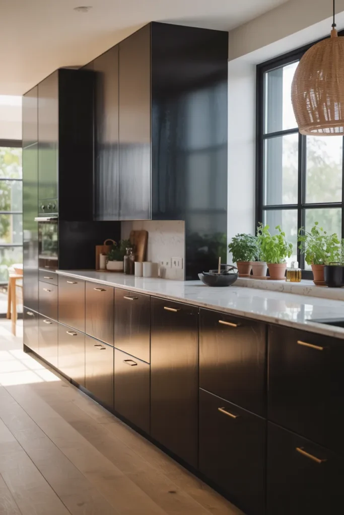
Matte black cabinets are the boldest choice on this list, and they reward confidence like no other color. The flat, non-reflective finish looks modern and architectural, almost like the kitchen was carved from a single block of material. Black makes other elements pop dramatically: brass hardware glows, wood counters warm up, and white backsplashes snap into focus with graphic punch. This is a statement kitchen, not a background kitchen, and it announces itself the moment you walk in. It suits modern, industrial, and minimalist styles that embrace drama. Matte black is also surprisingly practical in one way: it hides the shadows and unevenness that glossy dark finishes reveal. But it demands commitment in styling and maintenance alike; this is not a color for the hesitant.
Soften the drama: Black needs softening to stay livable day after day, or the drama becomes exhausting. Wood open shelves, a warm wood island top, or textured bar stools keep the kitchen from feeling severe and add the organic warmth black craves. Plenty of light is non-negotiable; plan for strong ceiling lights, under-cabinet strips, and pendants, because dark kitchens without enough light feel oppressive. A white or light backsplash gives the eye relief and keeps the room feeling open. Keep the styling minimal and architectural; the black is already dramatic, so everything else should be calm and quiet. One or two warm materials, wood and brass, are enough to humanize the scheme. The goal is a kitchen that feels bold but still like home.
Mind the finish: Matte black shows dust, fingerprints, and water spots more than any other finish, so go in with realistic expectations. Choose a high-quality matte cabinet paint with a scrubbable formula, and accept that the doors near the stove and sink need regular wiping; this is the price of the drama. A microfiber cloth and gentle cleaner handle daily upkeep in seconds. Avoid touching up with a different sheen, since the patch will show as a shiny spot against the matte. Keep a small bottle of the original paint for touch-ups, applied with a fine brush. With realistic expectations and good paint, matte black stays striking instead of becoming a maintenance burden you resent. Many owners find the quick daily wipe becomes a habit they barely notice.
- Choose scrubbable matte cabinet paint and wipe high-touch doors weekly.
- Soften black with wood accents and warm lighting.
- Use brass or gold hardware for contrast that glows against black.
Shop This Look
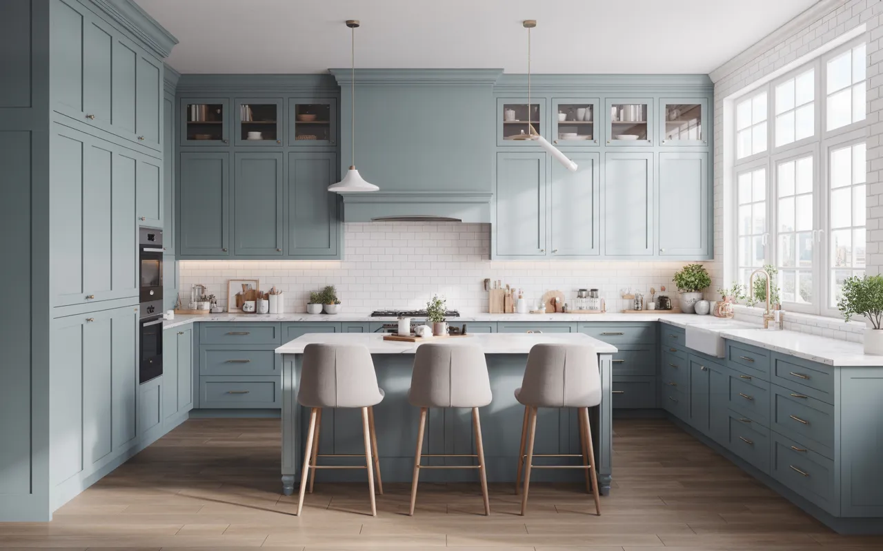
10. Dusty Blue Cabinets for a Soft Trendy Look
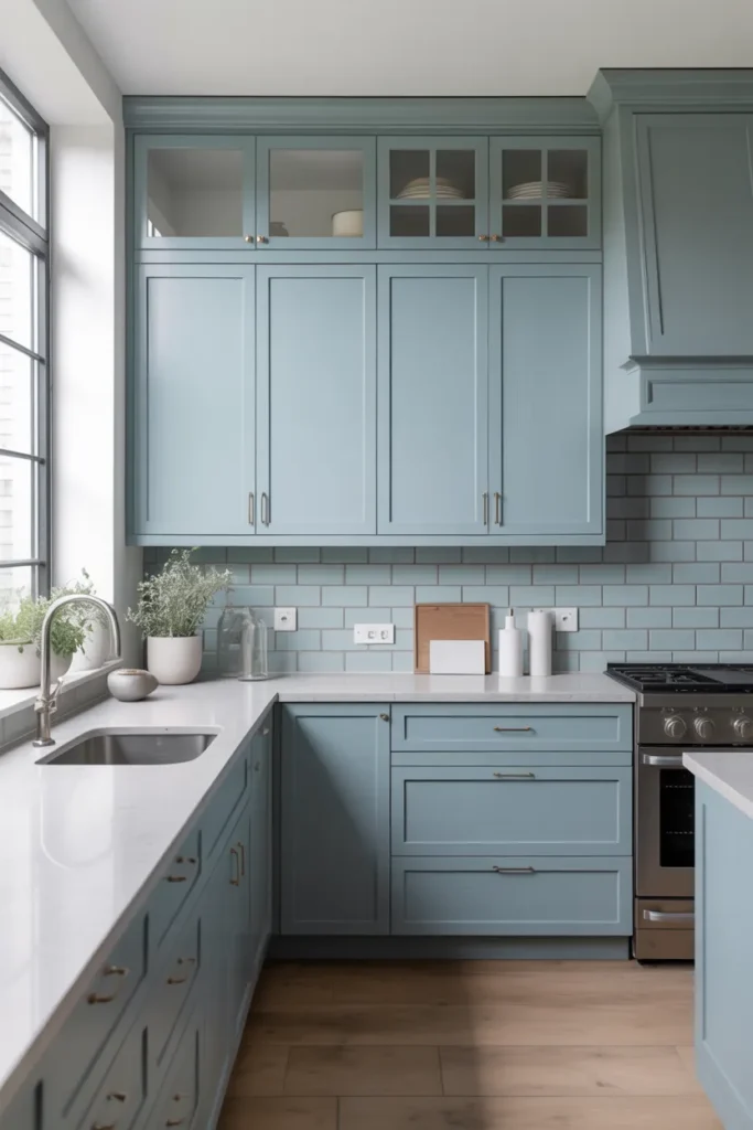
Dusty blue is blue with the saturation turned down and a little gray mixed in, and that restraint is its charm. The result is soft, calming, and surprisingly versatile, bringing color into the kitchen without shouting about it. It is a good choice for people who want more than neutrals but less than navy’s full drama. Dusty blue suits coastal, farmhouse, and transitional kitchens, bringing a breezy calm to each. It feels current without being tied to a single trend cycle, which means it will age better than more fashionable blues. The color has a gentle, lived-in quality that makes kitchens feel relaxed and welcoming. If navy is a tailored suit, dusty blue is a favorite soft sweater: comfortable, pretty, and easy to live with.
Keep it soft: Dusty blue’s softness is the point, so protect it with equally gentle companions. Pair with white counters, light wood floors, and plenty of natural light to keep the feeling fresh and airy. Chrome or brushed nickel hardware keeps the look crisp and coastal. Avoid dark, heavy elements that overwhelm the delicate color; black counters or dark floors will crush it. A white backsplash, maybe handmade-look tile for subtle texture, completes the gentle palette. Keep wall colors light and warm to support the softness. The kitchen should feel like a sea breeze coming through an open window: light, fresh, and calming. Every element should whisper, because dusty blue cannot compete with loud neighbors.
Test in your light: Dusty blue shifts with light more than most colors, so sampling is essential. In bright daylight it reads as a clear, soft blue; under warm lamplight it can go gray or even slightly green, which surprises many homeowners. Sample it on your actual cabinet doors and check at multiple times of day, including the evening when warm bulbs dominate. Make sure you love it in evening light too, since that is when you will see it most during winter months. If it goes too gray at night, choose a version with slightly more blue saturation. North-facing kitchens enhance the blue beautifully. The right dusty blue looks calm and pretty in every light, which is exactly what you want from a color you will see daily.
- Sample dusty blue in both daylight and evening lamplight before deciding.
- Pair with white counters and chrome hardware for a fresh coastal feel.
- Keep the rest of the palette light so the soft blue stays the star.
Shop This Look
11. Taupe Kitchen Cabinets for a Balanced Neutral Style
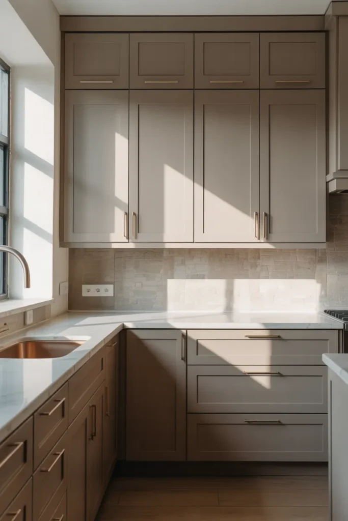
Taupe is the diplomat of neutrals, sitting exactly between gray and beige and keeping the peace. It brings warmth without yellowness and coolness without coldness, which makes it remarkably easy to live with through changing light and seasons. Taupe cabinets work with both warm and cool palettes, so they coordinate with almost any countertop, floor, or hardware you already have. The color feels calm and sophisticated without trying hard. It is an excellent choice when you cannot decide between gray and beige, because it gives you the best of both without the weaknesses of either. Taupe is also the easiest neutral for mixing metals, since it harmonizes brass and nickel equally. If you want one color that simply works with everything, taupe is hard to beat.
Find your balance: Taupe’s balance is its superpower, so do not tip it with strongly warm or cool companions. Pair with elements from both sides: warm wood and cool stone, brass and nickel, cream and gray. The color harmonizes mixed metals beautifully, so this is the kitchen where you can confidently use brass faucets with nickel hardware. Keep the overall palette restrained; taupe looks best when it is the quiet foundation, not when it competes with strong colors for attention. Let the balance do the work rather than adding bold accents. A simple backsplash, quiet counters, and unfussy hardware complete the calm. The result is a kitchen that feels effortlessly coordinated, as if every choice was obvious.
Mind the light: Taupe changes with light, sometimes reading warm, sometimes cool, and this chameleon quality is usually a feature rather than a bug. It means the color adapts through the day, feeling cozy in lamplight and fresh in daylight. But check it in your specific kitchen before committing, because the shift can surprise. In dark kitchens, choose a lighter taupe so the room does not feel muddy or closed in. In bright kitchens, a deeper taupe adds welcome richness and depth. Sample large areas, not just chips, because taupe needs scale to show its true character; small samples lie. Live with the sample for several days and notice whether the shifting delights or bothers you.
- Use taupe when you want to mix warm and cool elements in one kitchen.
- Sample large swatches, since taupe needs scale to reveal its character.
- Choose lighter taupe for dark kitchens and deeper taupe for bright ones.
Shop This Look
12. Forest Green Kitchen Cabinets for a Luxurious Look
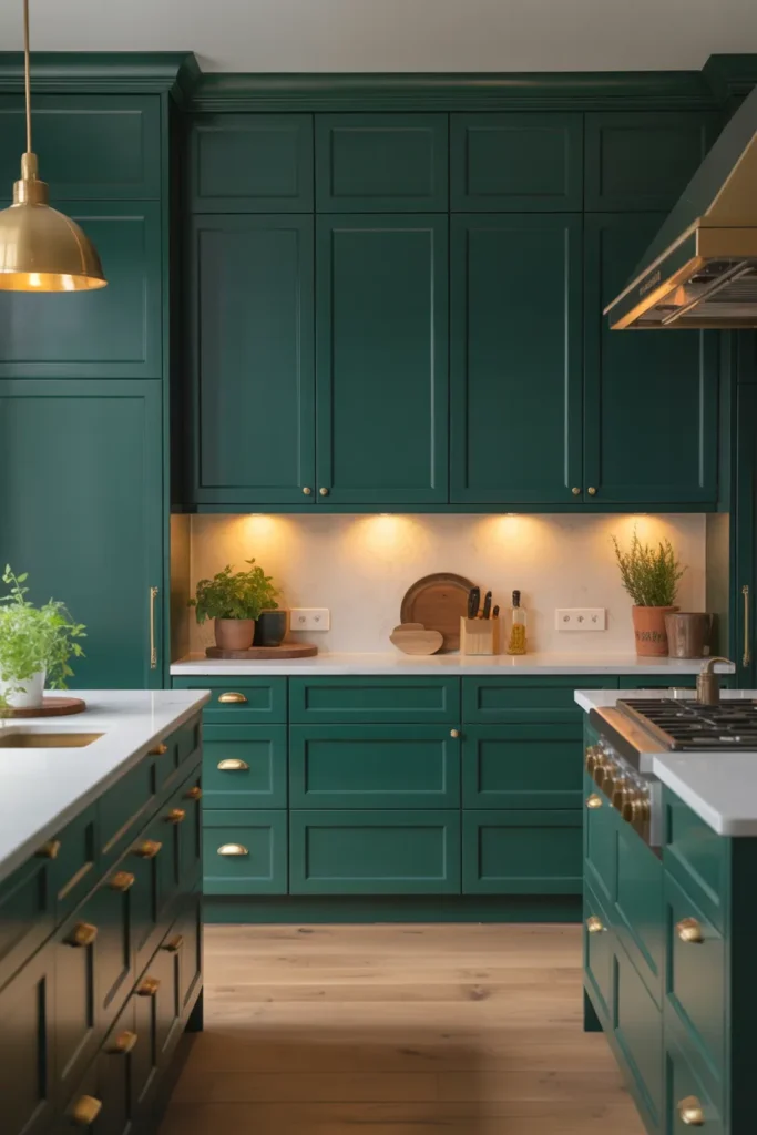
Forest green cabinets bring the richness of a private library into the kitchen, and the effect is immediately luxurious. The deep, saturated color feels grounded and confident, especially paired with brass and marble. Forest green has become a modern classic, appearing in high-end kitchens everywhere, but it still feels special rather than common because few homeowners are brave enough to choose it. It suits traditional, transitional, and modern kitchens with confident styling that matches its boldness. This is a color that makes a kitchen feel expensive regardless of the actual budget, because deep green reads as a deliberate, designer choice. The color also connects the kitchen to nature in a sophisticated way, like a garden viewed through tall windows. If you want a kitchen with presence and personality, forest green delivers.
Add luxury: Luxury details make forest green sing, so do not skimp on the supporting elements. Brass or gold hardware is almost mandatory; the warm metal against deep green is a timeless combination that never fails. Marble or marble-look counters add veining and light, breaking up the depth beautifully. A patterned backsplash in complementary tones brings craftsmanship and visual interest. Keep the walls light and the lighting warm so the green glows rather than broods in shadow. Every element should feel considered, because forest green punishes sloppy styling more than pale colors do. The hardware, the faucet, even the small details should feel intentional. This is a color that rewards those who commit fully to the vision.
Balance the depth: Deep green absorbs a lot of light, so balance it deliberately or the kitchen will feel heavy. White or cream uppers keep the room bright if full green feels like too much; the combination is classic and safe. Glass-front uppers break up the mass, show off beautiful dishes, and add sparkle. Plenty of natural light helps enormously, so keep windows uncovered and treatments minimal. At night, warm layered lighting, under-cabinet strips plus pendants plus ceiling lights, keeps the green rich and glowing. Avoid cool bulbs, which make deep green look flat and lifeless. The goal is a kitchen that feels like a jewel box: deep, glowing, and full of considered details that reveal themselves slowly.
- Pair forest green with brass hardware and marble counters for a luxurious combination.
- Use glass-front or white uppers to balance the depth of green lowers.
- Layer warm lighting so the green glows in the evening.
Shop This Look
13. Greige Kitchen Cabinets for a Soft Modern Feel
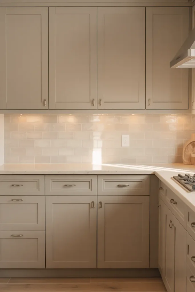
Greige, the blend of gray and beige, has earned its popularity honestly through sheer versatility. It is warmer than gray and cooler than beige, which makes it the most adaptable neutral in current kitchen design. Greige cabinets feel soft and modern without the coldness that gray can bring or the blandness beige risks. They work with wood, stone, white, and black, which covers nearly every kitchen element you might already have. If you want one color that goes with everything and offends nothing, this is it. Greige is also remarkably forgiving of changing tastes; as your style evolves, the cabinets keep working. It is the closest thing to a universal neutral that kitchen design has produced, and its staying power suggests it is becoming a classic rather than a passing trend.
Keep it soft: Greige’s softness is its charm, so avoid harsh contrasts nearby that would shatter the calm. Soft white walls, light wood floors, and gentle textures keep the feeling serene and cohesive. Matte black hardware adds definition without harshness, giving the soft color the structure it needs. Avoid brilliant white counters right next to greige doors, since the stark contrast can make the greige look dirty by comparison; a warm white or light stone works far better. Keep the backsplash quiet and the lighting warm. The palette should feel like a deep breath: quiet, easy, and comfortable. Greige does not need bold accents to succeed; it needs calm companions that let its subtlety shine.
Pick your mix: Greiges range from warm-leaning to cool-leaning, so choose based on your fixed elements rather than preference alone. Warm greige suits wood floors, cream tiles, and brass hardware. Cool greige suits gray stone, concrete, and nickel. Sample next to your countertop, because that large surface has the most influence on how the cabinet color reads. Check the combination in different lights, since greige shifts like all complex neutrals. Once you find the right greige, it becomes the easiest color you have ever decorated around; everything seems to match, which is the whole point. Keep the paint formula recorded, because greige is notoriously hard to match by eye later.
- Choose warm greige for wood floors and cool greige for gray stone.
- Avoid brilliant white counters next to greige; warm white works better.
- Pair with matte black hardware for soft modern definition.
Shop This Look
14. Terracotta Kitchen Cabinets for Warm Earthy Charm
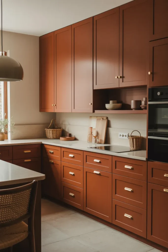
Terracotta cabinets bring sun-baked warmth that few colors can match, and they do it with soul. The earthy orange-red feels handmade and full of character, like a Mediterranean villa kitchen that has been loved for generations. Terracotta is bold but not loud; it glows rather than shouts, warming the whole room with its presence. It suits rustic, Mediterranean, and eclectic kitchens, and it pairs beautifully with natural materials that share its earthiness. This is a color for people who want their kitchen to feel alive and personal rather than perfect. Terracotta has a timeless quality despite being trendy right now; earthen colors have been used in kitchens for millennia. Choosing it connects your kitchen to a very old and human tradition of building with the earth.
Embrace the earth: Terracotta loves company from the earth, so surround it with natural companions. Clay tiles, wood beams, stone counters, and woven textures all deepen the Mediterranean feeling and build the layered look terracotta deserves. Keep the palette in the warm family: creams, warm woods, aged metals, and let terracotta be the undisputed star. Plants thrive visually against terracotta; the green and orange combination is naturally beautiful and costs almost nothing to achieve. Avoid cool grays and stark whites, which fight the warmth and make the terracotta look garish by contrast. The kitchen should feel like it grew from the ground organically, not like it was assembled from a catalog. Every element should feel sun-warmed and handmade.
Use it wisely: Terracotta is strong, so placement matters more than with quieter colors. Full terracotta kitchens look amazing in the right home with enough light and the right architecture, but most people do better with terracotta lowers and warm white uppers, which gives the color room to breathe. An island in terracotta with neutral perimeter cabinets is another safe and beautiful entry point. Keep the lighting warm to enhance the natural glow; cool light flattens terracotta and kills its magic. Balance the warmth with enough light surfaces that the kitchen stays bright and open. Used wisely, terracotta gives you the most characterful kitchen on the block, and guests will remember it long after they forget every white kitchen they have seen.
- Try terracotta on the island or lowers first before committing to a full kitchen.
- Pair with clay tiles, wood, and plants for an earthy Mediterranean feel.
- Keep lighting warm to enhance terracotta’s natural glow.
Shop This Look
15. Soft Blue-Gray Kitchen Cabinets for Subtle Elegance
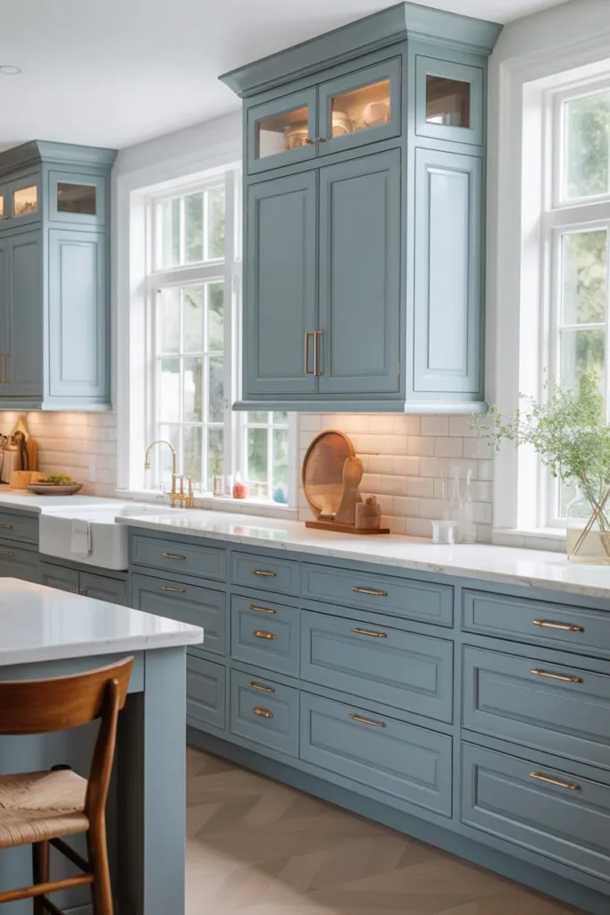
Soft blue-gray is elegance without effort, a color that looks refined without trying. The color is muted enough to read as a neutral but has enough blue to feel special and intentional. It brings a calm, coastal refinement that works beautifully in traditional and transitional kitchens. Blue-gray pairs wonderfully with white, which keeps it fresh and bright, and with brass, which warms it up and adds a classic touch. This is a color for people who want subtlety with a point of view, something more interesting than plain gray but just as easy to live with. It has a quiet confidence that does not need to announce itself. In a world of loud kitchen trends, soft blue-gray is a calm, assured whisper.
Keep it subtle: Subtlety is the whole game here, so avoid strong contrasts that would overwhelm the delicate color. Soft white counters, light backsplashes, and gentle lighting keep the mood refined and serene. Brushed nickel or polished chrome hardware continues the cool elegance without adding visual weight. Avoid dark, heavy elements that crush the delicate color; black counters or dark floors will dominate it completely. Keep wall colors light and the overall palette hushed. The kitchen should feel like a quiet morning by the water: calm, light, and quietly beautiful. Every element should be chosen for restraint. When everything whispers, the room achieves a serenity that bold kitchens cannot match.
Mind the gray: The gray in blue-gray can take over under warm light, turning the color muddy and disappointing. Sample in your evening lighting, not just daylight, because warm bulbs shift the balance toward gray. If it goes too gray at night, choose a version with slightly more blue saturation to compensate. North-facing kitchens enhance the blue naturally, which is usually flattering and fresh. South-facing kitchens warm it up, which can be pretty too, softening the color. The right blue-gray holds its character in every light, staying elegant from morning coffee to evening cleanup. It is worth sampling several versions to find the one that stays true in your specific conditions.
- Sample in evening lamplight, since warm bulbs can turn blue-gray muddy.
- Pair with white counters and brushed nickel for cool elegance.
- Add brass accents if you want to warm up the palette.
Shop This Look
16. Warm Wood-Tone Kitchen Cabinets for Natural Beauty
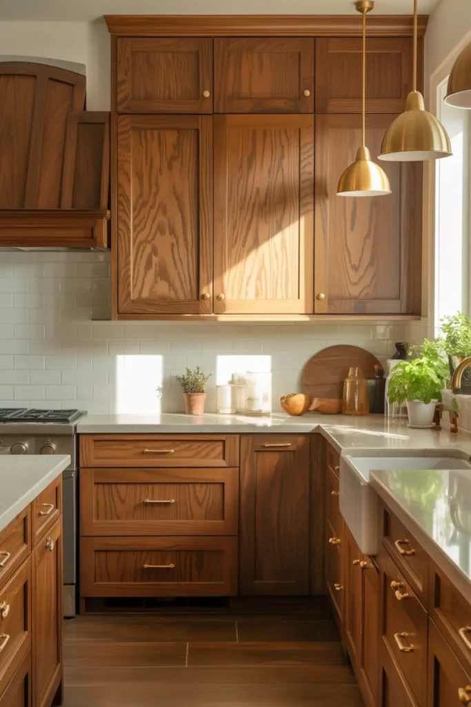
Wood-tone cabinets are having a well-deserved comeback after years of painted everything. Natural wood brings warmth, texture, and character that painted cabinets cannot match, no matter how good the paint. Modern wood kitchens favor clean lines and simple grain; white oak and walnut are the current favorites for good reason. Wood suits Scandinavian, modern, and transitional styles, bringing organic warmth to each. It also ages gracefully, developing patina and character instead of just wearing out like paint does. This is the choice for people who love natural materials and want a kitchen that feels alive. Wood connects the kitchen to nature in a way no paint color can, and that connection matters in the room where you start every day.
Celebrate the grain: Wood’s beauty is in its grain, so choose finishes that show it off rather than hiding it. Clear matte or satin finishes protect the wood while keeping it looking natural and touchable. Avoid heavy stains that obscure the grain; the point is to see the natural variation that makes each door unique. Rift-sawn white oak gives a calm, straight grain that suits modern rooms. Walnut offers rich drama with its deep tones and flowing figure. Keep the door style simple, flat panel or simple shaker, so the wood is the undisputed star. A little variation between doors is natural and desirable, not a flaw to be corrected. That variation is the proof of real wood and the source of its beauty.
Balance with light: Wood kitchens need light surfaces for balance, or they can feel heavy and dark. Light stone counters, a pale backsplash, and white walls keep the room bright and let the wood glow. Too much wood, cabinets plus floors plus ceiling in similar tones, can feel like a sauna, so vary the tones deliberately. If your floors are wood, choose a different tone for the cabinets; contrast is more interesting than matching. Black or bronze hardware adds definition against wood grain and gives the eye clean lines to follow. The result should feel like a modern cabin: warm, natural, full of light, and deeply comfortable. Seal the wood properly, since kitchens are humid and steamy, and the finish is what protects your investment.
- Choose clear matte finishes that show off the natural grain.
- Vary wood tones between cabinets and floors to avoid a sauna effect.
- Pair wood cabinets with light counters and simple black hardware.
Shop This Look
17. Soft Pastel Pink Kitchen Cabinets for a Trendy Touch
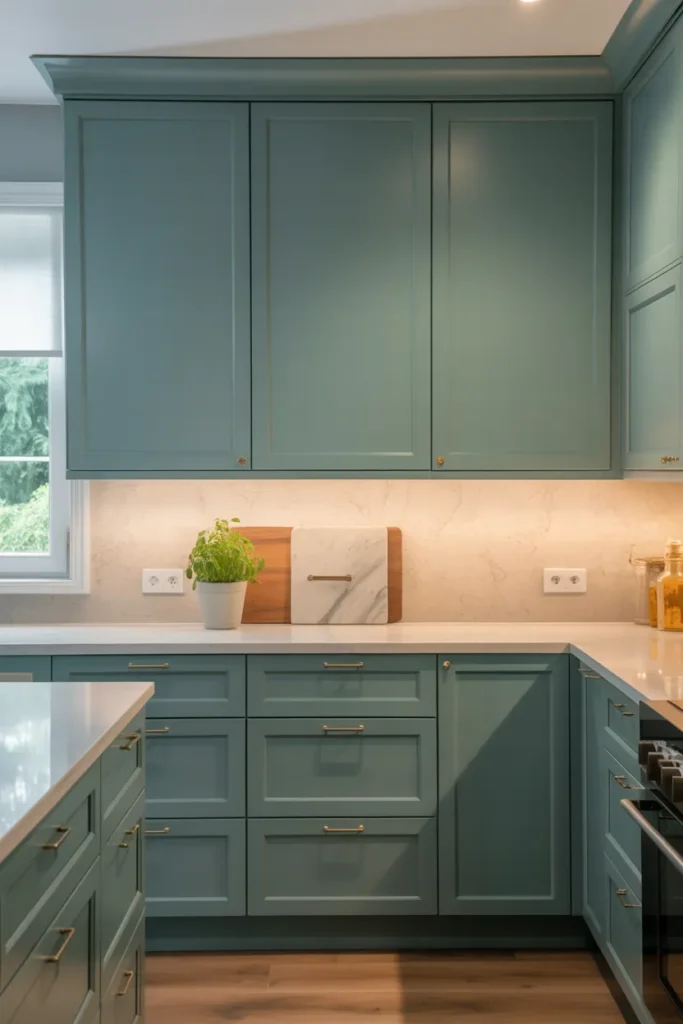
Pastel pink cabinets are playful, unexpected, and surprisingly livable once you see them in person. The soft blush tone reads as a warm neutral in the kitchen, especially paired with white and wood that ground it. Pink suits eclectic, retro, and modern feminine styles, bringing a sense of joy to each. It is definitely trendy, so it works best for people who enjoy color and do not mind a kitchen with real personality. Used well, it feels charming and confident rather than childish. Blush pink has a warmth that flatters both people and food, making the kitchen feel happy at any hour. It is a brave choice that pays off with a kitchen nobody forgets, and in a sea of white and gray, being memorable is no small thing.
Keep it grown-up: The difference between charming and childish is entirely in the details, so style pink with sophistication. Pair blush cabinets with marble counters, brass hardware, and clean modern lines that signal intentionality. Avoid pairing pink with other pastels, which pushes the room toward a candy shop and undermines the grown-up feeling. White uppers keep it fresh and bright, and wood floors ground the color in warmth. The pink should feel like a confident design choice, not a theme or a joke. One strong color, styled seriously with quality materials, always looks intentional. Keep the styling minimal and let the color be the personality; it does not need cute accessories to work.
Know your commitment: Pink is a commitment, so be honest with yourself about your staying power before you begin. If you love it deeply, go for the full kitchen; timid pink on a single cabinet looks accidental and unresolved. If you are unsure, try it on the island or a pantry wall first and live with it for a few months. Renters can get the effect with peel-and-stick panels on a small section, fully reversible. Keep the rest of the kitchen neutral so the pink has room to shine without competition. A pink kitchen is a happy kitchen, as long as you chose it on purpose and styled it with conviction. And if your taste changes in five years, repainting is always an option.
- Pair blush cabinets with marble, brass, and clean lines to keep it sophisticated.
- Try pink on the island first if a full kitchen feels like too much.
- Keep surrounding elements neutral so the pink stays the focus.
Shop This Look
18. Deep Teal Kitchen Cabinets for Bold Sophistication
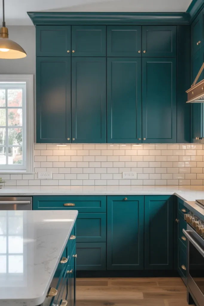
Deep teal sits between blue and green, and it brings the best of both: the calm of blue and the life of green. The saturated color feels bold and sophisticated, like a jewel-box kitchen designed without compromise. Teal suits modern, eclectic, and transitional styles, bringing drama and depth to each. It pairs beautifully with brass, marble, and warm wood, which all glow against the deep background. This is a color for people who want drama with depth rather than mere brightness. Teal has an exotic, collected feeling, like something from a well-traveled home. It is bold without being aggressive, rich without being heavy. In the right kitchen, it is unforgettable.
Go bold: Teal rewards boldness, so commit fully rather than hedging. Full teal lowers with light uppers, or a full teal kitchen in a well-lit room, both look stunning and intentional. Half measures, a single teal accent cabinet or a timid island, look indecisive and undermine the color’s power. Support the drama with equally confident choices: veined marble with real movement, statement lighting with presence, and rich hardware in brass or gold. Keep the walls simple so the teal has the stage to itself; competing wall colors dilute the impact. A bold color styled boldly always looks better than a bold color apologizing for itself. Trust the teal and give it the supporting cast it deserves.
Light it right: Deep colors need strong light to show their true character, and teal is no exception. Plan for bright, layered lighting so the teal glows instead of going murky and flat. Under-cabinet lights keep the counters usable and show off the backsplash against the dark background. Warm white bulbs bring out teal’s richness and depth; cool bulbs can make it look flat and lifeless. Natural light is teal’s best friend, so keep windows uncovered and treatments minimal. At night, the lit teal kitchen feels like the most glamorous room in the house, glowing with saturated color. Test your lighting plan before finalizing, because the difference between glowing teal and muddy teal is entirely in the light.
- Commit to teal on all lowers or the full kitchen, not as a small accent.
- Pair with brass, marble, and warm wood for a rich combination.
- Layer bright warm lighting so the deep color glows.
Shop This Look
19. Classic White Kitchen Cabinets with Warm Accents
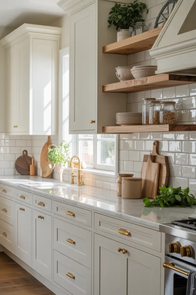
Classic white cabinets never really leave, and warm accents are what keep them feeling current instead of stark. The formula is simple and proven: white shaker cabinets as the bright foundation, then warmth through wood, brass, and textured textiles. The white keeps everything bright and timeless, while the warm elements stop it feeling sterile or cold. This is the most broadly appealing kitchen on the list, and it suits nearly every home style from farmhouse to modern. It is also the safest choice for resale, since buyers consistently love bright white kitchens. The warm accents are what make it yours rather than generic; without them, white kitchens can feel like showrooms. With them, the kitchen feels like home.
Warm it up: Warmth comes from materials, not just color, so layer them generously. A wood island top or open shelves, brass hardware and faucet, and a runner rug in warm tones transform white cabinets from plain to inviting. Warm white paint on the walls, not stark white, keeps the palette cohesive and flattering; the slight creaminess makes everything glow. Natural light does a lot of the work, so keep windows clear and treatments minimal. Add texture through linens, woven stools, and handmade-look tile to keep the white from feeling flat. The kitchen should feel like a sunny morning: bright, warm, and easy to be in. Every warm element should feel collected over time rather than installed all at once.
Keep it classic: Classic means avoiding trendy details that will date the kitchen within a few years. Shaker doors, simple hardware, subway or handmade-look tile, and stone counters are all safe long-term choices with decades of history. Skip the ultra-trendy finishes and let the warm accents provide the personality; they are easier to change than cabinets. This kitchen will still look good in fifteen years, which is the real definition of classic and the true test of any design. Spend your budget on quality materials rather than fashionable details, because materials age gracefully while trends do not. A classic white kitchen with warm accents is never the most exciting choice, but it is the one you will still love when trends have moved on.
- Warm up white cabinets with wood, brass, and warm textiles.
- Use warm white wall paint to keep the palette cohesive.
- Choose timeless details like shaker doors and subway tile.
Shop This Look
20. Mushroom Gray Kitchen Cabinets for Soft Neutral Style
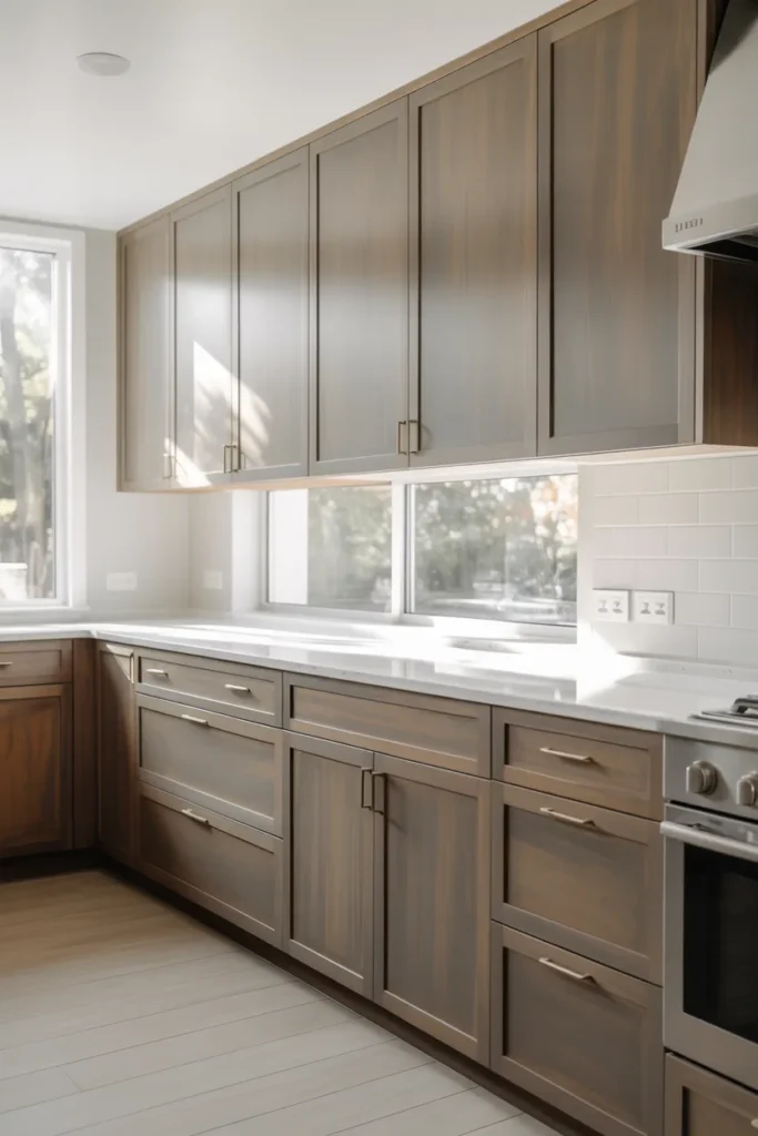
Mushroom gray is gray with a warm, earthy soul, and that warmth makes all the difference. The subtle brown undertone keeps it from feeling cold or stark, which makes it one of the most livable neutrals you can choose. Mushroom suits transitional and modern kitchens, bringing a quiet richness to each. It pairs beautifully with both warm and cool elements, adapting gracefully. It is understated but never boring, with a depth that reveals itself slowly over time rather than shouting on day one. This is a sophisticated neutral for people who find plain gray too cold and beige too bland. Mushroom occupies the perfect middle ground, and once you see it in person, the appeal is immediate and lasting.
Stay neutral: Mushroom’s neutrality is its strength, so keep the supporting cast calm and let it lead quietly. Soft whites, light woods, and gentle textures let the color’s warmth come through without competition. Avoid strong contrasts that overwhelm its subtlety; bold colors will bully mushroom into looking muddy. Brushed nickel or soft brass hardware both work beautifully, adding quiet refinement. Keep the backsplash simple and the lighting warm to support the earthy feeling. The palette should feel like a calm, overcast morning: soft, quiet, and deeply comfortable. Mushroom does not shout, so do not make it compete with things that do. Restraint is the entire strategy, and it works.
Mind the undertone: Mushroom’s brown undertone is what makes it special, but it needs checking against your fixed elements before you commit. Next to very cool gray floors it can look muddy and confused; next to warm wood it glows with quiet richness. Sample it large and live with it for several days, watching how the undertone behaves in different lights. In bright light it reads as a warm, sophisticated gray; in dim light it deepens toward taupe and feels cozier. Choose the depth based on your kitchen’s natural light: lighter mushroom for dark rooms that need all the help they can get, deeper mushroom for bright rooms that can handle the richness. The right mushroom feels inevitable once it is up.
- Sample mushroom next to your floors to check the undertone harmony.
- Keep the palette calm and avoid strong contrasts.
- Choose lighter mushroom for dark kitchens and deeper for bright ones.
Shop This Look
21. Soft Lavender Kitchen Cabinets for a Modern Elegant Look
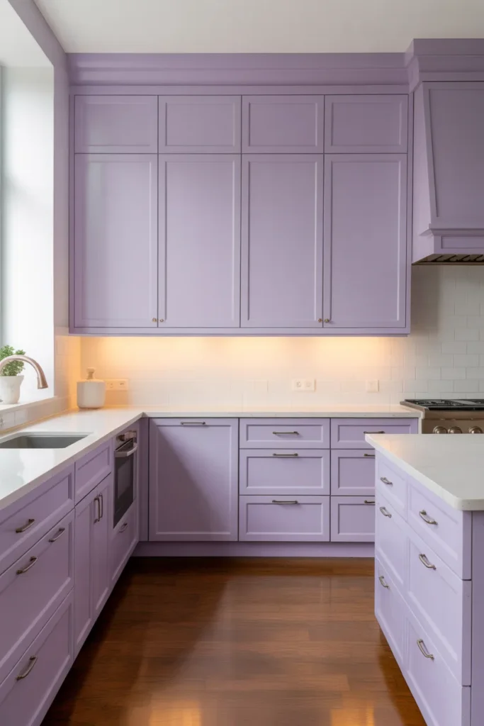
Soft lavender cabinets are unexpected in the best way, bringing a hint of romance to the hardest-working room in the house. The pale purple-gray reads as a sophisticated neutral with a whisper of color, never shouting but always noticed. Lavender suits modern eclectic and transitional kitchens, and it pairs beautifully with white, gray, and silver tones that keep it crisp. It is definitely a statement, but a quiet one, like a signature scent rather than a loud perfume. This is a color for people who want their kitchen to feel personal and a little bit magical. Lavender kitchens are rare, which means yours will be genuinely unique. It takes confidence to choose, but the result is a room with real personality.
Keep it elegant: Lavender’s elegance depends entirely on restraint, so style it with discipline. Pair with white counters, light backsplashes, and polished nickel or chrome hardware that keeps the feeling crisp and modern. Avoid pairing it with other purples or strong colors, which turn the room chaotic and undermine the subtlety. Keep the styling minimal and refined; the lavender is the personality and does not need decorative help. The color should feel like a whisper of something beautiful, not a shout for attention. Done right, with quality materials and quiet styling, guests will remember your kitchen as the pretty, unusual one. Done wrong, with clutter and competing colors, it becomes a cautionary tale. The margin is entirely in the styling.
Test the tone: Lavenders range from pink-leaning to gray-leaning, and the difference matters enormously in the final result. Gray-leaning lavender feels modern and sophisticated, almost like a cool neutral with a secret. Pink-leaning lavender feels romantic and soft, which suits some homes but risks preciousness. Sample both types and see which suits your home’s overall feeling. Check the color in evening light, since warm bulbs can shift lavender toward pink in ways daylight never suggests. The right lavender holds its cool elegance in every light, from morning to midnight. It is a brave choice that pays off with a truly unique kitchen, but only if you sample carefully and style it with restraint.
- Choose gray-leaning lavender for a modern, sophisticated feel.
- Pair with white, chrome, and minimal styling.
- Sample in evening light to check for unwanted pink shifts.
Shop This Look
22. Two-Tone Kitchen Cabinets for a Stylish Contrast
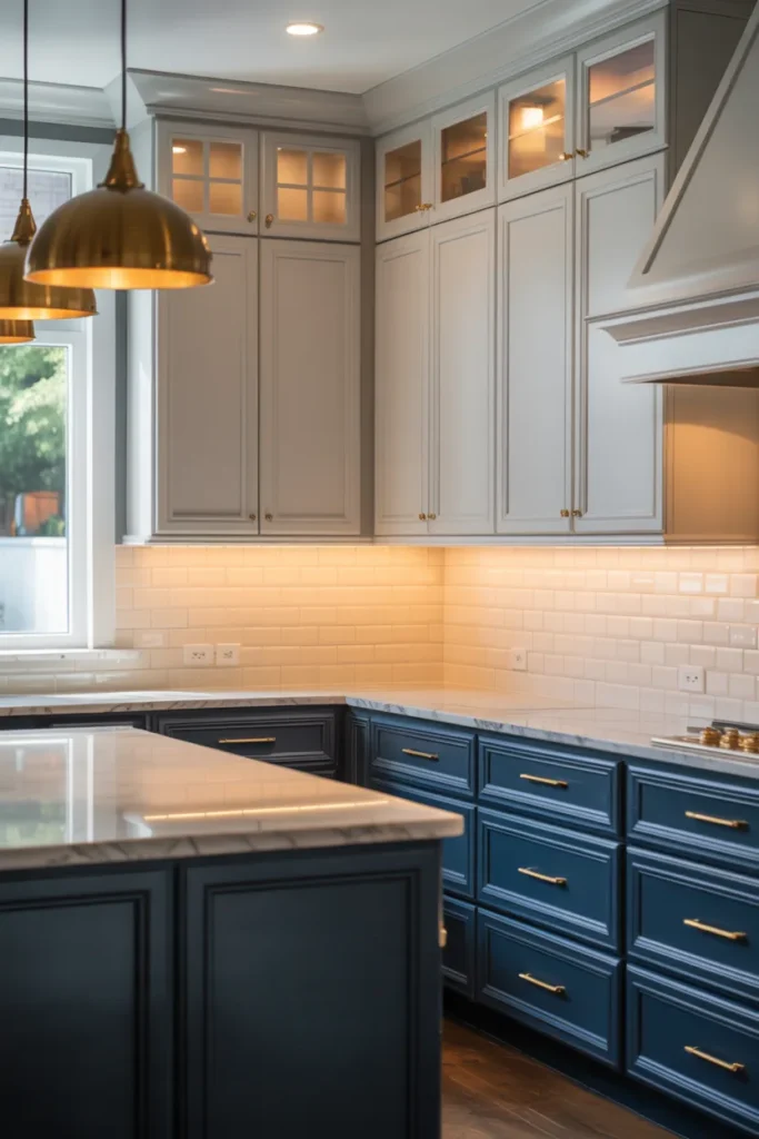
Two-tone cabinets give you the best of two colors instead of forcing a single choice. Usually a darker shade on the lowers and a lighter one on the uppers, or a bold island standing out against neutral perimeter cabinets. The contrast adds depth and visual interest that single-color kitchens lack, giving the eye more to enjoy. It also lets you use a daring color in a controlled, low-risk way; the bold color gets its moment without taking over. Two-tone suits modern, transitional, and farmhouse kitchens, adapting through the specific colors chosen. Done well, it looks custom and considered, like a designer was involved. Done poorly, it looks like you ran out of paint. The difference is entirely in the planning.
Create contrast: The classic formula is dark lowers with light uppers, which grounds the room while keeping it bright and open. Navy, forest green, or charcoal below with white or cream above is a reliable combination that rarely fails. Alternatively, keep the perimeter neutral and make the island the star in a bold color; this is the lowest-risk way to try two-tone. The two colors should relate to each other, sharing an undertone or a level of saturation, so they feel like partners. Avoid pairing two equally strong colors, which fight each other for dominance and create chaos. One lead, one support: that is the rule that keeps two-tone harmonious. Test the combination together before committing, because colors interact in ways single samples cannot show.
Keep it cohesive: Two colors need unifying elements to feel like one kitchen rather than two kitchens sharing a room. Use the same hardware throughout, a consistent countertop material, and one backsplash that works with both tones. The floor should work with both colors, acting as neutral ground. Repeat each color at least twice: the lower color on the island as well as the lowers, the upper color on the walls as well as the uppers, for example. When every element relates to both colors, the kitchen feels designed rather than divided. The contrast should energize the room and add depth, not split it in two. Step back and squint; the two tones should feel like a conversation, not an argument.
- Use dark lowers with light uppers for a grounded yet bright kitchen.
- Keep hardware, counters, and backsplash consistent across both tones.
- Repeat each color twice so the scheme feels unified.
Shop This Look
How to Start
Start by sampling, not deciding. Order sample pots or peel-and-stick samples of your top three colors and put them on actual cabinet doors in your kitchen. Live with them for at least three days, checking them in morning, afternoon, and evening light. Colors shift dramatically with light, and the only opinion that matters is what you see in your own room. This step feels slow, but it prevents the most expensive mistake in kitchen design: hating the color after the work is done.
Next, check the color against your fixed elements. Your floors, countertops, and backsplash are not changing, so the cabinet color must work with them. Hold the sample next to each one and look for undertone clashes, like pink-beige against yellow-beige. Take a photo of the combinations; the camera sometimes reveals clashes your eyes miss. If you are also replacing counters or backsplash, choose the cabinet color first, since it is the biggest commitment.
Finally, plan the painting or ordering process. For a repaint, clean and degrease the doors thoroughly, sand lightly, prime with a bonding primer, and apply two coats of cabinet-specific paint. For new cabinets, order door samples before the full order. Either way, buy all the paint from the same batch and keep the formula label for future touch-ups. Work one section at a time so the kitchen stays usable during the project.
- Sample your top three colors on real doors for at least three days.
- Check every sample against your fixed floors, counters, and backsplash.
- Use cabinet-specific paint and bonding primer for a durable finish.
Shop This Look
Common Mistakes
- Choosing a color from a screen without sampling it in your kitchen. Screens lie about undertones, and your lighting changes everything.
- Ignoring undertones. A pink-beige next to a yellow-beige floor creates a muddy clash that no styling can fix.
- Using wall paint on cabinets. It chips and wears fast; cabinet-specific paint with proper primer lasts years longer.
- Skipping the degreasing step before repainting. Kitchen grease prevents paint from bonding, and the finish peels within months.
- Picking a dark color for a dark kitchen. Without enough light, deep colors make small kitchens feel smaller and gloomier.
- Forgetting about the ceiling and trim. Stark white trim next to warm cabinets can look disconnected; warm white ties the palette together.
- Rushing the cure time. Cabinet paint needs up to 30 days to fully harden; handle doors gently in the first weeks.
Frequently Asked Questions
What is the most popular kitchen cabinet color right now?
White remains the most popular overall, but green tones, especially sage and forest green, are the fastest-growing trend. Warm neutrals like greige and mushroom gray are also very popular. Navy blue holds steady as the favorite bold choice. The safest long-term pick is still a soft white or warm neutral, since bold colors cycle in and out of fashion.
Should kitchen cabinets be lighter or darker than the walls?
There is no fixed rule, but contrast usually looks better than matching exactly. Light cabinets with slightly darker walls, or dark cabinets with light walls, both create definition. If your cabinets and walls are the same tone, add contrast through the backsplash, counters, or hardware. The goal is enough difference that each element reads clearly.
How do I choose a cabinet color for a small kitchen?
Light colors, soft white, cream, light gray, or pale sage, make small kitchens feel larger and brighter. If you love dark colors, use them on the island or lowers only, with light uppers to keep the room open. Good lighting matters even more in small kitchens, so plan under-cabinet and ceiling lights generously.
Can I mix cabinet colors in one kitchen?
Yes, two-tone kitchens are a well-established look. The classic approach is darker lowers with lighter uppers, or a bold island with neutral perimeter cabinets. Keep hardware and counters consistent across both colors so the kitchen feels unified. For a deeper look at working with blue tones, see our ideas for blue kitchen cabinets.
How long does a cabinet repaint last?
A properly prepared repaint with cabinet-specific paint lasts 5 to 10 years in a normal kitchen. The keys are thorough degreasing, bonding primer, and allowing full cure time before heavy use. High-touch areas near the stove and sink wear first. Keep leftover paint for touch-ups, and expect to refresh those spots every couple of years.
The Finishing Touch
Cabinet color is a decision you will live with every day, so it is worth the sampling time. Once the color is right, everything else in the kitchen gets easier: the hardware, the backsplash, and the styling all fall into place around it. Take a final look at your samples in evening light before you commit, since that is when most families actually use the kitchen. Then move forward with confidence.
For more professional perspective on choosing cabinet colors, Houzz’s editorial piece on kitchens with bold, beautiful cabinet colors shows how designers use mauve, teal, sapphire, and other lively colors in real homes. Seeing the colors in finished rooms, with notes on what worked, is the next best thing to visiting the kitchens yourself.
Whatever color you choose, the fundamentals stay the same: sample in your own light, check undertones against fixed elements, use proper cabinet paint, and light the room well. A well-chosen cabinet color makes the kitchen feel intentional for years. Start sampling this weekend, and you will be surprised how quickly the right color makes itself known.