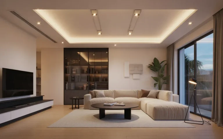
21 Modern Living Room Ideas for Contemporary Homes
A modern living room is not about following a trend. It is about clean lines, honest materials, and a space that works for how you actually live. Whether your style leans minimal or warm and layered, the modern approach gives you a framework: edit ruthlessly, choose quality over quantity, and let light and proportion do the heavy lifting. These 21 ideas cover the full range, from monochrome schemes to wood-warmed contemporary spaces.
Each idea below breaks down one modern living room look with practical guidance you can apply right away. You will find tips on furniture scale, lighting layers, color palettes, and the small details that separate a showroom from a home. Every idea also includes product picks to help you source the look without guesswork. Some ideas are full-room concepts, others are single upgrades that shift the whole feel.
If you are furnishing a first apartment, refreshing a tired family room, or planning a full renovation, there is something here for you. Renters will find plenty of non-permanent ideas, and homeowners can go deeper with built-ins and architectural changes. Start with the idea that matches your light, your space, and your life, then build from there.
This post contains affiliate links. If you buy through them, I may earn a small commission at no extra cost to you.
1. Neutral Minimalist Living Room with Clean Lines

A neutral minimalist living room strips away the noise so the architecture and the few chosen pieces can speak. Whites, warm grays, and soft beiges layer together without competing, and clean-lined furniture keeps every sight line calm. This look works in any size room, but it is especially powerful in small spaces where visual clutter makes walls feel closer. Neutral does not mean boring when texture does the talking. Boucle, linen, wool, and light wood add the depth that color usually provides, so the room stays interesting without a single bold hue. Keep the palette to three neutrals at most, and let natural light be the main decoration. The result is a living room that feels bigger, calmer, and quietly confident. It also ages well, since neutrals never shout themselves out of style.
Layer the neutrals: Start with the largest surfaces: walls in a warm white, the sofa in a mid-tone greige or oatmeal. Then build depth with textiles in slightly darker and lighter versions of the same family. A cream throw on a taupe sofa, a charcoal cushion against ivory, a jute rug under it all. The contrast between the layers is what keeps a neutral room from looking flat, so do not be shy about going a few shades darker in at least one element. Texture matters as much as tone here. Mix a nubby boucle chair with smooth linen curtains and a low-pile wool rug, and the eye stays engaged. Keep metals consistent, brushed brass or matte black, repeated in the lamp, the curtain rod, and small decor. When every layer belongs to the same quiet family, the room feels collected rather than empty, and the minimalism reads as a choice, not an absence.
Edit with intent: Minimalism fails when it becomes a rule instead of a tool. Keep the pieces you love and use, and remove the ones that only fill space. A good test: if you would not notice it missing for a week, it can go. What stays should be the best version of each essential, the most comfortable chair, the right-sized rug, lighting that actually flatters. Give each remaining piece breathing room, pulling furniture slightly away from walls and leaving clear surfaces. One piece of art, properly sized, beats a gallery wall of maybes. A single sculptural object on the coffee table beats a tray of small things. The discipline pays off in how the room feels: open, calm, and easy to keep clean. And when something new comes in, something old goes out. That is the whole maintenance plan, and it works.
- Stick to three neutrals maximum so the palette stays calm and cohesive.
- Mix at least three textures, like boucle, linen, and wood, to keep neutrals interesting.
- Leave clear surfaces; one considered object beats a cluster of small decor.
Shop This Look
2. Modern Living Room with Statement Lighting

Statement lighting is the fastest way to give a modern living room a point of view. A sculptural pendant, an oversized arc lamp, or a cluster of glass globes becomes the jewelry of the room, drawing the eye up and giving the space a focal point that is not the television. In modern design, the light fixture is often the art. This works in every budget range, since one dramatic piece beats a full set of forgettable lamps. The key is scale: the fixture should be big enough to read from across the room but not so large it dominates. In a standard living room, a pendant 20 to 30 inches wide over the seating area hits the sweet spot. Hang it low enough to feel intentional, around 7 feet off the floor in a walkway-free zone, so it becomes part of the seating arrangement rather than floating near the ceiling. Choose a finish that repeats elsewhere, black metal with black frames, brass with brass hardware, so the statement feels connected. Done right, guests remember the light before they remember the sofa.
Scale the drama: Measure before you fall in love. A fixture that looks perfect in a showroom with 12-foot ceilings can overwhelm an 8-foot living room. As a rule, add the room’s length and width in feet and use that number in inches for the fixture diameter: a 12 by 14 foot room suits a 26-inch pendant. For arc lamps, check the reach so the shade actually lands over the seating, not two feet behind it. Clustered pendants at staggered heights fill vertical space beautifully in rooms with high ceilings. Whatever you choose, put it on a dimmer. Statement lighting at full blast all evening is tiring; dimmed down, the same fixture becomes ambient sculpture. The dimmer is the cheapest upgrade in this whole idea and the one you will use most.
Support the star: One statement piece needs a quiet supporting cast. Keep other lighting simple and recessed: small table lamps, a slim floor lamp, or LED strips tucked where they glow without showing. The supporting lights handle the actual illumination so the statement piece can be about form. Avoid competing focal points nearby; a bold pendant fighting a busy gallery wall just creates noise. Let the fixture own its zone. Also consider the bulb: exposed-bulb fixtures need warm, dimmable LEDs with a vintage-style filament to look right. Nothing kills a sculptural light faster than a harsh cool-white bulb. Spend the extra few dollars on good bulbs. They are the difference between a fixture that glows and one that glares.
- Size the fixture to the room: length plus width in feet equals diameter in inches.
- Always put statement lighting on a dimmer for day-to-night flexibility.
- Use warm dimmable LED bulbs, around 2700K, in exposed-bulb fixtures.
Shop This Look
3. Contemporary Living Room with Floor-to-Ceiling Windows

Floor-to-ceiling windows are the ultimate modern luxury because they erase the line between inside and out. Daylight floods the room, views become living art, and even a modest living room feels expansive. If you have them, design around them: keep furniture low so sight lines stay open, and let the glass be the star. If you do not have them, you can fake some of the effect with the right treatments and mirrors. The modern approach to big windows is minimal dressing. Sheers or simple roller shades preserve the light while giving privacy on demand. Heavy drapes piled beside full-height glass fight the architecture; light, tailored treatments work with it. Keep the window wall as clear as possible: no tall bookcases blocking the glass, no bulky media unit hogging the view. Low-profile seating arranged to face both the room and the outlook makes the windows part of daily life, not just a backdrop. At night, the glass goes dark, so plan evening lighting that does not rely on the view: layered lamps and a dimmed pendant keep the room glowing after sunset.
Dress them lightly: Choose window treatments that disappear when open. Sheer linen panels on a slim rod, or roller shades that vanish into a cassette, keep the glass clean and architectural. Mount rods high and wide so open panels stack on the wall, not over the glass. For privacy without losing light, top-down bottom-up shades or sheer curtains are the modern answer. Avoid heavy valances, swags, or anything that chops the window into sections. The whole point of full-height glass is uninterrupted verticality, so every treatment choice should protect that. If glare is an issue on screens, a light-filtering roller shade solves it without the cave effect of blackout drapes. And keep the glass clean: floor-to-ceiling windows show every smudge, and a monthly wipe keeps the view crisp.
Furnish for the view: Arrange seating to honor the windows. A sofa with its back to the glass wastes the best feature of the room; instead, float seating to face the view, or use low swivel chairs that turn between conversation and outlook. Keep the furniture palette quiet so it does not compete with what is outside: neutrals, natural wood, and one muted accent. A low console or bench under the windows gives you a surface without blocking light. Plants love window walls, so cluster a few at varying heights in the corners where they will not block the view. At night, add exterior lighting if you can, a lit garden or terrace keeps the windows alive after dark instead of turning them into black mirrors. The room then works in all hours, not just daylight.
- Keep furniture low near full-height glass so sight lines stay open.
- Use sheer or disappearing treatments; heavy drapes fight the architecture.
- Plan evening lighting since the view goes dark after sunset.
Shop This Look
4. Monochrome Modern Living Room in Black and White

Black and white is the most disciplined palette in modern design, and the most forgiving. There are no undertones to clash, no trends to expire, and the contrast itself creates all the visual interest a room needs. A monochrome living room feels graphic and intentional, like a well-designed page. It suits modern architecture beautifully, and it makes art and texture pop harder than any color scheme. The trick is getting the balance right. Too much white feels clinical; too much black feels heavy. Aim for roughly two-thirds light to one-third dark, with the dark concentrated in grounding pieces: the sofa frame, a media console, curtain panels, or one accent wall. White and off-white handle the walls, the rug, and the larger upholstery. Gray lives in the middle as the peacemaker, softening the jump between the extremes. Pattern helps too: stripes, geometrics, and abstract prints in black and white add energy without adding color. When the palette is this strict, every texture and shape matters more, so choose pieces with strong silhouettes.
Balance the contrast: Distribute black evenly around the room so it does not pool in one corner. A black floor lamp here, black picture frames there, a dark throw on a white chair. The eye should travel the contrast, not get stuck on it. If the room starts feeling stark, warm it with natural materials: light oak, rattan, or a wool rug in ivory. These add warmth without breaking the monochrome rule. Brushed brass or matte black metals both work; just pick one and repeat it. Plants are the sanctioned exception: green reads as neutral in a black and white room and adds the life the palette needs. One or two healthy plants keep the scheme from feeling like a showroom. The goal is crisp, not cold, and the difference is in the warm textures and living touches.
Mind the light: Monochrome rooms live or die by lighting. Harsh overhead light on white walls creates glare; warm layered light creates depth. Use a mix of floor lamps, table lamps, and picture lights to wash the walls softly. Black furniture absorbs light, so give dark pieces their own nearby lamp or they will disappear into shadow. Mirrors are useful allies, bouncing light into dark corners and doubling the graphic impact. Keep bulb color consistent at a warm 2700K to 3000K so whites look creamy, not blue. And embrace the shadows: the interplay of light and dark is the whole point of the palette. A monochrome room with thoughtful lighting feels dramatic and calm at once, which is a rare and valuable combination.
- Aim for roughly two-thirds light to one-third dark for a balanced monochrome room.
- Distribute black pieces evenly so the contrast travels around the room.
- Add one or two green plants; green reads as neutral and keeps the scheme alive.
Shop This Look
5. Warm Contemporary Living Room with Wood Accents

Wood accents warm up contemporary spaces the way nothing else can. Sleek modern furniture in white, gray, and black can feel a little cool on its own; introduce oak, walnut, or teak and the room suddenly feels human. This is the look for people who like modern lines but want their living room to feel like a home, not a gallery. The key is letting the wood be a clear supporting player, not a competing theme. Choose one or two wood tones and repeat them: a walnut coffee table with oak floating shelves, or a teak media console with light wood picture frames. Keep the wood finishes in the same temperature family, all warm or all cool, so they harmonize. Let the wood appear at different heights: low in the coffee table, mid in shelving, maybe high in a beam or a pendant.
Pick your wood: Light woods like white oak and ash keep a modern room feeling airy and Scandinavian. Medium woods like walnut and teak add richness and pair beautifully with deep greens, navy, and charcoal. Dark woods like ebonized oak bring drama but need good light so they do not weigh the room down. Match the wood choice to your light: sunny rooms can handle dark wood, dim rooms do better with light wood. Also consider the existing fixed elements: floors, doors, and trim set the baseline, and new wood pieces should relate to them. If your floors are warm oak, walnut furniture complements; if floors are gray-washed, stick with cooler wood tones. One reliable move is matching the coffee table wood to the media console wood and letting shelves be the accent. Repetition makes different pieces feel like a set without being matchy.
Soften the modern edges: Wood does its best work alongside the hard surfaces of modern design. A walnut table next to a glass and chrome chair, oak shelves against a concrete-look wall, a teak bench under black-framed art: the contrast is what makes both materials sing. Add textiles in warm neutrals to complete the softening: wool throws, linen cushions, a hand-knotted rug. These natural materials share wood’s organic quality and bridge it to the sleeker elements. Avoid pairing wood with too many other warm materials at once; wood plus leather plus brass plus warm textiles can tip into heavy. Let wood be the main warmth and keep metals cool or neutral. The result is a contemporary room with a pulse, modern in line but warm in feeling, which is exactly where most people want to live.
- Repeat one or two wood tones at different heights for a built-in feel.
- Match new wood pieces to the temperature of existing floors and trim.
- Let wood be the main warmth; keep metals cool so the room stays balanced.
Shop This Look
6. Modern Living Room with Open-Concept Layout

An open-concept layout merges the living room with the kitchen or dining area into one flowing space. It suits modern life, cooking while chatting, kids playing within sight, guests mingling without walls. But openness needs structure, or it becomes one big undefined room where furniture drifts. The modern approach zones the living area clearly within the open plan so it holds its own. Start with the rug: a large area rug under the seating group is the fastest way to claim the living zone. Then orient the sofa with its back to the kitchen or dining area, creating a soft boundary. A console table behind the sofa sharpens the line and adds storage facing the living side. Keep the sight lines open above sofa-back height so light and conversation flow. The living zone should feel like a room, just one without walls. Scale matters more in open plans because every piece is visible from everywhere. Choose seating that looks good from the back, since the kitchen sees it all day.
Zone without walls: Beyond the rug and sofa placement, use lighting to define the living zone. A pendant or arc lamp over the seating area marks it as a destination, distinct from the kitchen’s task lighting. Repeat one material across the zones to keep them related: the same wood in the coffee table and the dining table, or the same black metal in both light fixtures. A change in ceiling treatment, like a wood-slat section over the living area, can zone architecturally without a single wall. Keep pathways clear between zones; open plans live or die by circulation. At least 36 inches between the sofa and the dining table, wider if it is a main route. When zones are clear and circulation works, the open plan feels generous instead of chaotic, and each area gets used more because its purpose is obvious.
Unify the palette: An open plan with a different color scheme per zone looks like three small rooms instead of one big one. Carry the same wall color, flooring, and two or three core tones through the entire space. Then give each zone its own accent within that family: rust cushions in the living area, a rust runner in the kitchen. The shared base makes it one space; the varied accents give each zone character. This is also the practical move for resale, since cohesive open plans photograph and show better. Keep clutter controlled, because in an open plan every mess is visible from everywhere. Closed storage in the living zone, a proper pantry in the kitchen, and a landing spot for daily items near the entry keep the openness feeling calm. Open concept rewards the tidy and punishes the rest, so build the storage the lifestyle needs.
- Use a large rug and sofa orientation to claim the living zone within the open plan.
- Keep 36 inches minimum between zones for comfortable circulation.
- Carry one palette through all zones; vary only the accents per area.
Shop This Look
7. Contemporary Living Room with Textured Walls

Textured walls give a modern living room depth that flat paint cannot. Limewash, plaster effects, wood slats, or 3D panels catch light and shadow, so the wall becomes a feature even in a neutral palette. Limewash and plaster-look paints are the easiest entry: they go on like paint but dry with soft movement and variation. Wood slat panels add warmth and a strong modern graphic, especially as a media wall or behind the sofa. The textured wall should be the backdrop for your simplest furniture, letting the wall do the decorative work.
Choose your texture: Limewash suits soft, organic modern rooms; it adds cloud-like movement in muted tones. Microcement or plaster effects suit industrial-leaning spaces with their smooth, concrete-like finish. Wood slats bring warmth and work brilliantly behind a TV, hiding cables between the battens. Fluted or reeded panels add a tailored, architectural rhythm that suits refined contemporary rooms. Match the texture scale to the room: large rooms can handle bold 3D panels, small rooms do better with subtle limewash or fine fluting. Consider maintenance too: textured walls collect dust, so smooth textures near cooking zones and washable finishes anywhere hands touch. What looks subtle in the store can go bold in your south-facing living room.
Light it right: Texture without the right light is just a bumpy wall. Wall-washing lights, picture lights, or even a floor lamp placed close to the wall rake light across the surface and reveal the depth. This grazing light is what makes limewash glow and slats cast their rhythmic shadows. Instead, let the textured wall be the backdrop you see across the room, behind the media unit or flanking the fireplace. Keep decor on textured walls minimal: one piece of art with breathing room, or nothing at all. The wall is the art. When texture, light, and restraint come together, a single wall can carry the whole design of a modern living room.
- Limit texture to one or two walls so it reads as a feature, not noise.
- Use grazing light, wall washers or picture lights, to reveal the texture’s depth.
- Sample textures in your own light; they shift dramatically through the day.
Shop This Look
8. Modern Living Room with Low-Profile Furniture

Low-profile furniture, pieces that sit close to the floor, makes ceilings feel higher and rooms feel larger. It is one of the oldest modern tricks, borrowed from Japanese and mid-century design, and it still works. The proportions need care, though. Low furniture with regular-height companions looks mismatched, so commit across the main pieces: sofa, chairs, and tables all in the lower range. Seat heights of 14 to 16 inches instead of the usual 18 define the look. Side tables and the media console should drop accordingly. Keep one taller element, a floor lamp or a tall plant, to give the eye vertical relief. Without it, a fully low room can feel squat. The payoff is a living room that feels calm, grounded, and noticeably bigger than its dimensions.
Commit to the height: Measure seat heights before buying, since product photos lie about scale. A sofa that looks low in pictures might sit at a standard 18 inches. True low-profile seating runs 14 to 16 inches at the seat, with backs under 30 inches. Pair with a coffee table 12 to 14 inches high, roughly the height of the seat cushion, so the table relates to the seating. Side tables should match the arm height or sit slightly lower. The media console can stay low and long, which suits modern TVs anyway. When every piece shares the low datum line, the room gains a composed, intentional feel. Mixing one standard-height armchair into a low set is the classic mistake; it towers over everything and breaks the spell. If you already own taller pieces, this look may not be for you unless you are replacing the set. Consistency is the whole game.
Mind the comfort: Low furniture is not for everyone physically. People with knee or back issues can struggle to get up from a 14-inch seat, so consider who uses the room. If grandparents visit often, keep one standard-height chair in the mix, placed where it does not break the sight line, or choose low pieces with firm cushions that are easier to rise from. Test sit before committing: low sofas with deep seats can be hard to exit gracefully. On the plus side, low furniture is great for families with small kids, fewer falls, easier climbing, and a coffee table at the right height for little hands. Balance the low seating with lighting at normal heights so the room does not feel like everything sank. A tall arc lamp or a pendant hung at standard height restores the vertical balance and keeps the room feeling designed, not diminished.
- True low-profile seats run 14 to 16 inches high with backs under 30 inches.
- Keep one taller element, like an arc lamp, for vertical relief.
- Test sit first; low deep seats can be hard to get out of for some guests.
Shop This Look
9. Modern Living Room with Built-In Storage

Built-in storage is the modern living room’s secret weapon: it holds everything without looking like storage. Floor-to-ceiling shelving flanking a media wall, a window seat with hidden compartments, drawers built into a platform: these keep the room’s clean lines intact while swallowing the clutter that ruins minimalism. The modern look depends on clear surfaces, and clear surfaces depend on somewhere for things to go. Built-ins give you that somewhere without adding furniture. The strongest move is the full media wall: shelving and closed cabinets spanning one wall, with the TV mounted flush in the middle. Closed lower cabinets hide consoles, remotes, and games; open upper shelves display books and objects. Paint it the same color as the walls and it reads as architecture, not furniture. A window seat with storage underneath turns dead space into the most-used seat in the house. Even a simple built-in bench with lift-up tops beside the sofa beats a clutter of baskets. Built-ins cost more upfront than freestanding pieces, but they add real value and they never wobble, migrate, or look temporary.
Plan the mix: The golden ratio for built-in shelving is about two-thirds closed, one-third open. Closed storage hides the ugly necessities; open shelves display the things worth seeing. Too much open shelving becomes a dusting burden and a styling chore, while all-closed storage looks like a wall of doors. Plan what goes where before building: measure the tallest items, allow for cable routing behind the media section, and include lighting in at least some open sections. LED strips under shelves make displays glow and make the whole wall feel custom. Leave some shelves adjustable, since needs change. If full custom carpentry is out of budget, modular systems from major retailers can be ganged together and trimmed with molding to look built-in. Paint everything one color, wall included, and the trick is nearly invisible. The goal is storage that looks like it grew there.
Keep it livable: Built-ins only work if they are easy to use daily. Drawers should glide, doors should close softly, and the things you grab every day should live between knee and shoulder height. Put seasonal and rarely used items up high or down low. Label the insides of deep cabinets if the household shares the storage; mystery cabinets become junk drawers. Leave one open shelf deliberately empty or sparse, because a wall of storage packed to the edges looks like a shop, not a home. And resist filling new built-ins just because the space exists. The point was clear surfaces and calm lines, not more places to accumulate. Review the contents once a year and let go of what the room has outgrown. Built-ins are a long-term relationship with your stuff; keep it honest and the room stays serene.
- Aim for two-thirds closed storage, one-third open display in built-in walls.
- Include LED strips in open sections; lit shelves look custom and intentional.
- Store daily items between knee and shoulder height for real-world ease.
Shop This Look
10. Contemporary Living Room with Bold Accent Color

A bold accent color in a modern living room works like punctuation: a little of it makes everything else read better. One saturated hue, deep green, burnt orange, cobalt, ochre, against a neutral modern base gives the room energy and personality without the commitment of a colorful scheme. The discipline is proportion. Let the accent own about ten percent of the room: an armchair, a set of cushions, one piece of art, maybe a throw. The neutrals do the heavy lifting everywhere else. Repeating the accent at least three times, in different spots and scales, makes it look intentional rather than accidental. A rust chair, rust cushions on the sofa, and rust in the artwork: the eye connects the dots and the room feels composed. Choose the accent for the light you have: saturated colors glow in bright rooms and can go muddy in dark ones, so test accordingly.
Pick the punch: Look at what you already own and love: the art you would never sell, the rug you chose first, the book covers on your shelf. The accent often hides in your existing taste. Deep greens suit wood-heavy modern rooms; burnt orange and ochre warm up gray bases; cobalt and teal electrify white ones. Consider the room’s orientation too: north-facing rooms with cool light welcome warm accents, while sunny south-facing rooms can handle cooler ones. Test with something cheap and returnable, a throw or a cushion, and live with it for a week before committing to the chair. And remember the accent can change with seasons or mood: cushion covers and throws are a low-cost way to rotate color while the neutrals stay put. That flexibility is the real advantage of the single-accent approach over a fully colorful room.
Keep the base quiet: The accent only sings if the background stays calm. Walls in white or warm neutral, large upholstery in gray, beige, or natural tones, flooring that does not compete. This restraint is what separates a modern accent scheme from a merely colorful room. Pattern can join in, but keep it in the accent color family so it reinforces rather than introduces new hues. A geometric cushion in the accent plus a solid throw in the same tone is plenty. Metals should stay consistent and quiet, black or brushed steel, so they do not become a second accent. When the base is disciplined, even a daring color like tangerine or emerald feels sophisticated. The modern lines do half the work of keeping bold color elegant; your job is just to not add a second bold color to argue with the first.
- Let the accent own about ten percent of the room, repeated at least three times.
- Test the color with a cheap throw for a week before committing to furniture.
- Keep walls and large upholstery neutral so the accent stays the star.
Shop This Look
11. Contemporary Living Room with Glass and Metal Accents

Glass and metal are the materials of classic modernism: honest, reflective, and precise. A glass coffee table, chrome or brass floor lamp, steel-framed shelving, and mirrored accents bring a crisp, tailored quality that wood and fabric alone cannot. These materials bounce light around the room, which makes them especially valuable in spaces that need brightness. They also add a subtle glamour without any ornament, the modern ideal of luxury through material rather than decoration. The trick is balance, because glass and metal are visually cool and hard. Pair them with soft, warm elements: a glass table over a plush rug, chrome chairs with sheepskin throws, a brass lamp beside a linen sofa. The contrast between hard shine and soft texture is what makes the combination feel designed. Keep the metal finishes to one or two: all chrome, all brass, or black with brass accents. Mixed metals can work, but in a glass-and-metal scheme, discipline reads as elegance. Fingerprints are the practical tax on these materials, so choose pieces with finishes that hide them, brushed over polished, and keep a microfiber cloth handy.
Layer the shine: Distribute reflective surfaces around the room so light bounces from multiple points. A glass coffee table in the center, a metal floor lamp in the corner, a mirror on one wall, metallic frames on the art. Each one catches light differently through the day, and the room feels alive. But watch the total: too many reflective surfaces create glare and a cold, showroom feeling. The soft furnishings should still dominate by area; glass and metal are the accents, not the base. A good check is the rug test: if the rug is the largest soft thing in the room and it feels generous, the hard materials are probably in proportion. Scale matters too: one oversized metal floor lamp makes a stronger statement than three small chrome objects. Let one metal piece be the star and keep the rest supporting.
Warm it up: Every glass-and-metal room needs deliberate warming, or it reads as an office. Wood is the easiest bridge: a walnut tray on the glass table, oak frames on the art, a teak side table beside the chrome chair. Textiles do the rest: wool, linen, and velvet in warm neutrals soften every hard edge they touch. Plants are almost mandatory here; green organic shapes against glass and steel is a classic modern pairing that never fails. Even the lighting color matters: warm 2700K bulbs keep metals glowing instead of glaring. The goal is tension between precision and comfort, the room should look sharp in photos and feel inviting in person. When someone sinks into the sofa and says the room feels cozy despite all the glass, you have nailed it.
- Limit metals to one or two finishes for a disciplined, elegant read.
- Pair every hard reflective piece with something soft and warm nearby.
- Add plants; organic green against glass and steel is a foolproof pairing.
Shop This Look
12. Modern Living Room with Floating Shelves

Floating shelves in a modern living room do two jobs: they display the objects that make the room yours, and they keep the floor clear for the clean lines the style demands. Unlike bookcases, they do not add visual bulk, so the wall stays light while gaining function. This makes them ideal for small modern rooms and for anyone who likes to restyle often without moving furniture. The modern way to style floating shelves is with restraint and rhythm. Group objects in odd numbers, vary heights, and leave generous empty space; a shelf that is half empty looks curated, while a full one looks like storage. Repeat one or two colors from the room so the shelves feel connected to the whole. Mix materials the way the room does: ceramic, glass, wood, and a small plant. Books can go horizontal in stacks or vertical in short runs, but avoid packing shelves like a library. These are display shelves, not archives. Two or three shelves beat one long one, since shorter spans sag less and style more easily.
Mount them right: Floating shelves fail when they sag or pull away from the wall, so mounting matters more than styling. Use the hardware rated for well above your intended load, anchor into studs where possible, and keep shelf depth to 10 or 12 inches for living room display. Deeper shelves invite clutter and stress the mounts. Space shelves 15 to 18 inches apart vertically so objects have breathing room. A level and a stud finder are non-negotiable tools here; crooked shelves ruin the modern precision instantly. If you are renting, high-quality adhesive-mounted picture ledges can hold light decor without holes, though they cannot carry books. Whatever the mount, test with weight before styling. A shelf that dips under load will haunt you every time you look at it. Solid mounting is invisible, which is exactly the point.
Style and edit: Treat the shelves as a rotating gallery, not permanent storage. Swap pieces seasonally or when you travel and bring something home; the shelves are the room’s way of staying personal without accumulating clutter. Follow the rule of thirds: roughly a third books, a third objects, a third empty space. Corral tiny items on a tray or in a small box so they read as one composed element. Step back across the room to judge; shelves are viewed from the sofa, not from six inches away. If something looks fussy from the seating, simplify it. Dust weekly, since floating shelves at eye level show every speck. The maintenance is small and the payoff is large: well-styled floating shelves are often the most complimented element in a modern living room, proof that restraint photographs beautifully.
- Anchor into studs and keep depth to 10 to 12 inches to prevent sagging.
- Leave about a third of each shelf empty for a curated, not cluttered, look.
- Restyle seasonally; the shelves are the room’s rotating personal gallery.
Shop This Look
13. Modern Living Room with Curved Furniture

Curved furniture softens modernism’s straight lines with shapes that feel welcoming and sculptural. A round coffee table, a curved sofa, barrel chairs, an arched floor lamp: these pieces add movement to rooms that can otherwise feel boxy. Curves are having a moment, but they are also timeless; the best modern interiors have always mixed a curve or two among the rectangles. The human body is curved, and curved seating simply feels good to sink into. Start with one hero curve, since a room full of circles can feel theme-parky. A curved sofa is the boldest move and the most transformative; it changes how people sit together, facing inward instead of forward. A round coffee table is the easiest entry, softening the center of any seating group. Barrel or tub chairs add curves at a smaller scale and swivel versions add function. An arched lamp introduces a curve overhead, drawing the eye up. Whatever you choose, let it contrast with the room’s straight lines; the curve is special because everything else is not.
Place the curve: Curved pieces need room to breathe, since their shape reads best with space around it. A curved sofa wants to float, not hug the wall; give it at least a few inches of clearance so its silhouette shows. Round tables need the same chair clearance as square ones, about 36 inches to the wall, despite looking smaller. In traffic terms, curves are actually practical: no sharp corners to catch hips in tight modern rooms. Pair the curved hero with straight companions so the contrast stays legible: a round table with a rectangular rug, a curved sofa with a linear media console. If the room already has an architectural curve, an arched doorway or a bay window, echo it with furniture curves for a cohesive feel. The curve should feel like a response to the room, not a random import.
Keep it grounded: Curves can float away visually if nothing anchors them, so ground each curved piece. A round coffee table needs a rug beneath it, ideally round or large enough to contain the composition. A curved sofa needs a defined zone, created by the rug and the arrangement of straight pieces around it. Upholstery in solid, quiet fabrics lets the shape be the statement; busy patterns on curves create visual noise. In small rooms, choose curves with legs rather than skirted bases, so floor shows beneath and the piece feels light. And do not curve everything: the modern tension between straight architecture and one beautiful curve is the whole effect. When guests walk in and their eyes go straight to the curved piece, then relax into the calm around it, the balance is right.
- Start with one hero curve; a room full of circles feels like a theme.
- Give curved pieces breathing room so their silhouette reads clearly.
- Ground curves with rugs; solid quiet fabrics let the shape be the statement.
Shop This Look
14. Contemporary Living Room with Minimal Wall Art

Minimal wall art in a modern living room means one strong piece instead of many small ones. A single oversized abstract, a large-scale photograph, or a sculptural object on the wall gives the room a focal point without the visual chatter of a gallery wall. This suits modernism’s love of negative space: the empty wall around the art is part of the composition. Scale is everything. The art should be big enough to hold the wall: roughly two-thirds the width of the sofa it hangs above, hung with its center at eye level, about 57 inches from the floor. In a neutral modern room, the art can carry the room’s single accent color, which makes choosing it easier: find the piece you love, then pull the accent from it. Black, white, or natural wood frames keep the modern discipline; ornate frames fight it. And lighting the art with a picture light or a directed spot makes it glow after dark, doubling its impact.
Choose with confidence: Buy the biggest piece you can afford for the wall you have, because small art on a big wall is the most common living room mistake. Abstract works safely in modern rooms since it adds color and movement without a subject to tire of. Large-scale photography, architectural or botanical, adds realism and depth. Textile art, a woven hanging or a framed fabric panel, adds the texture that modern rooms crave. Whatever the medium, choose something you genuinely like looking at, since minimal art means you will look at it a lot. Avoid the generic hotel-art trap: mass-produced canvases of vague landscapes add nothing personal. One piece with a story, from a local artist, a travel find, even a well-chosen print, beats three anonymous ones. The art is the room’s personality in concentrated form, so let it be yours.
Hang it right: Placement makes or breaks minimal art. Center the piece over the sofa or the console it relates to, not necessarily centered on the wall. The 57-inch rule, center of the art at 57 inches from the floor, works because it matches average eye level. Above a sofa, leave 6 to 8 inches between the sofa back and the frame bottom so they read as a group. In rooms with high ceilings, resist hanging art higher to fill space; instead, choose a bigger piece. A picture light mounted above the frame adds gallery polish and makes the art visible in the evening, when living rooms are actually used. Keep the surrounding wall clear: no small frames creeping in beside it, no shelves crowding it. The negative space is doing work. When one piece of art can hold a whole wall, the room feels curated, calm, and confident.
- Size art to roughly two-thirds the width of the furniture below it.
- Hang the center at 57 inches, the average eye level, for natural viewing.
- Keep surrounding wall clear; the negative space is part of the composition.
Shop This Look
15. Modern Living Room with Layered Lighting

Layered lighting is what separates a modern living room that looks good in photos from one that feels good at 8pm. Overhead light alone creates flat, shadowless rooms; layers, ambient, task, and accent, create depth, mood, and flexibility. The modern approach treats lighting as a system: each layer has a job, and together they let the room shift from bright and functional to soft and atmospheric. Start with ambient: the general glow from ceiling fixtures, recessed lights, or a large pendant on a dimmer. Add task lighting where activities happen: a reading lamp by the chair, a table lamp where you work or play games. Finish with accent: picture lights, LED strips on shelves, a small uplight behind a plant. Each layer on its own switch or dimmer, so you can compose the light like music. In the evening, turn off the overheads and let the lower layers carry the room; the difference is immediate and dramatic. Good layered lighting is the single most impactful upgrade in most living rooms, and it costs less than new furniture.
Build the layers: Audit your room layer by layer. Most living rooms have ambient covered but lack task and accent entirely. Add a floor lamp with an adjustable head beside the main reading seat; it should cast light over the shoulder, not into the eyes. Put small lamps on side tables and the console, keeping shades at similar heights for a composed look. Add accent where the room has something worth showing: art, shelving, plants, architectural details. LED strips are the modern secret weapon: tucked under shelves, behind the TV console, or along a tray ceiling, they add glow without visible fixtures. Put every layer on dimmers or smart plugs so adjusting is effortless.
Unify the glow: Keep bulb color temperature consistent across all layers, ideally a warm 2700K throughout. Mixed temperatures, cool overheads with warm lamps, make the room feel disjointed even when you cannot name why. Use dimmable LEDs everywhere so every layer can go from functional to atmospheric. Match shade styles loosely: the lamps do not need to match, but they should share a design language, similar shapes or materials. Hide the hardware where you can: cords tucked behind furniture, strips concealed in channels, drivers hidden in cabinets. The modern ideal is light without visible source, glow that seems to come from the architecture itself. Finally, consider smart controls if the budget allows; scenes like reading, movie, and entertaining turn layered lighting from a chore into a pleasure. The best lighting system is the one you actually adjust, so make adjusting easy.
- Cover all three layers: ambient, task, and accent, each on its own control.
- Keep every bulb at the same warm temperature, around 2700K, for cohesion.
- Put layers on dimmers or smart plugs so adjusting light is effortless.
Shop This Look
16. Modern Living Room with Natural Light Focus

Designing around natural light means treating the windows as the room’s main feature and everything else as supporting cast. Furniture stays low and pulled back from the glass, colors stay light and reflective, and mirrors multiply the daylight. The result is a living room that feels awake and energized all day, with lower lighting bills as a bonus. This approach suits rooms with good window exposure best, but even a single bright window can anchor it. Start by clearing the window wall: no tall furniture blocking glass, no heavy treatments eating light. Sheers or light-filtering shades give privacy without dimming. Arrange the main seating to face or flank the windows so daylight falls on faces and pages, which is where you need it. Choose a palette that bounces light: whites, pale woods, light upholstery, glossy or satin finishes that reflect. A large mirror opposite the windows doubles the light and the view.
Maximize the daylight: Audit what blocks your light and remove it. Tall bookcases beside windows, dark heavy curtains, furniture piled in front of glass: all of it steals daylight. Replace heavy drapes with sheers or light-filtering rollers that preserve brightness. Paint walls in high-reflectance whites or pale tones; the ceiling especially, since it bounces light deep into the room. Choose flooring and rugs in lighter tones if you are renovating, or layer a light rug over dark floors. Position mirrors strategically: opposite windows to double them, or adjacent to bounce light into dark corners. Keep windowsills clear of clutter that casts shadows. If privacy is the issue, frosted film on lower panes or cafe curtains preserve the upper light while blocking sight lines. Every one of these moves is small, but together they can transform a dim living room into a bright one without touching the architecture.
Handle the bright side: Too much direct sun brings glare, fading, and heat, so manage it. Light-filtering shades cut glare on screens while keeping the room bright; solar shades preserve the view while blocking UV. Rotate or protect textiles and art from the strongest sun, since even indirect daylight fades fabrics over years. A sheer curtain is often enough to take the edge off without darkening. For evening, plan lighting that takes over gracefully: the room should not go from bright to black when the sun sets. Warm lamps on timers or smart schedules ease the transition. Plants are the natural winners of a light-focused room, so indulge: a bright living room can host the statement plants that dim rooms cannot. When the room is designed around its light, every sunny day feels like the house is showing off, and even gray days feel brighter than they are.
- Clear the window wall of tall furniture and heavy treatments first.
- Use mirrors opposite or adjacent to windows to multiply daylight.
- Manage glare and fading with light-filtering shades, not blackout drapes.
Shop This Look
17. Contemporary Living Room with Neutral Layering

Neutral layering builds a modern living room from shades of the same quiet family: ivory, oatmeal, greige, taupe, stone. Unlike stark minimalism, which can feel cold, layered neutrals feel warm and enveloping because the subtle shifts between tones create depth. This is the look of high-end hotels and calm Scandinavian homes, and it photographs beautifully. It is also forgiving: neutrals hide wear, mix easily, and never clash with the art or objects you add later. The technique is tonal dressing: choose a base neutral for the largest pieces, then add lighter and darker versions in textiles and decor. A greige sofa, ivory walls, an oatmeal rug, taupe cushions, a stone throw: each layer is close enough to harmonize and different enough to read. Texture does the heavy lifting here, so mix them deliberately: boucle against linen, wool against leather, matte ceramic against brushed metal. The room should feel like a landscape of soft variations. Keep one darker anchor, a walnut table or a charcoal cushion, so the lightness has something to rest against. Without it, all-pale rooms can feel washed out.
Build the tones: Start with fixed elements: floor tone, wall color, and any large furniture you are keeping. Identify their undertones, warm or cool, and choose new layers to match. Mixing warm beige with cool gray is the classic neutral-layering mistake; the room looks muddy instead of calm. Once the undertone family is set, collect swatches and compare them in your light at different times of day. Build from large to small: walls and rug first, then sofa and curtains, then cushions, throws, and decor. Each new layer should be visibly lighter or darker than its neighbors, or the layering disappears. A good test is the black-and-white photo: snap the room and check that you can still see distinct tonal bands. If it all merges into one gray, push the contrasts further. The layering should be subtle in color but clear in value.
Keep it alive: All-neutral rooms risk feeling flat or lifeless, so add life deliberately. Plants are the easiest fix: green is technically a color, but it reads as neutral and adds organic shape. Natural materials, wood grain, stone, woven fibers, bring the variation that flat neutrals lack. One metallic accent, brushed brass or matte black, adds a crisp note. And let the room change: swap a throw or a cushion seasonally, a slightly deeper tone for winter, a lighter one for summer, to keep the layering feeling fresh. Lighting matters enormously: warm light deepens neutrals beautifully, while cool light can make them look gray and sad. Keep bulbs at 2700K and use enough layers that the room glows in the evening. A neutrally layered room with warm light feels like a cashmere sweater: soft, enveloping, and quietly luxurious.
- Match undertones: keep all layers warm or all cool, never mixed.
- Check layering with a black-and-white photo; tonal bands should still read.
- Add plants and natural materials so the neutrals feel alive, not flat.
Shop This Look
18. Modern Living Room with Indoor Plants

Indoor plants are the living finish in a modern living room: they add organic shape, fresh color, and a sense of life that no object can. Against clean lines and neutral palettes, a sculptural plant becomes art. They also improve air quality and humidity, and caring for them gives the room a gentle daily ritual. You do not need a jungle; a few well-chosen plants at varying heights transform the feel of the space. Choose plants for your light, not your wishes. Bright indirect light suits fiddle-leaf figs, monsteras, and olive trees; medium light suits pothos, ZZ plants, and snake plants; low light limits you to the toughest survivors. Match the plant to the spot and it thrives on neglect; mismatch it and it becomes a chore. And choose planters with the same care as furniture: ceramic, concrete, or woven baskets in the room’s palette, since the pot is visible always and the plant only sometimes.
Place with intent: Give plants the jobs that objects cannot do: softening a hard corner, filling the dead space beside the media console, adding height where furniture is low, breaking up a long empty wall. A tall plant in an empty corner is the single easiest living room improvement. Trail a pothos from a high shelf to add vertical movement. Cluster plants at different heights in one spot for a composed arrangement rather than scattering singles around the room. Keep plants off the main traffic paths and away from heating vents, which dry them out. If you have pets, check toxicity before buying; many popular plants are harmful to cats and dogs, and pet-safe options like parlor palms and calatheas are plentiful. Rotate plants occasionally so all sides get light and growth stays even. Intentional placement makes plants look like design, not clutter.
Keep them thriving: The secret to good-looking plants is consistency, not expertise. Water on a schedule matched to each plant, checking soil moisture first; most houseplants die from overwatering, not neglect. Group plants with similar needs together so care is efficient. Wipe large leaves monthly, since dust blocks light and dulls the look. Feed lightly in spring and summer, and repot when roots circle the pot. If a plant struggles despite your efforts, move it before you mourn it; a different window often solves the problem. And be honest about your commitment: if you travel constantly, choose snake plants and ZZ plants that forgive weeks of neglect. A thriving easy plant beats a dying fussy one every time. Healthy plants are the difference between a room with plants and a room that feels alive.
- Match each plant to the actual light of its spot, not the light you wish you had.
- One large statement plant anchors a room better than many small scattered pots.
- Check pet toxicity before buying; plenty of beautiful options are pet-safe.
Shop This Look
19. Contemporary Living Room with Sleek Media Unit

A sleek media unit is the modern answer to the TV problem: the screen is unavoidable, so the furniture around it should be beautiful. Low, long consoles with clean lines, hidden cable management, and a mix of closed storage and open display turn the media wall from an eyesore into a design feature. The console should be wider than the TV, ideally by at least six inches on each side, so the screen does not overwhelm the furniture. Wall-mounting the TV with the console below creates the sleekest look and frees the console top for styling. Hide every cable: route them through the wall, through cable channels, or behind the console. Choose a console with closed storage for the boxes, remotes, and discs, and leave some open shelving or top surface for books and objects. The media wall should look furnished, not just equipped.
Style the wall: Treat the media wall as a composition, not an appliance installation. If the TV is wall-mounted, style the console top with a low stack of books, a small sculptural object, and one plant, keeping everything below the screen’s bottom edge. Flank the unit with something vertical on at least one side: a tall plant, a floor lamp, or floating shelves, to balance the horizontal spread. If the wall is large, consider paneling or a paint treatment behind the unit to define the zone; wood slats are the classic modern move and hide cables beautifully. Keep the styling quiet near the screen, since busy decor competes with what you are watching. The goal is a wall that looks good when the TV is off, which is most of the day. When guests see a composed media wall instead of a black rectangle on a bare wall, the whole room feels more finished.
Manage the tech: Sleek looks require invisible tech. Mount power and HDMI access behind the TV so no cables drape. Use a universal remote or a smart system to eliminate the pile of controllers. Store consoles and boxes inside ventilated cabinets; they need airflow, so choose units with open backs or vent slots. If the gear runs hot, add a small silent fan. Soundbars mount below the TV or sit on the console, never on the floor. And plan for the future: leave extra HDMI capacity and a spare outlet, since setups grow. The best media walls are the ones where the technology disappears and only the experience remains. When movie night starts and the room transforms with one remote, the planning pays off. A sleek media unit is really about respect: respect for the room’s design and for the people watching in it.
- Choose a console wider than the TV by at least six inches per side.
- Hide every cable; visible wires ruin the sleek effect instantly.
- Ventilate closed cabinets that hold consoles and media boxes.
Shop This Look
20. Modern Living Room with Cozy Seating Arrangement

A cozy seating arrangement proves that modern does not have to mean austere. Deep seats, soft textiles, and an inward-facing layout create a living room that invites long conversations and lazy afternoons, while clean lines keep it firmly contemporary. The trick is choosing modern-shaped pieces in comfort-first proportions: a sofa you can actually curl up on, chairs that embrace rather than perch. Start with the arrangement: pull seating into a conversational group around the coffee table, with pieces facing each other rather than all facing the TV. Layer in the comfort: throws on every seat, cushions in varying sizes, a rug thick enough to go barefoot on. The modern discipline shows in the edited palette and the clean silhouettes; the coziness shows in everything you touch. A room can be both tailored and sink-in, and the best modern living rooms are.
Layer the comfort: Comfort is built in layers, and each one is simple. Start with the rug: thick, soft, and large enough that all front legs of the seating sit on it. Add throws in washable fabrics, draped rather than folded, one per seat so nobody fights over them. Mix cushion sizes: large squares behind, smaller lumbar in front, in a tight palette so the abundance looks curated. Choose upholstery in performance fabrics that feel soft but survive real life; modern velvets and textured weaves offer both. Keep a basket nearby for the throws when tidying, so cozy does not become clutter. Lighting should be warm and low in the evening: table lamps at seating height, never harsh overheads. The room should feel like an embrace at night. When every seat has a throw, a cushion, and a lamp within reach, the arrangement stops being furniture and becomes an invitation.
Keep the modern edge: All this comfort needs the modern framework to avoid sliding into shapelessness. Keep the silhouettes clean: a track-arm sofa, simple drum tables, chairs with defined lines. The palette stays disciplined, three or four tones, so the layers of comfort read as intentional. Edit regularly: cozy attracts accumulation, and the throw that was charming becomes clutter when joined by six more. Give everything a home, the basket for throws, the lidded box for remotes, so tidying takes minutes. Keep one tailored element prominent, a crisp-lined coffee table or a sculptural lamp, as a reminder of the modern bones. The balance point is personal: some rooms lean cozier, some lean cleaner. Find yours by noticing when the room stops feeling designed and starts feeling merely comfortable. Then pull back one layer. The sweet spot is where guests say it looks great and then immediately sink in.
- Arrange seating in an inward-facing group, not all facing the TV.
- Put a throw and good light within reach of every seat.
- Edit regularly; cozy attracts clutter, so give everything a home.
Shop This Look
21. Modern Living Room with Balanced Simplicity

Balanced simplicity is modern design at its most restrained: every element earns its place, nothing shouts, and the room feels calm because nothing is fighting for attention. The furniture is comfortable and good-looking, the palette is quiet, the light is warm, and there is simply nothing extra. Achieving it is harder than it looks, because simplicity exposes every choice. A cheap sofa cannot hide behind styling; a bad layout cannot be rescued by decor. So invest where it counts: the sofa, the rug, the lighting. These three carry a simple room. Keep the palette to two or three tones with natural materials doing the textural work. Let the architecture show: clean walls, simple window treatments, floors that are allowed to be beautiful on their own. The room should feel like a deep breath.
Choose less, better: The formula is simple and demanding: fewer pieces, better pieces. One excellent sofa instead of a sofa plus two mediocre chairs. One beautiful rug instead of layered maybes. Lighting that is genuinely good, not just present. Each purchase should be the best you can afford in its category, because in a simple room there is nowhere for compromise to hide. Before buying, ask whether the piece serves daily life or just fills space; if the latter, skip it. Leave deliberate empty space: a clear wall, an uncluttered corner, a surface with nothing on it. Emptiness is a design element in simple rooms, giving the eye rest and making the chosen pieces more precious. Resist the urge to fill every gap. The gaps are the point. When someone asks where you got the idea for the empty corner, you will know the simplicity is working.
Maintain the calm: Simple rooms show clutter instantly, so maintenance is part of the design. Build in closed storage for the daily mess: remotes, chargers, magazines, the things that multiply on surfaces. Make tidying a two-minute evening ritual, because in a simple room two minutes is all it takes. Choose materials that age gracefully: solid wood that patinas, leather that softens, wool that wears well. Simplicity should get better with time, not shabbier. And protect the calm from well-meaning additions: the souvenir, the extra cushion, the gadget. Each new object should pass the test of earning its place, or the simplicity erodes one small thing at a time. This sounds strict, but it is actually freeing: when the room holds only what you love and use, living in it is effortless. Balanced simplicity is not about having less for its own sake. It is about making room for what matters.
- Invest in the sofa, rug, and lighting; these three carry a simple room.
- Leave deliberate empty space; gaps are a design element, not a flaw.
- Build in closed storage so a two-minute tidy restores the calm.
Shop This Look
How to Start
Start by looking at your room with fresh eyes. Photograph it from the doorway, since photos reveal clutter and imbalance that daily familiarity hides. Note what bothers you most: the lighting, the layout, the color, the lack of storage. That single biggest complaint is your starting point, because fixing what annoys you daily gives the fastest satisfaction.
Next, define your version of modern. Collect a handful of images you love and look for the pattern: are they all neutral, all wood-warmed, all dramatic? Your pattern is your brief. Then measure the room and sketch the layout, marking windows, doors, and walkways. Modern rooms depend on proportion and flow, so the plan matters more than any single purchase.
Finally, work in layers: layout first, then large furniture, then lighting, then textiles and decor. Do not buy decor before the big pieces are placed; it is like accessorizing before getting dressed. Live with each layer briefly before adding the next. Modern design rewards patience, and a room built in considered layers always beats one bought in a weekend.
- Photograph the room from the doorway; photos reveal what familiarity hides.
- Find your pattern in saved inspiration images before buying anything.
- Work in layers: layout, large furniture, lighting, then textiles and decor.
Shop This Look
Common Mistakes
- Pushing all furniture against the walls. Floating the seating inward creates conversation zones and makes the room feel designed; perimeter furniture makes it feel like a waiting room.
- Buying a rug that is too small. A rug that floats in the middle of the seating, touching nothing, shrinks the room visually; front legs of all seating should sit on it.
- Using only overhead lighting. A single ceiling light flattens everything; modern rooms need layered ambient, task, and accent light to feel alive.
- Choosing style over comfort in seating. A sculptural chair nobody sits in is a sculpture, not furniture; test sit everything and prioritize the pieces you use daily.
- Matching everything in a set. A sofa, loveseat, and chair in identical fabric looks like a showroom; mix related pieces for a collected, personal feel.
- Ignoring scale. Oversized furniture in a small room and dainty furniture in a large room both feel wrong; measure and choose pieces proportioned to the space.
- Skipping window treatments. Bare windows in a modern room look unfinished and leak privacy; even simple sheers or rollers complete the architecture.
Frequently Asked Questions
What defines a modern living room?
A modern living room is defined by clean lines, uncluttered spaces, honest materials, and functional furniture. The palette tends toward neutrals with restrained accents, and light, both natural and layered artificial light, plays a central role. It is less about a specific era and more about clarity and intention in every choice.
How can I make my modern living room feel cozy instead of cold?
Warm it with texture and natural materials: wood, wool, linen, and leather soften modern lines. Use warm 2700K lighting in layers rather than a single overhead, add throws and cushions in a tight palette, and include plants. Cozy modern rooms keep the clean silhouettes but dress them in touchable materials.
What colors work best in a modern living room?
Neutrals do the heavy lifting: whites, grays, beiges, and greiges. One bold accent color, used sparingly and repeated, adds personality without chaos. Wood tones count as neutrals here and add the warmth that keeps modern palettes from feeling stark.
Where can I find more modern living room ideas?
Our guide to modern living room decor goes deeper into styling, accessories, and finishing details that complement these room concepts. Pairing the right layout with the right decor is what turns a modern room from correct to compelling.
Is modern style expensive to achieve?
It does not have to be. The modern emphasis on fewer, better pieces means you buy less overall. Prioritize the sofa, rug, and lighting, shop secondhand for solid wood and quality frames, and use paint and textiles for affordable transformation. Restraint is free, and it is the core of the style.
The Finishing Touch
A modern living room is not a look you buy; it is a way of deciding. Clean lines, honest materials, good light, and the discipline to keep only what earns its place. The 21 ideas in this guide are starting points, not rules. Take the ones that fit your light, your space, and your life, and leave the rest without guilt.
Start this week with the easiest win: fix the lighting, pull the rug under the sofa’s front legs, or clear the one surface that has been bothering you. Small rooms and big ones alike respond to these moves immediately. For a look at how designers compose fresh modern rooms, Houzz features seven stylish new living rooms with designer notes worth studying.
The goal was never perfection. It is a room that feels calm when you walk in, works for the way you actually live, and still looks good when friends drop by unannounced. Build it in layers, edit honestly, and let the light do half the work. That is modern living, and it is well within reach.