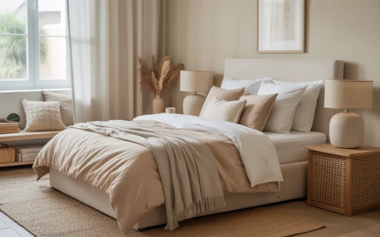
18 Living Room Color Scheme Ideas for Beautiful Decor
Picking a living room color scheme sounds simple until you are standing in the paint aisle with 40 swatches in your hand. The wall color sets the tone for everything else. Sofa, rug, curtains, even the art you already own. A good scheme pulls all of that together. A bad one fights it every single day.
The truth is, most living rooms need just two or three colors done well. Start with a base you will not get tired of, add one supporting tone, then one accent for personality. A tester pot of paint costs roughly 8 to 15 dollars, and repainting a living room runs roughly 200 to 400 dollars for paint and supplies, prices vary by brand and room size. Soft goods are cheaper still. You can restyle a whole room for under a hundred dollars with new pillow covers, a throw, and a lamp shade.
Below are 18 living room color scheme ideas that actually work in real homes, not just in staged photos. If blue is calling your name, browse these blue living room color schemes for more focused inspiration. Each idea below names the exact tones to use, where to put them, and what to buy to get the look without overspending.
This post contains affiliate links. If you buy through them, I may earn a small commission at no extra cost to you.
1. Beige and White Calm Elegance
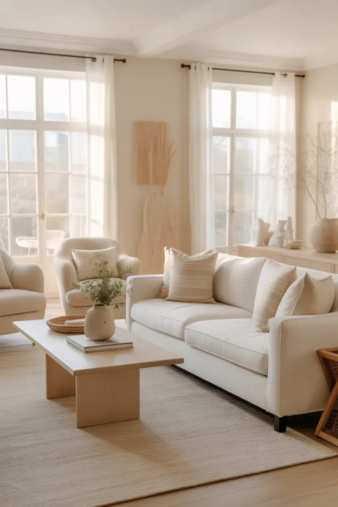
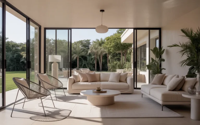
Beige and white is the calmest pairing in the book, and that is exactly why it never goes out of style. Start with the walls: a warm beige on the walls gives the room depth while white trim and ceilings keep it fresh. This combination hides everyday dust well and makes small living rooms feel noticeably bigger, which is why it shows up in so many real homes.
The budget move: Keep the furniture close to this palette but vary the textures so nothing looks flat. A beige linen sofa with white cotton throws reads cozy, not boring, once you add a jute rug underfoot. Layering a white area rug over a larger beige one costs roughly 60 to 150 dollars, prices vary by size and material. The trick is contrast in texture, not color. Wood, linen, and wool in the same neutral family always look intentional.
One honest warning: beige on beige can look washed out in rooms with north-facing windows, which cast a cooler light. Add one warm metal accent, like a brass lamp or a walnut side table, to give the eye somewhere to land. Paint chips always look different at home than under store lights, so test a large swatch on your own wall before committing to a full gallon.
- Paint walls a warm beige and keep ceilings and trim bright white for contrast
- Layer two neutral rugs in different textures to define the seating area
- Add one warm metal accent, like brass or aged bronze, for depth
Shop This Look
| RUGS | PILLOWS | LIGHTING |
|---|---|---|
| Beige Area Rug 8×10 | Beige Linen Throw Pillow Covers | Brass Floor Lamp Living Room |
| Shop → | Shop → | Shop → |
2. Gray and Mustard Modern Contrast
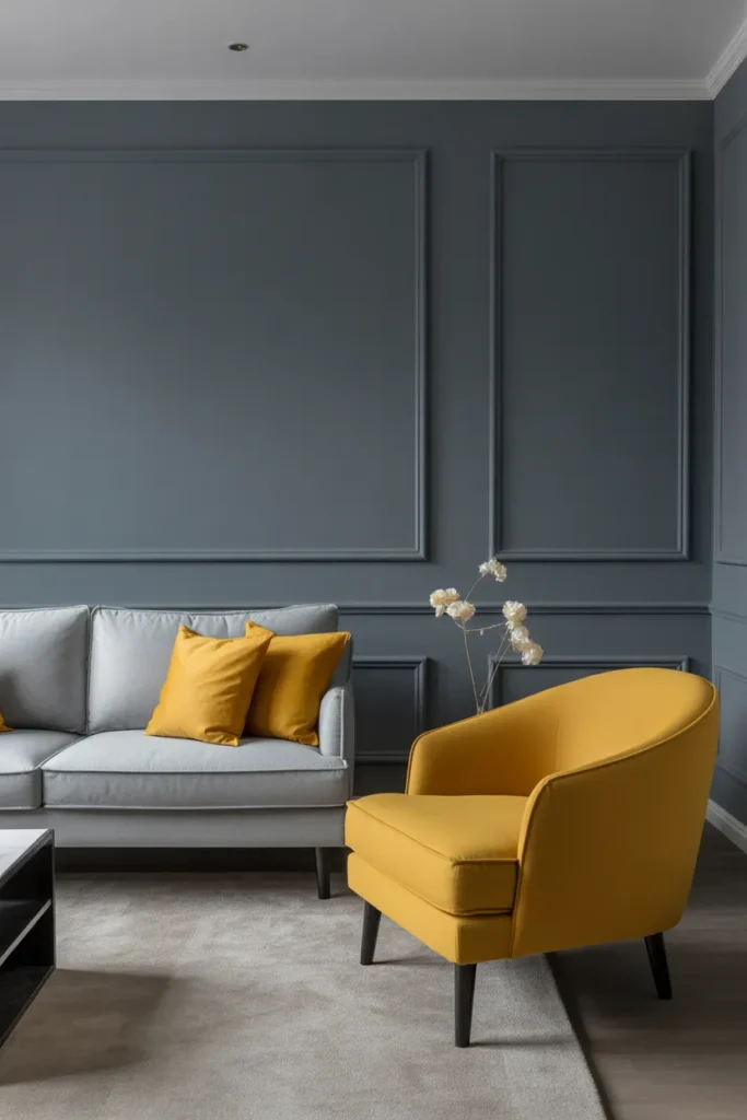
Gray and mustard is a pairing that sounds risky and looks fantastic. Let gray do the heavy lifting: use it on the sofa, the walls, or the rug as your steady base. Mustard then works as the spark, two or three accents are enough. A pair of mustard pillow covers or one bold armchair is plenty for a standard living room.
Pick warm gray: This scheme works best when the gray leans warm rather than blue, which keeps the room from feeling cold. A set of mustard yellow throw pillow covers costs roughly 20 to 40 dollars, prices vary by fabric and set size. That tiny spend can carry the entire color story. Pair the mustard with natural wood tones and the look feels curated instead of random.
Be careful with mustard in rooms that get a lot of warm afternoon sun. Too much yellow plus golden light can turn the whole room a bit muddy. If that happens, pull the mustard back to smaller items like a throw or a piece of art, and keep the bigger pieces gray. Also, mustard is a strong color, so live with the pillows for a week before painting anything to match them.
- Use warm gray on large pieces like the sofa, rug, or walls
- Limit mustard to two or three accents so it stays a highlight
- Pair with natural wood furniture to ground the contrast
Shop This Look
| PILLOWS | RUGS | LIGHTING |
|---|---|---|
| Mustard Yellow Throw Pillow Covers | Gray Area Rug Living Room | Modern Table Lamp Gray |
| Shop → | Shop → | Shop → |
3. Blue and White Coastal Freshness
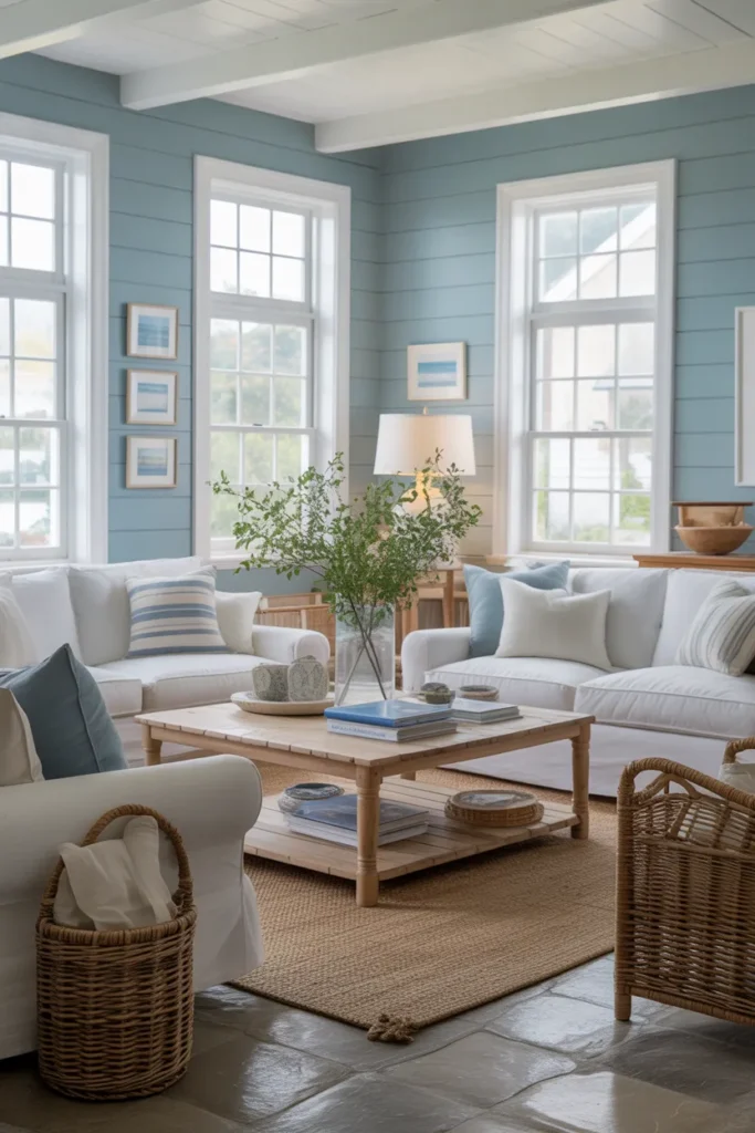
Blue and white reads clean and calm without feeling cold, which is why coastal style keeps coming back. Keep white dominant: white walls, a white or cream sofa, and light curtains do most of the work. Blue then appears in layers, a striped rug, navy pillows, a piece of art over the sofa. The room feels airy first and beachy second.
Skip the theme decor: You do not need to live near the ocean to pull this off. The key is restraint with the theme. Skip the anchor prints and starfish decor, and stick to the two colors plus natural textures like rattan and driftwood-toned frames. A blue and white coastal area rug costs roughly 50 to 130 dollars, prices vary by size and quality. It anchors the whole scheme in one purchase.
One practical tip: pure white upholstery is a commitment if you have kids or pets. Choose a performance fabric or a washable slipcover from the start rather than learning this the hard way. Also, very dark navy walls can shrink a small room visually, so in tight spaces keep the navy on textiles and let the walls stay white or pale blue.
- Keep white dominant on walls, sofa, and curtains for an airy base
- Layer blue through the rug, pillows, and one piece of wall art
- Add rattan or light wood textures instead of literal beach decor
Shop This Look
| PILLOWS | RUGS | CURTAINS |
|---|---|---|
| Blue White Throw Pillow Covers | Blue White Coastal Area Rug | White Linen Curtains Living Room |
| Shop → | Shop → | Shop → |
4. Green and Cream Natural Harmony
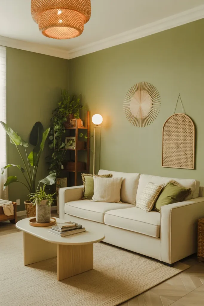
Green and cream brings the outside in without any effort. Use cream as your canvas: cream walls, a cream sofa, and light curtains make the green pieces pop. Then bring green in through plants, a sage throw, or an olive accent chair. The combination feels fresh and grounded at the same time.
Repeat one green: Real plants do double duty here. They are decor and they are the green in your scheme, so a few well-placed pots can replace an accent chair entirely. A set of indoor plant pots costs roughly 25 to 60 dollars, prices vary by size and material. If your thumb is not green, good artificial plants in ceramic pots read just as well from across the room.
One warning: mixing too many shades of green can look messy instead of natural. Pick one green, sage or olive or forest, and repeat it three times in the room. A plant, a pillow, and a throw in the same family tie everything together. And keep green away from yellow-toned cream walls, the mix can turn the green slightly murky.
- Use cream on walls and large furniture as the base
- Repeat one shade of green at least three times in the room
- Use real or quality artificial plants as part of the color scheme
Shop This Look
| THROWS | PILLOWS | PLANTS |
|---|---|---|
| Sage Green Throw Blanket | Cream Throw Pillow Covers | Indoor Plant Pots Set |
| Shop → | Shop → | Shop → |
5. Black and White Chic Minimalism
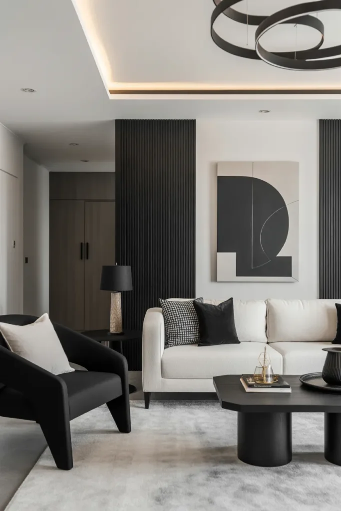
Black and white is the most decisive scheme you can choose. Balance the two on purpose: about 70 percent white and 30 percent black keeps the room crisp instead of cave-like. A white sofa with black picture frames, a black coffee table, and one graphic rug gives you the full effect without any guesswork.
Mind the upkeep: This scheme is forgiving because every new purchase either fits or it does not, which makes shopping simple. A black and white graphic area rug costs roughly 40 to 120 dollars, prices vary by size and pile height. Add pattern through the rug and the throw pillows so the flat black and white surfaces do not read as stark. Stripes, chevrons, or a simple geometric print all work.
The honest downside is maintenance. White shows everything, and black shows dust. In a real, lived-in home, choose white slipcovers you can wash and black pieces with a matte finish that hides fingerprints. Also, a strictly black and white room can feel cold in winter, so keep a warm throw blanket in a neutral tone nearby for the colder months.
- Aim for roughly 70 percent white and 30 percent black across the room
- Add pattern through the rug and pillows to keep flat surfaces lively
- Choose washable white fabrics and matte black finishes for real life
Shop This Look
| RUGS | PILLOWS | ART |
|---|---|---|
| Black White Area Rug | Black White Geometric Throw Pillows | Black White Abstract Wall Art |
| Shop → | Shop → | Shop → |
6. Navy Blue and Gold Luxury Style
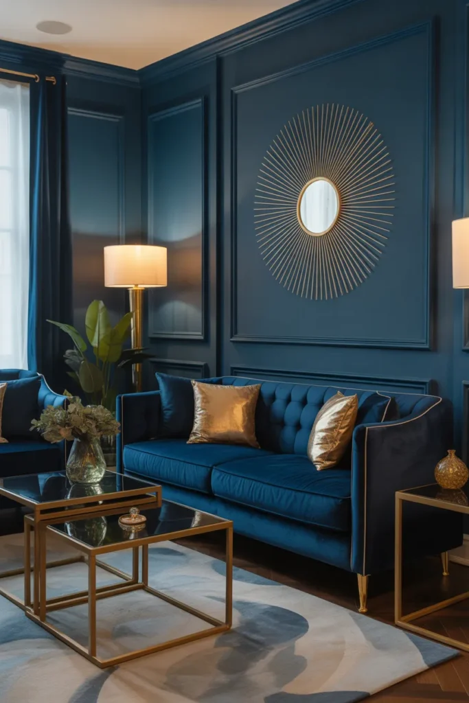
Navy and gold is the fastest route to a living room that feels expensive. Let navy take the big surfaces: a navy sofa, navy curtains, or a navy accent wall does the heavy lifting. Gold then appears in small doses, a lamp base, a mirror frame, a tray on the coffee table. The gold reads as luxury only when it is used sparingly.
Use velvet: Velvet is the fabric that makes this scheme sing. Navy velvet pillows or a velvet ottoman catch the light in a way flat fabrics cannot. A pair of navy blue velvet throw pillows costs roughly 25 to 50 dollars, prices vary by brand and fill. Mix in crisp white or cream somewhere, like a throw or the rug, so the navy and gold have room to breathe.
A practical warning: navy is a dark color that shows lint and pet hair, especially on velvet. Keep a lint roller in the side table drawer and vacuum upholstered pieces weekly. Also, too many gold finishes in different tones, brass plus chrome plus rose gold, can look cluttered, so pick one metal tone and repeat it.
- Use navy on big surfaces like the sofa, curtains, or one wall
- Add gold in small doses through lighting, frames, and trays
- Stick to one metal tone instead of mixing several golds
Shop This Look
| PILLOWS | LIGHTING | CURTAINS |
|---|---|---|
| Navy Blue Velvet Throw Pillows | Gold Table Lamp Living Room | Navy Blue Curtains Living Room |
| Shop → | Shop → | Shop → |
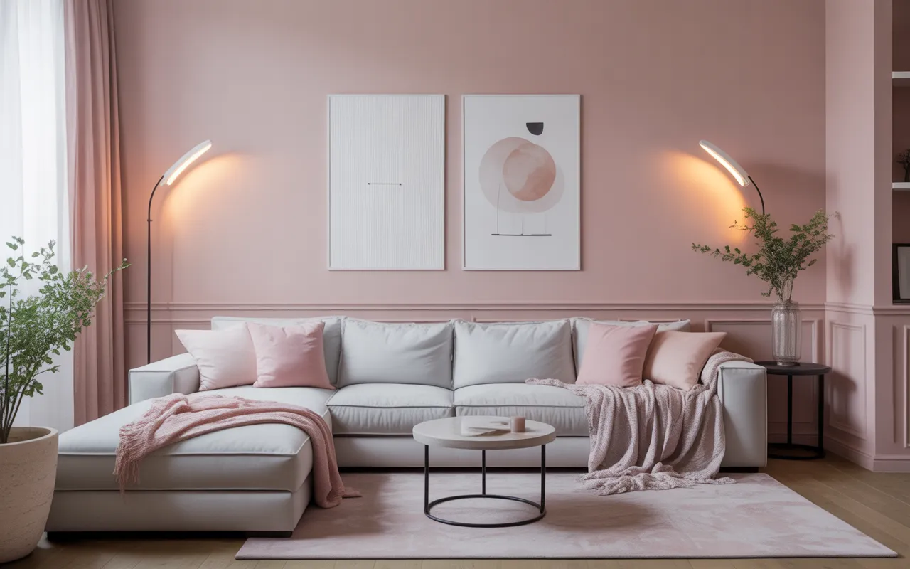
7. Soft Pink and Gray Modern Comfort
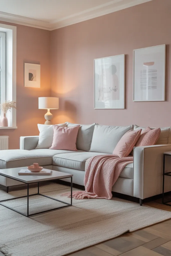
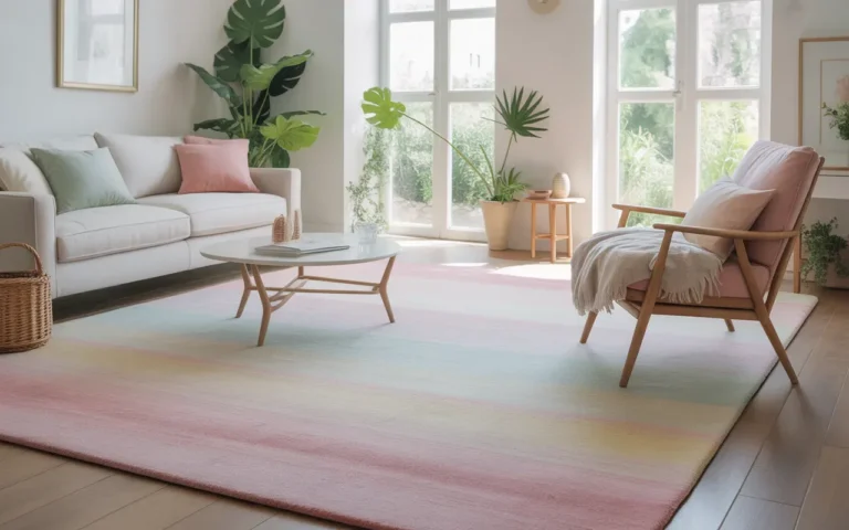
Soft pink and gray is a gentle pairing that works in far more homes than people expect. Keep the pink dusty, not bright: blush and mauve tones act like neutrals and pair beautifully with warm gray. Use gray on the sofa or the walls, then layer the pink through pillows, a throw, and maybe one piece of art.
Test in your light: This scheme is easy to live with because both colors recede instead of demanding attention. A set of blush pink throw pillow covers costs roughly 20 to 35 dollars, prices vary by fabric. Add a gray knit throw blanket and the room feels pulled together for under 60 dollars total. White accents, like a white rug or white lamp shades, keep the pink from turning the room too sweet.
One thing to watch: pink undertones shift a lot in different light. A blush that looks perfect at noon can read slightly orange under warm evening bulbs. Test your pillow covers or paint swatches under both daylight and your evening lighting before you buy the full set. And if the room starts feeling too soft, one black frame or dark wood piece adds just enough edge.
- Choose dusty blush or mauve tones rather than bright pink
- Use gray on the sofa or walls as the steady base
- Add white or black accents to balance the softness
Shop This Look
| PILLOWS | THROWS | RUGS |
|---|---|---|
| Blush Pink Throw Pillow Covers | Gray Knit Throw Blanket | Light Gray Area Rug |
| Shop → | Shop → | Shop → |
8. Terracotta and Cream Warm Earth Tones
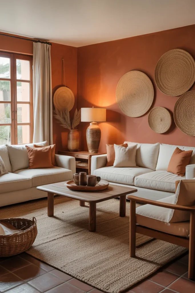
Terracotta and cream feels like warm sunlight even on a gray day. Build on a cream base: cream walls and a cream or beige sofa keep the room bright. Terracotta comes in through pillows, clay pots, a rug pattern, or a painted accent wall. The warmth is instant and hard to get wrong.
Switch the bulbs: This is one of the most forgiving schemes for mixing materials. Clay, wood, rattan, and linen all belong in the same family here. A set of terracotta throw pillow covers costs roughly 22 to 40 dollars, prices vary by fabric and size. Add a couple of terracotta vases or planters and you have layered the color three times, which is the rule that makes any scheme look deliberate.
The warning with terracotta is about lighting. Under very cool LED bulbs it can look dull and brownish instead of warm. Switch to warm white bulbs, around 2700K, and the terracotta glows the way you want it to. Also, a full terracotta accent wall is a big commitment, so try the color in pillows and decor first and paint only if you still love it in a month.
- Keep walls and large furniture cream for a bright base
- Repeat terracotta at least three times through textiles and decor
- Use warm white bulbs around 2700K so the terracotta glows
Shop This Look
| PILLOWS | DECOR | RUGS |
|---|---|---|
| Terracotta Throw Pillow Covers | Terracotta Vase Set | Cream Area Rug Living Room |
| Shop → | Shop → | Shop → |
9. Teal and Gold Bold Elegance
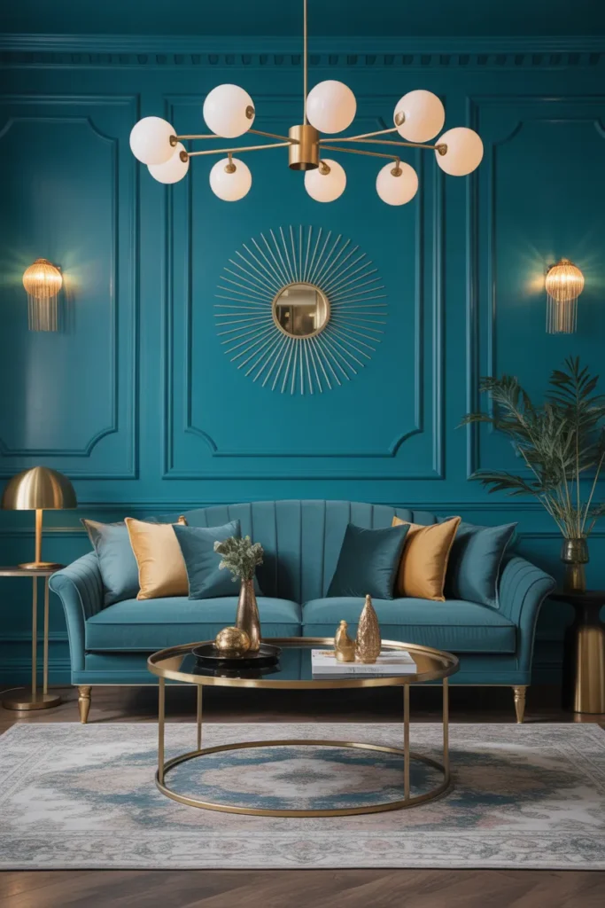
Teal and gold is bold in the best way. It has depth, richness, and just enough drama. Anchor with teal: a teal velvet sofa, teal curtains, or a teal accent wall sets the stage. Gold then lights it up through lighting fixtures, frame edges, and small decor pieces. The two colors make each other look better.
Keep the rest quiet: Because teal is a strong color, the rest of the room should stay quiet. Cream or warm white on the remaining walls and a neutral rug keep the teal from overwhelming the space. A set of teal velvet throw pillows costs roughly 25 to 45 dollars, prices vary by brand. If a full teal sofa feels like too much, start with pillows and curtains and see how you feel.
Be honest about your room’s light before choosing teal for the walls. In a dark room, deep teal can read almost black by evening. Test a large swatch and look at it at night with your lamps on. If it goes too dark, use teal on furniture instead and keep the walls a lighter shade. Gold also needs light to shine, so place gold pieces where they catch daylight or lamp light.
- Anchor the room with teal on the sofa, curtains, or one wall
- Keep remaining walls cream or warm white for balance
- Place gold pieces where they catch daylight or lamp light
Shop This Look
| PILLOWS | LIGHTING | ART |
|---|---|---|
| Teal Velvet Throw Pillows | Gold Arc Floor Lamp | Teal Abstract Wall Art |
| Shop → | Shop → | Shop → |
10. Brown and Ivory Classic Warmth
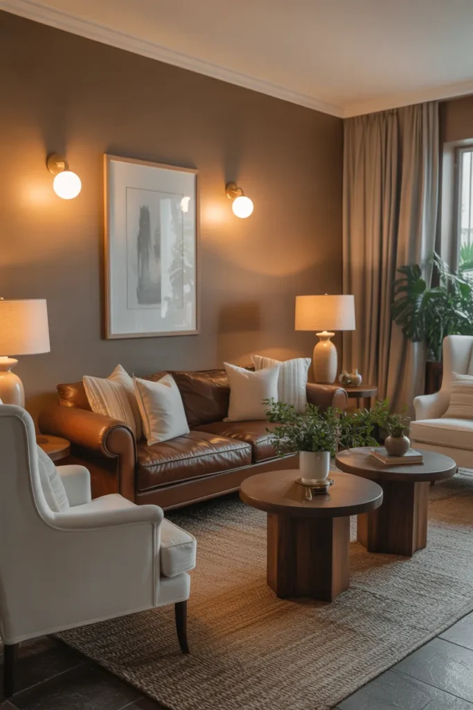
Brown and ivory is a classic for a reason. It is warm, welcoming, and almost impossible to mess up. Let brown ground the room: a brown leather sofa, brown wood furniture, or a brown rug gives the space its backbone. Ivory then lifts everything, ivory walls, ivory curtains, ivory throws. The contrast is gentle but clear.
Light the windows: This scheme suits homes with lots of wood, since brown furniture blends right in. An ivory knit throw blanket costs roughly 25 to 55 dollars, prices vary by material and size. Drape one over the arm of a brown sofa and add two ivory pillows, and the sofa suddenly looks styled instead of just placed. Natural light makes this pairing glow, so keep window treatments light.
The risk here is heaviness. Too much dark brown with not enough ivory can make a room feel dated and dim. If your room leans dark, flip the ratio and let ivory take the lead on the rug and curtains. Also, brown leather needs conditioning once or twice a year to stay supple, so factor that small maintenance into your decision.
- Let brown ground the room through the sofa or wood furniture
- Use ivory generously on walls, curtains, and throws to lift the space
- Keep window treatments light so natural light reaches the room
Shop This Look
| THROWS | PILLOWS | LIGHTING |
|---|---|---|
| Ivory Knit Throw Blanket | Brown Throw Pillow Covers | Wooden Table Lamp |
| Shop → | Shop → | Shop → |
11. Olive Green and Beige Natural Balance
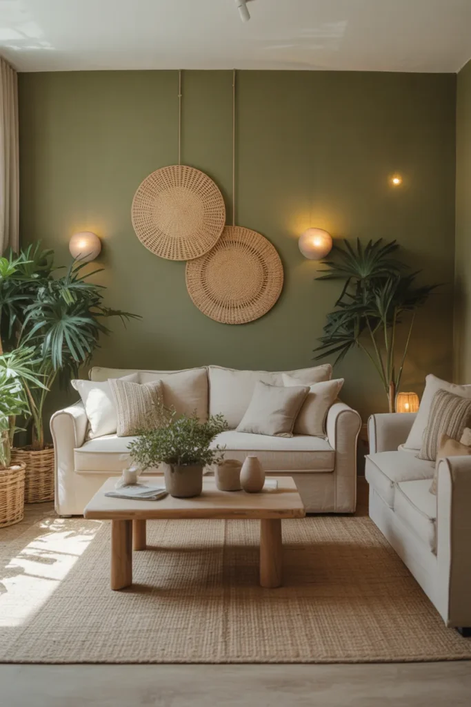
Olive green and beige feels earthy and calm, like a walk through dry grass and leaves. Use beige as the foundation: beige walls and a beige sofa or rug set a neutral stage. Olive green then steps in as the accent color on pillows, a throw, an accent chair, or curtains. The room feels grounded without being dark.
Test the olive: Olive is a chameleon color that shifts with the light, sometimes reading green, sometimes reading brown. That is part of its charm. A set of olive green throw pillow covers costs roughly 20 to 40 dollars, prices vary by fabric. Pair them with natural materials like woven baskets, jute, and light wood, and the whole room feels organic and collected over time.
Because olive shifts in different light, test it in your actual room before committing to large pieces. What looks like a rich olive in the store can read muddy under certain bulbs. Bring a pillow home first and check it morning and evening. If you love it, then go bigger with curtains or an accent chair in the same family.
- Use beige on walls and large furniture as the foundation
- Add olive through pillows, throws, or one accent chair
- Pair with woven baskets, jute, and light wood for an organic feel
Shop This Look
| PILLOWS | THROWS | DECOR |
|---|---|---|
| Olive Green Throw Pillow Covers | Beige Throw Blanket | Woven Storage Baskets |
| Shop → | Shop → | Shop → |
12. Charcoal and White Modern Sophistication
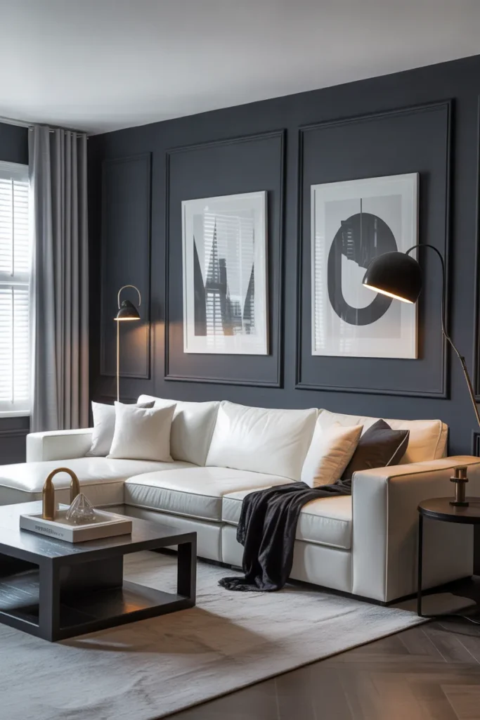
Charcoal and white is sharper than plain gray, and that edge is the whole point. Give charcoal a starring role: a charcoal sofa, charcoal curtains, or a charcoal accent wall makes the white around it look brighter. White walls with charcoal furniture is the easiest version, and it photographs beautifully.
Balance the ratio: This scheme suits modern and minimalist homes because the high contrast does the decorating for you. A charcoal gray area rug costs roughly 50 to 130 dollars, prices vary by size and quality. Layer it under a glass or light wood coffee table to keep the dark tones from feeling heavy. A few white pillows on the charcoal sofa complete the look in minutes.
The honest trade-off is that charcoal shows pet hair and lint, especially lighter colored hair. If you share your home with a cream-colored dog, plan on frequent vacuuming or choose a different scheme. Also, in rooms with little natural light, lean harder on the white, more white walls and lighter rugs, so the charcoal accents instead of dominates.
- Give charcoal a starring role on the sofa, curtains, or one wall
- Keep most walls and large surfaces white for brightness
- Use a glass or light wood coffee table to lighten dark tones
Shop This Look
| RUGS | PILLOWS | LIGHTING |
|---|---|---|
| Charcoal Gray Area Rug | White Throw Pillow Covers | Modern Floor Lamp Black |
| Shop → | Shop → | Shop → |
13. Sage Green and White Soft Serenity
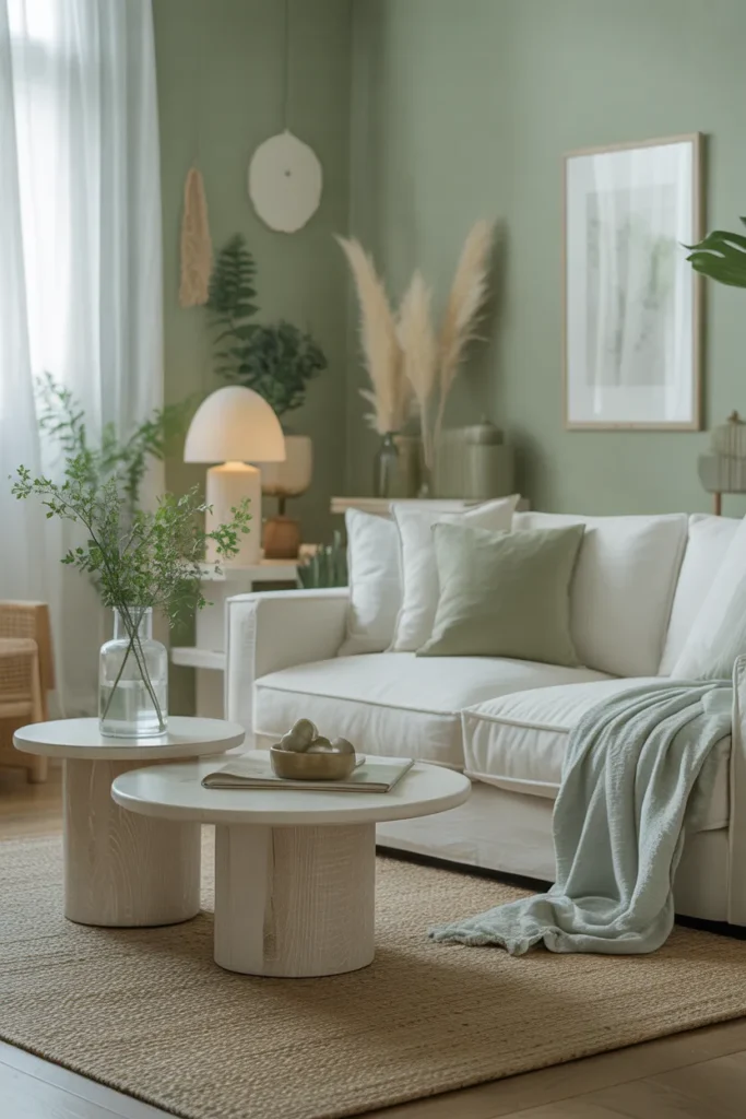
Sage green and white is the softest green scheme you can choose, and it suits almost any style. Paint is the cheapest entry point: sage on the walls with white trim instantly changes the mood of a room. If painting feels like too much, sage pillows and curtains against white walls get you 80 percent of the way there.
Check each wall: Sage works especially well in living rooms that open to the outdoors, because it echoes the view through the windows. A set of sage green throw pillow covers costs roughly 20 to 40 dollars, prices vary by fabric and count. White sheer curtains let light filter through while keeping the palette airy. Add one natural wood piece, like an oak side table, to keep the scheme from feeling too cool.
One caution: sage can read gray or even slightly blue in north-facing rooms. If your living room gets cool light, choose a sage with warm undertones, sometimes labeled warm sage or eucalyptus. Test a swatch on each wall, since the same paint can look different on the wall facing the window versus the wall beside it.
- Paint walls sage with white trim, or use sage textiles against white walls
- Hang white sheer curtains to keep the palette light and airy
- Add one natural wood piece to warm up the cool tones
Shop This Look
| PAINT | PILLOWS | CURTAINS |
|---|---|---|
| Sage Green Interior Wall Paint | Sage Green Throw Pillow Covers | White Sheer Curtains |
| Shop → | Shop → | Shop → |
14. Burgundy and Gold Elegant Warmth
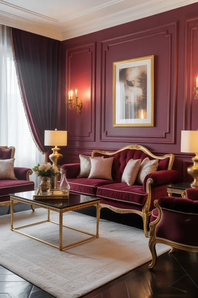
Burgundy and gold feels rich and a little bit traditional, in a good way. Use burgundy as the depth color: burgundy velvet pillows, a burgundy throw, or burgundy curtains against neutral walls. Gold then appears in frames, lamp bases, and candle holders. The combination reads elegant without trying too hard.
Limit the burgundy: This scheme shines in fall and winter, when the deep red tones feel right at home. A pair of burgundy velvet throw pillows costs roughly 25 to 45 dollars, prices vary by brand. Keep the walls neutral, warm white or soft beige, so the burgundy and gold have a quiet background to stand out against. A cream rug underfoot keeps the whole thing from feeling too heavy.
Be measured with burgundy. It is a strong color, and too much of it can make a small room feel closed in. Limit it to textiles and decor rather than walls or a whole sofa, unless the room is large. Also, match your golds. Mixing antique brass with shiny gold cheapens the look, so pick one finish and repeat it.
- Use burgundy on pillows, throws, and curtains rather than walls
- Keep walls warm white or soft beige as a quiet background
- Match your gold finishes instead of mixing different tones
Shop This Look
| PILLOWS | LIGHTING | CANDLES |
|---|---|---|
| Burgundy Velvet Throw Pillows | Gold Floor Lamp | Gold Candle Holders Set |
| Shop → | Shop → | Shop → |
15. Sky Blue and Light Gray Airy Style
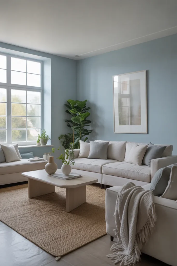
Sky blue and light gray is one of the airiest combinations you can pick. Let gray be the structure: a light gray sofa, gray rug, or gray walls form the base. Sky blue then floats on top through pillows, a throw, curtains, or art. The result feels open and calm, perfect for small living rooms.
Add one deeper tone: Both colors are light enough that you can use them generously without the room feeling busy. A set of light blue throw pillow covers costs roughly 18 to 35 dollars, prices vary by fabric. Pair with white curtains and a light gray rug, and you have a full scheme for very little money. This pairing also photographs well, if that matters to you.
The practical note here is about contrast. Sky blue and light gray are so close in value that the room can look flat if everything is the same lightness. Add one slightly deeper element, a medium gray throw or a deeper blue pillow, to give the eye something to rest on. And as always, check your blue swatches in your own light before painting.
- Use light gray on the sofa, rug, or walls as the structure
- Layer sky blue through pillows, throws, and curtains
- Add one slightly deeper element for contrast and depth
Shop This Look
| PILLOWS | THROWS | ART |
|---|---|---|
| Light Blue Throw Pillow Covers | Gray Throw Blanket | Light Blue Wall Art |
| Shop → | Shop → | Shop → |
16. Lavender and White Soft Elegance
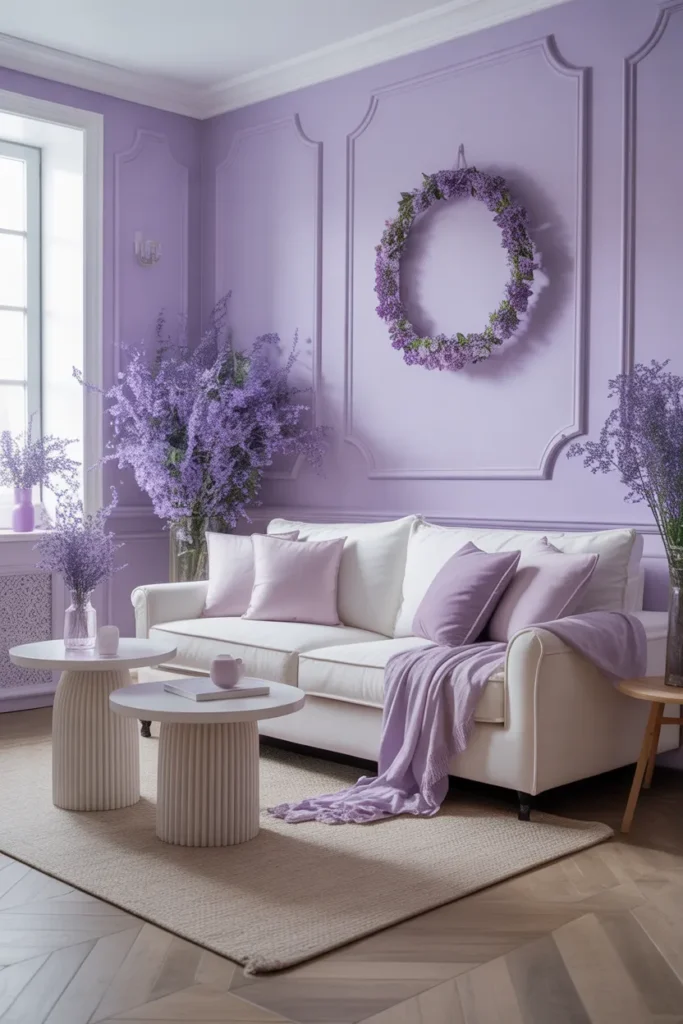
Lavender and white is soft without being childish, when you get the shade right. Choose a muted lavender: grayish or dusty purples read elegant, while bright purples read loud. Use white on the walls and large furniture, then bring lavender in through pillows, a throw, candles, or a single accent chair.
Match the lavenders: This scheme suits bedrooms too, but in a living room it works best when lavender is the accent, not the star. A set of lavender throw pillow covers costs roughly 20 to 35 dollars, prices vary by fabric. Silver or light wood accents complement lavender better than gold, which can clash with the cool undertones. Keep it simple and let the softness carry the room.
The warning: lavender undertones vary wildly between brands. One company’s lavender reads pink, another’s reads blue. If you are buying pillows, a throw, and candles, try to buy them from the same brand or at least compare them side by side in your home. Mismatched lavenders are the fastest way to make this scheme look accidental.
- Choose muted, dusty lavender rather than bright purple
- Keep white on walls and large furniture, lavender as the accent
- Pair with silver or light wood accents instead of gold
Shop This Look
| PILLOWS | CANDLES | THROWS |
|---|---|---|
| Lavender Throw Pillow Covers | Lavender Scented Candles | White Throw Blanket |
| Shop → | Shop → | Shop → |
17. Dark Green and Gold Sophisticated Style
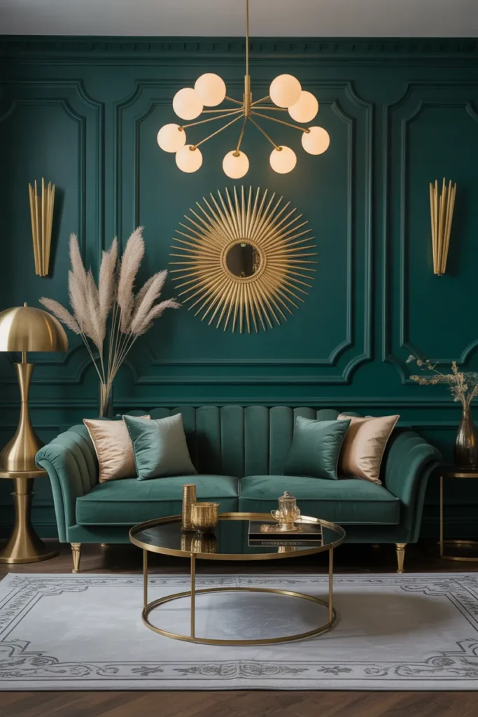
Dark green and gold is the moodiest scheme on this list, and one of the most rewarding. Commit to the green: deep emerald or forest green on the walls, the sofa, or the curtains creates a cocoon-like feel. Gold accents, a brass lamp, a gilt mirror, gold picture frames, catch the light and keep the green from feeling flat.
Light it well: This scheme works best in rooms where you want coziness over brightness. A pair of dark green velvet throw pillows costs roughly 25 to 50 dollars, prices vary by brand and fill. If a full green wall feels risky, paint just the wall behind the sofa, or use a green velvet sofa against warm white walls. Cream or beige rugs keep the floor light under all that depth.
Dark green absorbs a lot of light, so lighting matters more here than in any other scheme on this list. Plan for at least three light sources in the room, overhead plus a floor lamp plus a table lamp, all with warm bulbs. Without enough light, even the prettiest dark green reads as muddy brown by evening.
- Use deep emerald or forest green on walls, sofa, or curtains
- Add gold accents that catch light, like brass lamps and gilt frames
- Plan at least three warm light sources to keep the green rich
Shop This Look
| PILLOWS | LIGHTING | ART |
|---|---|---|
| Dark Green Velvet Throw Pillows | Brass Table Lamp | Gold Framed Wall Art |
| Shop → | Shop → | Shop → |
18. Cream and Light Wood Scandinavian Simplicity
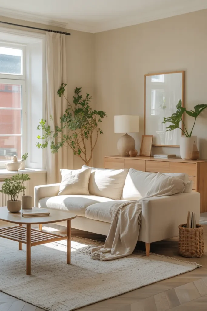
Cream and light wood is the heart of Scandinavian style, and it works because it is so simple. Keep it pale: cream walls, cream upholstery, and light oak or birch furniture. The wood grain becomes the pattern in the room, so you do not need much else. A sheepskin throw or a white knit blanket adds softness.
Edit ruthlessly: The beauty of this scheme is how little you need to buy. A cream jute area rug costs roughly 40 to 100 dollars, prices vary by size. Add a light wood picture frame set and one good floor lamp, and the room is essentially done. The style rewards restraint, so edit out anything that does not earn its place. Every item should be useful or beautiful, ideally both.
The honest downside is that very pale rooms can feel unfinished if you go too minimal. Add texture, not color, to fix that. Linen curtains, a wool rug, a knit throw, and a sheepskin give the eye plenty to enjoy without breaking the palette. And since everything is light, choose washable fabrics where you can, especially on seating.
- Keep walls, upholstery, and curtains cream or white
- Use light oak or birch furniture so the wood grain is the pattern
- Add texture through linen, wool, and sheepskin instead of color
Shop This Look
How to Start
The easiest way to start is not with paint. It is with one thing you already own and love, a rug, a piece of art, even a favorite pillow. Pull two or three colors out of that one item and build your scheme around them. This guarantees your colors already work together, because they came from the same source. Then test everything in your own light before you spend real money.
Before your first shopping trip, decide your ratio. A simple formula that works for every scheme on this list: 60 percent base color, 30 percent supporting color, 10 percent accent. The base goes on walls and the sofa. The supporting color goes on the rug, curtains, and big textiles. The accent goes on pillows, art, and small decor. Write your three colors on your phone and shop to the list, not to your impulses.
Your first trip can cost under 60 dollars and still change the room. You are buying textiles and small decor only, nothing big. Start with pillow covers in your accent color, then a throw in your supporting color, then one small decor piece like a candle holder or a vase. If those three items look right together in your room, your scheme is solid and you can invest in the bigger pieces with confidence.
- Buy two pillow covers in your accent color, roughly 15 to 25 dollars for the pair
- Buy one throw blanket in your supporting color, roughly 25 to 35 dollars
- Buy one small decor piece like a vase or candle holder, roughly 10 to 15 dollars
Shop This Look
| PILLOWS | THROWS | DECOR |
|---|---|---|
| Neutral Throw Pillow Covers 2 Pack | Cozy Throw Blanket | Ceramic Vase Set |
| Shop → | Shop → | Shop → |
Common Mistakes
- Choosing paint from a tiny chip: a one-inch chip looks completely different spread across a wall. Always test with a sample pot or a large swatch taped to the wall.
- Judging colors under store lighting: fluorescent store lights distort every color. Check every swatch in your own room, in daylight and at night with your lamps on.
- Using too many accent colors: three accents become a rainbow, not a scheme. Pick one accent color and repeat it at least three times.
- Forgetting the undertones: a gray with blue undertones next to a gray with brown undertones will clash even though both are “gray.” Compare swatches side by side.
- Painting before choosing textiles: paint comes in thousands of colors, but that perfect rug comes in three. Choose the rug, pillows, and art first, then match the paint.
- Ignoring the fixed elements: your floor, fireplace, and trim are not changing. Your scheme has to work with them, so hold every swatch against the floor before deciding.
- Skipping the finish: flat paint hides wall flaws but marks easily, while satin wipes clean but shows every bump. In a busy living room, eggshell is usually the right middle ground.
Frequently Asked Questions
How many colors should a living room color scheme have?
Two or three is the sweet spot for most living rooms. One base color, one supporting color, and one accent is a formula that rarely fails. You can add small doses of black, white, or natural wood on top without breaking the scheme, since those act as neutrals.
Should the living room match the rest of the house?
It does not need to match, but it should not clash when you see one room from another. Repeating one neutral, like warm white or natural wood tones, through connected rooms creates flow even when each room has its own personality.
What is the safest living room color scheme for resale?
Warm neutrals, beige, cream, soft gray, and white, appeal to the widest range of buyers. If you love bold color, keep it in textiles and art that you can take with you, and keep the walls neutral.
How do I pick a scheme for a dark living room?
Lean on light-reflecting colors. Warm whites, creams, and pale tones bounce what little light you have around the room. If you want a dark accent wall, paint it the wall that gets the most natural light so it does not swallow the room.
Can I mix warm and cool colors in one living room?
Yes, and the best schemes often do. The trick is a clear ratio, roughly 70 percent of one temperature and 30 percent of the other. A warm beige room with a few cool blue accents feels balanced, while a 50-50 split can feel unresolved.
The Finishing Touch
A color scheme only works when you commit to it. The biggest difference between a room that looks designed and one that looks random is repetition. Pick your two or three colors and repeat each one at least three times around the room. A navy pillow here, navy curtains there, and a navy piece of art on the wall. That is what makes a scheme feel intentional instead of accidental.
Start small and build up. Pillow covers, a throw, and one piece of art can test a whole scheme for under a hundred dollars. If you love how those pieces look together in your own light, then go bigger with a rug, curtains, or paint. And give yourself permission to adjust. Most good rooms were not finished in a day. They were layered over weeks as the owner figured out what the space wanted.
Your living room is the room you live in the most, so choose colors that make you feel the way you want to feel at home. Calm, energized, cozy, sophisticated, whatever that is for you. The schemes above are starting points, not rules. Take the one that speaks to you and make it yours. For more professional guidance on choosing the right color for your space, read Houzz’s guide to finding the right living room color.