24 Dopamine Decor Bathroom Ideas with Bold Color
Dopamine decor is a simple idea. You use color, pattern and small playful details on purpose, so the bathroom feels good to walk into instead of just clean and plain.
A bathroom is a good place to try it. The room is small, so one painted wall, one set of tiles or one bright cabinet changes the whole feel without a full remodel. Most of these ideas work in a rental too, if you stick to paint, textiles and accessories.
The 24 ideas below go from full color walls to smaller moves like colored fixtures and mosaic tile. Pick one strong color first, live with it for a bit, and then decide if the room needs more.
This post contains affiliate links. If you buy through them, I may earn a small commission at no extra cost to you.
1. Bright Yellow Accent Walls for Energizing Vibes
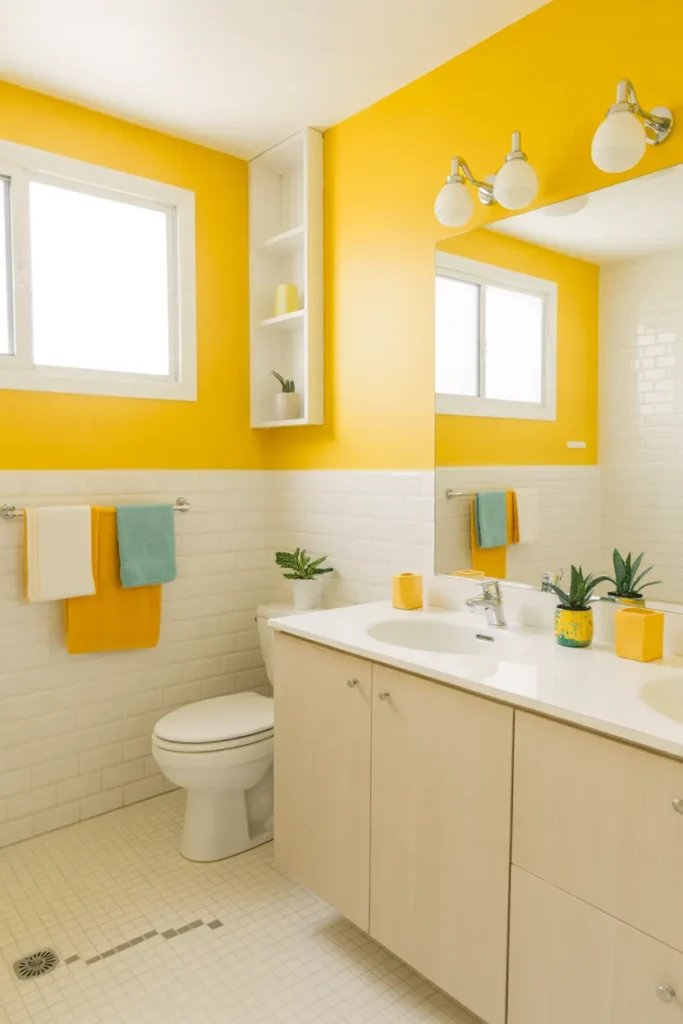
A yellow accent wall is the fastest way to change the mood of a plain bathroom. Put it behind the vanity or opposite the door so you see it as soon as you walk in. In a small room with weak natural light, yellow does a lot of the work that extra lighting would normally do.
Pick the right wall: Paint only one wall and keep the other walls white or very pale. Use a bathroom paint in satin or semi gloss so steam and splashes wipe off easily. Test a large swatch first, because yellow looks brighter on a full wall than it does on a small card.
Keep the rest calm: Let the wall be the loud part. White towels, a light floor and simple chrome or black fittings stop the room from feeling busy. Add one small yellow item, like a soap dish, so the color looks planned rather than random.
- Paint one wall only and leave the rest neutral
- Use moisture resistant bathroom paint in satin or semi gloss
- Repeat the yellow once in a small accessory
Shop This Look
2. Vibrant Teal Walls with Contrasting Fixtures

Teal walls give a bathroom depth without making it feel dark, as long as the fittings contrast with them. White sanitaryware, light wood and brushed brass or chrome all stand out well against teal. It suits both a main bathroom and a small powder room.
Balance it with contrast: Pair teal with a white ceiling and a light floor so the room still feels open. If every surface goes dark, a small bathroom starts to feel closed in. A large mirror helps too, because it bounces light back into the room.
Choose fittings carefully: Warm metals soften teal, while black fittings make it look sharper and more modern. Pick one metal finish and use it for the tap, towel rail and mirror frame. Mixed finishes make a strong color scheme look untidy fast.
- Keep the ceiling and floor light against teal walls
- Use one metal finish throughout the room
- Add a large mirror to reflect light back
Shop This Look
3. Coral Statement Walls for Playful Energy
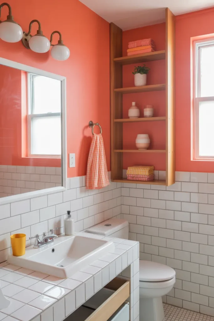
Coral sits between pink and orange, so it feels warm without being as intense as red. A coral statement wall works well behind a white bath or a simple vanity. It also flatters skin tones in the mirror, which is a practical bonus in a bathroom.
Start with one wall: One coral wall is usually enough. Paint the wall behind the bath or the vanity and keep the remaining walls soft white. If you are unsure, try coral on towels and a bath mat first and live with it for a week.
Soften it with texture: Coral looks better with natural texture next to it. Woven baskets, a wooden stool and plain linen towels stop it from looking flat. Avoid adding two or three more bright colors, or the room loses its focus.
- Use coral on a single statement wall
- Test the color first with towels and a bath mat
- Add wood and woven texture to soften the look
Shop This Look
4. Bold Fuchsia Accents with Minimalist Design
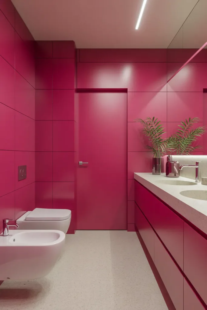
Fuchsia is strong, so this idea uses it in accents rather than on every wall. A fuchsia vanity front, mirror frame or set of towels against a plain background reads as deliberate and tidy. The minimalist base is what makes the color work.
Keep the base simple: Start with white or pale grey walls, a plain floor and uncluttered surfaces. Then add fuchsia in two or three places only. When everything else is quiet, even a very bright color looks controlled.
Limit the accents: Three touches are plenty, for example towels, a small stool and one piece of art. Store everyday bottles out of sight so labels do not compete with the color. If it feels like too much, remove one item rather than adding a softer color to fix it.
- Use fuchsia in two or three accents only
- Keep walls, floor and surfaces plain and clear
- Remove one item if the room starts to feel busy
Shop This Look
5. Electric Blue Tiles for High-Impact Energy
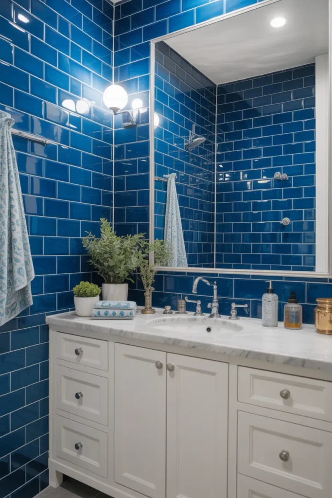
Electric blue tiles make a shower wall or splashback the main feature of the bathroom. Glossy tiles reflect light, so the blue stays bright instead of heavy. This is a permanent choice, so it suits a bathroom you plan to keep for a while.
Decide the tile area: Tile one zone well instead of spreading tile everywhere. A full shower wall or the wall behind the vanity gives the strongest effect for the cost. Use a pale grout if you want each tile to stand out, or a matching grout for a smoother block of color.
Plan the other finishes: Keep the remaining walls and floor plain so the tiles stay in charge. White or light grey works best. Choose tapware in chrome or black and avoid patterned towels, which fight with the tile for attention.
- Tile one zone, such as the shower or vanity wall
- Keep other walls and the floor plain
- Avoid patterned textiles next to strong tile
Shop This Look
6. Lime Green Walls for Fresh Energy
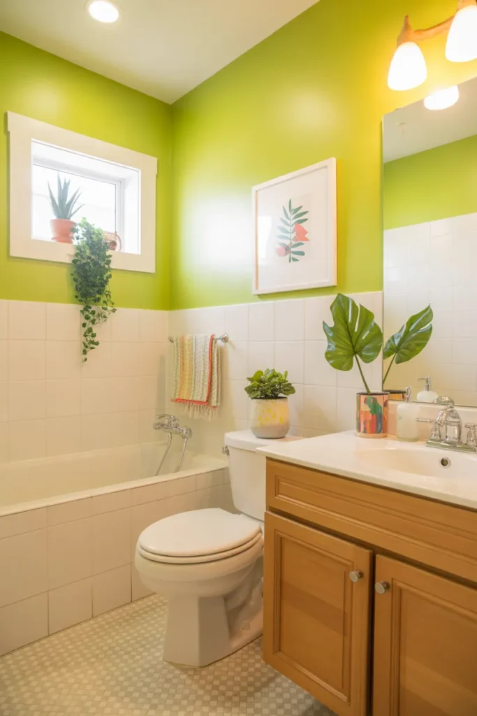
Lime green walls feel fresh and clean, which suits a bathroom. The color is bright, so it works best with plenty of white around it. A family bathroom or a guest bathroom that feels dull is a good candidate.
Control the brightness: Choose a lime with a little yellow in it rather than a harsh neon version. Paint the walls and keep the bath, basin and toilet white. Check the color in your bathroom light, because cool bulbs can make green look harder than it is.
Add natural touches: Wood, bamboo and a green plant all sit comfortably next to lime. They take the edge off the brightness without dulling it. Keep patterns small and simple, such as a striped towel, rather than a large print.
- Pick a yellow based lime, not a neon shade
- Keep sanitaryware and ceiling white
- Add wood, bamboo or a plant to soften it
Shop This Look
7. Tangerine Walls for Warm Vibrancy
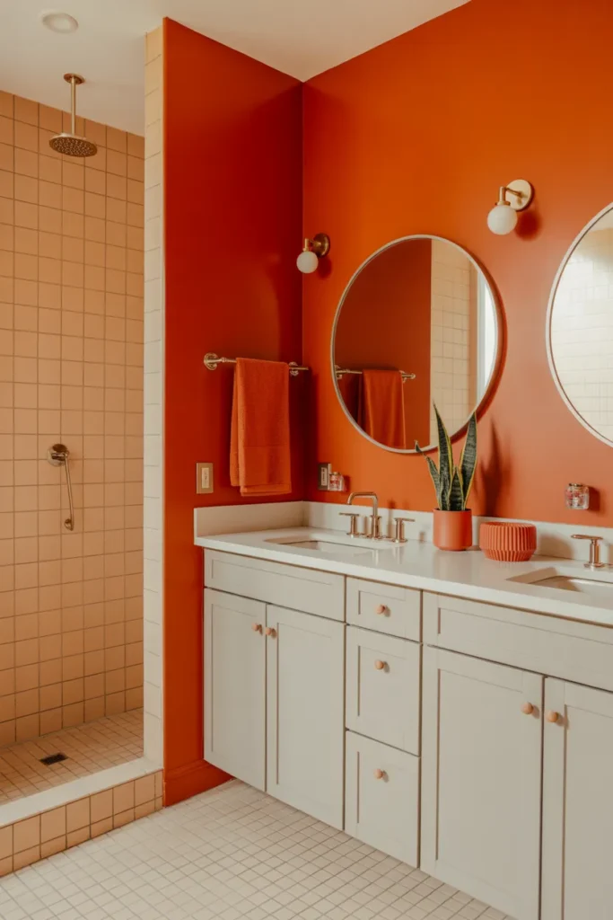
Tangerine walls bring warmth into a bathroom that faces north or gets little sun. The color is cheerful in the morning and still looks good under warm evening light. It pairs well with white, cream and light wood.
Use warm neutrals with it: Cream and warm white sit better with tangerine than a cold blue white does. Test your white paint next to the tangerine swatch before you commit. A mismatch here is the main reason orange rooms can look slightly off.
Ground it with wood: A wooden bath mat, shelf or stool gives the room some weight. Without something natural, a full orange room can feel flat. Keep metal finishes warm too, such as brushed brass or copper, rather than cold chrome.
- Pair tangerine with cream or warm white, not blue white
- Add a wooden shelf, stool or bath mat
- Use warm metal finishes like brass or copper
Shop This Look
8. Hot Pink Details for Bold Feminine Flair

Hot pink details are an easy entry point if you like the dopamine look but do not want to repaint. Towels, a shower curtain, a mirror or a small cabinet front can all carry the color. Because the items are replaceable, you can change the scheme later without much cost.
Pick replaceable items: Start with textiles and accessories you can swap in an afternoon. A hot pink shower curtain plus matching towels changes the room straight away. Keep the walls and main fittings neutral so the swap stays simple next time too.
Make it look deliberate: Use the pink at least twice, in different parts of the room, so it reads as a scheme. One pink item alone tends to look like a mistake. Keep surfaces clear, since clutter weakens the effect of a strong accent color.
- Start with swappable items like towels and a shower curtain
- Repeat the pink in at least two places
- Keep countertops clear so the color stands out
Shop This Look
9. Royal Purple Walls for Luxe Energy
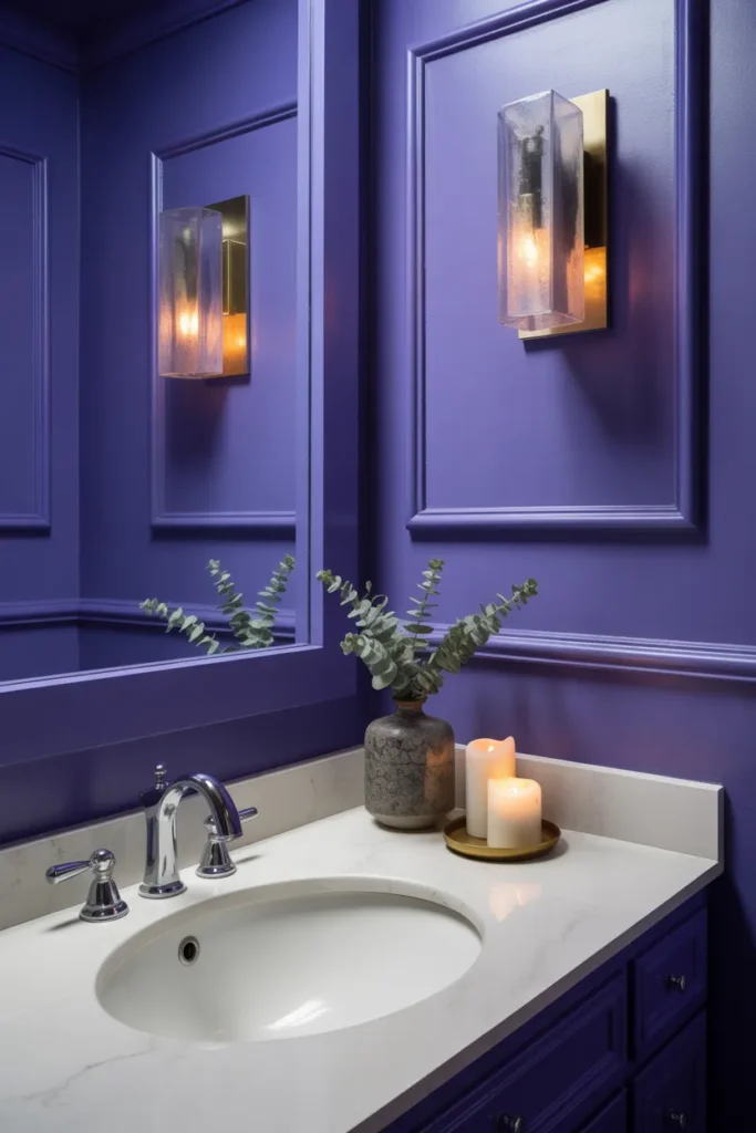
Royal purple walls give a bathroom a rich, calm feel, especially in a powder room or an ensuite. Purple is darker than most colors in this list, so lighting matters more here. With good light and pale fittings, it looks smart rather than heavy.
Sort the lighting first: Add light around the mirror before you judge the paint color. Dark walls absorb light, so a dim bathroom will feel smaller in purple. Warm white bulbs keep purple looking rich instead of cold.
Use pale and metallic contrast: White sanitaryware and a light floor keep the room balanced. Gold or brass details suit purple well and add a bit of shine. Keep the towels plain and light so they lift the scheme.
- Improve mirror lighting before painting in purple
- Keep sanitaryware and floor pale for contrast
- Add brass or gold details for shine
Shop This Look
10. Bright Orange Tile Backsplash for Bold Impact
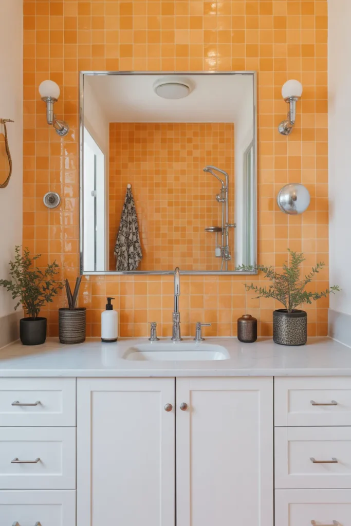
An orange tile backsplash behind the basin gives you strong color in a small, contained area. It is easier to live with than a full orange wall and cheaper to change later. Gloss tiles are practical here because toothpaste and water splashes wipe straight off.
Keep the area small: Run the tiles from the counter up to the mirror and no further. That strip is enough to change the room. Use a simple tile shape, such as a subway or square tile, so the color rather than the pattern does the work.
Match the grout with care: White grout makes orange tiles look crisp and bright. Grey grout gives a softer, more modern result and shows less staining over time. Seal the grout in a splash zone, whatever color you pick.
- Tile only the strip between counter and mirror
- Use a simple tile shape so color leads
- Seal the grout because it is a splash zone
Shop This Look
11. Bold Red Walls for Dramatic Energy
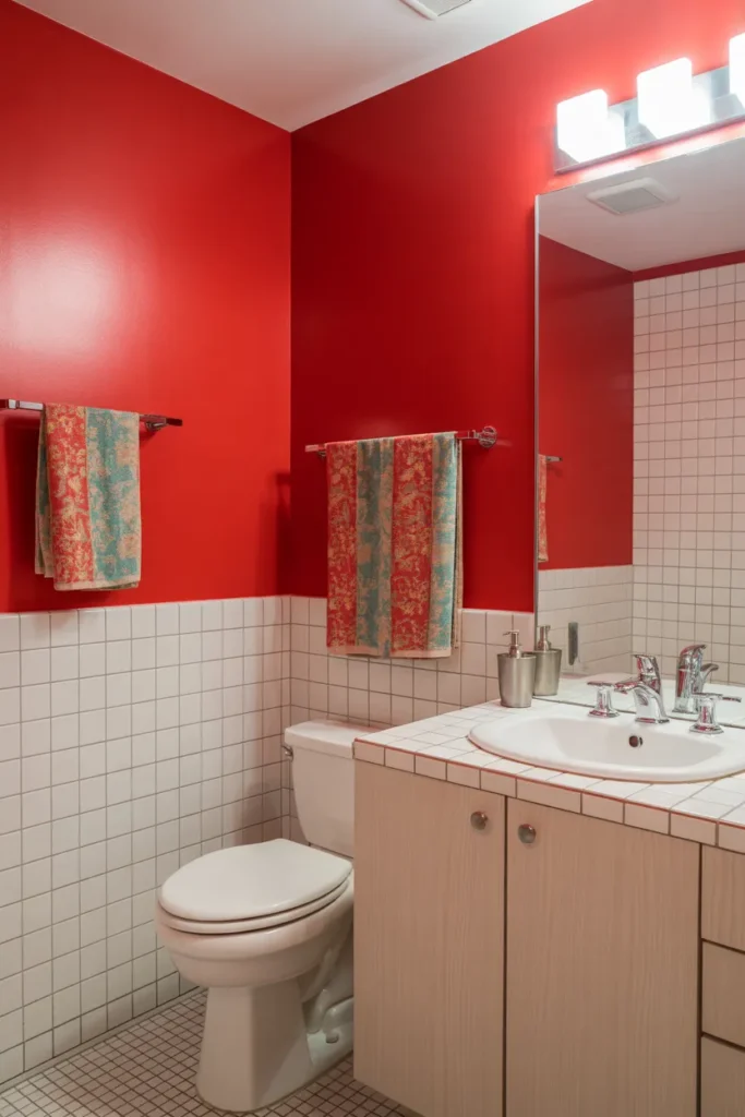
Red walls are the boldest option in this list and they suit a small powder room best. In a compact space, red feels intentional and warm. In a large bathroom it can be tiring, so scale matters with this one.
Choose the room carefully: A powder room or downstairs toilet is the safest place for red, because you are only in there for a few minutes. Keep the ceiling white and the floor light. A big mirror is essential, since red walls absorb a lot of light.
Add classic fittings: Red works well with white ceramics, black fittings and a little brass. That mix keeps it looking smart rather than themed. Avoid adding red accessories on top of red walls, which quickly becomes too much of one color.
- Use red in a small powder room rather than a large bathroom
- Keep ceiling white and add a large mirror
- Do not layer red accessories on red walls
Shop This Look
12. Vibrant Lime and White Patterned Tiles
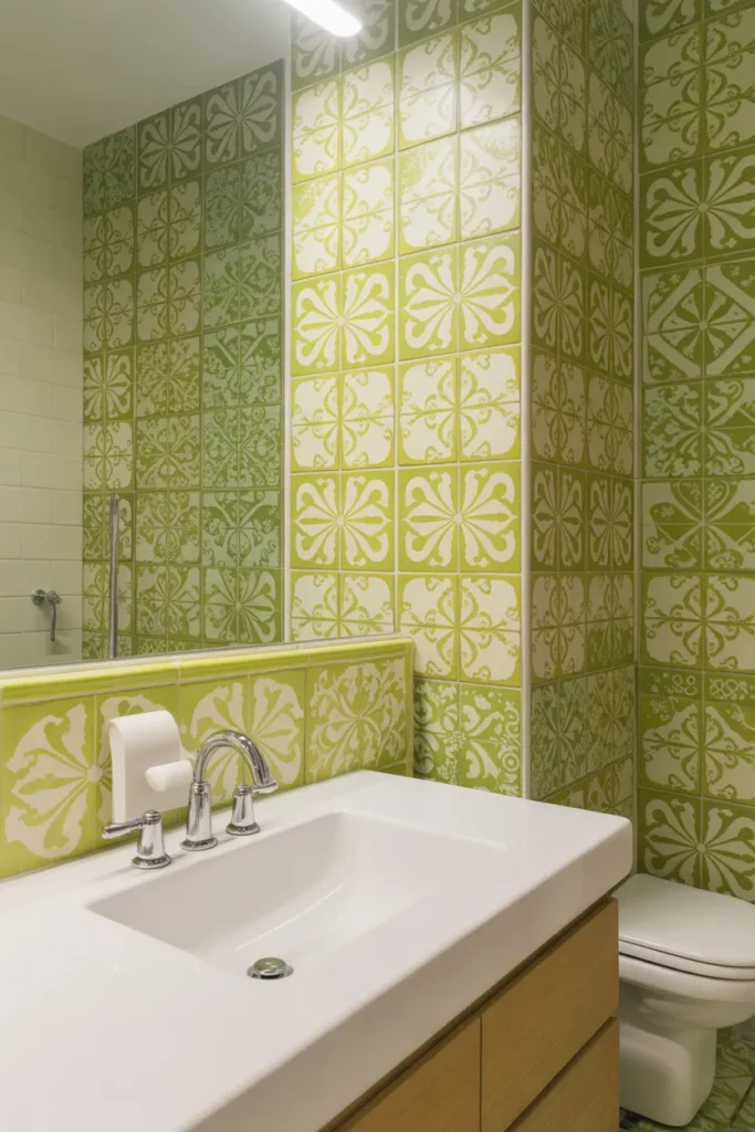
Patterned tiles in lime and white give you color and pattern in one move. The white in the pattern keeps the lime under control, so the room stays bright. Floor tiles or a shower wall are the usual places for this.
Use pattern in one place: Choose the floor or one wall, not both. Pattern everywhere is hard to live with and expensive to change. Keep the remaining surfaces plain white or very pale green so the pattern has room to breathe.
Keep fittings plain: Simple taps, a plain shower screen and white towels are the right partners here. Patterned tile plus patterned textiles is the quickest way to make a bathroom feel chaotic. Let one pattern lead and everything else support it.
- Put patterned tile on the floor or one wall only
- Keep other surfaces plain and pale
- Avoid patterned towels with patterned tile
Shop This Look
13. Bright Turquoise Walls for Refreshing Energy
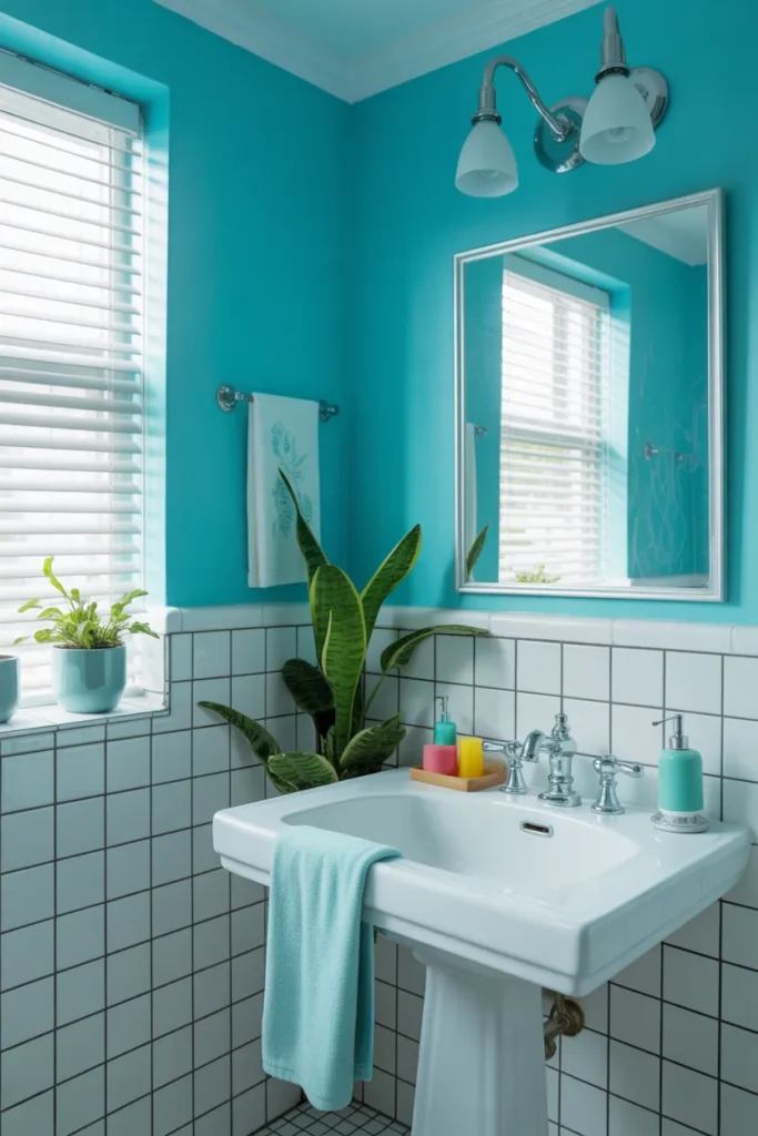
Turquoise walls feel clean and watery, which makes sense in a bathroom. It is bright enough to lift a dull room but softer than electric blue. Turquoise also works across styles, from a simple family bathroom to a coastal guest bathroom.
Pair it with white and sand: White fittings and pale sandy tones keep turquoise looking fresh. A light wood shelf or a woven basket adds warmth without another strong color. Avoid dark floors here, because they make turquoise look heavier than it is.
Add one darker accent: A single black or navy touch, such as a mirror frame or towel rail, gives the scheme some structure. Without a darker note, an all pale room can look washed out. Keep that accent to one or two items.
- Combine turquoise with white and pale sandy tones
- Keep the floor light to hold the fresh feel
- Add one black or navy accent for structure
Shop This Look
14. Neon Pink Fixtures for Unexpected Boldness
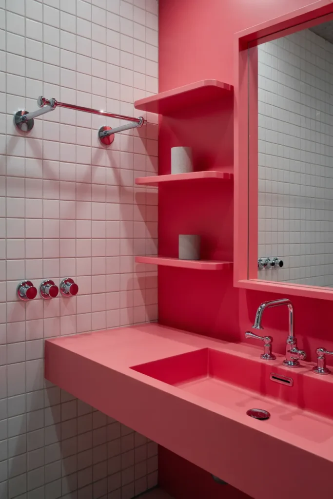
Neon pink fixtures are a small but noticeable move. A pink tap, towel rail or light fitting stands out against plain walls and white ceramics. Because fixtures are mid priced and fairly quick to swap, this suits someone who likes to change things up.
Choose one fixture type: Pick one thing, such as the tap and matching towel rail, and leave the rest standard. Two or three neon items in different shades of pink will clash. Buy the set together so the color matches properly.
Keep the background plain: White or pale grey walls make neon fixtures look sharp. Patterned walls behind neon pink get messy very quickly. Simple towels in white or grey finish the look without competing.
- Swap one fixture type, bought as a matching set
- Keep walls white or pale grey behind neon pink
- Use plain towels so fixtures stay the focus
Shop This Look
15. Tangerine and Coral Gradient Walls
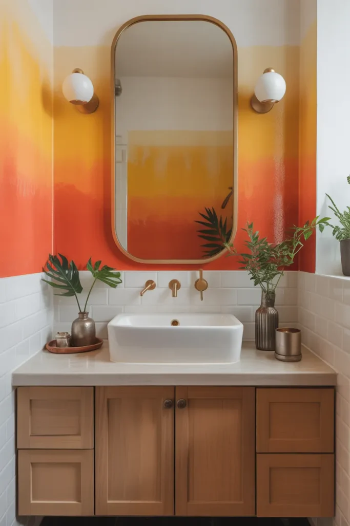
A gradient wall blends tangerine at the bottom into coral higher up, so the color softens as it rises. It is more work than flat paint, but it gives a bathroom a finished, designed feel. The effect works best on one clear wall with little on it.
Blend while the paint is wet: Work in horizontal bands and blend each join with a dry brush while the paint is still wet. Paint a sample board first to practice the transition. Rush this stage and the bands will show as hard lines.
Keep the wall uncluttered: A gradient needs an empty wall to read properly, so avoid hanging shelves and art over it. Put storage on another wall instead. Simple white fittings in front of it look clean and do not interrupt the blend.
- Practice the blend on a sample board first
- Blend each band while the paint is still wet
- Keep the gradient wall free of shelves and art
Shop This Look
16. Bright Aqua Tiles for Refreshing Mood
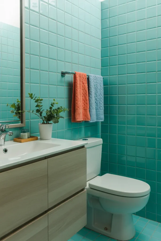
Aqua tiles are a softer way to get a colorful bathroom. They suit a shower enclosure or a full wall behind the bath, and the gloss finish keeps the color light. Aqua also pairs easily with white, chrome and pale wood, so styling the rest is simple.
Use gloss for light: Gloss aqua tiles reflect the light and keep a small bathroom feeling open. Matt tiles in the same color look moodier, which can work in a larger room. Decide based on how much natural light the room actually gets.
Keep grout and fittings simple: White grout and chrome fittings are the safe, clean combination with aqua. Add warmth with a wooden bath mat or stool rather than another color. Plain white towels complete it without any fuss.
- Choose gloss aqua tile in a small or dark room
- Use white grout and chrome fittings
- Add warmth with wood, not another color
Shop This Look
17. Neon Green Fixtures for Bold Pop
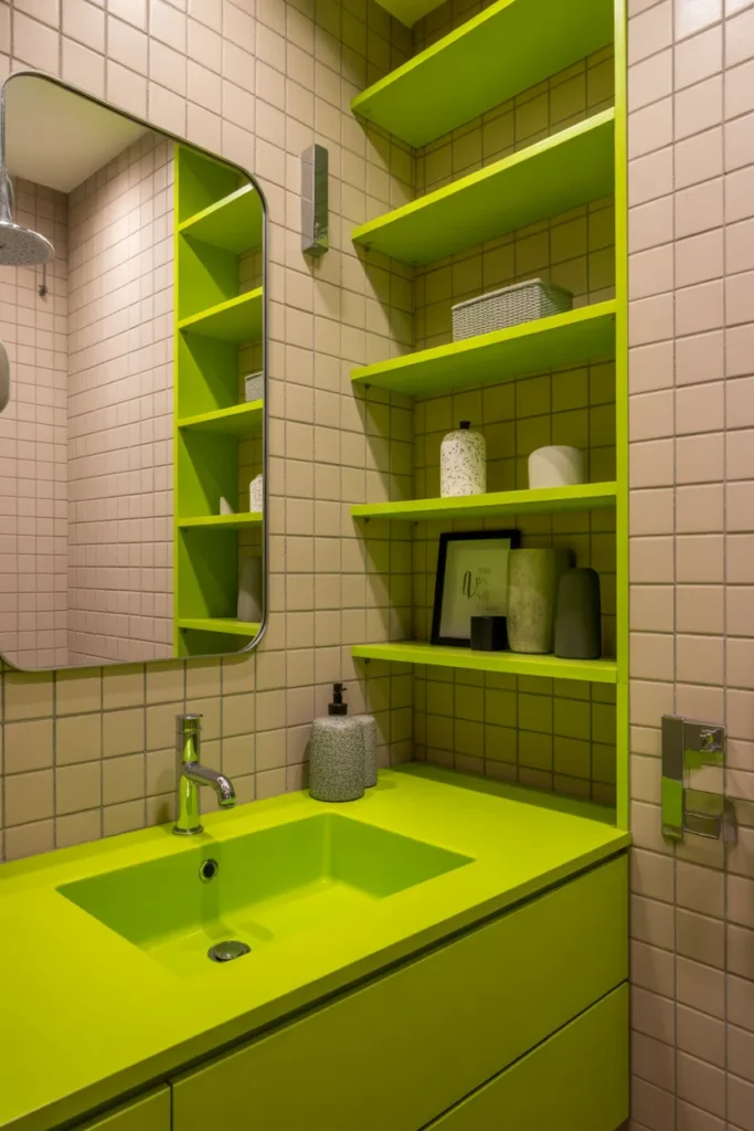
Neon green fixtures give a plain bathroom one strong talking point. A green tap set or shower fittings against white tiles is hard to miss, in a good way. Like the pink version, this is a contained change rather than a full remodel.
Buy a matched set: Get the tap, shower control and towel rail from the same range so the green matches exactly. Slight shade differences show up badly under bathroom lighting. Check the finish is rated for wet use before you buy.
Give it a neutral base: White tiles, a plain floor and grey or white towels let the green stand alone. Do not add green walls as well, because fixture color plus wall color is usually too much. One color statement per room is a good rule here.
- Buy fixtures as one matched range
- Check the finish is suitable for wet areas
- Do not combine neon fixtures with colored walls
Shop This Look
18. Electric Orange Walls for Maximum Energy

Electric orange walls are for someone who wants the strongest version of this look. The color fills the room, so everything else needs to be simple and pale. It works best in a bathroom with a window, where daylight balances the intensity.
Check your light first: In a windowless bathroom, electric orange under artificial light can feel harsh by the evening. Test a big swatch and look at it morning and night before painting everything. A slightly softer orange is often the smarter pick indoors.
Strip everything else back: White ceramics, a pale floor and clear glass keep the room usable. Store bottles inside a cabinet so labels do not add visual noise. One plant is enough decoration, and the green looks good against orange.
- Test a large swatch in day and evening light first
- Keep ceramics, floor and glass pale and plain
- Hide bottles in a cabinet to cut visual clutter
Shop This Look
19. Bold Magenta Accent Walls
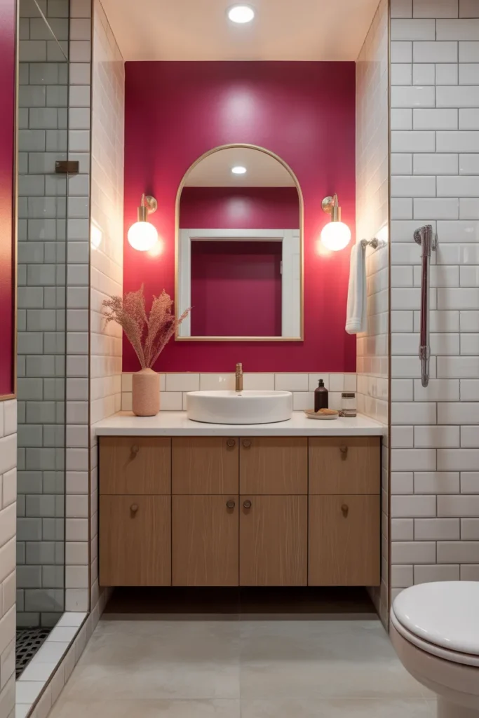
A magenta accent wall sits behind the vanity or bath and does the heavy lifting for the whole room. Magenta is rich rather than sugary, so it suits an adult bathroom. Keep the mirror area well lit, because the color reflects onto skin.
Light the mirror well: Fit lights on both sides of the mirror or a good overhead bar before judging this color. Magenta walls with poor light make a mirror almost useless for makeup or shaving. Sort the lighting and the color becomes much easier to live with.
Use cool neutrals around it: White, pale grey and chrome keep magenta looking sharp. Warm wood can fight with it, so use wood sparingly here. Plain towels in white or grey are the right finish.
- Put strong lighting at the mirror with magenta walls
- Pair magenta with white, grey and chrome
- Use warm wood only in small amounts
Shop This Look
20. Bold Aqua and Yellow Combo
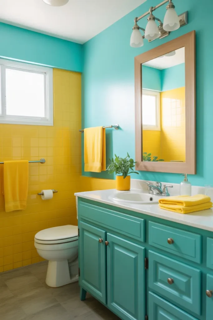
Aqua and yellow together is a classic cheerful pairing, and a bathroom is a safe place to use it. Aqua on the walls with yellow in the towels, cabinet or accessories keeps the balance flexible. You can shift the mood later just by changing the yellow pieces.
Give each color a job: Let aqua be the background color and yellow the accent, roughly a two to one split. When both colors cover equal areas, the room feels restless. Paint and tile in aqua, textiles and small items in yellow is a reliable split.
Add white as the buffer: White ceramics, ceiling and towels sit between the two colors and calm the scheme down. Without enough white, aqua and yellow start to compete. Keep the floor pale for the same reason.
- Use aqua as background and yellow as accent
- Keep about twice as much aqua as yellow
- Use white ceramics and towels as a buffer
Shop This Look
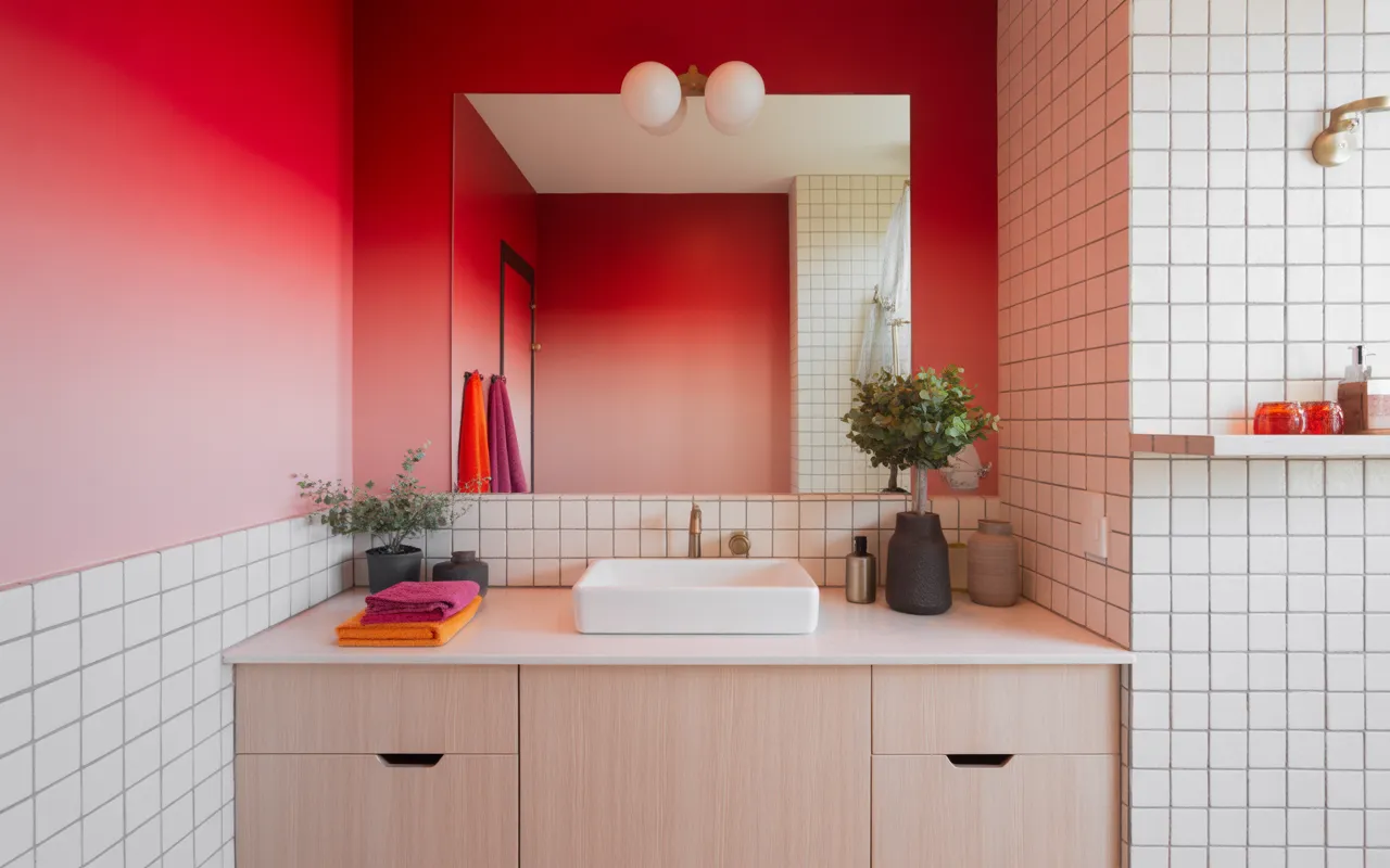
21. Bold Red and Pink Gradient Wall
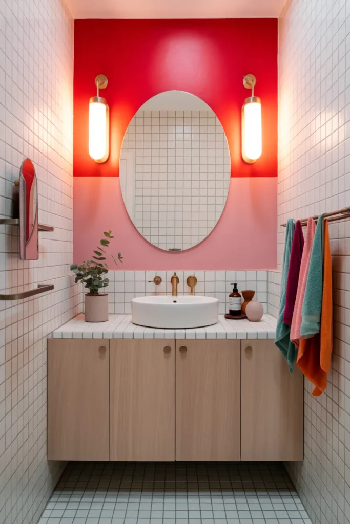
A red and pink gradient wall softens as it climbs, from deeper red low down to lighter pink at the top. It suits a statement bathroom or a powder room where you want one memorable feature. The rest of the room should stay quiet so the wall can do its job.
Plan the blend in bands: Mark three or four horizontal bands and work from the darkest at the bottom upward. Blend each edge while wet and step back often to check the transition. A practice board saves a lot of repainting on this one.
Keep fittings simple: White ceramics and one metal finish are enough in front of a gradient. Gold taps can look good here, but pick gold or chrome, not both. Leave the gradient wall bare, with no shelves or pictures on it.
- Work from darkest at the bottom to lightest at the top
- Blend band edges while the paint is wet
- Leave the gradient wall completely bare
Shop This Look
22. Sunshine Yellow Cabinets
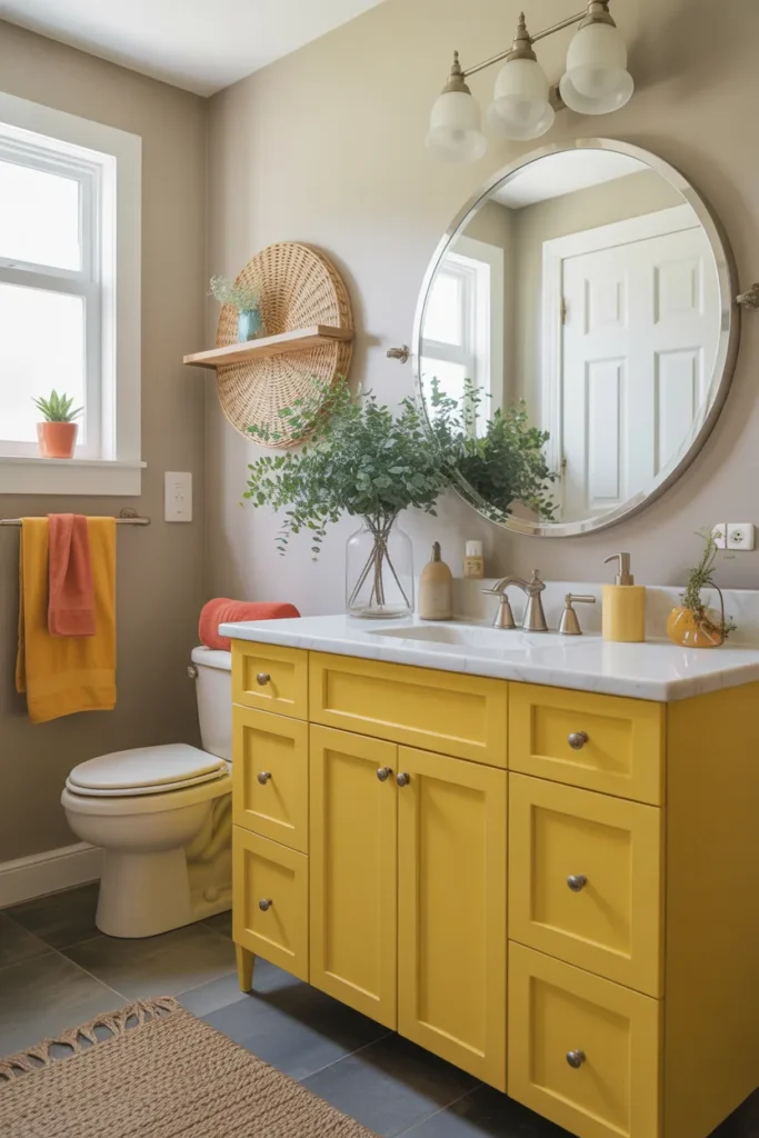
Sunshine yellow cabinets bring the color in at furniture level instead of on the walls. A painted vanity unit is easier to repaint later than tiles are to replace, so this is a flexible way to go bold. It works in both white and pale grey bathrooms.
Prep the cabinet properly: Clean, sand and prime the cabinet before painting, or the finish will peel in a steamy room. Use a durable cabinet paint and give it time to harden before putting items back. Handles in black or brushed brass finish it well.
Keep walls neutral: Yellow cabinets with white or soft grey walls look fresh and balanced. Adding a second bright color on the walls is where this scheme usually goes wrong. A yellow hand towel is enough of a repeat.
- Sand and prime cabinets before painting
- Use durable cabinet paint and let it harden fully
- Keep walls white or soft grey behind yellow cabinets
Shop This Look
23. Vibrant Purple Accent Wall
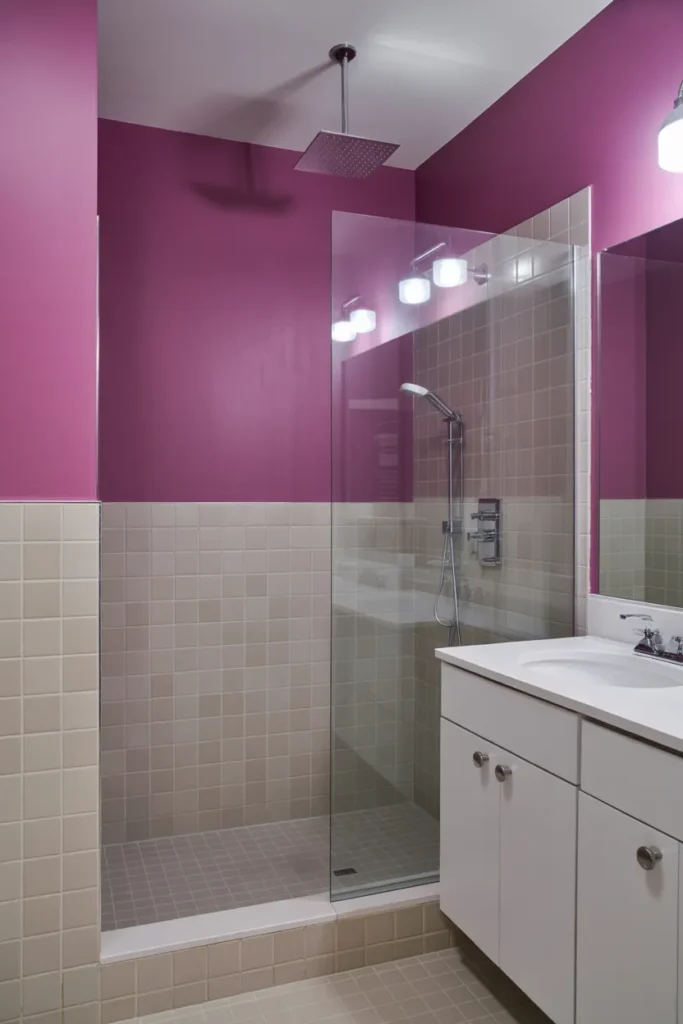
A vibrant purple accent wall is a slightly deeper take on the royal purple idea, used on one wall only. Behind a white bath it looks smart and calm. It is a good pick for an ensuite where you want color without a busy pattern.
Choose the bath or vanity wall: Put the purple on the wall you face from the door, usually the bath or vanity wall. Keep the other walls soft white so the contrast stays clean. One wall of a darker color also makes a long bathroom feel less narrow.
Soften with pale textiles: White and pale lilac towels bridge the gap between the dark wall and the white walls. A light bath mat does the same job at floor level. Avoid black towels here, as they push the room too dark.
- Place the purple wall opposite the door
- Keep remaining walls soft white
- Use white or pale lilac towels and a light bath mat
Shop This Look
24. Multi-Color Tile Mosaic for Maximum Energy
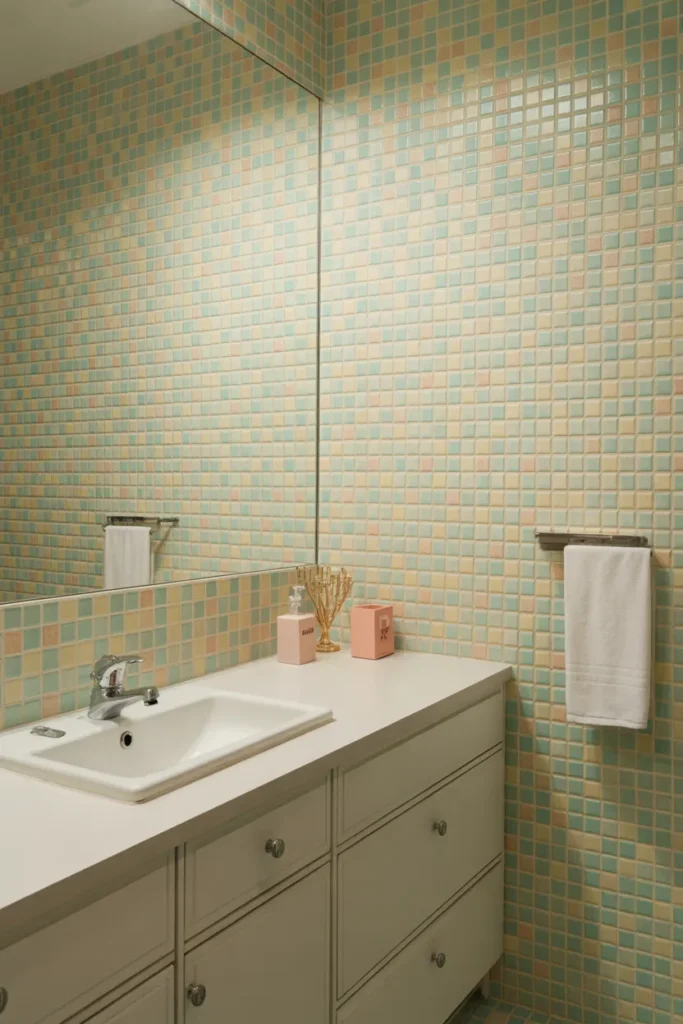
A multi color tile mosaic is the fullest version of dopamine decor. Small tiles in several colors cover a shower wall, a splashback or a floor section and give the room real energy. Because it is permanent and busy, plan the rest of the bathroom around it.
Contain the mosaic: Use the mosaic in one defined area with a clean edge, such as inside a shower or as a framed splashback panel. A clear border tile helps it look finished. Spreading mosaic across several surfaces is where it starts to overwhelm.
Make everything else plain: Plain walls, simple fittings and solid color towels are non negotiable next to a mosaic. Choose your towel color from one of the tile colors and keep it at that. Any extra pattern will compete and tire you out quickly.
- Use mosaic in one bordered area only
- Keep walls, fittings and towels plain
- Pick towel color from one tile color
Shop This Look
How to Start
Start with the smallest change that gives you the color you want. In most bathrooms that means paint or textiles first, then fixtures, and tile last because it costs the most to undo. Decide your one main color before you buy anything, and write it down so every later choice has to match it.
Test before you commit: Paint a large swatch on the wall you see from the door and check it in morning and evening light. Bathroom lighting changes color a lot, and small sample cards are misleading. Live with towels or a shower curtain in the color for a week if you are still unsure.
Add color in layers: Start with the biggest surface, usually one wall, then add two smaller repeats of the same color. Stop there for a few days before adding anything else. Most colorful bathrooms go wrong at the adding stage, not at the choosing stage.
- Choose one main color and use it on the biggest surface first
- Test paint on a large swatch in your own lighting
- Add two small repeats of the color, then stop and review
Shop This Look
Common Mistakes
- Using three or four bright colors at full strength, so nothing stands out and the room feels restless.
- Painting every wall in a dark, saturated color in a small bathroom with no window.
- Skipping the swatch test and judging a color from a small card under shop lighting.
- Adding patterned towels and a patterned shower curtain on top of colored walls or patterned tile.
- Mixing metal finishes, such as chrome taps, black rails and brass handles, in one small room.
- Using standard wall paint in a steamy bathroom, then watching it peel around the shower.
- Putting strong color at the mirror without fixing the lighting, which makes the mirror hard to use.
Frequently Asked Questions
What is dopamine decor in a bathroom?
It means using color, pattern and a few playful details on purpose so the room feels cheerful to use. In a bathroom that usually means one strong color on a wall, in tiles, on a cabinet or in fixtures, with the rest of the room kept fairly simple so the color stands out.
Can I try bold color in a rental bathroom?
Yes, if you stick to things you can remove. Towels, a shower curtain, a bath mat, stick on tiles and accessories can all carry a bright color without touching the walls. Check your agreement before painting, and keep the original fittings if you swap a tap or a rail.
Which color is easiest to live with?
Turquoise, aqua and teal are usually the easiest because they suit a bathroom and pair well with white fittings and wood. Yellow is cheerful but needs testing in your light first. Red and electric orange are the hardest, so use them in small rooms or in small areas.
How many colors should I use?
One main color plus white and one neutral is enough for most bathrooms. You can add a second accent color if one of them clearly leads, like aqua walls with yellow towels. Equal amounts of two bright colors tend to fight each other.
Where can I find calmer bathroom ideas if bold color is too much?
Start with the basics and build up slowly. This guide to bathroom aesthetic ideas covers softer schemes you can borrow from, and you can add one bright item at a time until the room feels right.
The Finishing Touch
The point of all this color is simple. A bathroom you enjoy walking into makes the start of the day easier, and it does not take a full remodel to get there. One wall, one cabinet or one set of fixtures is usually enough to change the feel.
If you want more examples before you decide, the bathroom ideas on Houzz are worth browsing by color, which helps you see how strong shades look in real rooms rather than in product photos. Save the ones closest to your room size and light.
Pick your color, test it properly, and keep everything else simple. That is the whole method, and it works whether your color is a soft aqua or a full strength magenta.