20 Terracotta Paint Trend Ideas for Chic Interiors
Warm, earthy tones are taking over interiors—and the terracotta paint trend is leading the way. If your space feels flat, cold, or lacking personality, this simple color shift can completely transform the mood.
Many homes rely on safe neutrals, but I’ve noticed they often miss that sense of warmth and depth that makes a room feel truly inviting. That’s where these ideas come in. From subtle accents to full wall transformations, each approach helps you bring in richness without overwhelming your space.
In my experience, even small touches of this tone can make a room feel more grounded and stylish. This guide will show you practical, creative ways to use it across different areas of your home, helping you create a space that feels cozy, modern, and beautifully put
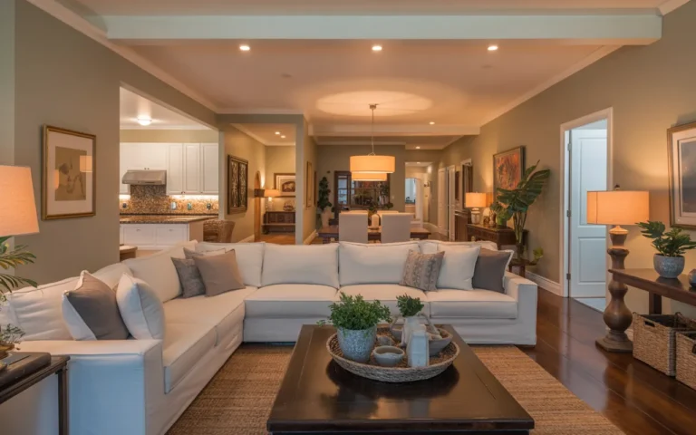
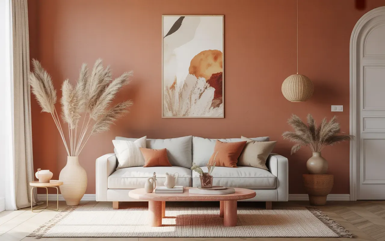
Accent Wall Focus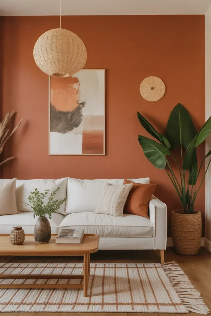
- Instantly adds warmth to neutral spaces.
- Creates a focal point without overwhelming the room.
- Works well with beige, cream, and wood tones.
- Easy way to try bold color without full commitment.
A single accent wall can completely transform how a room feels without requiring a full redesign. The warm, earthy tone creates a grounded and inviting atmosphere while still feeling modern and stylish. This approach works especially well in living rooms where you want to add depth without cluttering the space. The terracotta paint trend brings natural warmth that pairs beautifully with soft neutrals and organic textures.
In my experience, keeping the surrounding decor light helps the wall stand out more effectively. I’ve noticed that too many bold elements can compete with the color and make the space feel heavy. Instead, balance it with simple furniture and natural materials. The result is a room that feels warm, balanced, and visually rich without being overwhelming.
Also view: 16 Pink Living Room Ideas That Feel Fresh & Bright
Half Wall Color Block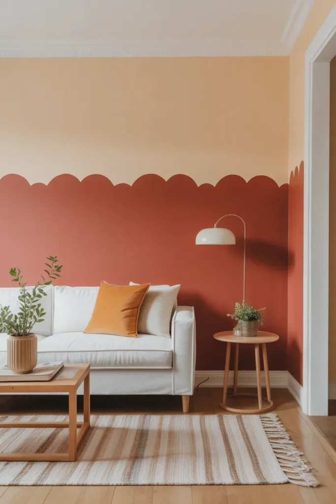
- Adds visual interest without full wall coverage.
- Keeps the space feeling light and open.
- Perfect for smaller rooms or apartments.
- Creates a modern, structured look.
A half wall color block is a creative way to introduce bold color while maintaining balance. By painting only the lower half, you keep the room feeling bright and open while still adding warmth. This technique works especially well in smaller spaces where full coverage might feel too intense. It also adds a subtle architectural element that makes the space feel more designed.
I’ve seen this work well in bedrooms and living areas where a softer approach to color is needed. I’ve noticed that pairing the painted section with simple decor keeps the look clean and modern. This method allows you to enjoy the warmth of the color without overwhelming the room. The result is a space that feels fresh, stylish, and thoughtfully layered.
Arched Wall Detail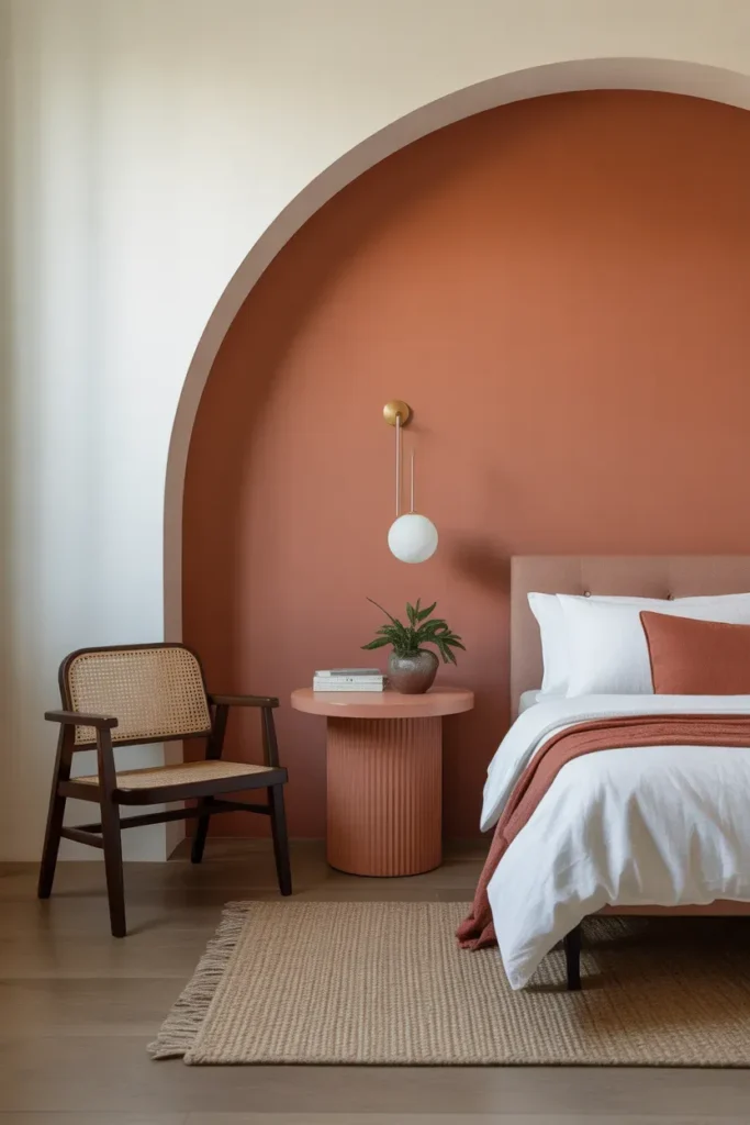
- Adds a soft, artistic focal point.
- Breaks up plain walls creatively.
- Works well behind furniture or decor pieces.
- Easy DIY-friendly design idea.
An arched wall detail is a simple yet striking way to add personality to your space. Instead of painting an entire wall, the curved shape creates a focal point that feels soft and modern. This works especially well behind a chair, bed, or console table, helping define that area visually. The terracotta paint trend enhances this look by adding warmth and depth without needing additional decor.
In my experience, keeping the arch proportion balanced is key to achieving a clean result. I’ve noticed that slightly oversized arches tend to look more modern and intentional. Pairing it with minimal furniture allows the shape to stand out. The result is a space that feels creative, stylish, and effortlessly unique.
Full Room Warmth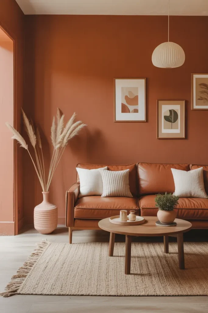
- Creates a warm, cocoon-like atmosphere.
- Makes large rooms feel more intimate.
- Pairs beautifully with natural materials.
- Ideal for living rooms or bedrooms.
A full room painted in warm clay tones can completely transform the mood of your home. Instead of feeling flat or cold, the space becomes enveloping and comforting. This approach works especially well in larger rooms that need a sense of coziness. The terracotta paint trend brings depth and richness while still feeling grounded and natural, making the space feel more inviting without needing excessive decor.
In my experience, balancing this look with lighter furniture helps prevent the room from feeling too heavy. I’ve noticed that soft fabrics, neutral tones, and natural textures create the best contrast. This combination allows the color to shine while keeping the space airy. The result is a room that feels warm, sophisticated, and perfectly styled for both relaxation and everyday living.
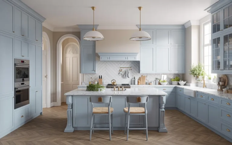
Terracotta Kitchen Cabinets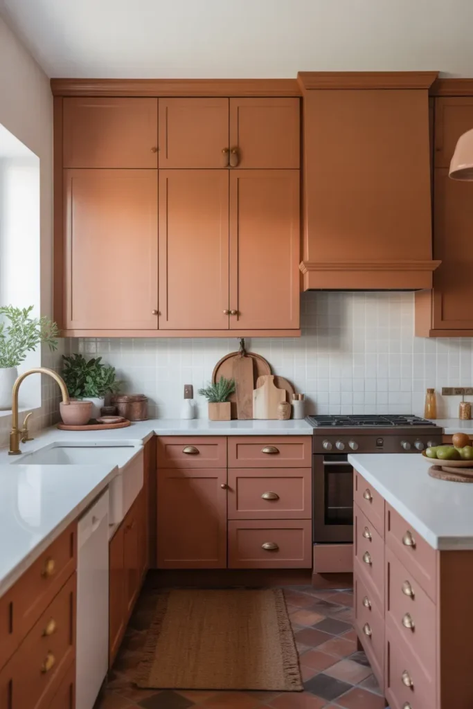
- Adds bold color without overwhelming the kitchen.
- Creates a unique and modern cabinet look.
- Pairs well with white and wood finishes.
- Refreshes outdated kitchens instantly.
Terracotta kitchen cabinets are a bold yet approachable way to update your space. Instead of standard white or gray, this warm tone adds personality while still feeling timeless. It works especially well when balanced with neutral countertops and simple finishes. This approach transforms the kitchen into a space that feels both stylish and welcoming.
I’ve seen this work well in kitchens that need a fresh update without a full renovation. I’ve noticed that matte finishes enhance the color’s natural depth. Keeping hardware simple also helps maintain a clean look. The result is a kitchen that feels modern, warm, and full of character without feeling overpowering.
Ceiling Color Statement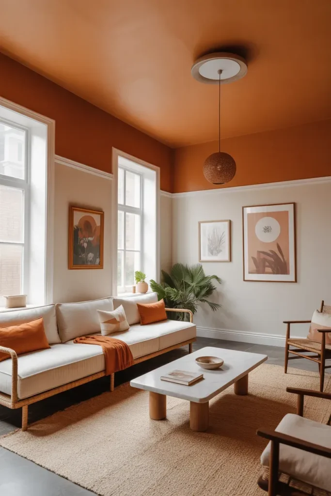
- Adds a unique and unexpected design element.
- Draws the eye upward to enhance height.
- Works well in rooms with high ceilings.
- Creates a cozy, enveloping effect.
A painted ceiling is one of the most unexpected ways to introduce warmth into a room. Instead of focusing only on walls, this approach draws the eye upward and adds a sense of depth. It works especially well in spaces with higher ceilings, where the added color helps create a more intimate feel. The terracotta paint trend brings a rich, earthy tone that feels both modern and grounded.
In my experience, pairing a bold ceiling with lighter walls creates the best balance. I’ve noticed that this contrast keeps the room from feeling too enclosed. Simple decor and soft lighting enhance the overall effect. The result is a space that feels creative, cozy, and visually striking in a subtle, sophisticated way.
Bathroom Spa Walls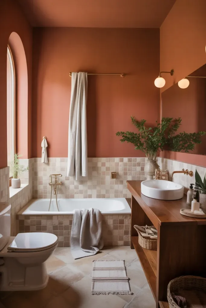
- Brings warmth to typically cold bathroom spaces.
- Creates a relaxing, spa-like atmosphere.
- Pairs beautifully with stone and wood textures.
- Makes the space feel more inviting and calm.
A bathroom painted in warm earthy tones can instantly feel more relaxing and luxurious. Instead of stark white walls, the rich color creates a softer, more calming environment. This works especially well in bathrooms where you want a spa-like feel without major renovations. The terracotta paint trend adds warmth that balances cool surfaces like tiles and stone.
In my experience, this look works best when paired with simple, natural materials. I’ve noticed that wooden accents and neutral textiles enhance the calming effect. Keeping decor minimal also helps maintain a clean and peaceful space. The result is a bathroom that feels warm, soothing, and perfect for unwinding after a long day.
Terracotta Entryway Walls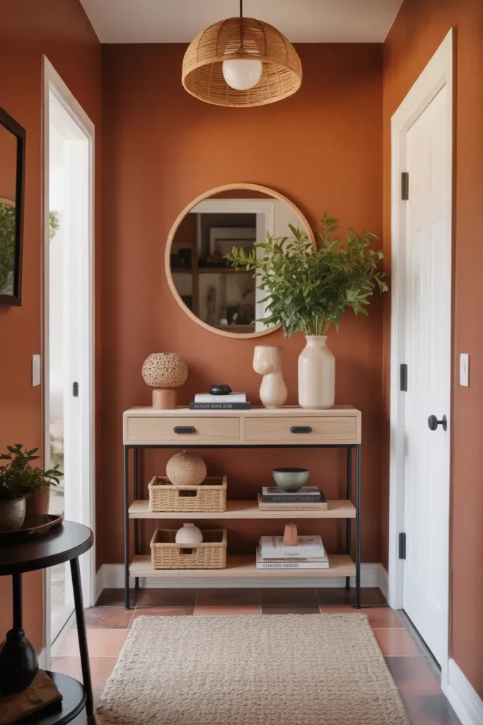
- Creates a warm and inviting first impression.
- Adds personality to small entry spaces.
- Works well with neutral decor accents.
- Enhances overall home atmosphere instantly.
An entryway with warm-toned walls can completely change how your home feels from the moment you walk in. Instead of a plain or empty space, the color creates an immediate sense of warmth and personality. This is especially helpful in small entry areas that need impact without clutter. The terracotta paint trend adds depth while still feeling welcoming and approachable.
I’ve seen this work well in homes where the entryway is often overlooked. I’ve noticed that pairing the color with simple furniture keeps the space balanced. A small console or basket adds function without overwhelming the design. The result is an entry that feels cozy, stylish, and perfectly set up to welcome you every day.
Terracotta Fireplace Surround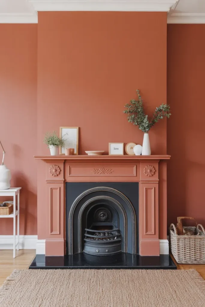
- Turns the fireplace into a standout feature.
- Adds warmth and depth to the living room.
- Works well with minimal decor styling.
- Creates a cozy, inviting atmosphere.
A painted fireplace surround is a simple way to create a strong focal point in your living room. Instead of blending into the wall, the warm color draws attention and adds character. This approach works especially well in spaces that feel flat or lack a central feature. The terracotta paint trend enhances the cozy feeling that fireplaces naturally bring.
In my experience, keeping the surrounding decor minimal allows the fireplace to stand out more. I’ve noticed that soft lighting and neutral furniture help balance the bold color. This combination creates a space that feels warm and inviting without being overwhelming. The result is a living room that feels cozy, stylish, and perfectly centered around its main feature.
Textured Plaster Finish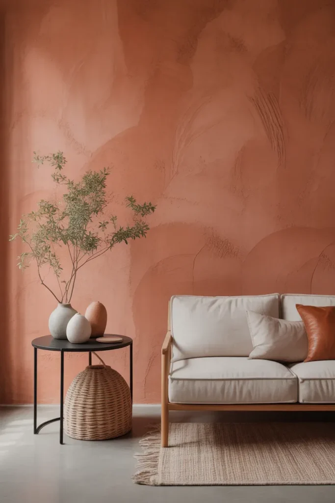
- Adds depth through subtle wall texture.
- Creates a handcrafted, organic look.
- Works well in minimalist interiors.
- Enhances light and shadow beautifully.
A textured plaster finish can take a simple wall and turn it into a statement without adding extra decor. The subtle variation in surface catches light differently throughout the day, creating a rich and layered effect. This approach works especially well in minimalist homes where texture replaces the need for heavy styling. The terracotta paint trend adds warmth while the texture adds visual interest, making the space feel more dynamic.
In my experience, softer textures create a more timeless and calming effect compared to heavy patterns. I’ve noticed that natural lighting enhances the finish beautifully, especially in neutral spaces. Keeping furniture simple allows the wall to stand out as a feature. The result is a room that feels refined, warm, and effortlessly stylish.
Built In Shelves Color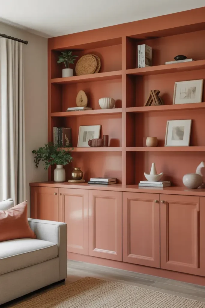
- Highlights shelving as a design feature.
- Adds depth without repainting the entire room.
- Creates contrast with neutral walls.
- Works well in living rooms or offices.
Painting built-in shelves is a smart way to introduce color without committing to full walls. It draws attention to the structure and makes the shelves feel more intentional. This works especially well in rooms that need a focal point but already have neutral walls. The warm tone creates contrast while still blending naturally with surrounding decor.
I’ve seen this work well when shelves are styled with a mix of books and simple decor. I’ve noticed that keeping the color consistent within the shelving area creates a cohesive look. This approach adds personality without overwhelming the space. The result is a room that feels more designed, balanced, and visually interesting.
Bedroom Headboard Wall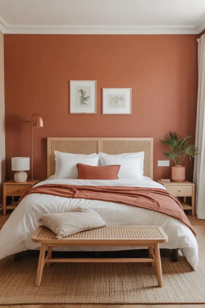
- Creates a focal point without a physical headboard.
- Adds warmth to the bedroom instantly.
- Keeps the design minimal and clean.
- Works well in modern or boho interiors.
A painted headboard wall is one of the easiest ways to add character to a bedroom. Instead of adding bulky furniture, color defines the space behind the bed. This approach works especially well in smaller rooms where simplicity is key. The terracotta paint trend adds a cozy, grounded feel that enhances relaxation and comfort.
In my experience, keeping bedding in soft neutral tones creates the best balance. I’ve noticed that this allows the wall color to stand out without making the space feel heavy. Adding subtle textures like linen or woven elements enhances the overall look. The result is a bedroom that feels warm, calm, and beautifully styled.
Dining Nook Warm Corner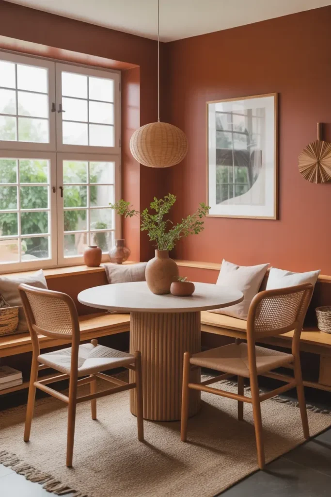
- Makes small dining areas feel cozy and defined.
- Adds warmth without needing extra decor.
- Creates a soft, intimate atmosphere.
- Perfect for breakfast corners or compact spaces.
A warm dining nook can completely change how you use a small corner of your home. Instead of feeling like an afterthought, the space becomes inviting and intentional. The rich, earthy tone helps define the area visually, making it feel separate from the rest of the room. The terracotta paint trend adds depth while still feeling natural and relaxed, which works beautifully for casual dining spaces.
In my experience, keeping furniture simple helps the color stand out without overwhelming the space. I’ve noticed that soft lighting enhances the warmth and makes the nook feel even more inviting. Pairing it with natural materials like wood creates a balanced look. The result is a dining area that feels cozy, stylish, and perfect for everyday meals.
Outdoor Patio Wall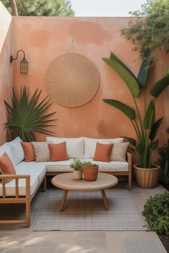
- Brings indoor warmth to outdoor spaces.
- Creates a stylish, vacation-inspired vibe.
- Enhances greenery and natural textures.
- Works well on patios, balconies, or gardens.
An outdoor patio wall in a warm earthy tone can instantly transform your exterior space. Instead of a plain background, the color adds character and depth, making the area feel more styled. This works especially well when paired with plants and natural textures, creating a relaxed and inviting environment. The terracotta paint trend brings a Mediterranean-inspired feel that’s both timeless and fresh.
I’ve seen this work well in patios that need a focal point without adding too many elements. I’ve noticed that warm lighting enhances the color beautifully in the evening. Keeping furniture neutral allows the wall to stand out naturally. The result is an outdoor space that feels cozy, stylish, and perfect for relaxing or entertaining.
Two Tone Wall Blend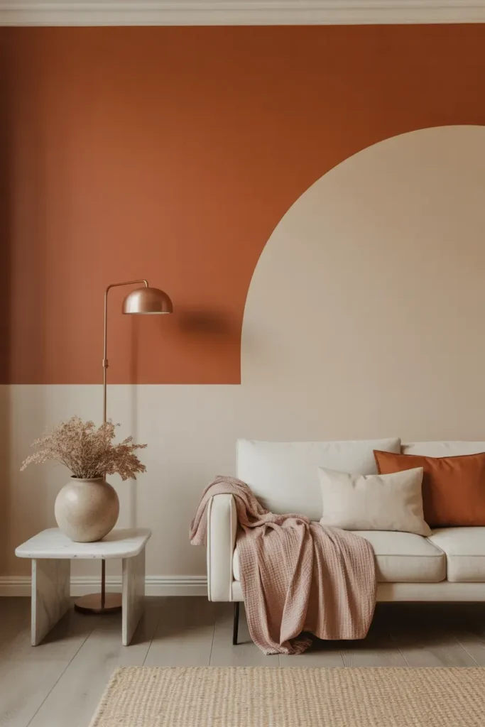
- Adds depth through layered color design.
- Keeps the space feeling light and balanced.
- Creates a modern, structured look.
- Works well in living rooms or bedrooms.
A two tone wall blend is a creative way to add color while maintaining balance. Instead of a single bold shade, combining it with a softer neutral creates a layered effect that feels more dynamic. This approach works especially well in modern interiors where subtle detail makes a big difference. The terracotta paint trend pairs beautifully with beige or cream tones, creating a warm yet refined look.
In my experience, keeping the transition line clean and simple makes the design feel more intentional. I’ve noticed that this method works well in both small and large rooms because it adds interest without overwhelming the space. The result is a room that feels stylish, balanced, and thoughtfully designed.
Window Frame Highlight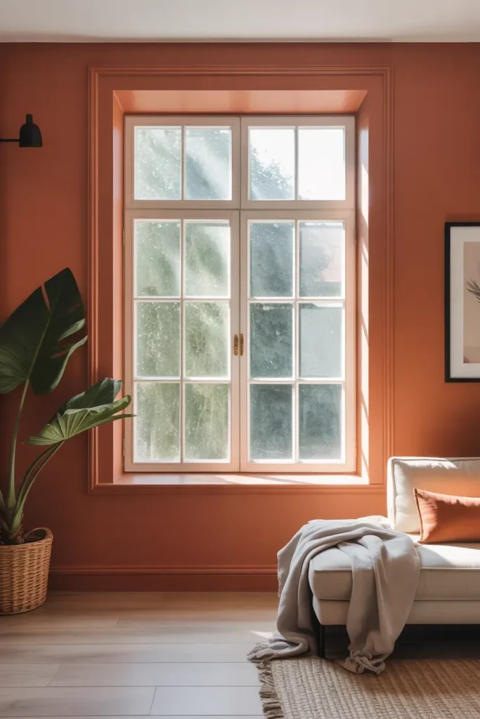
- Adds a unique detail without painting full walls.
- Frames natural light beautifully.
- Keeps the space bright and open.
- Perfect for subtle color integration.
A window frame highlight is a subtle yet impactful way to introduce warmth into your space. Instead of covering entire walls, focusing on the frame draws attention to natural light and architectural details. This works especially well in rooms that already feel bright and open. The terracotta paint trend adds a soft contrast that feels modern yet grounded, making the window area more visually interesting.
In my experience, this works best when the rest of the room stays neutral and simple. I’ve noticed that too many competing colors can reduce the effect. Keeping decor minimal allows the frame to stand out naturally. The result is a space that feels fresh, balanced, and thoughtfully styled.
Furniture Color Pop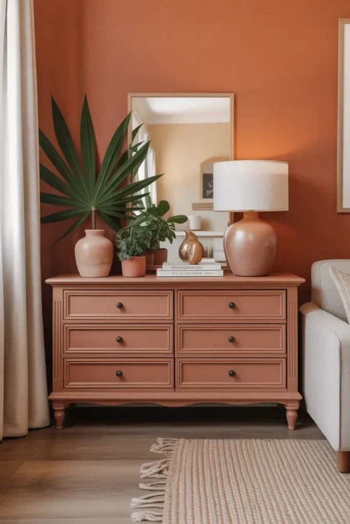
- Adds color without committing to walls.
- Creates a bold focal point in the room.
- Easy to update or change later.
- Works well in neutral interiors.
A furniture color pop is one of the easiest ways to experiment with warm tones without repainting your entire space. By updating a single piece, you create a focal point that adds personality and depth. This approach works especially well in neutral rooms that need a touch of color. The terracotta paint trend brings warmth while still feeling versatile and easy to style.
I’ve seen this work well when the rest of the room stays simple and uncluttered. I’ve noticed that one bold piece often feels more impactful than multiple smaller accents. Keeping the finish matte also enhances the color’s natural depth. The result is a space that feels modern, balanced, and visually engaging.
Hallway Color Flow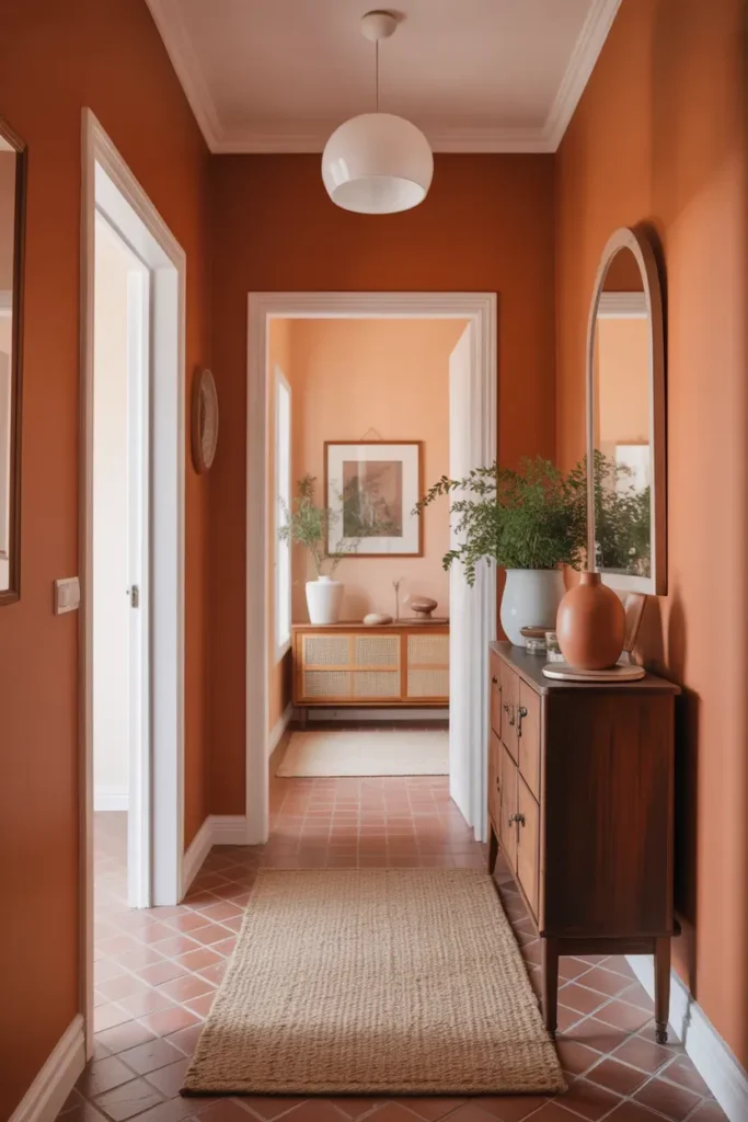
- Connects spaces with a cohesive color flow.
- Adds warmth to often overlooked areas.
- Makes hallways feel more intentional.
- Enhances overall home continuity.
A hallway color flow can completely change how your home feels as a whole. Instead of disconnected spaces, the consistent tone creates a sense of continuity and warmth. This works especially well in long or narrow hallways that often feel plain or empty. The terracotta paint trend adds depth while guiding the eye naturally through the space.
In my experience, keeping adjacent rooms lighter helps maintain balance. I’ve noticed that this contrast prevents the hallway from feeling too enclosed. Simple decor and soft lighting enhance the overall effect. The result is a home that feels more connected, stylish, and thoughtfully designed from one room to the next.
Door Frame Accent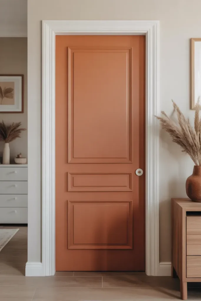
- Adds subtle color without overwhelming walls.
- Highlights architectural details beautifully.
- Works well in minimalist interiors.
- Easy way to refresh a space quickly.
A door frame accent is a simple yet effective way to introduce warmth into your home. Instead of painting entire walls, focusing on frames creates a refined and modern detail. This approach works especially well in minimalist spaces where small design choices make a big impact. The terracotta paint trend brings depth and contrast while still feeling soft and natural, making the doorway stand out in a subtle way.
In my experience, this works best when paired with clean, neutral walls. I’ve noticed that keeping the rest of the space simple allows the frame to become a quiet focal point. This technique adds personality without cluttering the design. The result is a space that feels fresh, modern, and thoughtfully styled.
Layered Color Corners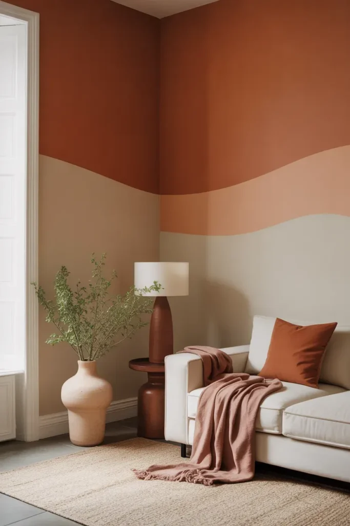
- Creates depth through subtle color layering.
- Adds warmth to small or unused corners.
- Enhances cozy, inviting atmospheres.
- Works well in living rooms or bedrooms.
Layered color corners are a beautiful way to bring depth into your space without relying on bold contrasts. By blending warm tones with softer neutrals, you create a smooth and calming transition. This works especially well in corners that might otherwise feel empty or disconnected. The terracotta paint trend enhances this effect by adding a grounded warmth that feels both modern and timeless.
I’ve noticed that this approach works best when textures are kept soft and natural. In my experience, combining warm tones with linen, wood, or woven elements creates a balanced look. Keeping the design simple ensures the layering remains subtle and elegant. The result is a space that feels cozy, refined, and visually harmonious.
Conclusion
Sometimes all it takes is one thoughtful change to completely refresh your home, and the terracotta paint trend does exactly that. It brings warmth, depth, and a natural elegance that works in almost any space. I’ve seen how small updates like these can make rooms feel more inviting and balanced without needing a full redesign.
Now it’s your turn to bring these ideas to life. Save this post on Pinterest, try one or two styles in your own space, and share it with someone who loves cozy, stylish interiors. A simple color choice can change everything—start with what inspires you most.