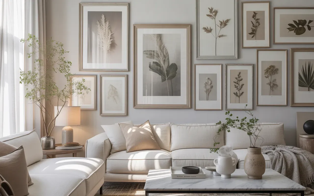
19 Gallery Wall Design Looks for Every Home Style
Looking to transform a plain wall into a stunning focal point? These gallery wall design ideas are perfect for adding personality, style, and charm to any room. Whether your home leans modern, minimalist, farmhouse, or eclectic, this guide showcases 19 creative ways to display artwork, photos, and decor that truly reflect your taste. In my experience, even small adjustments like frame layout or color coordination can completely change a space’s energy. You’ll find practical tips, visually inspiring setups, and real-life insights that make designing your gallery wall simple, fun, and stress-free. Get ready to create walls worth saving on Pinterest!
1. Minimalist Black Frame Grid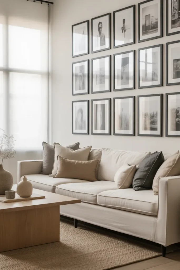
- Creates a clean, organized wall layout
- Perfect for modern and minimalist interiors
- Keeps artwork visually balanced and uncluttered
- Works well above sofas, desks, or console tables
- Makes small spaces feel intentional and polished
A structured frame grid instantly makes a wall look organized and thoughtfully styled. Instead of random placements, each frame aligns perfectly, creating a sense of balance that feels calming to the eye. I’ve noticed this layout works especially well in modern homes where simplicity is the main focus. The uniform spacing keeps the design from feeling overwhelming while still allowing the artwork to stand out. Black frames add a crisp contrast against light walls, making photos, prints, or illustrations feel more refined and gallery-like without needing bold colors or oversized art pieces.
In real spaces, this type of layout can completely change the mood of a room. A carefully planned Gallery Wall Design like this often becomes the visual anchor of the entire space. When placed above a sofa or console table, the symmetry draws attention upward and makes the room feel taller and more styled. In my experience, homeowners love this setup because it feels modern yet timeless. It also allows you to swap prints over time without disturbing the overall structure, keeping the wall fresh while maintaining the clean minimalist aesthetic.
2. Eclectic Mixed Frame Wall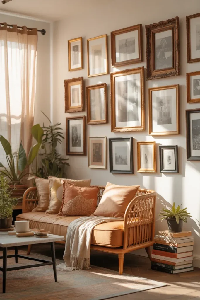
- Adds personality and creative expression
- Perfect for boho, vintage, and artistic homes
- Combines different frame styles and finishes
- Makes collected artwork feel intentional
- Turns a blank wall into a storytelling feature
An eclectic frame arrangement instantly brings personality into a room. Instead of matching frames, this idea mixes different sizes, finishes, and shapes to create a collected look that feels relaxed and artistic. The beauty of this approach is that it doesn’t need to be perfect. In fact, the slight irregularity makes the display feel more authentic. I’ve seen this work beautifully in homes where art pieces come from travel, family photos, or vintage markets, because each frame adds another layer of story to the wall.
This style also makes decorating easier because you can add pieces gradually over time. Instead of planning everything at once, the wall grows naturally as you find artwork you love. I’ve noticed that this approach often leads to the most interesting and personal walls in a home. Different frame textures like wood, metal, and antique gold create depth, while varied artwork styles add visual energy. When arranged thoughtfully, the wall feels lively yet balanced, transforming a plain surface into a creative focal point that guests instantly notice.
3. Oversized Statement Arrangement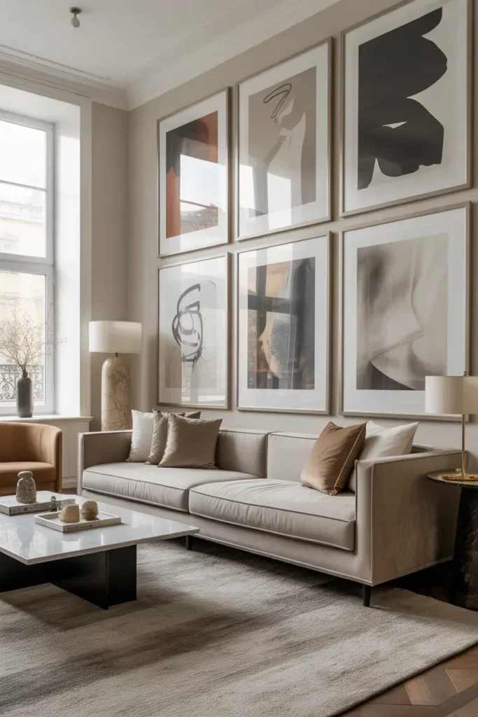
- Creates a bold focal point instantly
- Ideal for large living rooms or open walls
- Uses fewer pieces but larger artwork
- Adds dramatic visual impact
- Makes rooms feel more upscale and styled
Large artwork can completely transform the feel of a room in seconds. Instead of many small frames, this approach focuses on fewer oversized pieces that command attention. The larger scale makes the wall feel intentional and powerful, especially in spacious living rooms. I’ve noticed that oversized art also helps fill wide walls that often feel empty with smaller frames. With strong visuals and generous spacing, the wall feels modern and elevated rather than cluttered.
In many homes, people struggle with decorating big blank walls because small frames tend to look lost. This is where a large-scale Gallery Wall Design can make a dramatic difference. Bigger pieces naturally anchor the space and create visual balance with large furniture like sectionals or long sofas. In my experience, homeowners often feel surprised by how sophisticated their room looks after adding oversized artwork. The scale instantly brings a high-end designer feel without needing complicated arrangements or dozens of frames.
4. Floating Shelf Gallery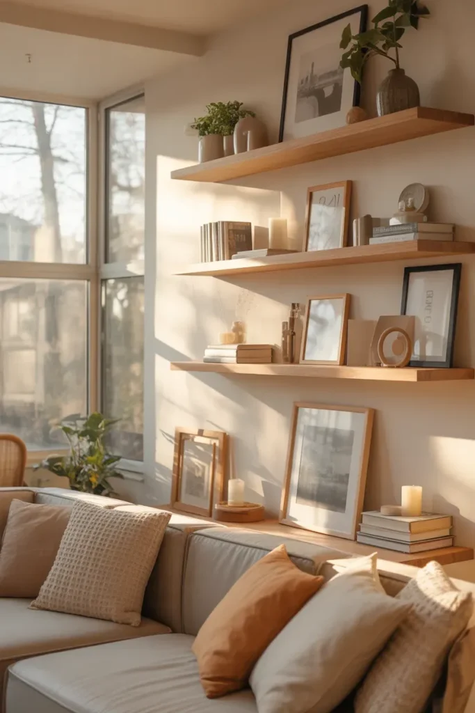
- Allows easy swapping of artwork and photos
- Creates a relaxed layered wall look
- Perfect for renters or flexible decorating
- Combines art with small decor pieces
- Adds depth and styling dimension to walls
Floating shelves offer one of the most flexible ways to style artwork on a wall. Instead of hanging every frame, the pieces simply lean against the wall on narrow shelves. This layered arrangement instantly creates depth and visual texture. I’ve noticed this idea works especially well for people who enjoy changing decor often. Frames can easily be swapped or rearranged without making new holes in the wall, which makes decorating feel less permanent and more creative.
In real homes, this style feels both relaxed and thoughtfully styled. Frames of different sizes can overlap slightly, while small decor pieces like candles, plants, or books add personality between the artwork. In my experience, this setup turns a simple wall into a dynamic styling area that evolves over time. The layered effect also softens the look of traditional framed art displays, making the wall feel warmer and more lived-in while still maintaining a clean and modern aesthetic.
Also view: 18 Open Shelves Without Clutter for Stylish Storage
5. Vintage Frame Collection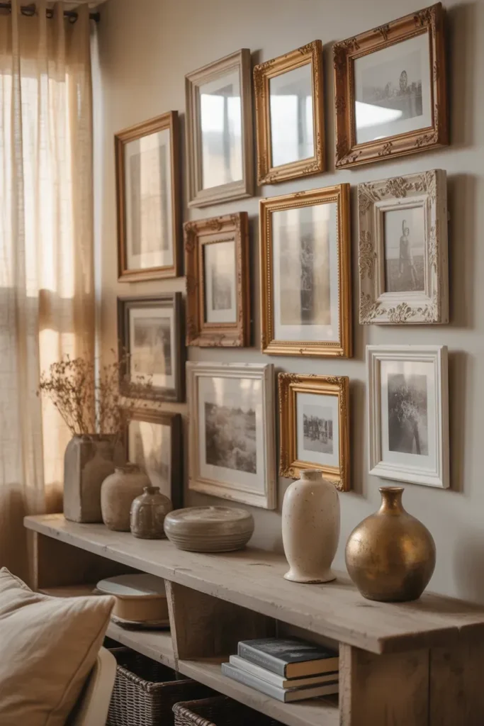
- Adds timeless character to any room
- Perfect for farmhouse or classic interiors
- Highlights ornate and antique frames
- Creates a curated, collected feel
- Works beautifully with neutral artwork
Vintage frames bring warmth and history into a space in a way that modern frames sometimes cannot. Their intricate details, aged finishes, and varied shapes add visual richness even before artwork is added. I’ve seen this work especially well in homes that lean toward farmhouse or traditional interiors. Instead of looking overly styled, the wall feels like it has grown over time through collected pieces, making the room feel personal and welcoming.
This idea also allows older frames from flea markets, thrift stores, or family collections to become a beautiful focal point. When grouped together thoughtfully, the frames create texture and depth across the wall. In many homes, this approach turns simple black-and-white prints or botanical illustrations into something that feels elegant and timeless. The layered antique finishes reflect light differently throughout the day, which gives the wall a subtle visual movement that keeps the space feeling warm and alive.
6. Symmetrical Sofa Layout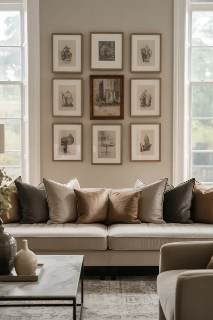
- Creates balance and visual harmony
- Perfect for styling above sofas
- Easy layout for beginners to plan
- Works well with matching frames or art sets
- Makes living rooms feel polished and structured
A symmetrical layout above the sofa instantly creates a sense of order and calm in a living room. Frames are arranged evenly from the center point, which makes the design feel balanced and intentional. I’ve noticed this approach works especially well for homeowners who want their space to feel polished without experimenting with complicated layouts. The symmetry naturally guides the eye across the wall and connects visually with the furniture below.
This arrangement is also one of the easiest ways to create a stylish Gallery Wall Design without guessing where pieces should go. Matching frames or coordinated artwork sets make the process even simpler. In my experience, this layout is ideal for people decorating their first gallery wall because it removes the stress of uneven spacing. The result is a wall that looks professionally styled while still feeling warm and inviting within everyday living spaces.
7. Staircase Wall Display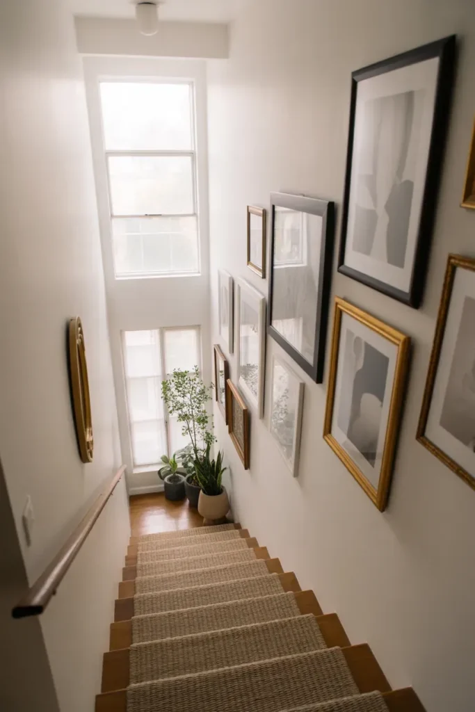
- Fills an often empty staircase wall beautifully
- Follows the natural angle of the stairs
- Adds visual movement to the space
- Works with family photos, prints, or travel art
- Turns a transition area into a design feature
Staircase walls often remain empty simply because they feel difficult to decorate. A flowing frame arrangement that follows the angle of the stairs instantly solves this problem. Instead of forcing straight rows, the frames gradually rise alongside the steps, creating a natural visual rhythm. I’ve noticed that this layout makes the staircase feel more integrated with the rest of the home rather than just a functional area people pass through quickly.
This approach also adds vertical movement that draws the eye upward, making the space feel taller and more dynamic. In many homes, a carefully arranged Gallery Wall Design along the staircase becomes one of the most memorable areas of the house. Family photos, travel memories, or meaningful artwork tell a visual story as people move up the stairs. In my experience, guests often stop midway just to look at the collection because the layout feels personal and visually engaging.
8. Neutral Tone Art Wall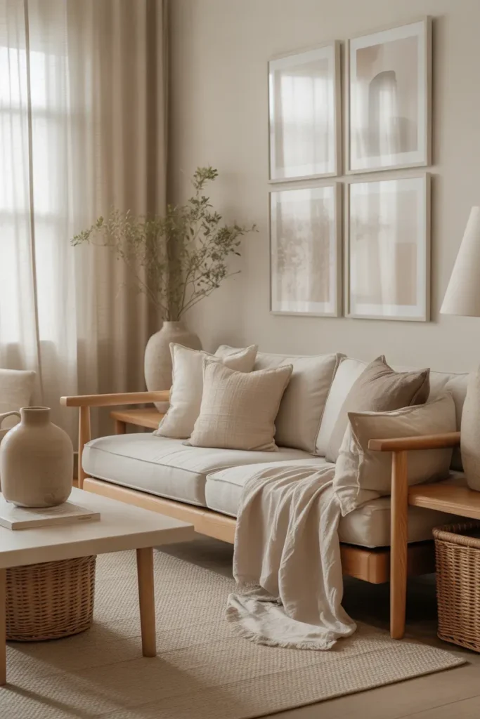
- Creates a calm and cohesive visual mood
- Perfect for minimalist and Japandi interiors
- Uses soft, neutral artwork palettes
- Blends naturally with warm textures
- Makes rooms feel peaceful and refined
Neutral artwork can create a surprisingly powerful visual impact when styled thoughtfully. Instead of bold colors, this idea focuses on soft tones like beige, ivory, sand, and warm gray. These shades blend beautifully with natural materials like wood, linen, and ceramics. I’ve noticed that this approach works especially well in calm, minimal interiors where the goal is to create a peaceful environment rather than a dramatic focal point.
The beauty of this wall arrangement is how effortlessly it connects with the rest of the room. When the artwork shares similar tones with furniture and textiles, the space feels cohesive and thoughtfully layered. In my experience, neutral-toned walls often make rooms feel brighter and more open because nothing visually overwhelms the eye. The result is a relaxed environment that feels elegant, balanced, and quietly sophisticated without relying on bold statement pieces.
9. Floor-To-Ceiling Frames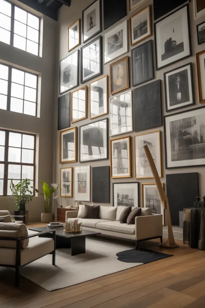
- Maximizes tall wall space beautifully
- Creates a dramatic design statement
- Ideal for lofts and high ceilings
- Adds visual height to rooms
- Makes the wall feel like a true gallery
Tall walls can sometimes feel empty or difficult to decorate, especially in homes with high ceilings. Extending frames from near the floor all the way up toward the ceiling instantly transforms that vertical space into a striking design feature. Instead of concentrating artwork in one small section, the entire wall becomes a visual showcase. I’ve seen this approach work beautifully in loft-style interiors where architectural height deserves to be highlighted.
The dramatic scale also makes the room feel more dynamic and thoughtfully designed. Large walls often need bold solutions, and a full-height arrangement provides exactly that. In my experience, this type of display gives the space a gallery-like atmosphere where each piece contributes to a larger visual story. The eye naturally travels upward through the arrangement, making the room feel taller, more open, and far more visually interesting than a single row of frames.
10. Botanical Print Cluster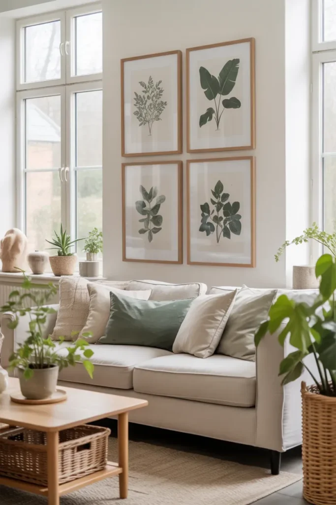
- Brings nature-inspired beauty indoors
- Perfect for plant lovers and fresh interiors
- Creates a calming organic wall display
- Works well with natural materials and textures
- Adds subtle color without overwhelming the room
Botanical artwork instantly introduces a sense of calm and freshness to a room. Leaf illustrations, plant sketches, or nature-inspired prints create a connection to the outdoors while keeping the space visually light. I’ve noticed this type of arrangement works especially well in bright living rooms where natural light highlights the soft greens and neutral tones within the artwork.
The clustered arrangement also gives the wall a natural, flowing look rather than a rigid structure. Instead of perfect alignment, the frames are grouped in a slightly organic layout that feels relaxed and inviting. In my experience, botanical displays pair beautifully with real plants placed nearby, creating a layered greenery effect. This combination makes the room feel vibrant, airy, and peaceful while still maintaining a clean and sophisticated interior style.
11. Monochrome Photo Wall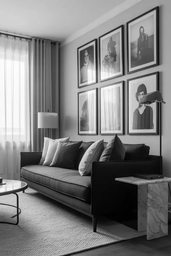
- Creates a timeless and elegant look
- Perfect for modern and contemporary interiors
- Highlights contrast and photography details
- Keeps the wall cohesive and refined
- Works beautifully with family photos or travel images
Black-and-white photography has a timeless quality that instantly elevates a space. Removing color allows textures, lighting, and composition within each image to stand out more clearly. I’ve seen this approach transform simple family photos into something that feels artistic and sophisticated. When displayed together, the consistent monochrome palette keeps the wall visually cohesive while still allowing each photograph to feel unique.
This type of wall arrangement also pairs beautifully with modern interiors where simplicity and contrast are key design elements. In many homes, a black-and-white Gallery Wall Design becomes a refined focal point without overwhelming the room with color. In my experience, this style is especially powerful in living rooms and hallways where the photos can tell a visual story while maintaining a polished, gallery-like atmosphere.
12. Floating Frame Mix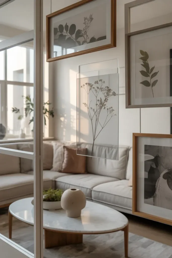
- Adds a light and airy visual effect
- Frames appear to float within the wall space
- Perfect for modern or minimalist interiors
- Works beautifully with delicate artwork
- Creates a layered contemporary display
Floating frames create a subtle yet striking design effect because the artwork appears suspended between glass panels. This transparent framing style allows light to pass through, which gives the entire wall a lighter and more open feeling. I’ve noticed this approach works beautifully with delicate pieces like botanical prints, sketches, or minimalist illustrations that benefit from a softer presentation.
The transparency also helps the arrangement feel less heavy than traditional frames, especially when placed on light-colored walls. In real homes, this style adds elegance without overwhelming the surrounding decor. In my experience, floating frames are particularly effective in modern interiors where clean lines and minimal clutter are important. The result is a sophisticated wall display that feels refined, airy, and visually unique.
13. Rustic Wood Frame Wall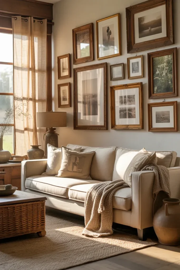
- Brings warmth and natural texture to walls
- Perfect for farmhouse and rustic interiors
- Highlights the beauty of wooden frames
- Creates a cozy, welcoming atmosphere
- Pairs beautifully with neutral artwork
Rustic wooden frames instantly make a wall feel warmer and more inviting. The natural grain, subtle imperfections, and aged finishes add texture that modern frames often lack. I’ve noticed this style works especially well in farmhouse-inspired homes where natural materials play a big role in the overall design. Instead of looking overly polished, the wall feels relaxed and authentic.
When grouped together, wooden frames create a layered visual texture that softens large empty walls. Artwork such as landscapes, vintage photos, or botanical prints complements the natural feel beautifully. In my experience, this type of arrangement often makes a room feel more comfortable and lived-in. The organic tones of the wood also connect easily with other materials in the space like woven rugs, linen fabrics, and ceramic decor.
14. Color-Coordinated Art Wall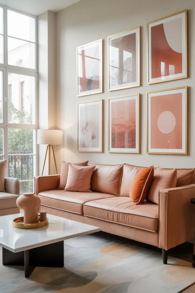
- Creates a cohesive color story on the wall
- Adds subtle vibrancy to neutral rooms
- Perfect for modern styled interiors
- Makes artwork feel intentionally curated
- Enhances the room’s overall palette
A color-coordinated wall arrangement brings harmony to a space by repeating similar tones throughout the artwork. Instead of mixing completely different colors, the prints share a consistent palette that connects visually with the rest of the room. I’ve noticed this approach works beautifully in neutral spaces where small color accents can make the entire room feel more styled.
This method also makes decorating easier because the wall becomes part of the room’s overall color scheme. In many homes, a thoughtfully planned Gallery Wall Design like this helps tie together cushions, rugs, and decorative pieces already present in the space. In my experience, when the artwork reflects the room’s existing colors, the entire environment feels more intentional, balanced, and professionally styled.
15. Corner Wrap Gallery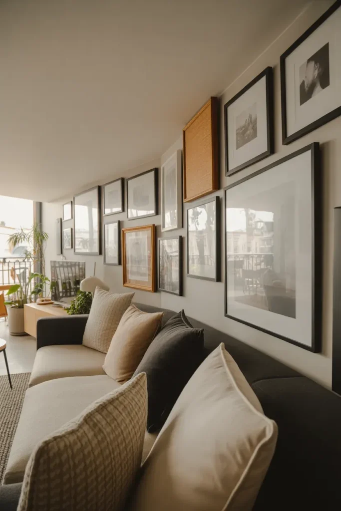
- Uses wall corners creatively
- Extends artwork across two walls
- Adds dimension to small rooms
- Makes unused corners visually interesting
- Creates a unique design feature
Most people focus only on flat wall surfaces when displaying artwork, but corners offer an unexpected design opportunity. Wrapping frames around the corner connects two walls visually, making the space feel more continuous and thoughtfully designed. I’ve seen this work particularly well in smaller living rooms where every wall surface matters.
The layout also adds depth because the arrangement can be viewed from multiple angles as you move through the room. Instead of a single flat display, the artwork becomes part of the room’s architecture. In my experience, corner displays often surprise guests because they feel creative and unconventional. This simple design trick can make a compact space feel more dynamic while maximizing wall usage.
16. Gallery Ledge Layering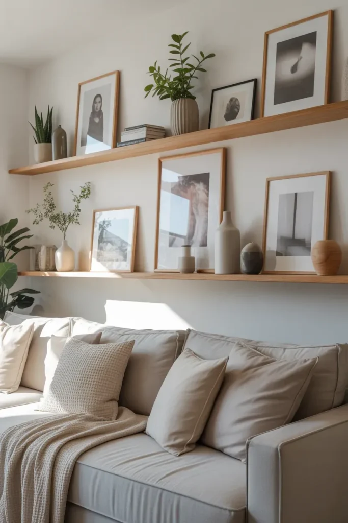
- Enables easy rearrangement of artwork
- Adds depth and dimension to walls
- Works well with varying frame sizes
- Perfect for modern and minimalist interiors
- Creates a casual yet polished look
Gallery ledges provide a flexible way to display artwork and decorative pieces without permanent wall damage. Instead of hanging frames individually, pieces lean on narrow ledges to create layered visual interest. I’ve noticed this approach is particularly great for renters or anyone who likes to change their decor frequently. The layering allows multiple frames of different sizes to coexist harmoniously.
Using stacked ledges also adds vertical visual interest without cluttering the wall. It’s easy to style with a mix of framed prints, small decor items, and greenery, creating a relaxed but intentional arrangement. In my experience, this technique makes a space feel curated and dynamic. The flexibility of gallery ledges means you can swap out artwork seasonally, keeping the wall fresh while maintaining a cohesive aesthetic.
17. Geometric Frame Arrangement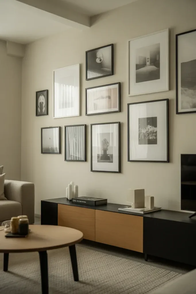
- Creates visual structure and rhythm
- Perfect for modern, minimalist interiors
- Works well with geometric prints or photographs
- Makes walls feel orderly and sophisticated
- Adds a clean, design-forward aesthetic
A geometric frame layout instantly brings structure and rhythm to a gallery wall. Arranging square and rectangular frames in a repeating or alternating pattern creates a sense of order that feels visually satisfying. I’ve seen this approach work best in modern interiors where simplicity and clean lines are key. The shapes themselves become part of the design even before considering the artwork inside.
This layout is particularly helpful for rooms that might otherwise feel scattered or busy. By using repetition and symmetry, the wall becomes a cohesive visual feature. In my experience, geometric arrangements allow for creative flexibility while keeping the design intentional. The consistent alignment and spacing draw the eye naturally, making the space feel both stylish and thoughtfully curated.
18. Layered Print Wall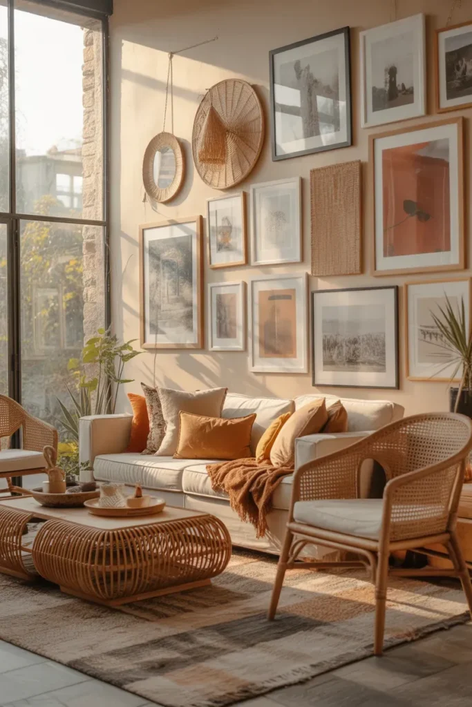
- Adds dimension through overlapping frames
- Creates a casual, artistic look
- Perfect for boho or eclectic interiors
- Allows small and large prints to coexist
- Feels dynamic and collected
Layering frames by slightly overlapping them adds instant depth and visual interest to a wall. Instead of a rigid grid, the casual overlapping layout feels artistic and effortless. I’ve noticed this approach works beautifully in eclectic or bohemian interiors where collected pieces and relaxed styling are celebrated. Each frame interacts with the others, creating a unified, yet dynamic composition.
This type of gallery wall also encourages mixing small and large prints, creating a more organic look. In real homes, the layered arrangement can easily incorporate new pieces over time, keeping the wall fresh. In my experience, this style often feels personal and curated simultaneously, making it a favorite for homeowners who want their gallery wall to feel like a living, evolving display.
19. Mixed Media Wall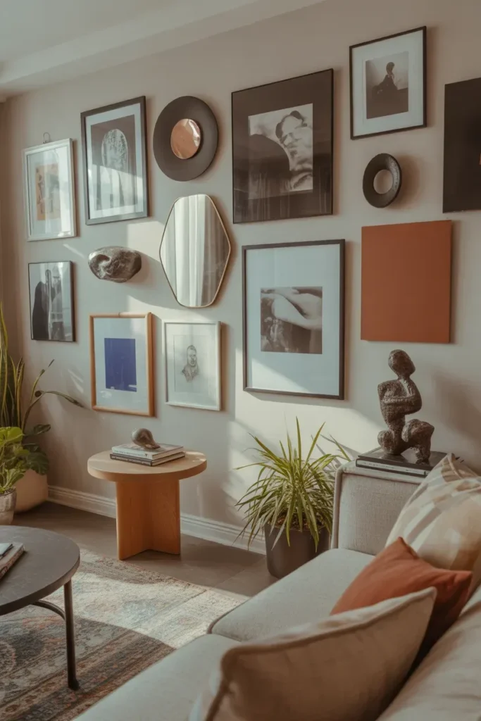
- Combines different art forms for variety
- Adds texture and dimensionality
- Works well for eclectic and creative interiors
- Makes the wall visually dynamic
- Encourages personal expression through decor
A mixed media gallery wall adds a layer of creativity and texture to any space. Instead of relying solely on framed prints, this idea incorporates mirrors, canvases, and sculptural pieces to create a more visually engaging display. I’ve seen this work especially well in homes where each wall tells a personal story through varied art forms. The diversity of materials makes the display feel lively and unique.
This approach also allows flexibility in design because each piece contributes something different—texture, reflection, or color. In many homes, mixed media walls turn plain surfaces into true artistic statements. In my experience, this idea works best when there is careful spacing and balance so that each element complements the others, creating a cohesive yet dynamic gallery that feels intentional and inspiring.
Conclusion
By exploring these 19 gallery wall design ideas, you can elevate any room with personality, style, and visual impact. Each idea shows how thoughtful placement, color, and framing can turn blank walls into inspiring spaces that feel lived-in and inviting. I’ve seen how small touches like layering, symmetry, or eclectic frames can completely transform a home’s atmosphere. Pick a style that resonates with you, experiment with layouts, and watch your walls come alive. Don’t forget to save this post on Pinterest, try a few ideas in your own space, and share the inspiration with friends who love home styling as much as you do!