16 Biophilic Paint Colors for Nature-Inspired Homes
Biophilic Paint Colors can completely change how a home feels without requiring a full renovation. Sometimes a room does not need new furniture or expensive decor. It simply needs colors that feel softer, warmer, and more connected to nature.
If your space feels cold, flat, overly bright, or visually stressful, the right paint shade can make a huge difference. This article shares calming earthy greens, warm neutrals, soft blues, and grounded natural tones that help rooms feel more relaxing and welcoming. Each idea is designed to bring a peaceful atmosphere into real homes while still looking stylish and Pinterest-worthy.
In my experience, natural paint palettes often make spaces feel more expensive and thoughtfully designed, even with simple decor. I’ve also noticed that earthy tones photograph beautifully in natural light, which is one reason they continue trending across Pinterest and modern organic interiors. Whether you want a cozy bedroom, a brighter living room, or a calmer bathroom, these color ideas will help you create a home that feels balanced, comforting, and connected to the outdoors.
Soft Sage Green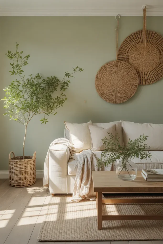
- Creates a calm, grounded feeling without making the room feel dark.
- Works beautifully with wood, linen, rattan, and stone textures.
- Helps small spaces feel softer and more connected to nature.
- A great choice for living rooms, bedrooms, or quiet reading corners.
Soft sage green instantly makes a room feel calmer, fresher, and more pulled together. This shade works because it brings in a natural leafy feeling without overwhelming the walls. In real homes, it pairs especially well with warm wood floors, cream upholstery, woven baskets, and simple greenery. The result feels peaceful but still polished. If your space currently feels too plain or cold, sage adds gentle depth while keeping the room bright. It is one of those nature-inspired wall shades that feels easy to live with every day.
In my experience, sage green is one of the safest ways to bring outdoor calm into a home without committing to a bold color. It looks beautiful in morning light and becomes softer in the evening with warm lamps. This makes it useful for rooms where you relax, read, or spend time with family. It also photographs beautifully for Pinterest because the color supports natural textures instead of fighting them. When used with creamy whites and light woods, it creates a clean, soothing, balanced space.
Warm Clay Beige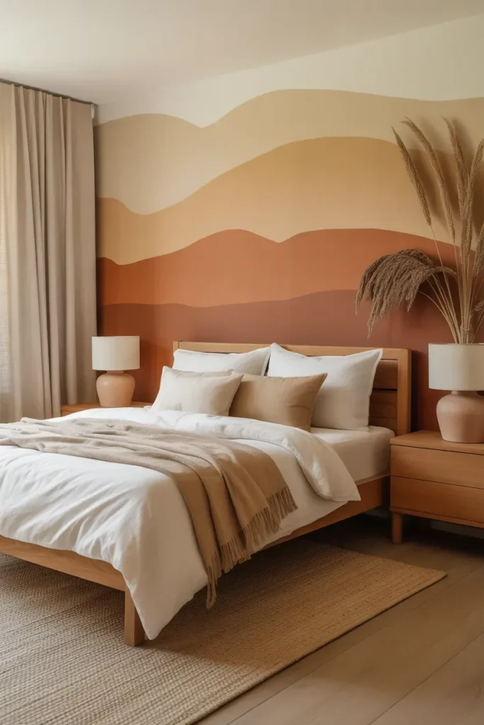
- Adds warmth without feeling too orange or heavy.
- Makes neutral rooms feel richer, softer, and more inviting.
- Looks beautiful with terracotta, cream, tan, and walnut wood.
- Helps create a grounded bedroom or lounge mood.
Warm clay beige gives a room that soft, sun-baked warmth people love in natural interiors. It feels more interesting than plain beige because it carries a gentle earthy undertone, almost like clay, sand, and soft terracotta blended together. This color works especially well in bedrooms because it makes the space feel cozy without closing it in. Add ivory bedding, wood furniture, and ceramic lamps, and the whole room starts to feel calm and layered. It is simple, but it never feels flat or unfinished.
This shade is especially helpful when a room has too many cool whites or gray pieces. Warm clay beige balances those elements and makes the space feel more human, relaxed, and lived-in. I’ve noticed it works beautifully in homes with natural light because the color changes gently throughout the day. In bright light, it feels airy and soft. At night, it becomes warmer and more intimate. For Pinterest-style interiors, this kind of earthy wall color creates an easy backdrop for texture, plants, and handmade decor.
Also view: 18 Nordic Hexagon Wall Shelf Ideas for Stylish Homes
Mossy Olive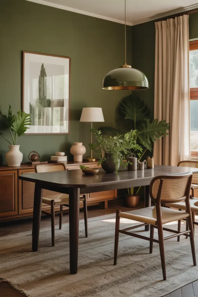
- Brings a deeper, moodier nature-inspired feeling into the home.
- Makes dining rooms and offices feel cozy, stylish, and grounded.
- Pairs well with brass, dark wood, linen, stone, and greenery.
- Adds character without needing busy wall decor.
Mossy olive creates a rich, grounded look that feels connected to forests, gardens, and shaded outdoor spaces. This color works well when you want a room to feel more intentional and cozy, especially in dining areas, offices, or accent walls. Unlike brighter greens, olive has a mature, earthy quality that feels elegant rather than trendy. Pair it with dark wood, brass lighting, cream curtains, and textured ceramics for a layered look. The room immediately feels warmer, calmer, and more designed without needing too many decorative pieces.
That’s why many designers recommend deeper greens for rooms where people gather, focus, or slow down. Mossy olive can make a plain dining room feel intimate, especially when combined with warm lighting and natural materials. It also hides small marks better than pale paint, which is practical in busy homes. If you love Biophilic Paint Colors but want something bolder than sage, olive is a strong option. It brings nature indoors in a way that feels stylish, grounded, and surprisingly easy to decorate around.
Muted Sky Blue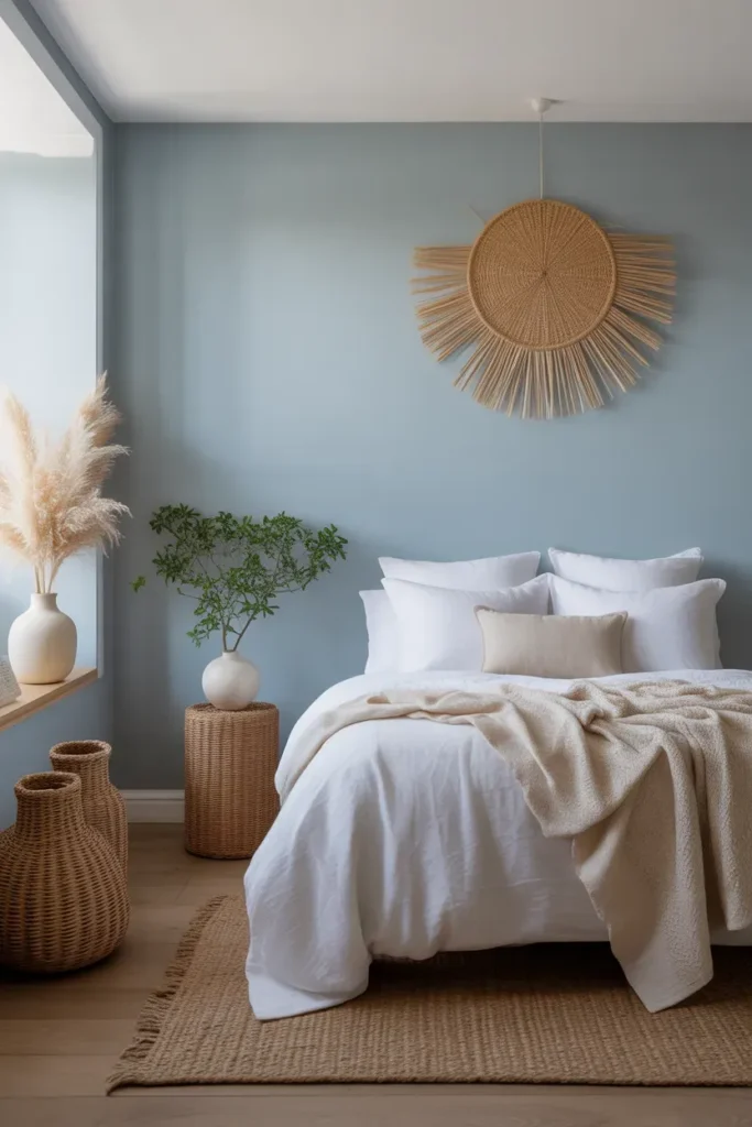
- Opens up small rooms and makes them feel brighter.
- Adds a soft, airy feeling without being too cool or stark.
- Works well with white, light wood, and soft neutral textures.
- Perfect for bedrooms, nurseries, or quiet relaxation spaces.
Muted sky blue brings a sense of openness that instantly lifts a room. This shade feels like a soft morning sky, making it ideal for spaces where you want calm energy without heaviness. In real homes, it pairs beautifully with white bedding, pale woods, and woven textures that add warmth. The result feels fresh but not cold. If your space feels cramped or lacks light, this tone visually expands the room and creates a gentle, breathable atmosphere that feels easy to relax in.
I’ve seen this color work especially well in rooms that don’t get a lot of natural sunlight. It reflects light in a way that brightens the space without feeling harsh or overly cool. When styled with soft fabrics and minimal decor, it creates that clean Pinterest look people love. It also blends effortlessly with nature-inspired palettes, making it a strong addition to Biophilic Paint Colors without overpowering other elements. The overall effect feels peaceful, simple, and quietly uplifting.
Forest Pine Green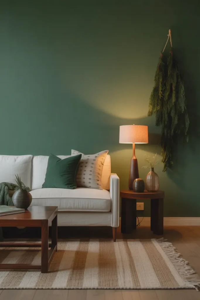
- Creates a bold, cozy, and grounded atmosphere.
- Perfect for statement walls or full-room color.
- Pairs beautifully with dark wood, black accents, and greenery.
- Adds depth and drama without feeling artificial.
Forest pine green transforms a room into a cozy, grounded retreat. This deeper shade brings a rich, forest-like feeling that works especially well in living rooms or feature walls. It adds instant depth, making even simple furniture look more styled and intentional. Pair it with dark wood, soft textiles, and warm lighting to balance the boldness. The result is a space that feels warm, layered, and slightly dramatic, but still connected to natural elements and textures found outdoors.
In my experience, darker greens like this work best when balanced with lighter decor and soft lighting. Without that contrast, the room can feel too heavy. But when styled correctly, it creates a stunning visual impact that feels both modern and timeless. I’ve noticed it photographs incredibly well, especially in evening light, making it a favorite for Pinterest interiors. It also works as a strong extension of Biophilic Paint Colors for those who want a deeper, more immersive natural feel.
Sandstone Neutral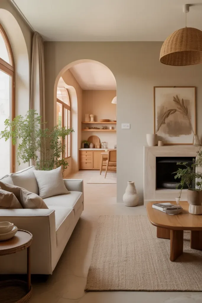
- Creates a warm, subtle base for any room style.
- Enhances natural textures like linen, wood, and jute.
- Works well in both small and large spaces.
- Easy to layer with seasonal decor and accents.
Sandstone neutral is one of those colors that quietly transforms a space without demanding attention. It sits between beige and soft tan, offering warmth while staying light enough to keep the room open. This makes it perfect for living rooms, hallways, or even kitchens where flexibility matters. Add linen sofas, wooden accents, and soft textiles, and the space begins to feel calm, natural, and welcoming. It is simple, but it supports every other design choice in the room.
I’ve noticed this tone works especially well for people who love changing decor throughout the year. Because it is so versatile, you can easily switch from cozy autumn textures to fresh spring styling without repainting. That’s why many designers use shades like this as a base in nature-inspired homes. It allows furniture, plants, and textures to stand out naturally. The result is a space that always feels balanced, warm, and effortlessly put together.
Dusty Eucalyptus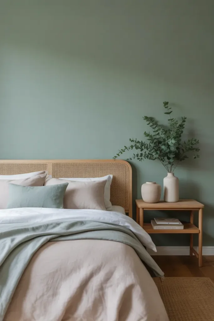
- Feels softer than green but richer than gray.
- Blends beautifully with neutrals and organic materials.
- Adds a relaxed, spa-like atmosphere to bedrooms.
- Ideal for creating a calm, clutter-free look.
Dusty eucalyptus brings a soft, soothing tone that sits perfectly between green and gray. This makes it incredibly versatile for real homes where you want calm without feeling too plain. It works especially well in bedrooms, where the muted tone helps reduce visual noise and create a restful atmosphere. Pair it with linen bedding, pale woods, and simple ceramics, and the space instantly feels more relaxed. The color quietly enhances everything around it without competing for attention.
I’ve noticed this shade works beautifully in homes that already have neutral furniture but need a subtle lift. It adds dimension without making the room feel busy or overwhelming. In natural light, it leans slightly green, while in softer lighting it appears more gray, giving the space a gentle shift throughout the day. That flexibility makes it a smart choice for Biophilic Paint Colors, especially if you want something understated yet connected to nature.
Golden Wheat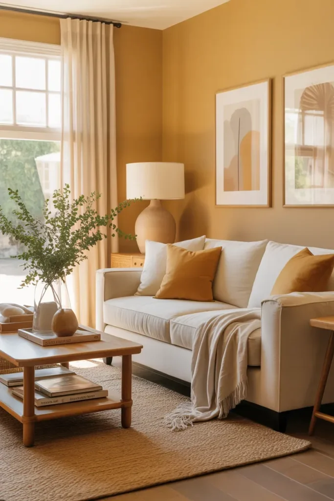
- Adds warmth and brightness without strong yellow tones.
- Creates a cozy, sunlit feeling even in darker rooms.
- Pairs well with cream, wood, and soft earthy accents.
- Ideal for living rooms and family spaces.
Golden wheat brings a warm, sun-kissed glow that makes any room feel instantly more inviting. It carries a soft golden undertone that feels natural rather than bold, making it easy to style with existing furniture. This color works especially well in living areas where you want comfort and light without harsh brightness. Combined with cream upholstery, wood furniture, and soft textures, it creates a welcoming environment that feels both cozy and open at the same time.
In my experience, this tone is perfect for rooms that feel slightly dull or shadowed. It reflects light in a warm way, helping the space feel brighter throughout the day. I’ve seen this work especially well in homes with limited natural light, where cooler colors tend to feel flat. Golden wheat adds that subtle glow people often try to achieve with lighting alone. It fits naturally into earthy palettes and enhances the overall warmth of a nature-inspired home.
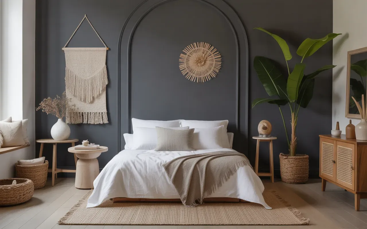
Charcoal Stone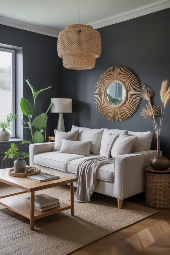
- Adds depth and contrast to lighter spaces.
- Works well as an accent wall or feature area.
- Highlights natural textures like wood and stone.
- Creates a modern, grounded aesthetic.
Charcoal stone introduces a strong, grounding element that balances lighter tones in a room. This deep gray shade works best as an accent wall, where it can add contrast without overwhelming the space. Pair it with lighter furniture, natural wood, and soft textiles to create a balanced look. The darker backdrop allows textures and decor to stand out more clearly, making the room feel more styled and intentional without adding clutter or excessive decoration.
I’ve seen this color used effectively in modern homes where simplicity is key but visual interest is still important. It brings a quiet sophistication that feels both clean and grounded. When combined with greenery and warm lighting, it softens and connects beautifully to nature-inspired interiors. This is a great option if you want to explore Biophilic Paint Colors in a more subtle, contemporary way while still keeping the space calm and visually striking.
Ocean Mist Blue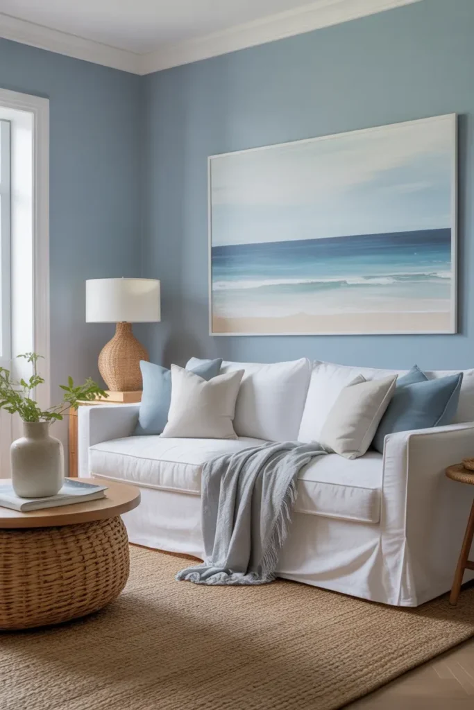
- Creates a light, breezy atmosphere without feeling cold.
- Softens harsh lighting and brightens the space naturally.
- Pairs beautifully with whites, pale woods, and woven textures.
- Ideal for open living areas and bedrooms.
Ocean mist blue brings a soft coastal calm that instantly makes a room feel lighter and more open. This shade sits between blue and gray, giving it a gentle, airy quality that works in almost any home. It reflects light beautifully, which helps brighten up rooms that feel dull or heavy. Paired with white fabrics, light wood furniture, and woven textures, the space begins to feel fresh and effortless. It’s especially effective in creating a relaxed environment that feels clean yet warm.
I’ve noticed this tone works best when you keep the styling simple and let the color breathe. Too many bold elements can take away from its calming effect. In real homes, it performs beautifully in both modern and coastal-inspired spaces, making it very versatile. It also blends seamlessly with Biophilic Paint Colors, adding a subtle water-inspired element that complements greens and earthy tones. The result is a space that feels peaceful, open, and naturally balanced.
Muted Terracotta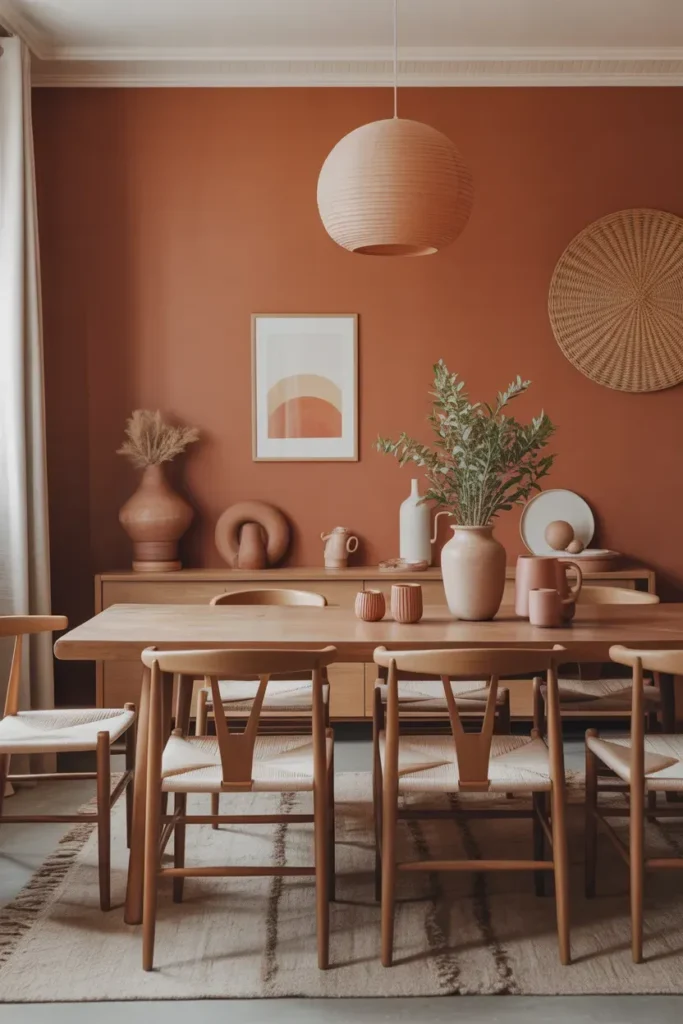
- Adds warmth and personality without being too bold.
- Works well with wood, ceramics, and neutral fabrics.
- Creates a cozy, grounded dining or lounge space.
- Brings a subtle Mediterranean-inspired feel indoors.
Muted terracotta introduces a warm, earthy richness that instantly adds character to a space. Unlike brighter orange tones, this shade feels soft and natural, making it easier to live with every day. It works especially well in dining rooms or cozy corners where warmth matters most. When paired with wooden furniture, linen fabrics, and simple ceramics, the room feels layered and inviting. This color helps create a welcoming environment where everything feels connected and thoughtfully styled.
In my experience, terracotta tones shine when combined with soft lighting and natural textures. They create a glow that feels comforting, especially in the evening. I’ve seen this work well in homes that want a bit of color without stepping too far away from neutral palettes. It also fits naturally into Biophilic Paint Colors because it reflects the tones of earth, clay, and natural landscapes. The overall effect feels warm, grounded, and quietly beautiful.
Pale Fern Green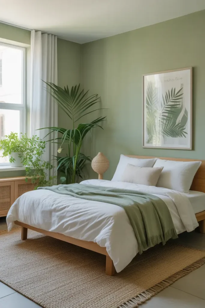
- Adds a fresh, plant-like feel to interiors.
- Brightens the room while still feeling soft and natural.
- Pairs well with white, wood, and botanical decor.
- Ideal for bedrooms, nurseries, or light-filled spaces.
Pale fern green brings a fresh, botanical feel that instantly connects a room to nature. This lighter green works beautifully in spaces where you want brightness with a hint of color. It reflects natural light in a soft way, making rooms feel open and uplifting. Paired with white bedding, light woods, and indoor plants, it creates a clean and refreshing environment. It is especially effective in bedrooms where you want a balance of calm and gentle energy.
I’ve seen this shade work well in homes that lean toward minimal or Scandinavian styles. It adds just enough color to keep the space from feeling plain, while still maintaining a clean and simple look. Because it is so soft, it blends easily with different decor styles and seasonal changes. This makes it a strong choice for nature-inspired interiors where flexibility matters. The result is a room that feels light, fresh, and quietly connected to the outdoors.
Cocoa Earth Brown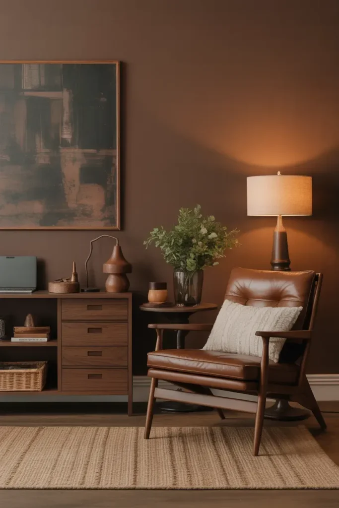
- Creates a warm and grounded atmosphere instantly.
- Makes larger rooms feel cozier and more intimate.
- Pairs beautifully with walnut wood and soft lighting.
- Adds richness without needing bold decor pieces.
Cocoa earth brown brings a deep, comforting warmth that makes a room feel grounded and secure. This shade works especially well in offices, libraries, or cozy living spaces where you want a more intimate atmosphere. The rich earthy tone pairs naturally with walnut wood, leather, linen, and warm lighting, creating a layered look that feels timeless. Instead of relying on bright decor or trendy accents, this color gives the room character through warmth and depth alone.
That’s why many designers recommend earthy browns when a space feels too cold or overly minimal. In my experience, this tone works best when balanced with lighter fabrics and natural textures to keep the room from feeling heavy. It creates a cozy environment that encourages relaxation and focus at the same time. For homeowners exploring Biophilic Paint Colors beyond greens and beiges, cocoa brown offers a grounded alternative inspired by soil, wood, and natural landscapes.
Stone Gray Taupe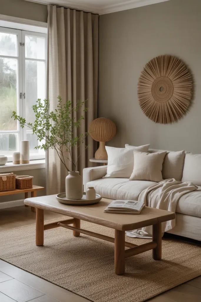
- Balances warm and cool tones beautifully.
- Helps natural textures stand out more clearly.
- Works with modern, rustic, and minimalist interiors.
- Creates a calm and polished backdrop.
Stone gray taupe offers the perfect middle ground between cool gray and warm beige. This balance makes it one of the easiest shades to use in nature-inspired homes because it supports almost every material and texture around it. Linen curtains, oak furniture, woven rugs, and ceramic accents all stand out beautifully against this soft neutral backdrop. The room immediately feels calmer, cleaner, and more cohesive without needing dramatic styling or bold color combinations.
I’ve noticed this tone is especially useful for open spaces where multiple rooms connect visually. It flows naturally from one area to another without creating harsh transitions. Because it adapts to changing light throughout the day, the room always feels soft and comfortable instead of flat. This makes it ideal for homeowners who want something timeless but still connected to modern organic interiors. The result feels polished, effortless, and naturally welcoming.
Rainwashed Green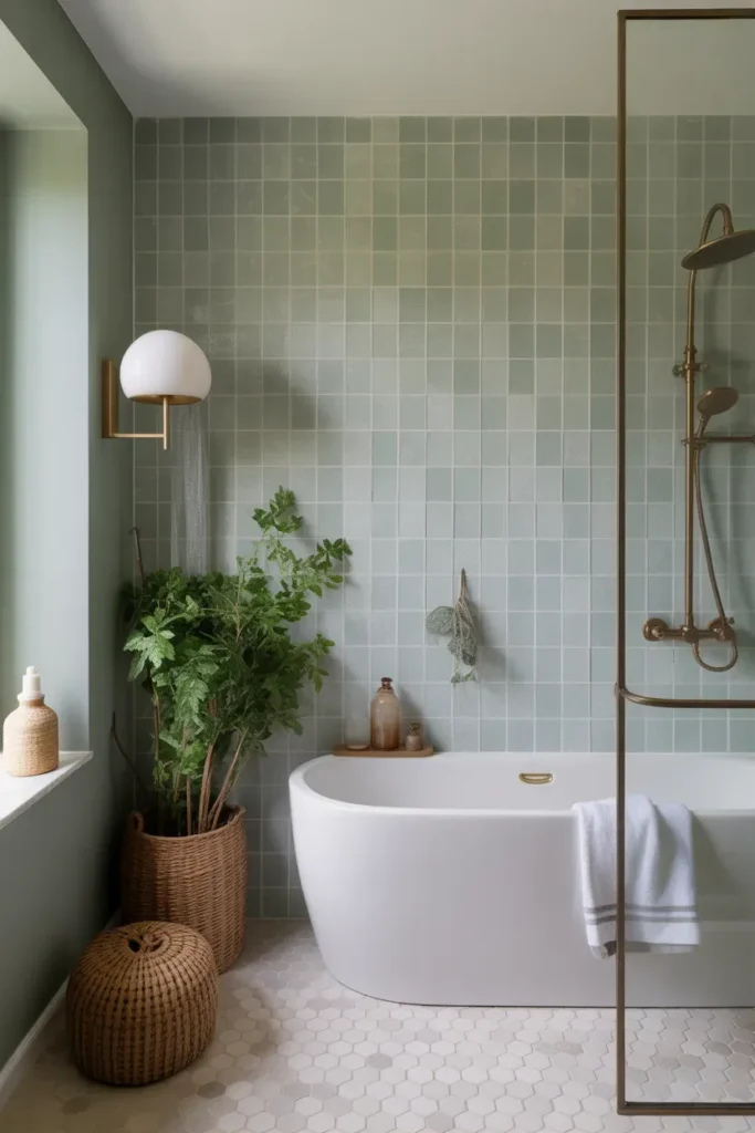
- Creates a soft spa-like atmosphere at home.
- Feels fresh and calming without overpowering the room.
- Pairs beautifully with stone, brass, and white finishes.
- Perfect for bathrooms or peaceful relaxation areas.
Rainwashed green brings a soft, refreshing quality that instantly makes a space feel calmer and cleaner. This muted green-gray tone works especially well in bathrooms because it creates a spa-like atmosphere without feeling overly styled. Combined with white stone surfaces, brass accents, and natural textures, the room begins to feel more relaxing and balanced. The subtle color also helps soften hard materials like tile and metal, making the overall space feel warmer and more inviting.
In my experience, colors like this work best when paired with simple decor and natural materials. Too many accessories can distract from the peaceful effect the shade creates. I’ve seen this work beautifully in smaller bathrooms where stronger colors would feel overwhelming. It also blends naturally into Biophilic Paint Colors by reflecting the quiet tones of rain, leaves, and soft outdoor landscapes. The final result feels fresh, calm, and incredibly easy to live with.
Creamy Mushroom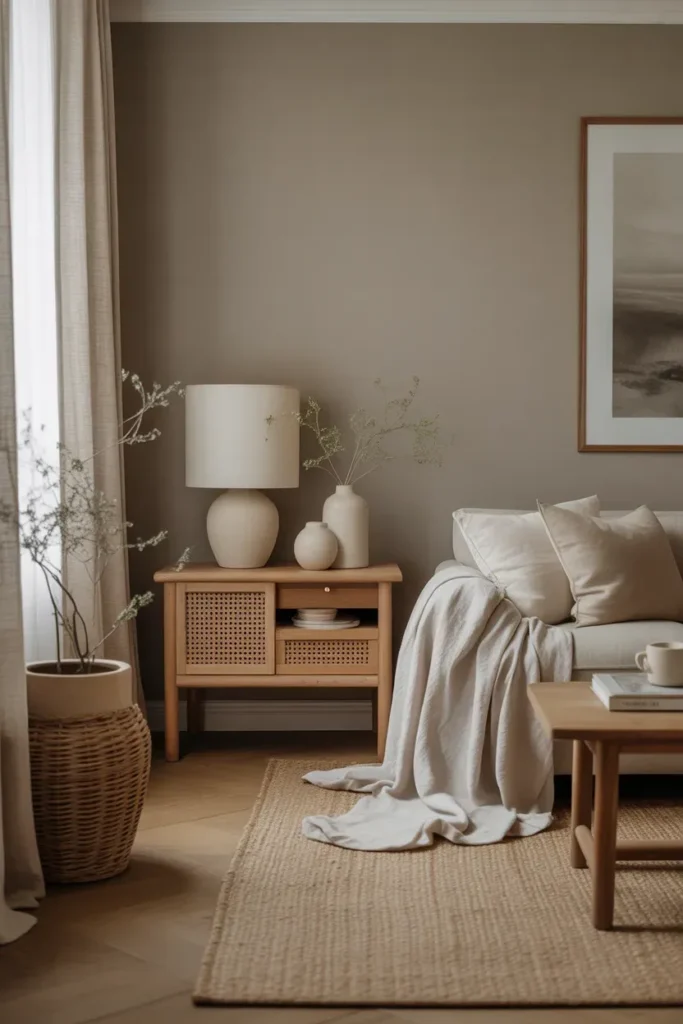
- Creates a soft organic look without plain white walls.
- Blends beautifully with wood, linen, and stone textures.
- Makes the room feel warm, calm, and polished.
- Works well in modern organic and minimalist homes.
Creamy mushroom brings a quiet warmth that instantly softens a room without making it feel dark or heavy. This neutral sits between taupe, beige, and soft gray, creating a balanced tone that works beautifully with natural materials. In real homes, it pairs effortlessly with oak furniture, linen curtains, woven rugs, and simple ceramic decor. The result feels layered and intentional while still staying calm and minimal. It is especially useful for homeowners who want warmth without strong color dominating the space.
I’ve noticed this shade becomes even more beautiful as natural light changes throughout the day. In bright daylight, it feels airy and creamy, while evening lighting gives it a warmer, cocoon-like atmosphere. That flexibility makes it one of the easiest tones to decorate around long term. It also works perfectly within Biophilic Paint Colors because it supports greenery, organic textures, and earthy styling without competing for attention. The overall effect feels timeless, soothing, and naturally elegant.
Conclusion
The right paint color can completely shift the mood of a home, making it feel calmer, warmer, and more connected to nature. From soft greens to earthy neutrals and rich grounded tones, these ideas show how small color changes can create a big visual impact. In my experience, Biophilic Paint Colors help rooms feel more relaxing and timeless without needing complicated design updates.
Save this article on Pinterest for future inspiration, try one or two shades in your own space, and share these ideas with anyone wanting a more peaceful home. Sometimes the simplest wall color creates the biggest transformation.