22 Classy Living Room Designs Timeless Elegance
A classy living room does not come from expensive furniture alone. It comes from restraint, balance, and the quiet confidence of pieces that belong together. The rooms that feel timeless share the same traits: a calm palette, thoughtful lighting, and textures that invite you to sit down. You do not need a designer budget to get there. You need a clear plan and a few honest choices about what stays and what goes.
This guide walks through 22 classy living room designs that lean on timeless ideas rather than passing trends. You will see neutral layers, symmetrical layouts, soft luxury textures, and traditional details that have worked for decades. Each idea breaks down what makes the look work, how to adapt it to your own space, and which pieces pull it together. Every idea also includes a small shopping list so you can find the key items without guessing.
If your living room feels flat, dated, or just a little unsure of itself, this is for you. These ideas work for small apartments and large family homes alike. Most of them can be started in a weekend with paint, fabric, and a better arrangement of what you already own. Read through, pick the ideas that fit your room, and build your version one layer at a time.
This post contains affiliate links. If you buy through them, I may earn a small commission at no extra cost to you.
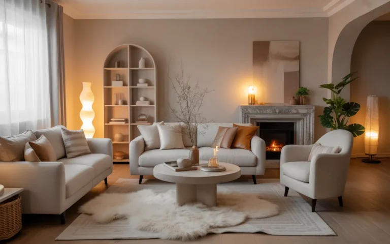
1. Neutral-Toned Living Room with Elegant Layers

A neutral palette is the safest foundation a living room can have, and it is also one of the hardest to make interesting. The trick is layering. One beige sofa against beige walls reads flat. But a beige sofa with an ivory throw, a cream rug with a deeper border, and linen curtains in a slightly warmer tone starts to feel rich. Neutrals work because they let texture and form do the talking. Your eye notices the weave of the fabric, the curve of an armrest, the way light moves across a wool rug. Nothing shouts, so everything gets heard. The layered approach also makes the room easy to update over time. Swap one textile, and the whole feeling shifts slightly without a full redecoration.
Warm it up: Cool neutrals can feel cold fast, so lean toward warm undertones like camel, oatmeal, and soft taupe. These shades flatter skin tones and make a room feel welcoming at any hour. If your walls are already a cool gray, warm the room with wood tones and brass accents instead of repainting. A cognac leather ottoman or a honey-toned side table can shift the whole temperature of the space. Lighting matters just as much as the palette. Cool daylight bulbs will make even warm neutrals feel chilly, so swap them for warm white bulbs around 2700K. In the evening, lamplight against warm neutrals creates a glow that flatters everyone in the room.
Layer the textures: Mix at least four textures to keep a neutral room from looking one-note. Try smooth linen, nubby boucle, a flat-weave rug, and something with sheen like silk or velvet. Place them close together so the contrast is visible: a rough throw over a smooth sofa, a glossy vase on a matte tray. The variety gives your hands and eyes something to explore, which is what makes a neutral room feel luxurious instead of empty. Do not forget the less obvious textures either. A woven basket, a carved wood bowl, or a stone coaster set all add tactile interest without introducing new colors. Spread the textures around the room so every seat and every sightline has something to discover. When someone runs their hand along the sofa arm and feels the difference between the linen and the throw, the room has done its job. That sensory richness is the real luxury of a neutral palette.
- Stick to three neutrals max so the palette stays calm, for example ivory, camel, and warm gray.
- Add one dark accent, like a walnut frame or black lamp base, to ground all the light tones.
- Wash or steam new textiles before styling so they drape naturally instead of looking stiff.
Shop This Look
2. Classic Living Room with Symmetrical Layout

A symmetrical living room usually starts with a focal point, most often a fireplace or a large window, and builds matching pairs outward from it. Two chairs facing each other across a coffee table, two lamps flanking a sofa, two matching side tables. The result feels orderly and intentional, even if the individual pieces are simple. You do not need matching furniture sets to pull this off. You need matching positions. That distinction matters because it means you can build symmetry with pieces you already own. A chair from one room and a chair from another become a pair when they sit in mirrored positions. The eye reads the arrangement before it inspects the furniture, so the balance registers first. This is why symmetrical rooms photograph so well and feel so restful in person. The order is doing quiet work that you feel more than notice.
Anchor the center: Start with your focal point and work outward in pairs. If you have a fireplace, center the sofa or a pair of chairs on it, then place one side table and one lamp on each side. A centered rug ties the pairs together and defines the seating zone. When the center is strong, the symmetry reads clearly and the room feels settled instead of scattered. If your room lacks an obvious focal point, create one. A large piece of art, a console table with a mirror above it, or even a well-styled bookshelf can anchor the center. The anchor does not have to be architectural. It has to be visually weighty enough to hold the middle while the pairs balance around it. Once the center holds, arrange outward in decreasing size: largest pairs closest to the center, smaller accents toward the edges. This graduated rhythm is what makes classic symmetrical rooms feel so naturally right.
Break it gently: Perfect symmetry can feel stiff, so allow one small break to keep the room human. A plant in one corner, a throw draped over one chair arm, or a slightly different book stack on one side table is enough. The break should be subtle, not a whole different arrangement. Think of it as a pause in a rhythm rather than a new beat entirely. The best breaks look accidental but are actually placed with care. A tall plant softens one side without unbalancing it. A throw adds color and texture exactly where the symmetry needs softening. Choose a break that adds something the room needs, like greenery or warmth, rather than breaking symmetry just for the sake of it. One deliberate imperfection makes the perfection around it feel intentional instead of rigid. That is the difference between a showroom and a home.
- Measure from the center of your focal wall so both sides land at equal distances.
- Use pairs of lamps with matching shades to make the symmetry obvious at night.
- Keep the coffee table centered between seating so the walkways stay even on both sides.
Shop This Look
3. Classy Living Room with Soft Luxury Textures

Luxury in a living room is felt more than seen. Velvet under your hand, a deep-pile rug underfoot, the slight weight of a good throw across your lap. Soft textures signal comfort and care, and they make a room feel expensive even when the pieces are modest. The key is choosing fabrics with a plush hand and using them where people actually touch things: seating, pillows, throws, and the rug. Hard surfaces can stay simple when the soft ones do the heavy lifting. This is good news for budgets, because texture is cheaper than furniture. A thirty-dollar velvet pillow cover changes how a sofa feels more than a three-hundred-dollar side table changes how a room looks. Guests may not consciously register the textures, but they will describe the room as cozy, rich, or inviting. That feeling is the texture working. Invest where hands land and feet step, and the whole room benefits from the impression.
Start with seating: The sofa and chairs carry the most texture, so invest your attention there first. A velvet or chenille upholstery reads instantly luxurious, while performance fabrics with a soft finish hold up better with kids and pets. If new upholstery is not in the budget, layer texture over what you have: a sheepskin draped on the arm, a set of velvet pillow covers, a soft throw folded over the back. Slipcovers are another honest option. A well-fitted slipcover in a soft washed linen can transform a tired sofa for a fraction of reupholstery cost. Whatever route you take, prioritize the seat and back cushions, since those get the most contact. Arm covers in a contrasting soft texture add another layer where hands rest. When the seating feels good to touch, people relax faster and stay longer, which is the whole point of a living room.
Mix the softness: Different soft textures look richer together than one texture repeated everywhere. Pair the smooth nap of velvet with the looped surface of boucle, the long pile of faux fur with the flat softness of washed cotton. Keep the colors close so the mix reads as depth rather than clutter. Three or four soft textures in a tight palette is the sweet spot. Pay attention to scale as well as type. A chunky knit next to a fine velvet creates more interest than two medium textures side by side. Vary the pile heights: something deep and shaggy against something short and smooth. This contrast at multiple levels, type and scale, is what makes a texture story feel designed rather than accidental. Step back and squint at the room. If you can still see variety in the blur, the mix is working.
- Choose performance velvet if you have pets, since it resists scratches better than cotton velvet.
- Fluff and rotate throw pillows weekly so the filling stays even and plush.
- Layer a smaller soft rug over a larger flat rug for extra depth under the coffee table.
Shop This Look
4. Timeless Living Room with Traditional Details

Traditional details never really leave style because they were designed around how people actually live. Rolled arms, turned wood legs, a patterned rug with a proper border, brass that has a warm glow. These elements have survived centuries of trends, which makes them a safe bet for a room you want to love for a long time. You do not need a house full of antiques. A few traditional pieces mixed with simpler modern ones create a room that feels collected rather than decorated. The collected look is the goal. It suggests a home assembled over years by someone with taste, not a room ordered from a catalog in an afternoon. Traditional details carry that suggestion naturally because they reference real history. A turned leg or a brass lamp does not need explaining. It simply looks right, the way it has looked right for generations. That quiet authority is what makes traditional rooms feel timeless instead of old-fashioned.
Pick the classics: Focus on details that have real staying power: a Persian-style rug, turned-leg furniture, brass lighting, and framed art with traditional molding. One or two of these per room is enough to set the tone. They act as anchors, and everything simpler around them reads as intentional contrast rather than an unfinished room. When choosing, favor the pieces with the longest track record. Oriental rugs have been beautiful for centuries. Brass lamps have been beautiful for a century. These are not trends waiting to expire. Buy the best quality you can afford in these anchor pieces, since they will outlive everything trendy around them. A good rug or a solid brass lamp can move with you for decades. The anchors are where your money works hardest, so spend there and save on the easily swapped accents.
Keep it fresh: Traditional rooms go stale when every piece matches the same era. Mix in something plain and modern, like a clean-lined sofa or a simple linen curtain, to give the traditional pieces room to breathe. The contrast is what keeps the room feeling current. A 19th-century-style rug under a simple modern coffee table looks far better than a whole matching set. The modern pieces also keep the room comfortable for contemporary life. A traditional armchair is beautiful, but a modern sofa is where everyone will actually sit. Let each style do what it does best: traditional pieces bring character and history, modern pieces bring comfort and simplicity. The tension between them is where the design energy lives. Too much of either and the room goes flat, either into a museum or into a generic box.
- Look for solid wood and brass rather than plastic imitations, since the real materials age better.
- Hang art at eye level with traditional frames to give the walls a finished, gallery feel.
- Choose a rug with a border pattern, which reads more traditional than a borderless design.
Shop This Look
5. Elegant Living Room with Minimal Color Accents

A mostly neutral room with one or two careful color accents feels more elegant than a room full of color. Restraint makes the color you do use feel deliberate and precious. The accent can be anything: a pair of deep green pillows, a single rust-colored throw, a blue vase on the mantel. Because the background is calm, the accent gets all the attention. This approach also makes it easy to change the mood of a room with the seasons by swapping just a few small pieces. Think of the neutral room as a gallery wall and the accent as the art. In a white gallery, one painting commands the room. In a room already full of paintings, one more is just noise. Your accent color works the same way. It needs the quiet around it to be heard. This is why the most elegant rooms often have the least color. The restraint is not a lack of imagination. It is the imagination, focused into a single confident gesture.
Choose one accent: Pick a single color family and repeat it two or three times in small doses. If you choose terracotta, use it on a throw, a small vase, and one piece of art. Repeating the accent makes it feel planned instead of random. Keep each accent piece small. The rule is that the neutrals should still dominate by a wide margin. When selecting your accent, consider what the room is missing. A north-facing room that feels cool might want a warm terracotta or ochre. A room that already feels warm might want a cooling dusty blue or sage. The accent should correct or complete the room, not just decorate it. Test the color in a pillow first, live with it for a week, and notice whether your eye keeps landing on it with pleasure. If it does, you have found your accent. If it starts to annoy you, keep looking.
Place it with intent: Scatter your accents so the eye travels around the room: one near the sofa, one on the far side by the window, one on a shelf. This triangle of color keeps the room balanced. Avoid clustering all your color in one corner, which makes the room feel lopsided and the accent feel like an afterthought. The triangle does not need to be geometric or precise. It is a loose principle: distribute, do not cluster. Vary the sizes too, with one larger accent piece and two smaller echoes. A large throw on the sofa, a small vase on the shelf, a touch of the same color in a piece of art. The variation in scale keeps the repetition from feeling mechanical. When the eye finds the color in three places at three sizes, the room feels composed from every angle.
- Test the accent color in a pillow first before committing to larger pieces.
- Choose muted or dusty versions of bright colors for a more elegant effect.
- Swap accent textiles seasonally to refresh the room without redecorating.
Shop This Look
6. Elegant Living Room with Statement Chandelier

A statement chandelier changes a room the way jewelry changes an outfit. It draws the eye upward, adds sparkle, and gives the whole space a focal point that works even when the lights are off. The chandelier does not have to be crystal or expensive. It has to be the right scale and the right finish for your room. Too small and it looks lost. Too large and it crowds the space. Get the size right and everything else in the room falls into place around it. There is also a psychological effect worth noting. A chandelier signals that a room is finished and cared for in a way that a bare ceiling fixture never does. Guests look up, notice it, and the room makes an impression before they have even sat down. It is one of the few single purchases that can carry a whole room. When the budget allows only one splurge, the chandelier is a strong candidate.
Size it right: A simple rule is to add the room’s length and width in feet and use that number as the chandelier diameter in inches. A 12 by 14 foot room calls for roughly a 26 inch fixture. Hang it so the bottom sits about 7 feet above the floor in a walkway, or 30 to 34 inches above a table it hangs over. When the scale is right, the chandelier feels like it belongs. Err slightly larger rather than smaller if you are between sizes. Designers consistently observe that homeowners choose chandeliers too small, never too large. A fixture with presence is what makes the statement. Also consider the visual weight, not just the dimensions. An open, airy chandelier can go bigger than a dense crystal one without overwhelming the room. Measure twice, then trust the math over your hesitation.
Match the mood: The chandelier finish should echo other metals in the room. Brass chandelier, brass lamp bases, brass curtain rods: the repetition makes the room feel designed. If your room leans modern, try a sputnik or ring chandelier. If it leans traditional, a candle-style or crystal fixture fits better. The style should rhyme with the room, not shout over it. Also think about the light quality, not just the look. A chandelier with exposed bulbs gives bright, direct light. One with shades or frosted glass gives a softer glow. For a living room, softer usually wins, since the goal is atmosphere rather than task lighting. Put the chandelier on a dimmer regardless of style. Dimming is what turns a beautiful fixture into a beautiful room, letting you tune the mood from bright gathering to quiet evening.
- Put the chandelier on a dimmer so you can shift from bright to moody in seconds.
- Use warm bulbs around 2700K so the light flatters the room and the people in it.
- Check your ceiling box is rated for the fixture weight before you buy.
Shop This Look
7. Classy Living Room with Built-In Shelving

Built-in shelving gives a living room an instant sense of permanence and polish. Unlike a freestanding bookcase, built-ins look like they were always meant to be there, which makes the whole room feel more finished and more valuable. They also solve the styling problem neatly: books, art, and objects arranged on built-in shelves become part of the architecture instead of clutter. Paint everything, shelves and trim, in one cohesive color and the separate pieces visually merge. Guests will assume the shelving came with the home, which is exactly the impression you want.
Style in layers: Good shelf styling follows a simple rhythm: books, then art, then objects, repeated with breathing room between groups. Stack some books horizontally and line others vertically. Lean a small framed print against the back of a shelf. Leave about a third of each shelf empty so the pieces have space to be seen. The empty space is as important as the objects. Think of each shelf as a small composition with a foreground, middle, and background. Tall items go at the back, medium items in the middle, small items in front. This layering creates depth that flat, single-row arrangements lack. Vary the heights across the shelf so the eye moves along it rather than stalling.
Paint it out: Painting the back of the shelves or the whole unit in a deep color like navy, forest green, or charcoal makes books and objects pop and adds instant richness. If you prefer light and airy, paint the shelves the same white as the trim so they disappear into the wall and the objects take center stage. Either way, a fresh coat of paint makes even basic shelving look custom. The paint color also sets the mood for everything displayed. Dark backgrounds make brass, ceramics, and book spines glow, which is why moody libraries feel so rich. Light backgrounds keep things fresh and let colorful objects carry the interest. Consider the room’s overall palette when choosing. The shelves should relate to the walls, either matching them for a seamless built-in look or contrasting deliberately for a furniture-like statement. Whichever you choose, use a durable satin or semi-gloss finish that wipes clean and stands up to dusting.
- Anchor tall bookcases to the wall and add trim around them to fake a built-in look.
- Group books by color or size for a calmer shelf, or mix freely for a collected feel.
- Add one small picture light or LED strip per shelf section to highlight the styling at night.
Shop This Look
8. Timeless Living Room with Grand Windows

Grand windows are a gift, and the classiest rooms treat them that way. Natural light makes colors truer, textures richer, and the whole room feel larger and more alive. The mistake is to cover big windows with heavy treatments that block the very thing that makes them special. The goal is to frame the light, not fight it. Sheer panels, simple linen drapes, or even well-fitted blinds let the window be the star while giving you privacy and light control when you need it. There is also a practical argument for restraint. Heavy curtains in front of grand windows trap dust, block views you are paying for in your home’s value, and make the room darker than it needs to be for most of the day. Light treatments preserve what the architecture gave you. When the sun moves across the room through sheer linen, the light itself becomes the decoration, shifting and changing in a way no object can match.
Frame, don’t cover: Hang curtain panels at the sides of the window so they frame the glass rather than covering it. Mount the rod wider than the window frame and let the panels stack on the wall when open. This makes the window look bigger and lets in maximum light. Choose a fabric that filters light softly, like linen or a light voile, so the room glows instead of glaring. The hardware matters too. A slim, elegant rod in brass or black extends the framed look without competing with the window. Avoid bulky finials or heavy rods that draw attention to themselves. The treatment should be felt more than noticed: soft edges around the glass, gentle filtering of the light, nothing that shouts. When guests compliment the light in your room rather than the curtains, you have done it right.
Keep the view clean: Arrange furniture to face or sit beside the windows rather than blocking them. A low sofa back under a window sill works, a tall bookcase in front of it does not. Keep the sill clear or style it with just one or two small items. When the windows are the focal point, everything else in the room should play a supporting role. This principle extends to the view itself. If the outlook is beautiful, keep the glass clean and the treatment minimal so nothing stands between you and it. If the view is less inspiring, use the window for light rather than vista: frosted film on the lower panes preserves brightness while screening the outlook. Either way, the window earns its place as the room’s best feature through light alone, and the furniture arrangement should honor that.
- Hang curtains high and wide to make windows look taller and grander.
- Use sheer panels for daytime privacy that still lets light flood in.
- Clean the glass inside and out twice a year, since dirty windows dull the whole room.
Shop This Look
9. Sophisticated Living Room with Dark Wood Accents

Dark wood brings a weight and seriousness that light woods cannot match. Walnut, mahogany, and espresso-stained oak add depth to a room the way a bass note deepens a song. In a sophisticated living room, dark wood works best as an accent rather than the whole story: a coffee table here, a set of frames there, maybe a sideboard against the wall. Against lighter walls and upholstery, those dark pieces stand out with quiet confidence. The contrast is the whole point. Dark wood needs light around it to be appreciated, the way a shadow needs light to exist. In an all-dark room, walnut disappears into murk. Against cream walls and pale upholstery, the same walnut glows with richness. This is why the accent approach works so well. Each dark piece gets the light-colored stage it needs to show off its grain and depth. The room gains gravity without gaining gloom.
Balance the darkness: Dark wood absorbs light, so pair it with lighter surroundings to keep the room from feeling heavy. Cream walls, a light rug, and pale upholstery let dark wood pieces shine without dragging the room down. If the room still feels dark, add a mirror opposite the window and warm-toned lighting to bounce light around. Lighting deserves special attention with dark wood. A dark coffee table under a bright pendant becomes a stage for whatever sits on it. A dark sideboard beside a lamp glows at its edges. Position your dark pieces where light will find them, near windows or under lamps, rather than in dim corners where they go flat. The interplay of light on dark grain is one of the richest visual effects in interior design, but only if the light actually reaches the wood.
Mix the woods: You do not need all your wood to match. A walnut coffee table can sit happily next to an oak side table as long as the tones are in the same family. The rule is to keep the undertones consistent, all warm or all cool, and to repeat each wood at least twice so it looks intentional. Two dark wood pieces and two medium wood pieces will look curated, not chaotic. The undertone rule is the one that matters most. Warm walnut and warm oak share a golden-brown family and get along fine. Warm walnut next to gray-washed oak clashes because the undertones fight. When in doubt, hold samples together in your room’s light. Your eye will tell you quickly whether they belong to the same family. And remember that small wood accents, frames, trays, boxes, count as repetitions. They help tie the larger pieces together without adding visual weight.
- Oil or wax dark wood pieces once a year to keep the finish rich and prevent drying.
- Place felt pads under dark wood legs so they do not scratch lighter floors.
- Repeat dark wood at least twice in the room so a single piece does not look stranded.
Shop This Look
10. Elegant Living Room with Layered Lighting

Rooms lit by a single ceiling fixture always feel flat, no matter how nice the furniture is. Elegant rooms layer three kinds of light: ambient for general glow, task for reading and work, and accent for highlighting art and architecture. When those layers work together, the room feels dimensional and alive. You can walk into a layered room at night and feel the difference immediately. It glows from several points instead of blasting from one. The single-overhead habit usually comes from how rooms are built, not how they should be lit. Builders install one ceiling fixture per room and call it done. But that fixture lights the ceiling more than the people, creating the familiar cave effect where faces sit in shadow. Layered lighting fixes this by bringing light down to human height, where it flatters faces, reveals textures, and makes the room feel inhabited rather than merely illuminated.
Build the three layers: Start with ambient light from a ceiling fixture or recessed cans on a dimmer. Add task lighting where people sit: a floor lamp beside the reading chair, a table lamp on each side table. Finish with accent light: a picture light over art, a small spotlight on a plant, candles on the coffee table. Each layer should be on its own switch or dimmer so you can tune the mood. The order matters because each layer has a job. Ambient sets the base level so nobody trips in the dark. Task serves the activities, reading, conversation, hobbies. Accent adds the drama and the beauty, drawing the eye to what you love most in the room. When all three are present and independently controlled, you can compose the light the way a photographer composes a shot. Bright and even for cleaning, low and warm for evening, focused pools for reading.
Keep it warm: Use bulbs around 2700K throughout the room so all the layers blend into one warm glow. Mixed color temperatures make a room feel disjointed, like a department store. Warm light flatters wood, fabric, and skin, which is exactly what you want in a living room. Swap any daylight bulbs for warm ones and the room will feel better the same evening. Consistency matters more than most people realize. One cool bulb among warm ones creates a visual itch you cannot quite place. Check every bulb in the room, including the ones in rarely used fixtures, and standardize. While you are at it, match the brightness roughly across layers. A blazing task lamp next to a dim ambient layer creates harsh contrast. The layers should feel like one continuous glow with gentle variations, not a set of spotlights competing for attention.
- Aim for at least five light sources in an average living room for proper layering.
- Place lamps at different heights so the light fills the room evenly.
- Use plug-in dimmers on lamps that are not wired to a wall dimmer.
Shop This Look
11. Classy Living Room with Marble Coffee Table

A marble coffee table is one of those pieces that elevates everything around it. The stone has a cool, solid presence and natural veining that no two tables share. It makes a simple sofa look more considered and gives the room a center of gravity. Real marble needs some care, but marble-look alternatives have gotten very good. Either way, the effect is the same: a table that feels like a permanent, grown-up choice rather than a placeholder. There is something about stone that signals commitment. A wood table can feel temporary, easy to replace. A marble table feels like it belongs to the house itself. That permanence changes how the whole seating area reads. The sofa, the rug, the chairs all seem more deliberate when they gather around something with the weight and presence of stone. It anchors not just physically but visually, giving the eye a cool, calm center in the middle of all the softness.
Choose your stone: Real marble is beautiful and cool to the touch, but it stains and etches, so it suits careful households. Marble-effect porcelain or sintered stone looks nearly identical and shrugs off red wine and coffee rings. Pick based on how you actually live, not how you wish you lived. A busy family room deserves the worry-free option. Be honest about your habits, because the wrong choice here causes years of low-grade stress. If you entertain often, have young kids, or tend to set drinks down without coasters, the maintenance-free option will make you happier than real stone. If your living room is more for looking than for living, real marble rewards the care with a depth and coolness that manufactured surfaces cannot quite match. There is no wrong answer, only a wrong match between the material and the life.
Style it simply: A marble top is already the star, so style it with restraint: a small stack of books, one sculptural object, maybe a short vase with a few stems. Leave plenty of bare stone visible. Too many objects on marble look like clutter on a stage. The stone’s veining is decoration enough, so let it show. Think of the table as a gallery plinth. A gallery does not cover its plinths with knickknacks. It places one or two considered objects and lets the material speak. Choose objects with interesting shapes rather than bright colors, since the veining already provides the visual interest. A sculptural bowl, a small bronze figure, a low stack of art books. Each should earn its place by adding something the stone does not already offer. When in doubt, remove one thing and see if the table looks better. It usually does.
- Seal real marble yearly and wipe spills quickly to prevent staining.
- Use coasters under every drink, since marble etches from acids like citrus and wine.
- Pair a marble top with a slim metal or wood base so the table does not feel bulky.
Shop This Look
12. Timeless Living Room with Soft Neutral Palette

A soft neutral palette is the decorating equivalent of a deep breath. Creams, warm whites, pale taupes, and gentle grays create a room that never shouts and never dates. The softness is the point: these colors recede, which makes the room feel larger and calmer. The challenge is keeping it from feeling washed out. The answer is subtle contrast, a slightly deeper tone here, a shadow line there, so the softness has shape. Without that contrast, soft neutrals blur into nothingness. The room feels less calm and more blank, like a space waiting to be decorated rather than a finished one. The contrast does not need to be dramatic. A greige sofa against white walls, a taupe rug under cream chairs, a soft gray throw on an ivory sofa. These gentle steps from light to slightly darker give the eye places to rest and the room a sense of structure. Softness with shape is calming. Softness without shape is just empty.
Vary the values: Use neutrals in a range from light to medium so the room has dimension. Pale walls, a mid-tone sofa, a deeper rug. When everything sits at the same lightness, the room goes flat. Even a small shift, like a greige sofa against white walls, creates the gentle contrast that makes soft palettes work. Think of it as a gradient rather than a single note. The lightest values go on the largest surfaces, walls and ceiling, so the room feels open. Medium values go on the big furniture, giving it presence without heaviness. The deepest neutrals go on the smallest elements, a rug border, a throw, a frame, where they add definition. This light-to-dark flow from top to bottom and from large to small is what makes neutral rooms feel naturally ordered. Break the gradient and the room feels off balance, even if you cannot say why.
Add quiet pattern: Subtle patterns keep a soft palette interesting without breaking the calm. A tone-on-tone stripe on the curtains, a small geometric on the pillows, a faint trellis on the rug. Keep the patterns low contrast so they read as texture from a distance. They give the eye something to find without demanding attention. The key is keeping the pattern quieter than you think necessary. In a soft neutral room, a pattern that looks subtle in the store can shout once it covers a whole curtain panel. Choose patterns you can barely see from across the room. Up close they reward attention with detail. From the sofa they melt into texture. Also limit yourself to two or three patterns max, and vary their scales: one large, one medium, one small. Same-scale patterns compete. Different scales cooperate, creating a layered richness that feels effortless.
- Paint a test patch and check it in morning and evening light before committing.
- Choose warm whites over stark whites for a softer, more inviting feel.
- Add one natural element, like a wood tray or stone bowl, to ground the softness.
Shop This Look
13. Elegant Living Room with Curved Furniture

Curved furniture softens a room in a way that straight lines cannot. A round-back chair, a kidney-shaped sofa, an oval coffee table: these shapes feel welcoming because they echo the human body rather than a box. Curves also improve flow, since there are no sharp corners to navigate around. In a formal or boxy room, even one curved piece changes the whole feeling from stiff to graceful. There is a reason curved furniture keeps returning to fashion every decade or so. Straight lines are efficient, but curves are comfortable. We are drawn to rounded forms the way we are drawn to faces and landscapes. A curved chair invites sitting in a way a square chair does not. A round table gathers people around it more naturally than a rectangle. These are not just aesthetic preferences. They are small human truths about how we move through and settle into spaces. One curve can change the emotional temperature of a room.
Soften the edges: Introduce curves where you currently have the most corners. A round coffee table instead of a rectangular one, a barrel chair instead of a square armchair. You do not need to replace everything. One or two curved pieces among straight ones create a pleasing tension that makes the room feel designed rather than assembled. Start with the piece you touch most. If the coffee table is where feet rest and drinks land, make it round and watch the room relax. If the armchairs are where guests sit, give them curved backs and watch guests settle in faster. The highest-impact curve is the one at body level, where people feel it directly. A curved sofa back against your shoulders, a round table edge under your forearm. These tactile curves register even when nobody is analyzing the design. They simply make the room feel kinder.
Echo the curve: Repeat the curve at least once so it looks intentional. A round mirror above a curved sofa, an arched floor lamp beside a round table. The echo ties the pieces together and makes the curve feel like a theme rather than an accident. Two curves minimum, three is even better. The echoes do not need to match in size or even in shape family. A large round mirror and a small round side table are clearly related. An arched lamp and a curved chair back share a language. What matters is that the eye finds the curve more than once, which tells the brain it was a choice. Without the echo, a single curved piece can look like a mistake or a leftover. With it, the same piece looks like the beginning of a design idea. That is the difference repetition makes.
- Round coffee tables are safer for homes with small children since there are no sharp corners.
- Leave enough clearance around curved pieces, since their footprint is wider than it looks.
- Pair curved furniture with a round rug to reinforce the soft geometry.
Shop This Look
14. Classy Living Room with High Ceilings

High ceilings are dramatic, but they come with a problem: furniture made for eight-foot rooms looks lost under twelve feet of air. The classy response is to fill the vertical space deliberately. Tall bookcases, large-scale art, long curtains, and a properly sized chandelier all pull the eye up and make the height feel like an asset instead of a void. The goal is to make the upper half of the room as considered as the lower half. Most people decorate only the bottom six feet of their walls and wonder why a tall room feels empty. The air above the furniture is not empty space. It is the room’s best feature, and it needs furnishing as much as the floor does. When the upper walls have art, molding, or architectural interest, the height reads as grandeur. When they are bare, the same height reads as a warehouse. The difference is entirely in what you put up there.
Go tall: Choose pieces that reach upward. Floor-to-ceiling curtains, a tall armoire, art hung higher than usual with a second piece above it. A good rule is to fill the wall in thirds: furniture in the bottom third, art in the middle, and something architectural like molding or a transom treatment near the top. When all three zones have something to look at, the height feels grand instead of empty. The thirds rule also prevents the common mistake of hanging one small picture in the middle of a vast wall. That lonely frame only emphasizes how much empty wall surrounds it. Instead, think in vertical compositions: a tall mirror with a console below and a picture light above, or stacked art that climbs the wall. Each composition should occupy its full third confidently. Timid decorating in a tall room is worse than none, because it draws attention to the scale mismatch.
Warm the volume: Large volumes of air can feel cold and echoey. Warm them with texture and softness: a big rug to quiet the floor, upholstered pieces to absorb sound, warm lighting at multiple heights. A chandelier hung lower than you think, with a long chain, brings light and presence into the middle of the volume where people actually live. Sound is the hidden problem in tall rooms. Hard floors and high ceilings bounce noise around, making conversation tiring and the room feel cavernous. Soft furnishings are acoustic treatment disguised as decor. A thick rug, heavy curtains, and upholstered furniture absorb the echo that makes tall rooms feel cold. Do not underestimate this. A tall room that sounds warm feels warm, even before you touch the thermostat. The softness does double duty: visual warmth and actual acoustic comfort.
- Hang curtains from just below the ceiling to emphasize the height.
- Use a large rug to anchor the seating and reduce echo in tall rooms.
- Choose a chandelier with a long adjustable chain so it hangs at the right height.
Shop This Look
15. Sophisticated Living Room with Minimal Décor

Minimal decor is not about having nothing. It is about having only things that earn their place. A sophisticated minimal living room feels calm because every object has room to breathe. The sofa, the rug, the one great piece of art: each gets full attention. This style demands quality over quantity, since there is nowhere for a weak piece to hide. But it also makes decorating simpler. Fewer decisions, fewer objects, more impact per piece. The simplicity is deceptive. Choosing ten perfect things is harder than choosing thirty pretty good ones. Every piece in a minimal room gets scrutinized by every visitor, because there is nothing else to look at. That scrutiny is the point. It forces honesty about what you love versus what you merely tolerate. The result is a room that feels deeply personal despite having fewer objects. Each survivor has a reason to be there, and the room tells that story clearly.
Edit ruthlessly: Start by removing half of your decorative objects and living with the room for a week. You will quickly see which pieces you miss and which you never noticed. Keep only the ones with real presence or real meaning. The survivors will look better with space around them, and the room will feel larger and calmer immediately. The week-long test is important. Removing things feels wrong in the moment. The room looks bare, and your instinct says to put it all back. Resist for seven days. By day three, the bareness starts to feel like calm. By day seven, you will look at the box of removed items and wonder why half of them were ever displayed. That is the edit working. Bring back only the pieces you genuinely missed, and find better homes for the rest. Someone else will love them.
Invest in the basics: With fewer pieces, each one matters more. Put your budget into the big three: a good sofa, a quality rug, and lighting that flatters. These carry the room. Accessories can be few and simple: one sculptural vase, one stack of books, one plant. When the basics are right, three accessories are plenty. The big three earn their priority because they define the room’s comfort, warmth, and light. A bad sofa ruins sitting. A bad rug ruins the floor. Bad lighting ruins everything after dark. Get these right and the room works even with nothing else in it. Then add accessories slowly, one at a time, living with each addition before adding the next. This slow layering is the opposite of a shopping spree, and it produces rooms that feel considered rather than filled. Minimalism done well is never about deprivation. It is about giving the best things the space they deserve.
- Store seasonal decor out of sight and rotate a few pieces to keep the room fresh.
- Choose furniture with clean lines and hidden storage to maintain the uncluttered look.
- Dust and maintain regularly, since minimal rooms show every speck.
Shop This Look
16. Elegant Living Room with Fireplace Focal Point

A fireplace gives a living room something most rooms lack: a natural center. Everything can orient around it, which makes furniture arrangement almost effortless. The classy approach is to honor the fireplace without overdecorating it. A clean mantel, a few well-chosen objects, seating that faces the fire. Whether it burns wood or not, the fireplace reads as the heart of the room, and the room feels more grounded because of it. Humans have gathered around fire for millennia, and that instinct has not left us. A room with a fireplace feels like a gathering place in a way that a room with a television never quite manages. The fire is alive, unpredictable, and warm in a way no screen can match. Even an unlit fireplace carries some of that power through association. It is the hearth, the historical center of the home. Arranging a room around it taps into something older and deeper than decorating trends.
Style the mantel: A mantel looks best with a simple composition: something tall in the center like art or a mirror, then lower objects stepping down on each side. Odd numbers work best. Keep it to five or fewer items so the mantel itself shows. Change the styling with the seasons if you like, but keep the structure the same so it always looks intentional. The center-tall arrangement works because it mirrors the fireplace’s own symmetry. The firebox anchors the bottom center, the tall piece anchors the top center, and the eye travels a satisfying vertical line. Flanking objects should step down gradually, not drop off suddenly. Think of a gentle slope from center to edge rather than a cliff. And leave some mantel visible between objects. The wood or stone of the mantel is part of the composition. Covering every inch makes even beautiful objects look like clutter. Restraint on the mantel reads as confidence.
Face the fire: Arrange the main seating to face the fireplace, not the television. If you need both, place the TV on an adjacent wall or above the mantel only if the height works for viewing. A room arranged around the fire feels social and calm. A room arranged around the TV feels like a waiting room, no matter how nice the furniture. This is really about what the room is for. Seating that faces the fire faces each other, which invites conversation. Seating that faces the TV faces away from each other, which invites parallel silence. Both have their place, but the living room earns its name from living, not viewing. If the TV must share the room, give it the secondary wall and let the fireplace keep the primary position. Guests will gather around the fire. Family will too, once the chairs point that way.
- Place a fire screen or simple basket of logs nearby to make the fireplace feel used and alive.
- Keep the hearth clear of clutter so the fireplace reads as a clean focal point.
- Add a pair of sconces or candles on the mantel for glow when the fire is not lit.
Shop This Look
17. Timeless Living Room with Floor-Length Curtains

Floor-length curtains are one of the fastest ways to make a living room look finished. They add height, softness, and a tailored quality that blinds alone cannot provide. Short curtains chop the wall and make ceilings feel lower, while full-length panels draw the eye up and give the room a sense of occasion. The fabric matters less than the length and the hang. Even affordable panels look expensive when they are long enough and hung properly. This is one of the highest-return updates in decorating. For the cost of two panels and a rod, you get taller-looking walls, softer light, and a room that feels dressed rather than bare. Designers reach for this trick in every price range because it works at every price range. The curtain does not know what you paid for it. It only knows whether it reaches the floor.
Get the length right: Curtains should just kiss the floor or puddle very slightly, never hover inches above it. Measure from the rod to the floor and buy the next size up if you are between lengths. Hang the rod 4 to 6 inches above the window frame, or near the ceiling for maximum drama. The long vertical line is what makes the room feel taller and more elegant. The hovering curtain is one of the most common decorating mistakes, and it is also one of the easiest to fix. Those two inches of floating fabric make the whole window look like a mistake, as if the curtains shrank or the rod was hung wrong. Floor-kissing curtains look deliberate. They say the window was measured and the treatment was planned. If your panels are too short, lower the rod slightly or add a fabric band at the hem. It is worth the small effort to get the length right.
Choose a forgiving fabric: Linen, cotton canvas, and light velvet all drape well and look timeless. Avoid shiny synthetics, which read cheap in large panels. A solid color or subtle texture is the safest choice and the easiest to live with. If you want pattern, keep it small and tone-on-tone so the curtains add interest without dominating the room. Forgiving also means practical. Living room curtains collect dust and the occasional paw print or small hand. Machine-washable cotton and linen can go through the laundry and come back fresh. Dry-clean-only silk cannot, and it will look tired within a year in a real living room. Choose the fabric for the life you have, not the life in the catalog photo. A washable linen panel that always looks fresh beats a silk one that always looks slightly sad.
- Buy panels wider than the window so they look full even when closed.
- Steam curtains after hanging to remove packaging creases for a crisp drape.
- Use curtain rings with clips for an easy, classic look that slides smoothly.
Shop This Look
18. Classy Living Room with Statement Artwork

One large piece of art can do more for a living room than a wall of small frames. Statement artwork gives the room a point of view and a conversation piece. It also simplifies decorating, since the art sets the color story and the mood. You do not need an original oil painting. A large-scale print in a good frame, a textile wall hanging, or even a well-chosen photograph printed big can hold a wall with confidence. The power of a single large piece is focus. A gallery wall asks the eye to wander and compare. A statement piece asks the eye to stop and look. That stopping point organizes the whole room around it. Furniture can orient toward it. Colors can echo it. The room gains a center of visual gravity that makes every other decision easier. When you are stuck on a room, start with the art. It will tell you what the room wants to be.
Go big: Art that is too small for the wall looks timid. As a rule, a piece above a sofa should be about two-thirds the width of the sofa. If you cannot afford one large piece, group smaller ones tightly into a single large arrangement so they read as one unit. Scale is what makes art feel like a statement rather than an afterthought. The two-thirds rule exists because our eyes expect visual weight to match physical weight. A big sofa with a tiny picture above it looks unbalanced, like a heavyweight with a feather on its head. When the art spans properly, the wall feels resolved. If budget is the barrier, remember that scale matters more than prestige. A large print of a photograph you took yourself, properly framed, holds a wall better than a small expensive print lost in white space. Go big with what you have.
Let it lead: Choose your art before finalizing accent colors, then pull one or two colors from the piece for pillows and accessories. This makes the room feel cohesive without matching everything. Hang the art so its center sits at eye level, about 57 inches from the floor. When the art is right and hung right, the whole wall feels finished. Letting the art lead also solves the blank-canvas problem. Starting a room from nothing is hard. Starting from a piece you love is easy, because every choice becomes a response to something real. Does this pillow pick up the ochre in the painting? Does that throw echo the deep blue? These are answerable questions. The art becomes your design consultant, available at all hours, never charging a fee. Trust its guidance. It knows what it wants the room to be.
- Use proper picture-hanging hardware rated for the art’s weight, especially for large pieces.
- Add a picture light above statement art to make it glow in the evening.
- Keep furniture below the art simple so the piece remains the focus.
Shop This Look
19. Elegant Living Room with Mixed Textures

Mixed textures are what separate a flat room from one that feels rich. When everything is smooth, the eye slides right off. When rough meets smooth, matte meets shine, the room gains a depth that color alone cannot create. The elegant version of this keeps the palette quiet so the textures become the pattern. Think of a nubby wool rug under a sleek leather chair, a rough ceramic vase on a polished wood table, a soft throw over a tailored sofa. Texture is the most underused tool in home decorating. People obsess over paint colors and furniture styles while ignoring the surfaces those things are made of. But texture is what you actually experience. You do not experience a color. You experience the roughness of the rug under your feet and the smoothness of the table under your hand. A room with rich textures feels expensive because it engages more senses. It is not just looked at. It is felt, and that feeling is what guests remember.
Pair opposites: The most pleasing combinations contrast each other: rough with smooth, soft with hard, matte with glossy. Put a chunky knit throw on a leather sofa. Set a glossy lamp base on a matte wood table. Each pairing makes both textures more noticeable. Aim for at least three contrasting pairs spread around the room so the mix feels deliberate everywhere. The pairings work because contrast creates definition. A smooth leather chair is just smooth until a nubby throw lands on it. Then both textures become visible in a way neither was alone. This is the same principle as light and shadow in photography. You need both to see either clearly. Place your pairs where they will be seen and touched together: the throw on the chair, the vase on the table, the pillow on the sofa. Do not separate the partners across the room. The contrast needs proximity to register.
Keep color calm: When textures are doing the work, color should stay in the background. A tight palette of neutrals with maybe one muted accent lets the texture differences shine. If the colors compete too, the room gets busy. Quiet color plus bold texture is the formula for elegance that does not try too hard. This discipline is what separates rich from chaotic. A room with ten textures and ten colors is overwhelming. A room with ten textures and three colors is fascinating. The limited palette gives the eye permission to focus on the surfaces instead of sorting out the hues. It also makes the texture mixing more forgiving. When colors are quiet, almost any texture combination works. When colors are loud, every texture choice becomes another variable to manage. Simplify the color so you can complicate the texture. That trade is the secret of rooms that feel both rich and calm.
- Touch fabrics before buying and choose ones with a distinct, pleasing hand-feel.
- Mix natural materials like wood, stone, wool, and linen for the richest texture story.
- Repeat each texture at least twice so the mix looks planned rather than random.
Shop This Look
20. Sophisticated Living Room with Balanced Proportions

Proportion is the invisible force behind every room that just feels right. It is the relationship between the size of the furniture and the size of the room, and between pieces themselves. A tiny rug under a big sectional, a massive sofa in a small room, a coffee table too tall for the seating: these mismatches create a subtle unease even when everything is beautiful on its own. Getting proportions right does not require a design degree. It requires measuring and a few honest rules. Proportion is not about taste. It is about math, and math is fixable. Measure the room, measure the furniture, and let the numbers guide you. The eye forgives a lot, but it never forgives things that do not fit.
Scale to the room: The biggest pieces should fit the room with breathing room to spare. Leave at least 18 inches for walkways and 30 inches where people pass regularly. The rug should be large enough that the front legs of the sofa and chairs sit on it. When furniture fits the room, the room feels calm. When it fights the room, nothing else you do will quite fix it. The breathing room is not wasted space. It is what lets each piece be seen and used comfortably. A sofa crammed against the wall with no side table is less usable than a slightly smaller sofa with room to breathe. Before buying any large piece, tape its footprint on the floor with painter’s tape and live with the outline for a day. Walk around it. Sit in the imaginary chair. This simple test reveals fit problems that no amount of hoping will solve. Trust the tape over your enthusiasm.
Relate pieces to each other: The coffee table should be about two-thirds the length of the sofa and roughly the same height as the seat cushions. Side tables should sit within a couple inches of the chair arm height. Art above furniture should span about two-thirds of the furniture width. These ratios are not laws, but rooms that follow them look effortlessly put together. Rooms where the pieces relate to each other feel harmonious. Rooms where they do not feel like a furniture store, full of nice things that never quite gel. Rooms where the pieces relate to each other feel harmonious. Rooms where they do not feel like a furniture store.
- Measure the room and sketch the layout on paper before buying any large piece.
- Tape out furniture footprints on the floor with painter’s tape to test the fit.
- Choose one statement piece per room and keep everything else in supporting scale.
Shop This Look
21. Classy Living Room with Layered Rugs

Layering rugs is a designer trick that adds instant depth and a collected feel. A large flat base rug with a smaller, softer rug on top creates a sense of abundance and makes the seating area feel like a distinct, intentional zone. It also solves practical problems: you can use an affordable large rug for coverage and a nicer small rug for the part people actually see and feel. The layers add pattern and texture without committing to one big expensive piece. The visible border of the base rug frames the top rug the way a mat frames a picture, which makes the seating area feel composed rather than accidental.
Start with a base: The bottom rug should be large, flat, and simple: a jute, sisal, or low-pile neutral that covers the seating area. It does the hard work of defining the zone and protecting the floor. Keep it plain so it does not fight with the top layer. A natural fiber base adds texture and works with almost any style. Size the base generously so it extends beyond the furniture on all sides and defines the full conversation zone, giving the layered look room to read clearly. A generous base also protects more of the floor and makes the whole seating arrangement feel anchored, deliberate, complete, and genuinely inviting.
Add the statement: The top rug is where you bring in pattern, softness, or color. A vintage-style Persian, a soft sheepskin, or a patterned wool rug layered at an angle or centered on the base creates the collected look. Let the base show as a border of 12 to 18 inches around the top rug. The visible border is what makes the layering read clearly. This is also where you can take a risk you would not take on a full-size rug. A bold pattern feels safer in a 5×7 than in a 9×12, and the base rug tones down whatever you choose. Try the vintage Persian you love but feared was too busy, or the saturated color you worried would dominate. On top of a quiet base, statement rugs behave beautifully. Angle the top rug slightly for a relaxed, collected feel, or keep it straight for a more tailored look. Either way, the combination will look like you hired someone, which is the point.
- Use a rug pad under the base layer to prevent slipping and add cushioning.
- Keep the top rug smaller so the base frames it like a mat frames art.
- Vacuum the top rug regularly and lift it to clean the base underneath.
Shop This Look
22. Elegant Living Room with Glass and Metallic Accents

Glass and metallic accents are the finishing sparkle in an elegant living room. They catch light, add a hint of glamour, and keep a neutral room from feeling flat. A glass coffee table, a brass tray, a mirrored side table: these pieces reflect the room back at itself and make everything feel a little more special. The key is using them as accents, not as the main event. A little shine goes a long way. Reflective surfaces do something no other material can: they borrow light from one part of the room and deliver it to another. A brass tray beside a lamp doubles the lamp’s glow. A mirror across from a window doubles the daylight. In a room that feels a little dim or flat, reflective accents are often the fix, cheaper and easier than new lighting. They also add a sense of occasion. Shine reads as celebration, which is why the most festive rooms always have something gleaming. A little of that energy makes everyday rooms feel special.
Add reflective shine: Place metallic and glass pieces where they will catch the light: near windows, beside lamps, on the coffee table. A brass bowl on a dark wood table, a glass vase on a sunny sill, a mirrored tray on the ottoman. Each reflective piece acts like a small light source, brightening its corner of the room. Think about the light path, not just the object. A beautiful brass bowl in a dark corner does nothing. The same bowl where lamplight hits it becomes a glow. Walk the room at night with the lamps on and notice the dark spots. Those are where your reflective accents belong. A mirror is the most powerful tool here. Hung where it catches a window or a lamp, it effectively adds another light source to the room. Place mirrors to reflect something worth seeing, and they pay for themselves in brightness alone.
Keep the mix tight: Stick to one or two metal finishes so the shine feels cohesive. Brass and glass are a classic pairing. Chrome and glass read more modern. Mixing brass, chrome, copper, and nickel in one room looks scattered. Pick your metals and repeat them in small doses around the room for a collected, intentional glow. The discipline also applies to the amount of shine. A room can have too much reflection, which feels cold and commercial rather than warm and elegant. Aim for shine in about three places: the coffee table zone, one side of the room, and one accent elsewhere. Each should be a considered moment, not a scatter of glitter. When the shine is rationed, each piece gets noticed. When it is everywhere, none of it registers. Restraint makes the sparkle feel precious rather than gaudy.
- Polish metal accents a few times a year so they keep their shine instead of dulling.
- Use glass trays to corral small items on coffee tables and keep the shine organized.
- Place a mirror where it reflects something beautiful, like a window or a piece of art.
Shop This Look
How to Start
Start with the room as it is, not as you wish it were. Clear the clutter first, then look at what you have with fresh eyes. The best classy living rooms are built on good bones: a sensible layout, a calm palette, and lighting that flatters. Before you buy anything, try rearranging what you own. Pull the furniture away from the walls, center the seating on the best focal point, and see how the room feels. Most rooms improve dramatically from arrangement alone.
Next, pick your palette and stick to it. Choose three neutrals and one accent, then use that combination for every new purchase. This single decision prevents the mismatched, bit-by-bit look that makes rooms feel chaotic. Paint is the cheapest transformation available, so if the walls fight your palette, repainting one room is a weekend project that pays off for years.
Finally, add the layers that make a room feel finished: textiles, lighting, and one or two pieces with real character. A rug under the seating, curtains that reach the floor, lamps at different heights. These are the details that separate a furnished room from a designed one. Work in this order, layout, palette, layers, and you will avoid the expensive mistake of buying pretty things for a room with no plan.
- Photograph the room from the doorway to see it the way guests see it.
- Set a budget per category, like seating, lighting, and textiles, before you shop.
- Buy the rug first, since its size and colors anchor every other decision.
Shop This Look
Common Mistakes
- Pushing all the furniture against the walls, which makes the room feel like a waiting area instead of a conversation space.
- Buying a rug that is too small, so the seating floats disconnected on bare floor instead of anchoring together.
- Using only overhead lighting, which flattens the room and casts unflattering shadows on everyone in it.
- Matching every piece of furniture in one set, which looks like a showroom rather than a real, collected home.
- Hanging curtains too short or too narrow, which makes windows look smaller and the room feel unfinished.
- Overdecorating surfaces with too many small objects, so nothing stands out and everything reads as clutter.
- Choosing paint colors from a tiny swatch without testing them on the wall in your actual light.
Frequently Asked Questions
How do I make my living room look classy without spending a fortune?
You do not need to spend a lot to look classy. Start with what you own, arrange it well, and add a few affordable upgrades. Paint is the cheapest transformation. A matching pair of lamps, a rug in the right size, and curtains that reach the floor can make a budget room look expensive. Shop secondhand for the character pieces, and spend your money where it shows most: the rug, the lighting, and the curtains. A small budget spent in the right places beats a large budget spent randomly.
What furniture works best in a classy living room?
Furniture with classic lines and good proportions. A simple sofa with clean lines, a pair of upholstered chairs, a wood coffee table, and a few well-placed side tables. Avoid anything overly trendy or bulky. Classic shapes have survived for decades because they work. If you want more ideas for a warm and inviting version of this look, see our cozy living room ideas for inspiration.
How do I add color to a neutral classy living room?
Pick one accent color and use it in three places at three sizes. A large throw, a small vase, a touch in the art. This triangle of color keeps the room balanced. Muted or dusty versions of colors look more elegant than bright ones. Swap the accents seasonally to refresh the room without redecorating.
What lighting works best for a classy living room?
Layered lighting in warm tones. A ceiling fixture on a dimmer for ambient light, table and floor lamps for task light, and accent lights like picture lights or candles for beauty. All bulbs should be warm white, around 2700K, so the layers blend into one glow. Five or more light sources in an average room is a good target.
Can a small living room still look classy?
Absolutely. Small rooms often look classier because the restraint is built in. Use appropriately scaled furniture, keep the palette light, hang curtains high, and use a mirror to bounce light. Edit hard so every piece earns its footprint. A small, well-edited room feels more luxurious than a large, cluttered one.
The Finishing Touch
A classy living room is never really finished, and that is part of the pleasure. The best rooms evolve slowly as you find pieces you love and let go of ones you settled for. The ideas in this guide give you the structure, but your taste fills in the details. Start with the layout and palette, add the layers, and trust that small, careful choices compound into a room that feels unmistakably yours.
If you want to see how professional designers put elegant living rooms together in real homes, this Houzz feature on stylish living rooms is worth a look. It shows how designers balance comfort with polish in rooms of all sizes, and you may spot a detail or two worth borrowing for your own space.
Pick one idea from this list and start this weekend. Rearrange the furniture, hang the curtains properly, or finally buy the rug in the right size. One honest improvement will motivate the next. Classy is not a price point. It is a series of good decisions, and you can make the first one today.