21 Moody Bedroom Inspirations with Dark Charm
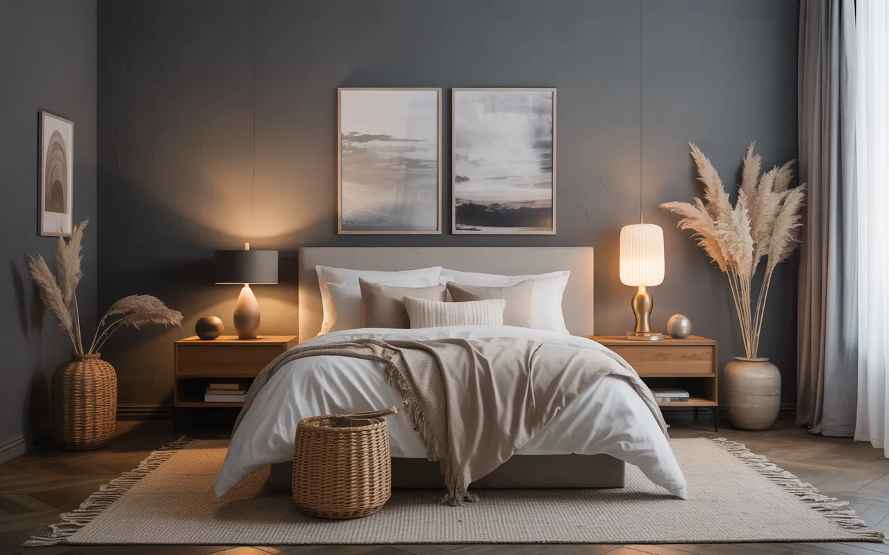
Moody bedrooms have a pull that bright rooms cannot match. Dark walls, rich textures, and warm low light make a bedroom feel like a true retreat. It is the kind of room that helps you unwind the moment you walk in.
The ideas below cover 21 ways to get the look, from deep charcoal walls to jewel-toned bedding. Each one balances the darkness with warmth so the room feels cozy, never gloomy.
You do not need to paint every wall black to join in. Sometimes one dark accent wall, or even just dark bedding with warm lamps, is enough to shift the whole mood.
This post contains affiliate links. If you buy through them, I may earn a small commission at no extra cost to you.
1. Deep Charcoal Walls with Velvet Accents
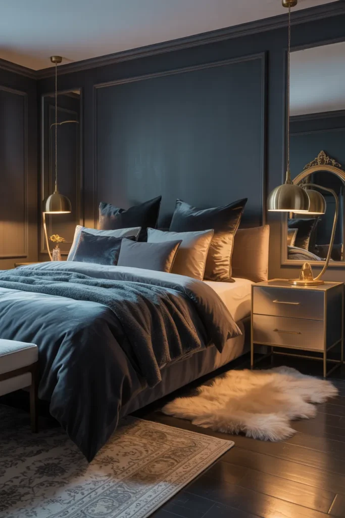
Deep charcoal walls make a bedroom feel like a cocoon. The dark color wraps the room in quiet and makes everything else feel softer. Velvet accents add a rich texture that keeps the darkness from feeling flat.
Test the charcoal first: charcoal paint can read blue or brown depending on the light, so test a large swatch on the wall. Live with it for two days and check it in daylight and lamplight before committing.
Layer the velvet: a velvet throw or two cushions is enough to get the effect. You do not need a full velvet bed. The sheen of velvet catches lamplight and adds depth to the dark walls.
- Charcoal walls create a cozy, cocoon-like feel
- Velvet texture keeps dark walls from feeling flat
- Test paint swatches in your own lighting first
Shop This Look
2. Moody Navy Retreat
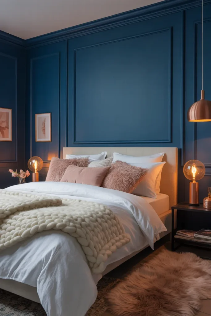
A moody navy bedroom feels calm without feeling cold. Navy is deep enough to create drama but still reads as a classic color. It pairs naturally with brass, wood, and cream for a balanced look.
Pick the right navy: inky navies like Hale Navy feel richer than bright primary blues. Avoid anything too saturated, which can look electric under artificial light. A dusty navy stays sophisticated.
Warm it up: navy needs warm elements so the room does not feel chilly. Brass lamps, a wood nightstand, and cream bedding bring the temperature back up beautifully.
- Navy gives drama while staying classic
- Dusty inky shades look richer than bright blues
- Brass and wood warm up the cool walls
Shop This Look
3. Black and White Contrast
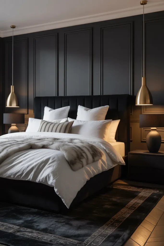
Black and white contrast is bold but never messy. The sharp contrast gives the bedroom a graphic, confident feel. Used right, it reads chic rather than harsh.
Soften the edges: pure black and white can feel stark, so add gray or cream as a bridge. A gray rug or cream throw keeps the contrast from feeling like a checkerboard.
Watch the lighting: black walls absorb light, so this look needs good lamps. Warm bedside lighting keeps the black rich instead of gloomy.
- High contrast gives a confident, graphic look
- Gray or cream softens the stark edges
- Strong lamps keep black walls from feeling gloomy
Shop This Look
4. Forest Green Escape
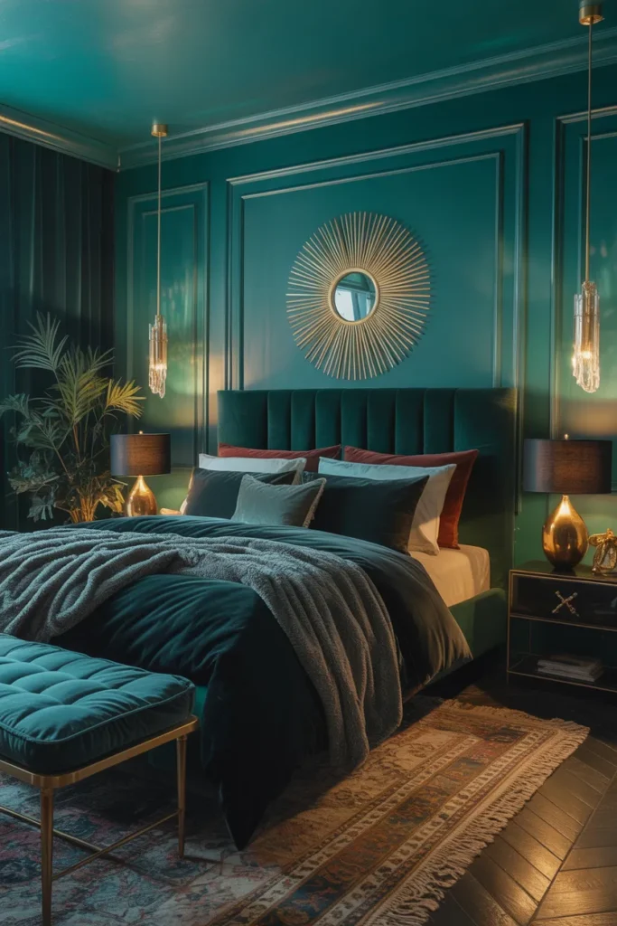
Forest green brings the calm of nature into the bedroom. The deep green feels restful and a little bit romantic. It works especially well in rooms with wood floors and natural light.
Go deep, not bright: a deep forest green stays moody, while a brighter green can feel playful. Look for shades with gray undertones for the most sophisticated result.
Add natural texture: green loves wood, linen, and rattan. A wood frame bed and linen bedding make the green feel like a natural extension of the outdoors.
- Deep green feels restful and romantic
- Gray undertones keep the green sophisticated
- Wood and linen pair naturally with green
Shop This Look
5. Moody Jewel-Toned Bedroom
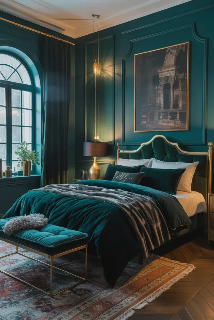
Jewel tones like emerald, sapphire, and ruby make a bedroom feel rich and layered. The saturated colors glow under warm lighting. This is the look for someone who wants drama with warmth.
Anchor with one jewel: pick one dominant jewel tone and let the others appear in small doses. Too many saturated colors at once will fight each other instead of blending.
Keep the base dark: jewel tones shine against dark neutrals like charcoal or espresso. A dark base lets each color glow instead of competing with a busy background.
- Saturated colors glow under warm light
- One dominant tone keeps the palette calm
- Dark neutrals let jewel tones shine
Shop This Look
6. Charcoal and Blush Harmony
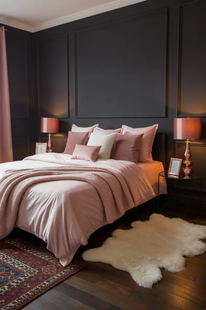
Charcoal and blush is an unexpected pairing that works beautifully. The gray gives structure while the blush adds softness. Together they feel modern and a little bit romantic.
Use blush sparingly: blush works best as an accent, not a main color. Bedding, art, or a chair in blush is enough. Too much pink and the charcoal loses its edge.
Pick a dusty blush: muted, dusty pinks suit the moody palette better than bright bubblegum. Look for shades with gray or beige undertones for a grown-up result.
- Gray structure plus blush softness
- Blush works best in small doses
- Dusty pinks suit a moody room better than bright ones
Shop This Look
7. Dark Rustic Charm
Dark rustic charm mixes deep colors with rough, natural textures. Think dark wood beams, worn leather, and heavy linen. The result feels grounded and honest, like a cabin that grew up.
Mix rough and smooth: rustic texture needs a smooth counterpoint so it does not feel heavy. A soft dark throw or smooth ceramic lamp keeps the rough wood from overwhelming the room.
Keep the palette tight: dark brown, charcoal, and one warm accent is plenty. Rustic rooms get messy fast when too many colors join in.
- Deep colors plus rough textures feel grounded
- Smooth accents keep rustic from feeling heavy
- A tight palette keeps rustic rooms calm
Shop This Look
8. Gothic-Inspired Elegance
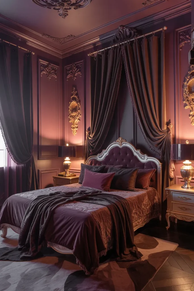
Gothic-inspired elegance brings drama through detail, not darkness alone. Arched mirrors, dark florals, and candle-style lighting create the mood. It feels romantic and a little bit mysterious.
Choose one statement piece: a gothic look needs a focal point, like an arched mirror or a dramatic headboard. One strong piece sets the tone better than many small dark accessories.
Use candlelight tones: warm, low lighting is essential for this style. Use dimmable warm bulbs or real candles in safe holders to get the flickering glow.
- Drama comes from detail, not just dark color
- One statement piece sets the tone
- Warm low lighting is essential
Shop This Look
9. Slate Gray Minimalist Mood
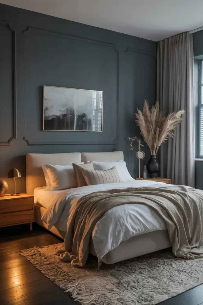
Slate gray minimalism proves moody does not have to mean busy. Clean lines and a restrained palette keep the room calm. The gray adds depth without any visual noise.
Layer grays carefully: use three shades of gray, light, mid, and dark, so the room has depth. One flat gray everywhere will look unfinished instead of minimal.
Add one texture: minimal rooms need at least one tactile element. A chunky knit throw or a wool rug keeps the simplicity from feeling cold.
- Minimalism keeps moody calm and uncluttered
- Three gray shades create depth
- One texture keeps it from feeling cold
Shop This Look
10. Dark Teal Sophistication
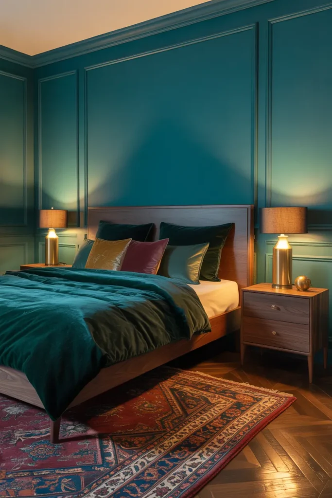
Dark teal sophistication sits between blue and green for a rich, complex color. It feels a little bit vintage and a little bit modern at the same time. Gold accents make it glow.
Pair with gold: teal and gold is a classic combination for a reason. Brass picture frames, a gold mirror, or brass lamps bring out the richness in the teal.
Balance with cream: dark teal needs light bedding or curtains to breathe. Cream softens the depth and keeps the room from feeling too heavy.
- Teal blends blue depth with green warmth
- Gold accents make teal glow
- Cream bedding keeps the look breathable
Shop This Look
11. Espresso Brown Elegance
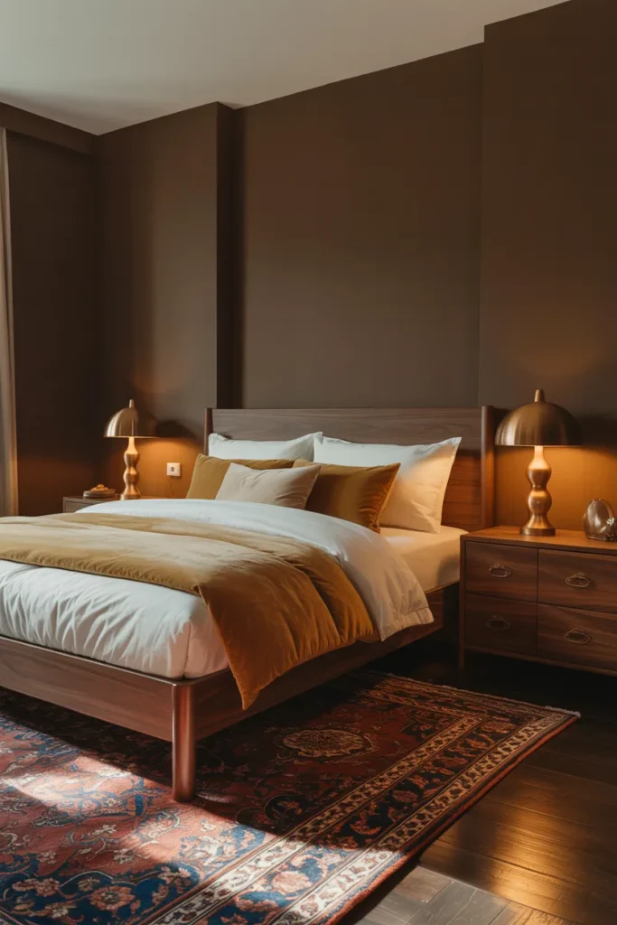
Espresso brown elegance feels warm and enveloping. The deep brown reads as a neutral but with more warmth than gray or black. It suits rooms with natural wood and leather.
Lighten with bedding: espresso walls need pale bedding to keep the bed from disappearing. Ivory or oatmeal sheets create a soft contrast that shows off both colors.
Mix wood tones: espresso pairs with both light and dark woods, so do not be afraid to mix. A light oak bench against espresso walls adds welcome variety.
- Deep brown reads as a warm neutral
- Pale bedding keeps the bed visible against dark walls
- Mixed wood tones add welcome variety
Shop This Look
12. Plum and Gray Sophistication
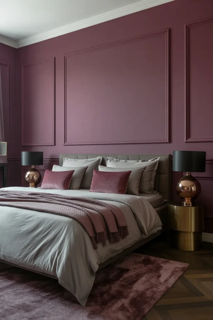
Plum and gray sophistication is moody with a soft edge. The plum adds a wine-like richness while the gray keeps it grounded. It feels luxurious without being loud.
Choose muted plum: dusty, muted plums suit bedrooms better than bright purples. Look for shades with gray undertones that sit quietly next to charcoal.
Ground with gray: let gray handle the larger surfaces and use plum for bedding and accents. That balance keeps the purple from taking over.
- Plum adds wine-like richness
- Muted shades suit bedrooms best
- Gray grounds the purple
Shop This Look
13. Midnight Blue Serenity
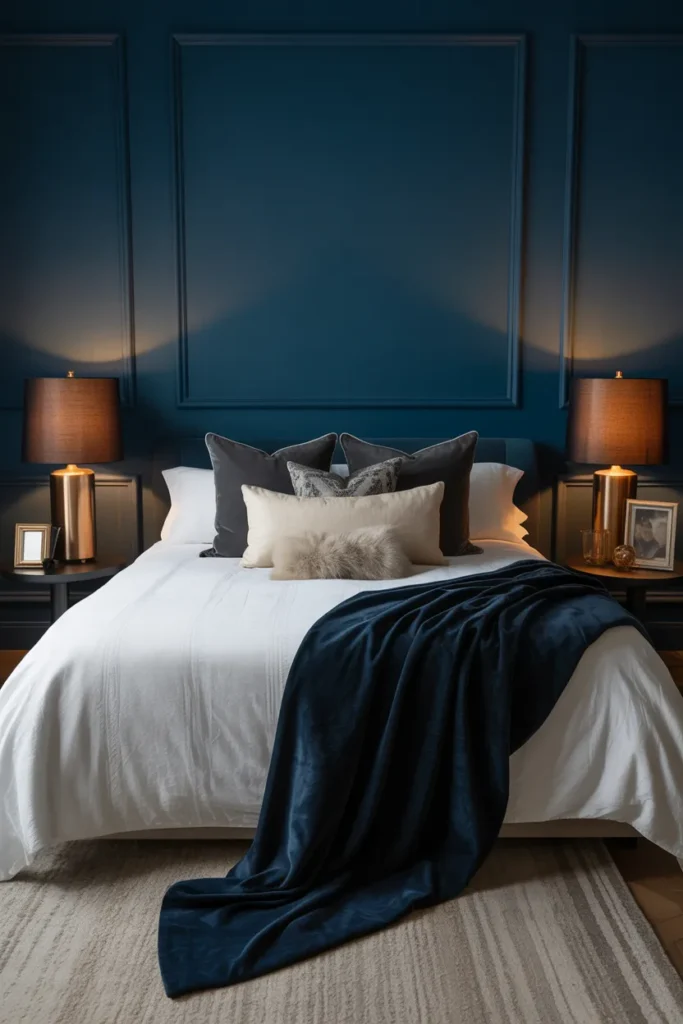
Midnight blue serenity feels like the sky just after dark. The deep blue is calming in a way few colors manage. It is a natural fit for a room meant for rest.
Keep it restful: midnight blue already sets a sleepy mood, so avoid busy patterns. Solid bedding and simple curtains let the color do the calming work.
Add silver or pewter: cool metallics suit midnight blue better than gold. A pewter lamp or silver-framed art adds a quiet shimmer.
- Deep blue sets a naturally sleepy mood
- Simple patterns let the color calm the room
- Cool metallics suit blue better than gold
Shop This Look
14. Charcoal and Mustard Contrast
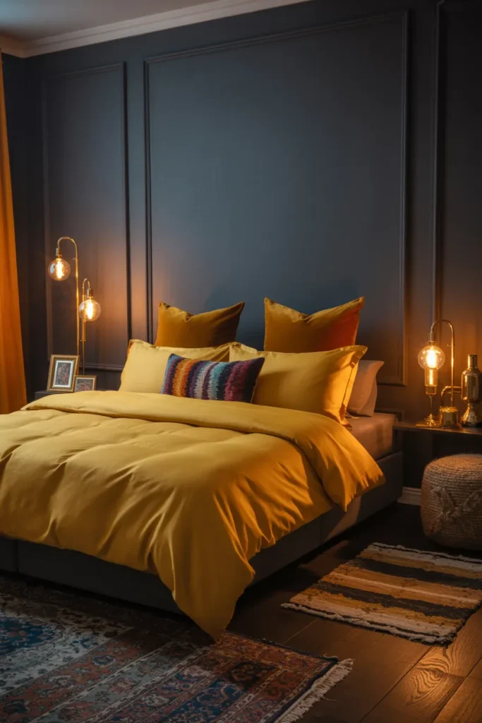
Charcoal and mustard is a bold pairing with real energy. The mustard pops against the dark gray in a way that feels modern and confident. It is moody without being gloomy.
Dose the mustard: mustard is strong, so use it in accents like cushions, art, or a throw. A little goes a long way against charcoal.
Pick a deep mustard: rich, turmeric-like mustards suit the moody palette. Pale yellows will look washed out next to dark gray.
- Mustard pops beautifully against charcoal
- Small doses keep the yellow from overpowering
- Deep turmeric shades suit dark rooms
Shop This Look
15. Dark Olive Retreat
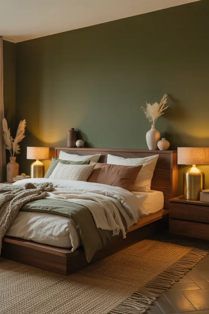
Dark olive retreat brings an earthy, grounded mood. The green-brown mix feels natural and calm, like a forest floor. It pairs well with cream, tan, and black.
Warm it with tan: olive can read muddy without warm companions. Tan bedding, a jute rug, or warm wood keeps the olive feeling rich instead of flat.
Use black sparingly: black picture frames or a black lamp add definition to olive walls. A little black sharpens the earthy palette.
- Olive feels earthy and grounded
- Tan and warm wood keep olive rich
- A touch of black sharpens the palette
Shop This Look
16. Espresso and Emerald Luxury
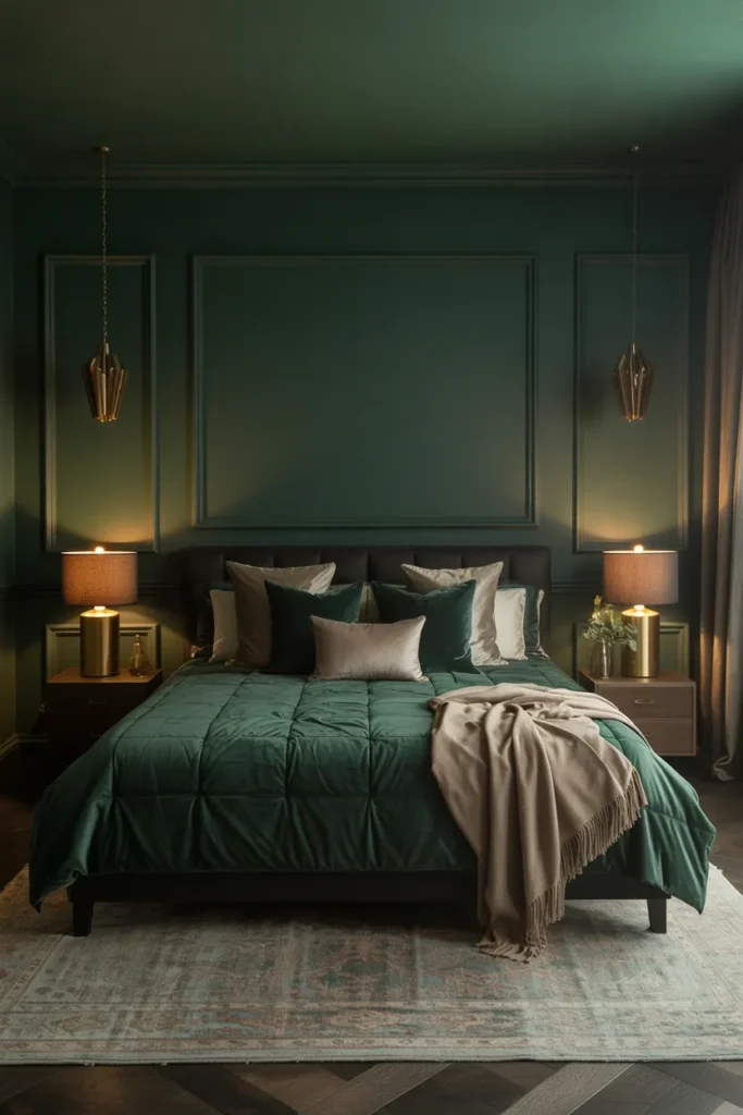
Espresso and emerald luxury feels rich in every sense. The deep brown grounds the vivid green, and together they read expensive. Velvet and brass complete the picture.
Let emerald lead: use emerald for the bedding or curtains where it gets noticed. Espresso works better on walls or large furniture as the quiet base.
Add brass shine: brass is the natural partner for this palette. A brass lamp or mirror adds the glint that makes the whole room feel finished.
- Brown grounds green for a rich result
- Emerald shines in textiles, espresso in structure
- Brass adds the finishing glint
Shop This Look
17. Black Velvet Glam
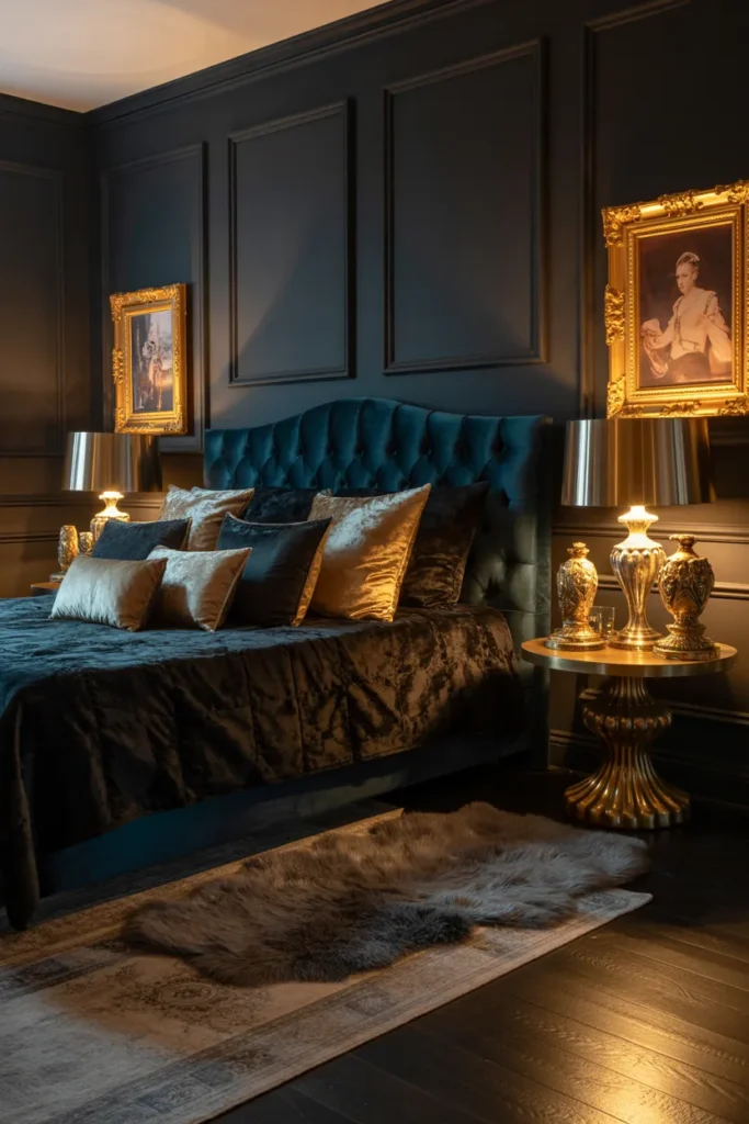
Black velvet glam is unapologetically dramatic. The black keeps it moody while the velvet keeps it soft. A little metallic shine stops it from feeling too heavy.
Add metallic shine: gold or silver accents are almost required here. A metallic tray, mirror frame, or lamp base gives the eye somewhere bright to land.
Keep it to one wall: black velvet-look walls or a black velvet headboard make the statement. Covering every wall in black can overwhelm even a large room.
- Black plus velvet equals soft drama
- Metallics give the eye a bright landing spot
- One dark wall makes the statement
Shop This Look
18. Aubergine Serenity
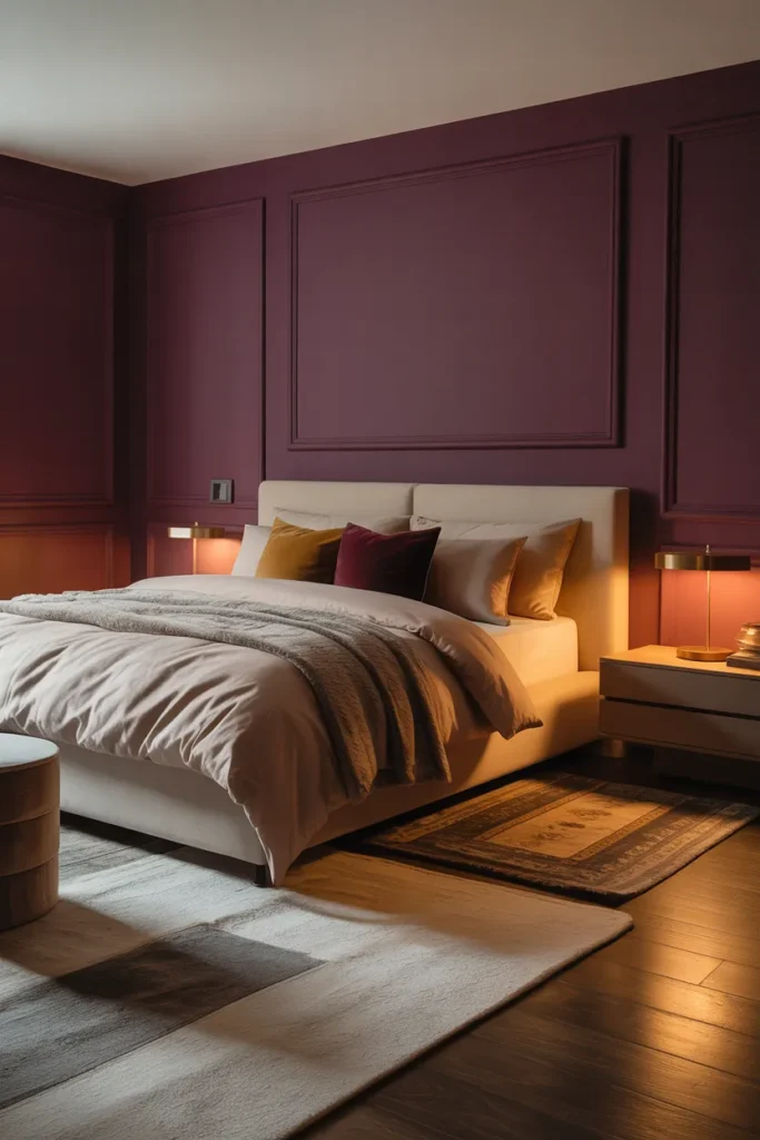
Aubergine serenity brings a wine-dark calm to the bedroom. The purple-brown mix is unusual enough to feel personal. It suits people who want moody without going full black.
Test undertones: aubergine can lean purple or brown, so test it against your furniture. The right undertone will harmonize, the wrong one will clash quietly.
Pair with warm neutrals: cream, taupe, and warm gray all suit aubergine. They soften the unusual color and make it feel livable every day.
- Wine-dark color feels personal and calm
- Undertones matter with unusual shades
- Warm neutrals make aubergine livable
Shop This Look
19. Dark Taupe Comfort
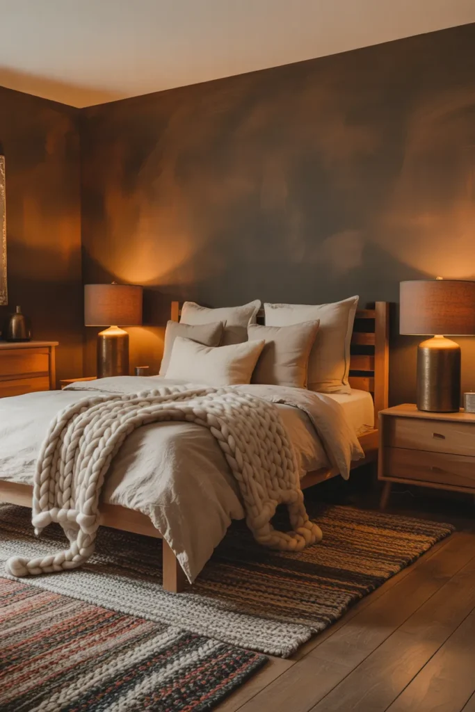
Dark taupe comfort is the softest kind of moody. The brown-gray mix feels warm and enveloping without any harshness. It is a good first step into dark bedrooms.
Try it if dark scares you: taupe is the gentlest dark neutral, so it suits anyone nervous about black or charcoal. You get the coziness with less risk.
Layer warm whites: warm white bedding and curtains keep taupe from going muddy. The contrast is soft but it keeps the room feeling fresh.
- Taupe is the gentlest dark neutral
- A safe first step into moody bedrooms
- Warm whites keep taupe fresh
Shop This Look
20. Dark Chocolate and Cream Balance
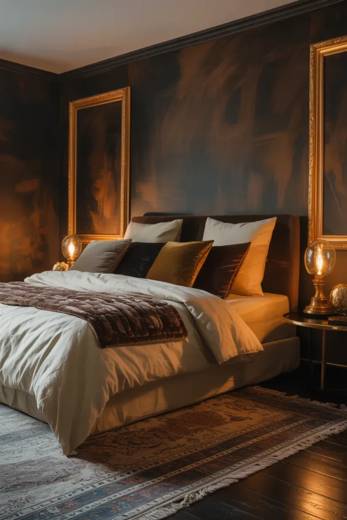
Dark chocolate and cream balance richness with lightness. The chocolate walls or furniture give depth while cream bedding keeps it airy. Neither color has to shout.
Split the ratio: a good balance is roughly two thirds dark to one third cream. Too much cream and the chocolate loses its mood, too little and the room feels heavy.
Mix the textures: chocolate leather or wood with cream linen or wool feels layered. The texture contrast matters as much as the color contrast.
- Chocolate depth plus cream airiness
- Two thirds dark to one third light works well
- Texture contrast matters as much as color
Shop This Look
21. Charcoal and Teal Retreat
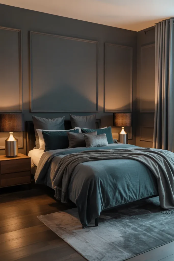
Charcoal and teal retreat mixes gray depth with blue-green energy. The teal keeps the charcoal from feeling flat. Together they feel modern, calm, and a little bit coastal.
Let teal be the accent: charcoal handles the walls while teal appears in bedding, art, or a chair. That ratio keeps the teal lively instead of overwhelming.
Add natural wood: wood warms up this cool pairing. A wood nightstand or oak frame stops the gray and teal from feeling chilly.
- Teal energy lifts charcoal depth
- Teal works best as the accent color
- Wood warms the cool pairing
Shop This Look
How to Start
Start with the walls, since they set the mood more than anything else. Pick one dark color you love and test a large swatch before committing. Paint is the cheapest way to transform a bedroom.
Next, fix the lighting. Dark rooms need warm, layered light, so add bedside lamps with warm bulbs and consider a dimmer. Good lighting is what separates cozy dark from gloomy dark.
Finally, layer in texture. Velvet, linen, wool, and wood all catch light differently and keep dark walls interesting. Two or three textures are enough to make the room feel finished.
- Test a large paint swatch before committing to a dark wall
- Add warm layered lighting so dark walls feel cozy
- Layer two or three rich textures for depth
Shop This Look
Common Mistakes
- Painting every wall dark without testing the color in your light first
- Forgetting warm lighting, which leaves dark rooms feeling gloomy
- Using flat paint everywhere with no texture to catch the light
- Mixing too many dark colors so the room feels muddy
- Skipping pale bedding, which lets the bed disappear into dark walls
- Choosing bright saturated colors that look electric under lamps
- Ignoring undertones, so the charcoal reads blue against brown furniture
Frequently Asked Questions
Will dark walls make my bedroom feel smaller?
Dark walls can actually make a room feel larger by blurring the corners, especially with good lighting. The key is warm lamps and pale bedding for contrast.
What is the best dark color for a first moody bedroom?
Dark taupe or slate gray are the gentlest starting points. They give you the cozy dark feeling with less risk than black or deep navy.
How do I keep a dark bedroom from feeling gloomy?
Layer warm lighting at different heights, add pale textiles, and include at least one reflective surface like a mirror. Those three things keep dark rooms inviting.
Can I do moody in a small bedroom?
Yes, small bedrooms suit dark colors well because the coziness works in your favor. Keep the ceiling light and use mirrors to bounce light around.
What bedding works best with dark walls?
Pale bedding in cream, ivory, or oatmeal creates the contrast dark walls need. For more bedroom styling ideas, browse these bedroom aesthetic inspirations.
The Finishing Touch
A moody bedroom is really about how the room makes you feel at the end of the day. The dark color sets the tone, but the warmth comes from light, texture, and the small details you touch every day.
If you are torn between light and dark, this Houzz guide to calm versus moody bedrooms walks through both styles with real rooms. It helps to see how designers balance darkness with comfort before you pick up a paintbrush.
Start with one wall or one textile and live with it for a week. Moody style rewards patience, and the room will tell you what it needs next.