22 Green Backsplash Kitchen Ideas for Bright Kitchens
A green backsplash adds colour to a kitchen without the commitment of painting every cabinet green. The wall between worktop and cabinets is a contained area, so even a deep shade like forest or emerald stays manageable.
The 22 ideas below run from pale mint and pistachio through sage and olive to deep teal and forest green, in subway, chevron, herringbone, mosaic and glass finishes. The right shade depends mostly on your light. Pale greens suit dark rooms, deep greens need daylight or good task lighting.
For each idea, note what it pairs with. Green is sensitive to what sits next to it, and the notes on cabinets, worktops, metals and grout will save you from the most common mistake, which is choosing a green in isolation and finding it clashes at home.
This post contains affiliate links. If you buy through them, I may earn a small commission at no extra cost to you.
1. Emerald Tile Backsplash with White Cabinets
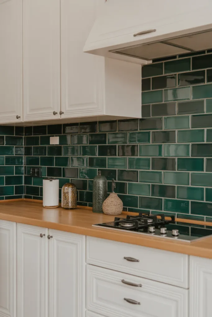
Emerald tile against white cabinets is a strong, clear combination. The white keeps the room bright, the deep green carries the colour, and neither side needs pattern to hold its own.
Gloss suits emerald best: A glossy glaze lifts the deep colour and wipes clean easily behind the hob. Matt emerald can look flat unless the room has strong natural light.
Limit other colours: Keep worktops pale and handles simple in black or chrome. Adding a third strong colour next to emerald usually makes the kitchen feel unsettled.
- Deep green with bright white contrast
- Gloss finish lifts the colour
- Keep worktops pale and handles simple
Shop This Look
2. Mint Green Subway Tiles for a Soft Look
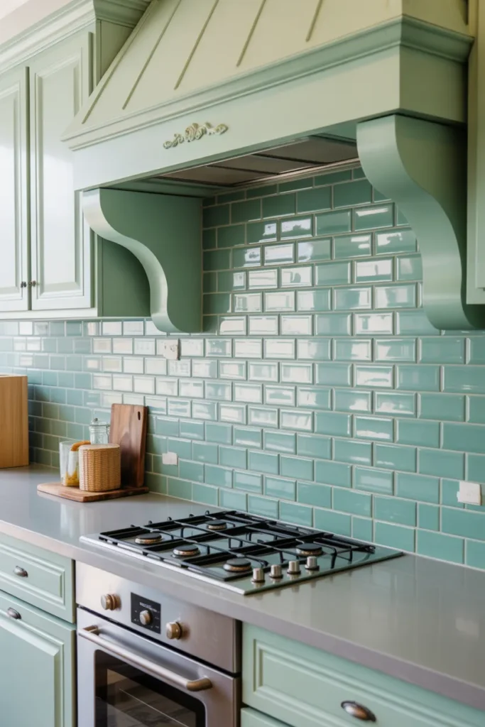
Mint green subway tiles give you colour without weight. The pale shade works like a tinted white, brightening the wall while staying soft enough for a full run behind cabinets.
Good for low light rooms: Unlike deep greens, mint does not absorb much light, so it suits kitchens with one small window. White grout keeps the effect light and joined up.
Pair it carefully: Mint sits well with white, pale wood and chrome. Strong orange toned woods can clash, so hold a sample against your worktop before ordering.
- Pale colour that still brightens the wall
- White grout keeps it light
- Check against orange toned wood first
Shop This Look
3. Forest Green Backsplash with Brass Accents
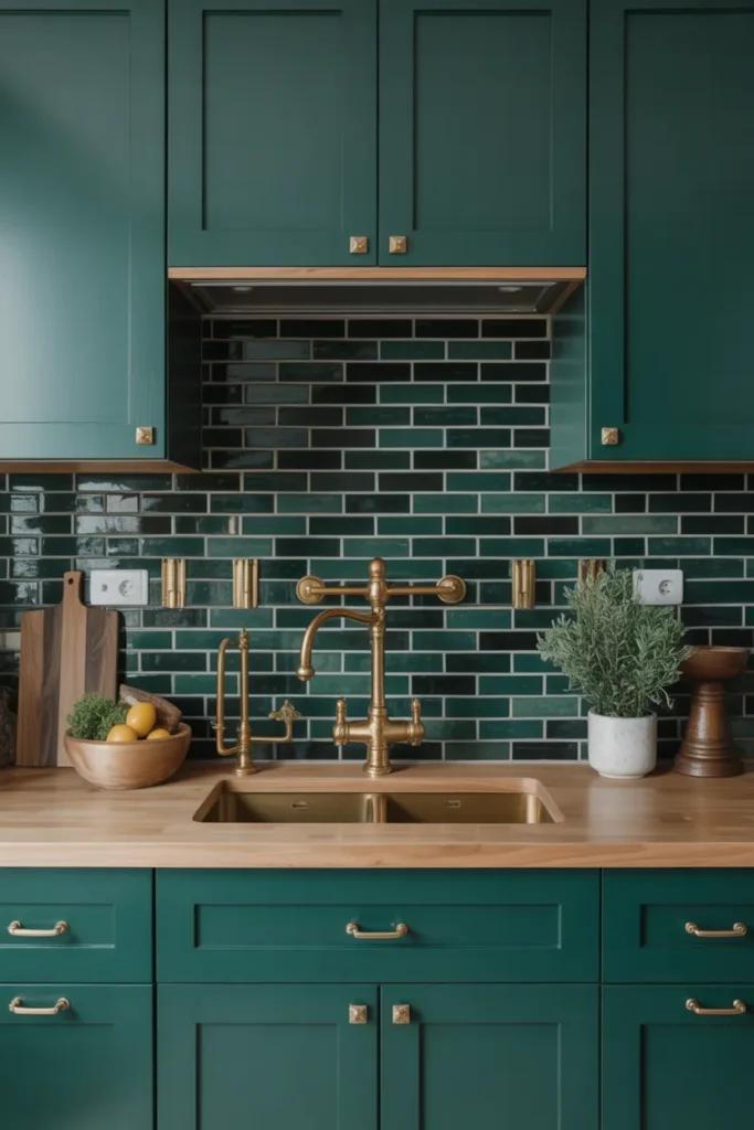
Forest green with brass accents is a rich pairing that suits shaker cabinets and kitchens used in the evening as much as the day. The brass warms the dark green and stops it reading cold.
Real brass or a good copy: Brass handles, taps and rails should match in tone. Mixing shiny gold with brushed brass on the same wall looks like a mistake, so order fittings from one range where you can.
Lighting matters here: Warm white under cabinet lights bring out both the green and the brass. Cool white bulbs push forest green towards blue, so check bulb colour before fitting.
- Rich pairing for shaker style kitchens
- Match all brass tones from one range
- Use warm white lighting, not cool white
Shop This Look
4. Olive Green Ceramic Tiles with Open Shelving
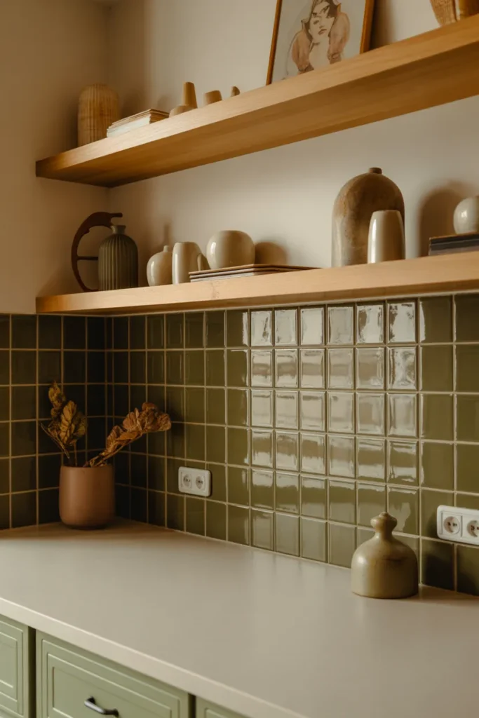
Olive green ceramic tiles with open shelving give a relaxed, practical kitchen where everyday items sit on display. Olive is muted enough that colourful crockery on the shelves does not clash with the wall.
Shelves need discipline: Open shelves look good when they hold things you use daily. Too many decorative items gather grease near a hob, so keep the shelf nearest the cooking zone for sturdy, washable pieces.
Tile behind every shelf: Run the tile the full height behind the shelves rather than stopping at each shelf level. It looks finished and protects the wall from steam and splashes at every height.
- Muted olive suits displayed crockery
- Keep hob side shelves practical and washable
- Tile the full height behind shelves
Shop This Look
5. Sage Green Backsplash with Patterned Tiles
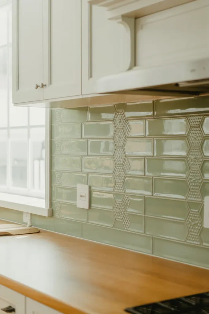
Sage green is one of the easiest greens to live with, and patterned tiles in sage add detail without the contrast of stronger prints. Keep the pattern in the same colour family so the wall reads calm from a distance.
Pattern scale counts: Small patterns suit small kitchens and short runs. A large repeat needs a longer wall to show properly and can look cut off behind a compact hob.
Balance with plain tiles: If the full patterned wall feels like too much, use patterned tile behind the hob and plain sage tiles either side. The colour stays consistent while the cost drops.
- Calm sage base with gentle pattern
- Match pattern scale to wall length
- Plain sage can flank a patterned centre
Shop This Look
6. Light Green Glass Tiles with Reflective Shine
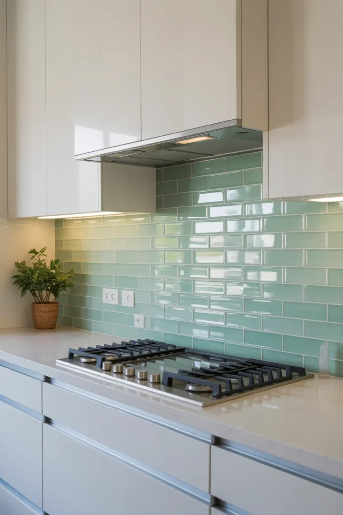
Light green glass tiles reflect light and show the colour cleanly because the tint sits behind a smooth glass surface. They suit modern slab cabinets and kitchens that need help with light.
Colour looks brighter in glass: Glass intensifies a pale green, so order a sample and judge it on your wall, not in the box. What looks soft in ceramic can look vivid in glass.
White adhesive again: As with all pale glass, white adhesive keeps the colour accurate. Grey adhesive shows through and makes patches look darker.
- Reflects light for modern kitchens
- Glass intensifies pale colours
- White adhesive keeps the tint accurate
Shop This Look
7. Deep Teal Backsplash with Contrasting White Cabinets
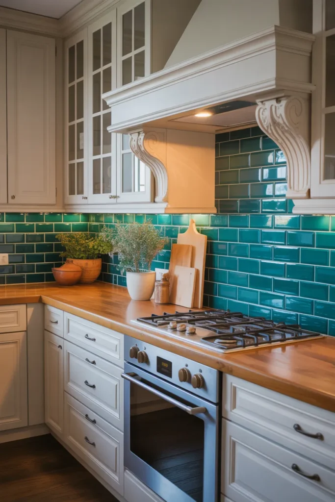
Deep teal sits between green and blue and makes white cabinets look crisper by contrast. It is a confident colour for a full backsplash, especially in a kitchen with good daylight to balance the depth.
Daylight decides it: In a north facing or windowless kitchen teal can read almost navy and darken the work area. Add under cabinet lighting if you choose it in a dim room.
Keep the worktop pale: White, pale quartz or light wood worktops stop the combination feeling heavy. A dark worktop with deep teal leaves very little light in the middle of the room.
- Strong contrast with white cabinets
- Needs daylight or task lighting
- Pale worktops balance the depth
Shop This Look
8. Pastel Green Chevron Tiles for Subtle Texture
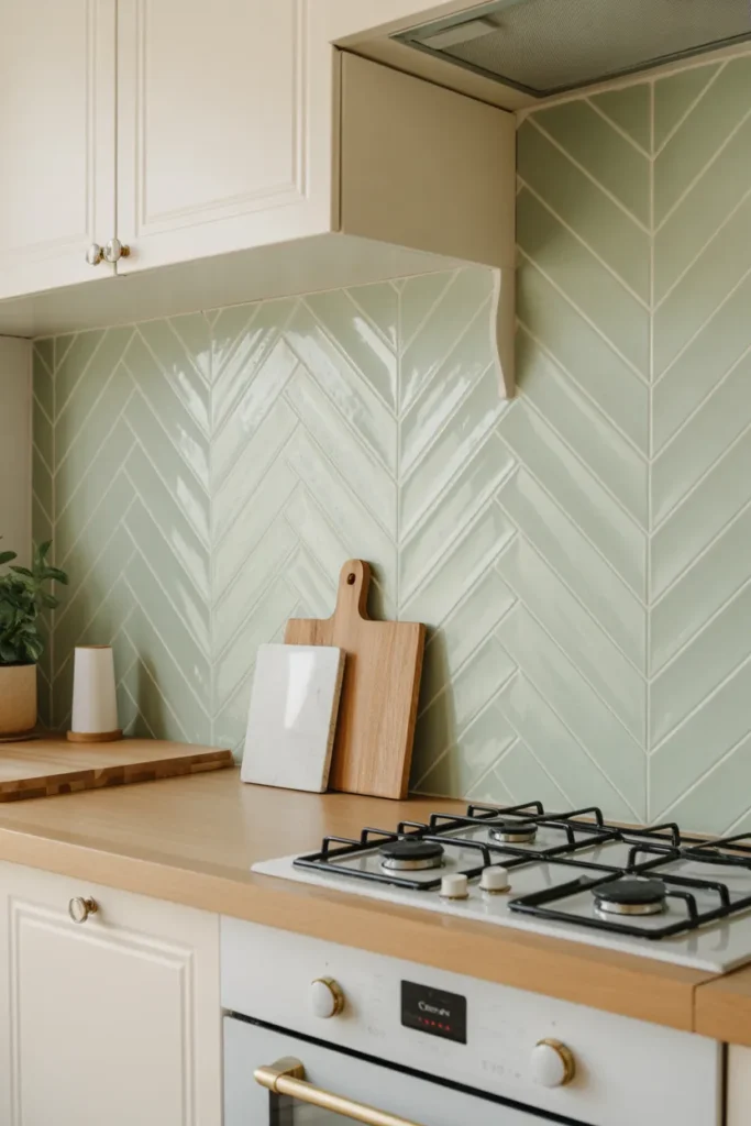
Pastel green chevron tiles add a gentle zigzag in a soft shade, so you get pattern movement without strong contrast. It suits kitchens that want interest on the wall but no dark or vivid colour.
Soft colour, clear shape: Because the colour is pale, the chevron shape does most of the work. That only reads well if the points meet neatly, so factory cut tiles are worth the cost.
Grout close to the tile: A grout colour close to the tile keeps the pastel effect soft. Dark grout would turn a gentle wall into a high contrast grid.
- Gentle pattern in a pale shade
- Neat points need factory cut tiles
- Close grout colour keeps it soft
Shop This Look
9. Moss Green Subway Tiles with Matte Finish
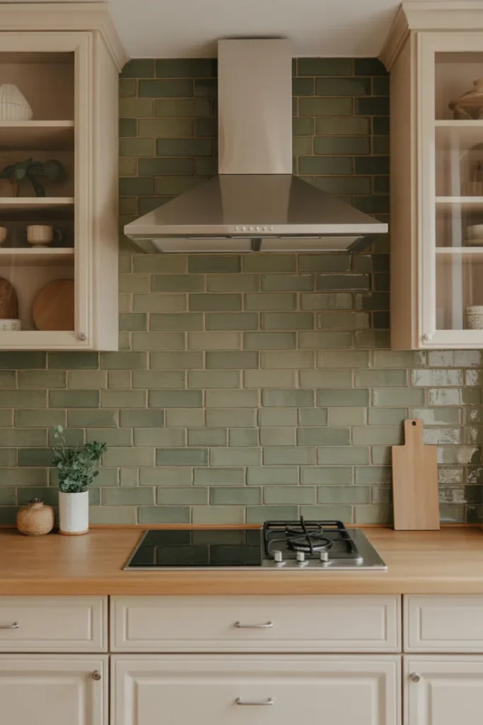
Moss green subway tiles in a matt finish give a muted, earthy wall that pairs naturally with wood worktops and cream cabinets. The matt surface absorbs light, so the colour looks deeper than the same shade in gloss.
Matt needs the right cleaner: Grease marks show as darker patches on matt glaze. Keep a degreasing spray for the hob area and wipe little and often rather than scrubbing monthly.
Earthy pairings work best: Black taps, wood and stone accessories suit moss green. Bright white plastic items left on the worktop will stand out sharply against it, so storage matters.
- Muted earthy green in matt finish
- Degreaser needed for hob area marks
- Suits wood worktops and cream cabinets
Shop This Look
10. Lime Green Backsplash for a Bold Pop of Color
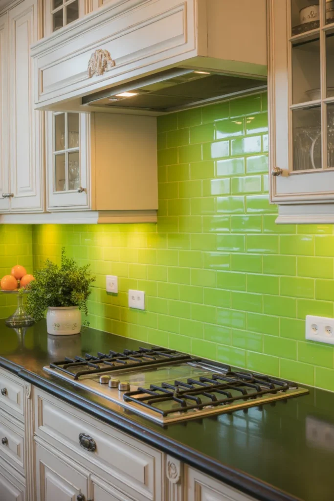
Lime green is the boldest choice in this list and works best in small doses or in a kitchen that is otherwise very plain. On a full wall it will dominate every other decision in the room, so be sure before you commit.
Try a limited area first: Behind the hob only, or on one short wall, gives the pop of colour without the full commitment. You can extend it later if you still want more.
Neutral surroundings are required: White or pale grey cabinets, plain worktops and simple flooring let lime work. Patterned floors or coloured cabinets next to lime rarely settle well together.
- Boldest green, best in limited areas
- Needs plain cabinets and worktops
- Start behind the hob and extend later
Shop This Look
11. Sage Green Herringbone Tiles with Neutral Cabinets
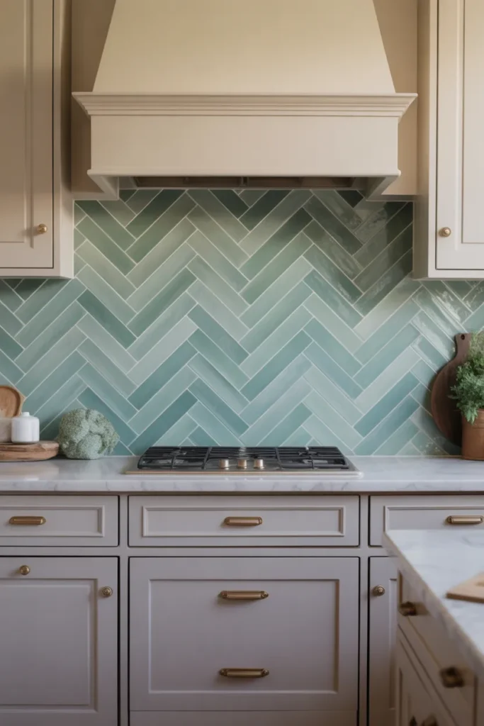
Sage green herringbone with neutral cabinets is a calm combination where the layout provides the interest and the colour stays restful. Beige, cream and pale wood cabinets all sit comfortably next to sage.
Herringbone in a soft colour: The zigzag is visible mainly through light and shadow rather than contrast, which is exactly right for this palette. It rewards good under cabinet lighting.
Keep grout tonal: Choose grout one shade lighter or darker than the tile. White grout can look stark against sage, and dark grout breaks the calm effect.
- Calm layout and colour combination
- Suits beige, cream and pale wood cabinets
- Tonal grout keeps the effect restful
Shop This Look
12. Olive Green Tiles with Matte Finish
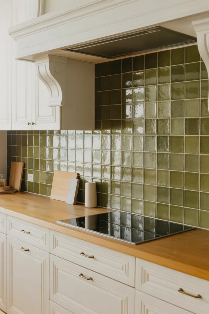
Olive green tiles with a matt finish give a grounded, slightly vintage feel that works with older houses and shaker style cabinetry. The colour hides marks well, which makes it a practical dark option for busy kitchens.
Matt finish, deeper colour: Matt glaze makes olive look darker and flatter than gloss. In a small kitchen, test a large sample on the wall for a few days before ordering the full amount.
Warm metals suit it: Brass and copper handles and taps warm olive up. Chrome can look cold against it, though black fittings work well as an alternative.
- Practical dark colour that hides marks
- Test a large sample in small kitchens
- Brass, copper or black fittings suit it
Shop This Look
13. Teal Glass Tiles with Reflective Finish
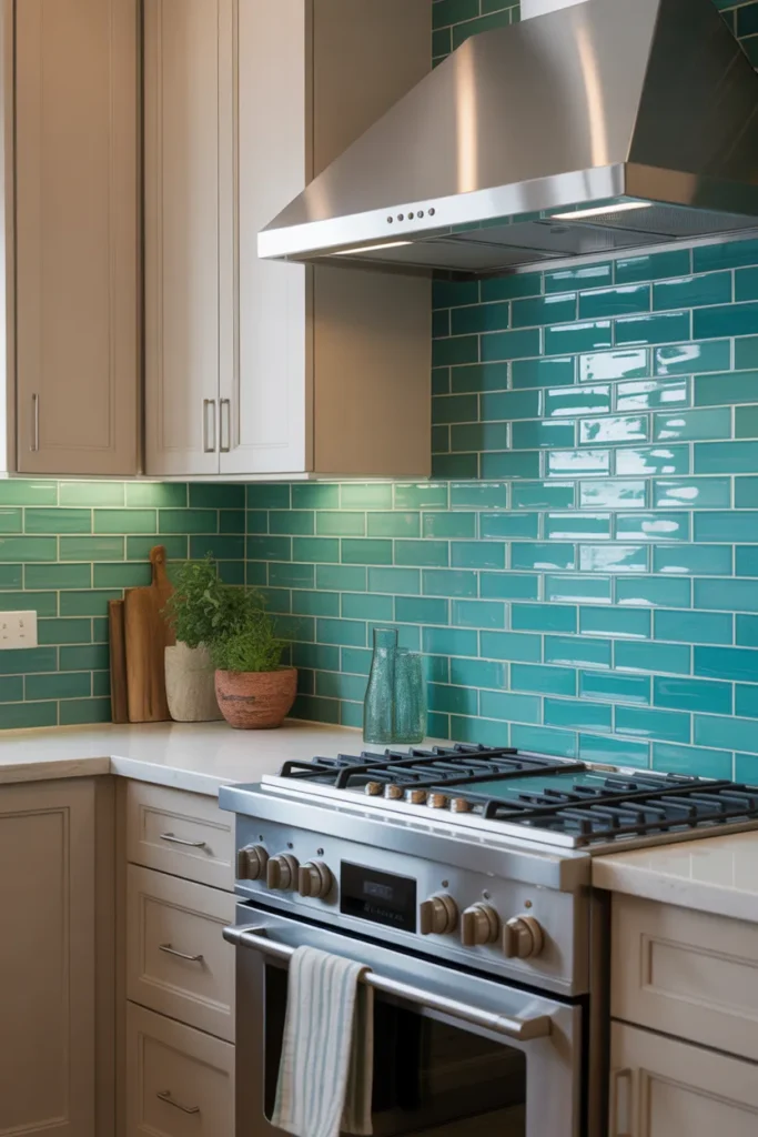
Teal glass tiles with a reflective finish bring colour and shine together, bouncing light while holding a deep blue green tone. They are a good middle path if you like deep teal but your kitchen lacks daylight.
Reflection lifts the depth: The shine stops teal feeling flat or heavy. Under cabinet lights make the wall glow slightly, which helps evening cooking feel less dim.
Smooth and easy to wipe: Glass releases grease easily, so the hob section needs only a cloth and warm water. Avoid abrasive pads, which can dull the surface over time.
- Deep colour lifted by reflective shine
- Easy wipe clean glass surface
- Avoid abrasive pads on the finish
Shop This Look
14. Pistachio Green Tiles with Open Shelving
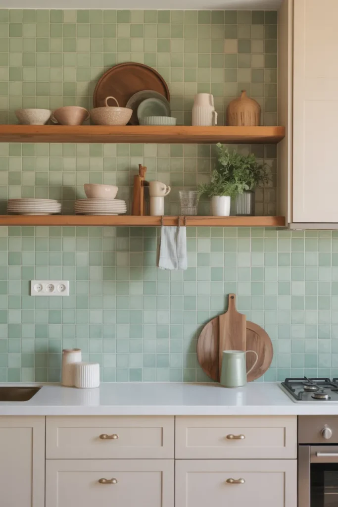
Pistachio green is a warm, yellow leaning pale green that feels friendly and suits cream cabinets and retro style appliances. With open shelving it gives an informal kitchen where things are easy to reach.
Warm pale green rules: Pistachio clashes with blue toned whites, so pair it with cream or warm white paint and tiles. Check your cabinet colour against a sample in daylight.
Shelves in pale wood: Pale wood shelves keep the light palette going and suit the warm tone. Dark stained shelves cut across it and look heavier than this colour wants.
- Warm pale green for cream cabinets
- Avoid blue toned whites beside it
- Pale wood shelves keep it light
Shop This Look
15. Dark Forest Green Tiles with Warm Wood Accents
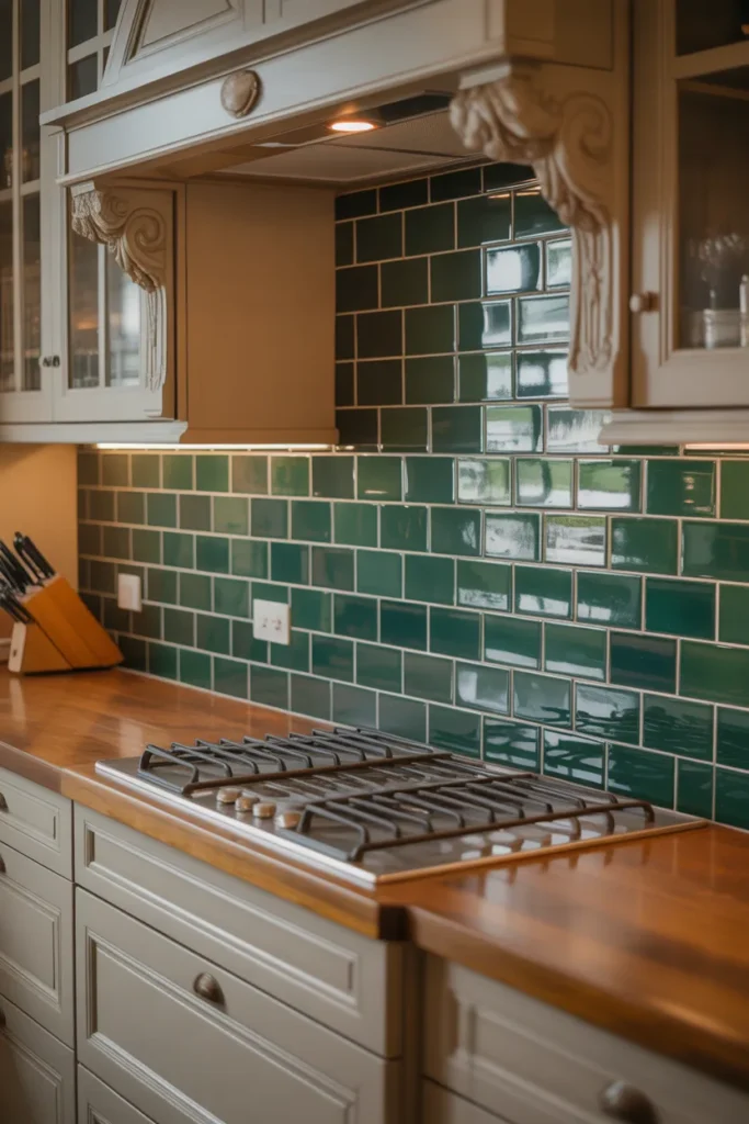
Dark forest green tiles with warm wood accents balance each other well. The wood stops the green feeling cold, and the green makes pale wood look richer than it does against white walls.
Wood near water needs care: Wood shelves or rails near the sink need oil or sealant and regular checks. Keep solid wood away from the wettest section or choose a sealed finish.
Even out the warmth: Spread the wood across the room in shelves, boards and handles rather than one heavy block. Small repeats make the pairing look planned.
- Dark green balanced by warm wood
- Seal wood near the sink properly
- Repeat wood in small items across the room
Shop This Look
16. Jade Green Mosaic Tiles with Subtle Shine
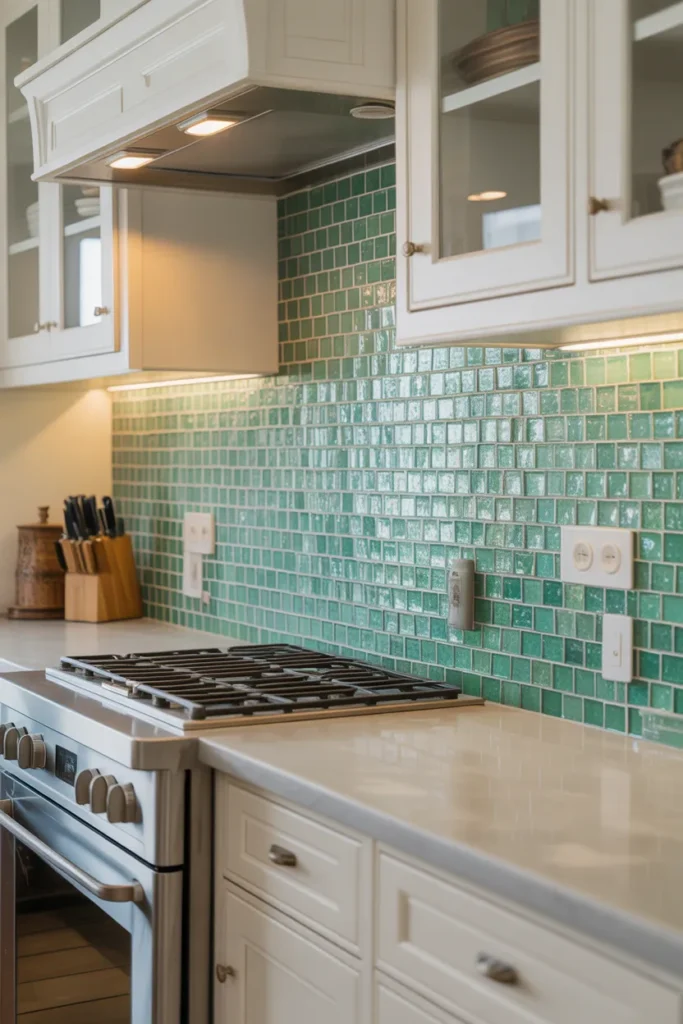
Jade green mosaic tiles mix small pieces in slightly varied tones, giving the wall a jewel like variation that changes with the light. The subtle shine keeps it from looking flat despite the small scale.
Variation across sheets: Sheets will not be identical, so lay them all out and arrange the order before fitting. It stops one darker sheet creating an obvious patch.
Best on a contained area: A hob panel or a single wall suits jade mosaic best. The many grout lines make a whole room expensive to fit and slower to clean.
- Varied tones in small mosaic pieces
- Lay out all sheets before fitting
- Best on a hob panel or single wall
Shop This Look
17. Mint Green Chevron Tiles for Fresh Vibes
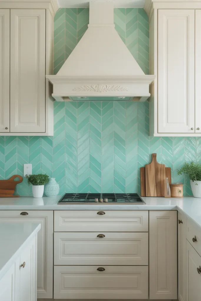
Mint green chevron tiles feel fresh and light, combining the softest green here with a clear geometric layout. It is a good choice for a small kitchen that needs pattern but cannot take a dark colour.
Fresh but not stark: Mint chevron gives movement while keeping the wall pale, so the room still feels open. White grout softens the zigzag further if the pattern feels busy.
Watch the points: As with any chevron, the meeting points show errors quickly. Fix the first row with care and check it from the doorway before continuing.
- Light pattern for small kitchens
- White grout softens the zigzag
- First row accuracy decides the result
Shop This Look
18. Dark Teal Tiles with Matte Finish
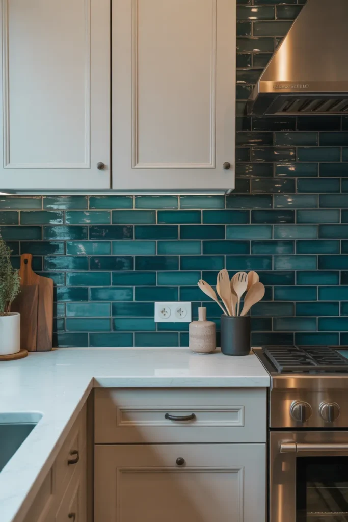
Dark teal tiles in a matt finish give a deep, calm wall with no shine at all. It is a strong choice for a kitchen with large windows, where daylight stops the matt surface feeling heavy.
No shine means no glare: Matt teal suits bright rooms where gloss would reflect windows all day. The colour reads consistent from morning to evening because light does not bounce off it.
Marks show differently: Water splashes dry as pale marks on matt dark tiles and need a wipe with a damp cloth to disappear. Behind a sink, that becomes a daily habit.
- Deep matt colour for bright rooms
- Consistent colour with no glare
- Water marks need daily wiping behind sinks
Shop This Look
19. Lime Green Glass Tiles for a Playful Look
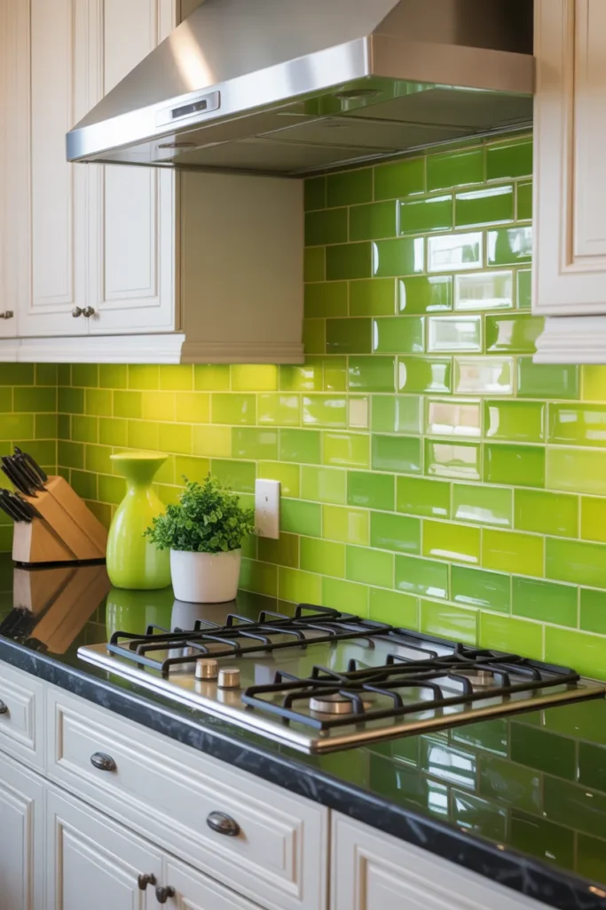
Lime green glass tiles are playful and unmistakably bright, with the glass shine adding to the energy. Use them where you want the backsplash to be the talking point of an otherwise simple kitchen.
Glass makes lime brighter: Expect the fitted colour to look stronger than a ceramic sample of the same shade. If you are between two shades, choose the paler one in glass.
One feature is enough: Do not repeat lime in appliances, blinds and accessories as well. One bright wall plus neutral surroundings looks deliberate, repeats everywhere look chaotic.
- Brightest option with glass shine
- Choose the paler shade in glass
- Keep lime to the backsplash only
Shop This Look
20. Soft Olive Green Tiles with Textured Pattern
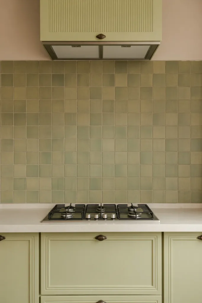
Soft olive green tiles with a textured pattern add depth through surface relief rather than printed design. The colour stays muted while the texture catches light and shadow across the wall.
Texture plus muted colour: This is the right balance for olive. Texture in a vivid colour would be too much, and flat olive can look plain, so the relief does useful work here.
Brush cleaning applies: Textured surfaces near the hob need a soft brush for grease in the recesses. Factor that small extra effort into the decision before fitting.
- Depth from texture, not print
- Soft brush needed near the hob
- Muted colour keeps texture calm
Shop This Look
21. Forest Green Subway Tiles with White Grout
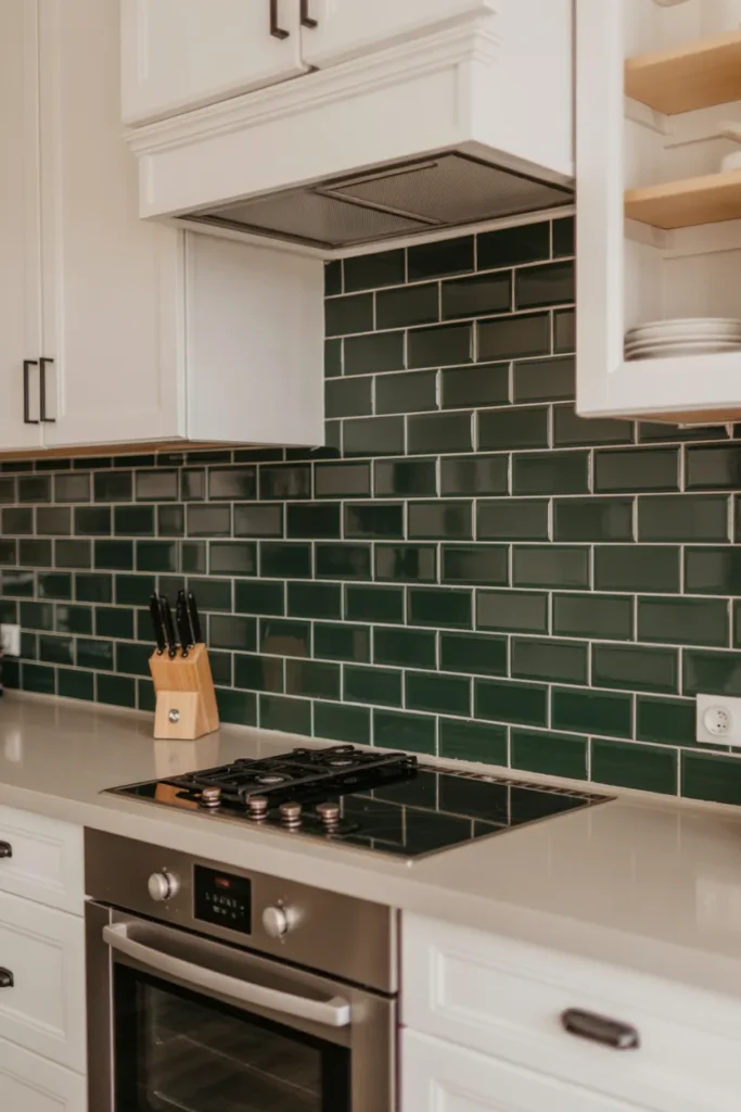
Forest green subway tiles with white grout show every tile outline clearly, giving a dark wall a crisp grid. The white lines stop the green closing in and give the eye a pattern to follow.
Lines must be level: The contrast exposes uneven rows straight away. Spacers and a level on every course are not optional with this combination.
White grout needs sealing: White grout behind a hob will stain without protection. Seal it once cured and wipe the cooking area weekly to keep the lines bright.
- Crisp grid on a dark green wall
- Level rows are essential with contrast
- Seal white grout and wipe weekly
Shop This Look
22. Soft Sage Green Tiles with Marble Countertops
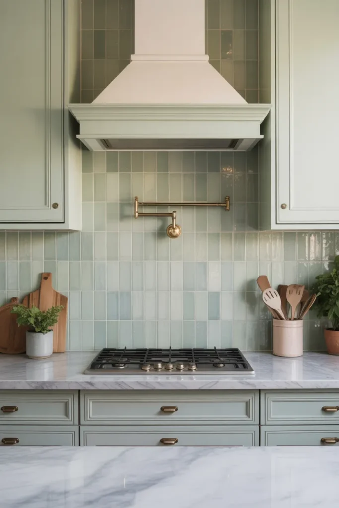
Soft sage green tiles with marble countertops is a gentle, expensive looking pairing. The grey veining in marble picks up the grey undertone in sage, so the two surfaces feel connected rather than chosen separately.
Check undertones together: Sage varies from grey leaning to yellow leaning. Hold the tile against the actual marble, or a large sample of it, because a mismatch in undertone is obvious once fitted.
Care differs by surface: The tiles need little more than a wipe, while the marble worktop needs sealing and prompt clearing of acidic spills. Budget time for the worktop care, not the wall.
- Sage and marble share grey undertones
- Compare real samples before ordering
- Marble worktop needs more care than the tiles
Shop This Look
How to Start
Start with your light, not your favourite colour. Note which direction your kitchen faces and how bright the backsplash wall is at midday. That tells you honestly whether a deep green will work or whether you should stay with mint, sage or pistachio.
Sample the shade at full size: Green changes more between a small sample and a full wall than most colours do. Buy at least four tiles, tape them together on the wall, and live with them for two days next to your cabinets and worktop.
Fix the pairings first: Decide cabinet colour, worktop and handle metal before you order the green. Green chosen last, to fit surfaces already decided, almost always settles better than green chosen first and matched afterwards.
- Judge deep greens only in your real daylight
- Tape four sample tiles together on the wall
- Decide cabinets, worktop and metals before ordering
Shop This Look
Common Mistakes
- Choosing a deep green for a dark, north facing kitchen without adding task lighting.
- Judging green from a single small sample instead of several tiles together on the wall.
- Pairing a blue leaning green with warm orange toned wood without checking samples together.
- Mixing brass, gold and chrome fittings on the same wall so none of them look intentional.
- Using grey adhesive under pale green glass tiles, which dulls and darkens the colour.
- Adding patterned green tiles, coloured cabinets and a patterned floor all in one kitchen.
- Forgetting that white grout against dark green tiles needs sealing and regular wiping.
Frequently Asked Questions
Which shade of green suits a dark kitchen?
Stay pale. Mint, pistachio and light sage reflect enough light to work in a dim room, especially in a gloss or glass finish. Save forest, emerald and deep teal for kitchens with a large window or strong under cabinet lighting.
What cabinet colours go with a green backsplash?
White and cream work with almost every green. Pale wood and beige suit sage and olive, while black cabinets pair well with mid greens. The key check is undertone, so compare real samples side by side.
Which metal handles look best with green tiles?
Brass and brushed gold warm up deep greens and are the most common choice. Black handles work across most shades, and chrome suits pale, cool greens like mint better than warm olives.
Does a green backsplash date quickly?
Sage, olive and forest green have been used in kitchens for a long time and date slowly. Very bright lime is more of a statement and is best kept to a small area you could change later if you tire of it.
Where can I see green backsplashes alongside other colours?
This wider guide to kitchen backsplash ideas puts green options next to white, black and patterned ones, which makes it easier to judge how strong a green will feel in a full kitchen.
The Finishing Touch
Check the finished wall at the time of day you cook most. Green shifts more than neutral colours between daylight and warm evening bulbs, and the evening view is the one you will see daily, so make sure you like that version of the shade.
For more real kitchens showing green tiles with different cabinets, worktops and metals, browse the kitchen backsplash photos on Houzz and save examples that match your cabinet colour.
Keep spare tiles and the exact tile and grout names written down. Greens vary between production batches, and a note made now is the difference between an invisible repair later and a patch that never quite matches.